Three colouring tutorials
Three tutorials on colouring techniques, using CS3 - Levels, Selective Colour, and Curves are involved at various stages, so I suspect they won't be translateable, alas. I'd say these are intermediate to advanced; I won't be explaining really basic Photoshop terms and concepts here. These ideas can work for many dark or low-contrast images to help brighten them up, but I don't advise punching in exactly the same numbers I've used, because your results will depend on the base you're using. Instead, I'll try to explain what I was aiming for with each step, and you can adapt it to suit your own image. That said, I'd love to see what results you can come up with! I hope this is helpful - let me know if there's anything that's unclear.
From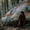
to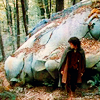
1. Crop your base image in some interesting way ;) Here's mine:
You can see it's quite dark, there's not much contrast, but I think the image still has a lot of potential.
2. Levels. I avoided using Levels for ages because I didn't really understand how they worked, but once I started, I found I used them on pretty much every icon. They're so much easier than doing a million screen layers to try and brighten a dark icon! So don't be scared of them :)
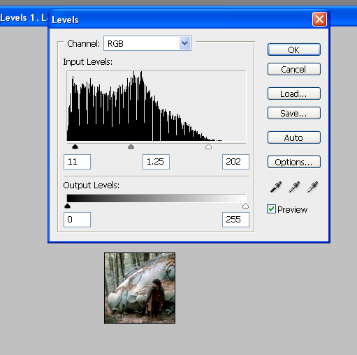
The RGB Levels. You can see immediately under Input Levels that there's a big curve to the left, which is the 'dark' side. Take the little pointer that's furthest to the right, slide it left to about where the curve starts to rise. That lightens the white/light tones in the icon. Then take the middle one and slide it somewhat to the left - this will lighten the medium tones. Finally, I took the leftmost pointer and slid it a bit to the right, in order to darken the dark tones and increase the contrast a bit, but not too much because this is already a very dark base.
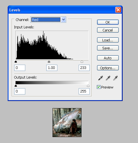
The Red Levels. Same basic sort of curve, very heavily weighted to the dark side (*cue Darth Vader voice*). I slid the right pointer in a bit to lighten things up, but not as far as where the curve starts, or the white tones would ultimately wind up sort of radioactive-looking. Just experiment with sliding it to a point where it looks brighter without being scary ;)
The Green and Blue Levels are the same basic idea - I'm just including them here so you can see all the steps:
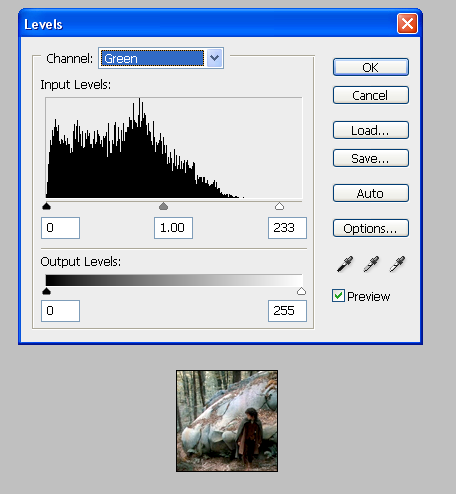
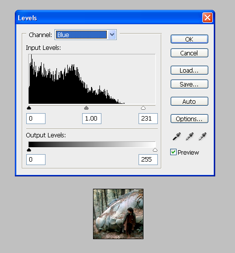
The ultimate result is this: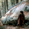
3. High Pass. I wish I could remember who I learned this trick from so I could thank them! Ctrl+Shift+Alt+E to merge-duplicate what you have up to this point, then take that new layer and go Filter > Other > High Pass, set to about 60. With quite a dark base like this one, I'll duplicate the High Pass layer, setting the first one to Screen and the second to Soft Light. If the base was less dark, I'd probably just go for the Soft Light layer, to increase the contrast. I like the High Pass technique because I find it results in much more natural-looking colours than just a Soft Light version of the base. Especially for skin tones, though that's not really a factor in this icon. Anyway, I set the Screen layer to 43% and Soft Light to 66%.
With Screen layer:
With Soft Light added:
4. Okay, it's looking brighter and has way more contrast now, but the colours are still pretty muted. So I put in a Hue/Saturation layer and increased the Master Saturation to +42.
Here's the result: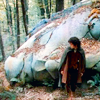
Much nicer!
5. At this point, I wanted to see where I stood and do a bit of Sharpening. I merge-duplicated everything I had so far, then sharpened it the way I usually do these days: Filter > Sharpen > Unsharp Mask, set to about 10-15 or so. The differences are subtle, but it avoids that oversharp look. In general, sharpening a merged layer is a good idea, because if you decide it's too sharp after the point where you could used Edit > Fade, you can always reduce the opacity of the layer (or delete it entirely and try again, if neccessary!) I also like to take the Sharpen Tool, set to about 10-20%, and, with a soft brush, go over any areas of high detail that I want to make just a little bit sharper - in this case, Frodo.
Here is my result:
6. Now, this is looking pretty okay! But I wanted to make the colours just a bit more intense and vibrant, especially the foresty-green tones. I filled a layer with a light peach tone (#f3e0bf) and set it to Colour Burn at 59%.
Here's the result:
7. Finally, I wanted to slightly de-emphasize the light area of the statue's face, so it blended into the icon a little bit better. I used the favourite trick, a light peach (in this case, same as previous step) or pale yellow Multiply layer, set to quite low opacity - I went with 27%.
Here's what I finally ended up with:
From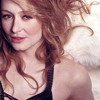
to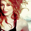
1. Crop your base. This base isn't horribly dark, but it's a lot of the same sort of colour tones - various pinkish shades kind of all blending together, not much contrast. So let's fix it!
Base:
2. Levels.
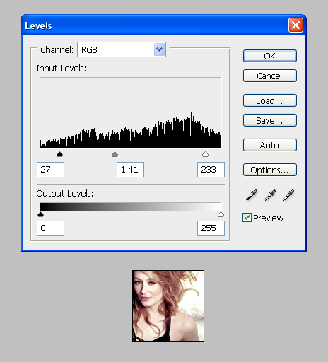
You can see from the RGB Levels that it's pretty flat, no huge peaks or valleys. I just slid the right pointer toward the centre to brighten the whites, the left pointer slightly toward the centre to darken the darks, and the middle pointer slightly to the left to brighten the mid-tones.
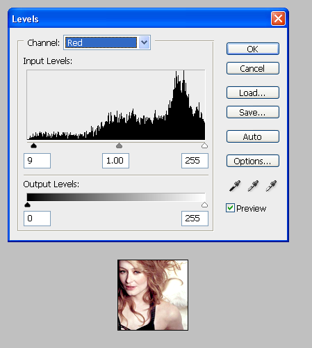
The Red Levels. Because this icon already has lots of red tones in it, I didn't want to emphasize those any more. So all I did here was slide the left-hand pointer into the centre very slightly, which has the effect of making the icon a bit less red in tone.
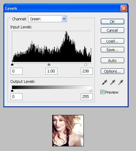
The Green Levels - I just slid the right pointer in a little, to make the white tones slightly more greenish.
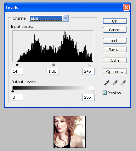
The Blue Levels - I moved the left pointer in as far as where the huge curve starts, and the right pointer in to the point where the big curve on that side begins, or even a little further because I don't mind if this icon gets a bit more blue-ish.
Here is the end result: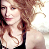
3. High Pass. Ctrl+Shift+Alt+E to merge-duplicate what you have so far, then take that layer and go Filter > Other > High Pass set to about 60. Then set that layer to Soft Light, adjusting the opacity as necessary. I set it to 70%. This is to give it greater contrast while maintaining a reasonably pleasant skin tone (not super-red, the way it could be if we just duplicated the base.)
Here's what it looked like: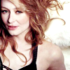
4. Now it's looking quite nice, but I wanted to do something a bit more funky with the colour. So I put a red-green Gradient Map set to Soft Light 100% as my next layer. I think it's one of the default gradients, but in case not, the red is #ec3017 and the green is #009980. More green tones to her skin, more red tones to her hair, is basically how it turns out in this particular case.
Here's the result: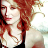
5. I wanted to quiet down the whiteness of her skin and the background a bit, so it didn't pop quite so much, so next I put a pale yellow (#f3efcd) Multiply layer, set to 41% opacity.
Result: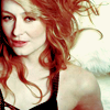
6. Now, this might seem contradictory with the last step, but I felt it was all looking a bit too yellow, so next we have a Selective Colour layer. Under Greens I set Yellow to -95%, under Cyans I increased Cyan to 100%, and on Neutrals I increased both Cyan and Magenta by 11% and reduced Yellow to -9%.
Result: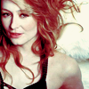
7. Sharpening. I merged and duplicated what I had so far (Ctrl+Alt+Shift+E), and used the same method as I described above: Filter > Sharpen > Unsharp Mask, set to somewhere between 10 and 15 or so.
Here was the (rather subtle) result:
8. It was looking pretty good, but I still wasn't completely happy with it - I felt like her hair was too dark and too red compared to the rest of the icon. I wanted to bring a bit of lightness and yellow tone back into her hair, so I took this texture by hel_lansky, rotated it 90 degrees, and set it to Soft Light at 75% opacity. I picked this texture because of the yellow section in one corner, balanced by the neutral-to-blue tones at the other side that I knew wouldn't mess up the rest of my colouring ;)
End result:
From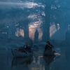
to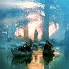
1. I saved the longest and most complicated one for last! Here our base is really dark, really low-contrast, but with one section of light in the centre. It's really quite hard to even tell what's going on in the image :( But I was sure it had the potential to be gorgeous, so here we go...
Base:
2. Levels.
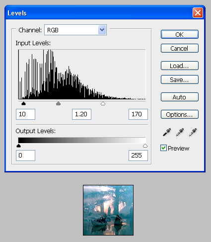
The RGB Levels. If you've read the previous two tutorials through, I hope you're starting to see a pattern with what I've done here - moved the right and left pointers more toward the centre, and slid the centre one to the left to lighten everything and add some contrast.
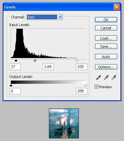
The Red Levels. You can clearly see the huge spike here :) I slide the pointers accordingly - right pointer in to where the curve starts, centre pointer to where the spike starts to build up, and left pointer just to the edge of the spike.
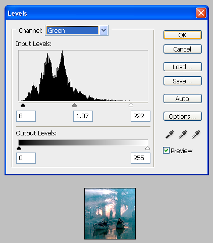
The Green Levels. I do about the same as I did above with the Red Levels.
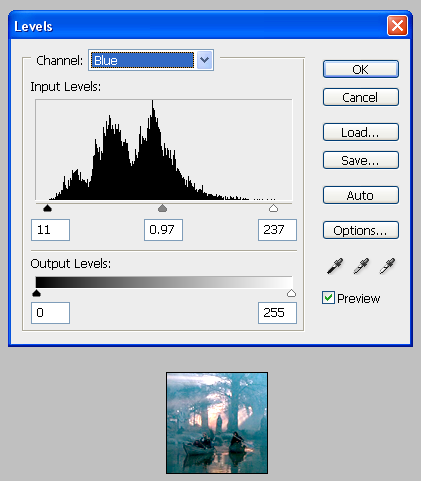
The Blue Levels. Again, same as above, with the exception that I slid the centre pointer just a smidge to the right rather than to the left, to increase the blue tones a bit.
The result: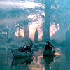
3. A Hue/Saturation layer, increasing the Saturation +18, to bring out the colours some.
Here's what it looks like: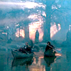
4. A selective colour layer. Right now everything is looking very blue, and while I want to keep some of those blue tones, I also want to bring out other shades, especially the red/orange tones in the centre. So here's what I did:
Reds: Cyan -58, Magenta +14, Yellow -27
Yellows: Yellow -74
Cyans: Cyan -46, Magenta +18
Neutrals: Cyan +5, Yellow +9, Black -9
Result: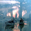
5. Now, the top half of the icon is much lighter than the bottom half, and I wanted to even them out a bit. So I applied a gradient fill, black > transparent, and oriented it so that the black just covered the top of the icon, then set it to Soft Light at 63% opacity.
Like so: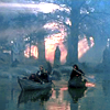
6. A Brightness/Contrast layer, Brightness +15, Contrast +25. Just generally trying to brighten the icon while still keeping the colour vibrant.
Result: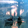
7. I still wanted to emphasize the red tones in the centre of the icon, so I made a new layer, took a soft brush, coloured over those areas with a peachy-orange tone, then set that layer to Overlay at 48% opacity.
Here's what it looked like:
8. A Colour Balance layer (make sure Preserve Luminosity is checked). Basically what I'm doing here is trying to make it a bit more yellow/orange, while still preserving the strong cyan/blue colours at the top of the icon.
Shadows: 0 0 -12
Midtones: -11 -11 -15
Highlights: 0 0 -10
Result: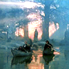
9. I still found the lower half of the icon too dark, so I made another Brightness/Contrast layer, Brightness +11 and Contrast +20, then masked it so that it only affected the water and boats.
Result: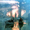
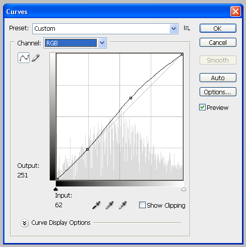
10. A Curves layer, to brighten it up a bit more. The exact numbers aren't that important, just adjust until it looks good for your icon, but here's my settings anyway:
Result: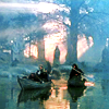
11. I wanted to focus the icon more on the figures at the centre. So I made a new layer, took a soft brush, and coloured around the edges with black, then set it to Soft Light 45%.
Here's what it looked like:
12. Another Hue/Saturation layer. I felt like the cyan was overpowering things a bit, and wanted to give the green of the water more chance to hold its own ;)
Master: Saturation +13
Greens: Saturation +5
Result: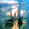
13. I still wanted to tone down the bright lights in the top half of the icon, so I filled a new layer with dark blue (#020719) and set it to Exclusion, then masked it so it only covered the top part of the icon, in order to bring a more muted tone to that area.
Result: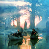
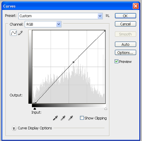
14. Another Curves layer, just to slightly darken the shadows. This is what it looked like:
Result: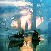
15. Finally, I still wanted more focus on the figures at the centre. So I merged-duplicated (Ctrl+Shift+Alt+E) everything, blurred that new layer with a Radial Blur (I forget what I set it too, just try something and see how it looks ;) Then I applied a layer mask and, with a soft brush of about 100px, made a big blob in the centre of the icon so that just the edges showed as blurry.
Voila!:
I hope you found these helpful. Like I said, if you have any questions or if something isn't clear, just let me know :)
Credit policy | Friend my icon journal | Make a request
From

to

1. Crop your base image in some interesting way ;) Here's mine:

You can see it's quite dark, there's not much contrast, but I think the image still has a lot of potential.
2. Levels. I avoided using Levels for ages because I didn't really understand how they worked, but once I started, I found I used them on pretty much every icon. They're so much easier than doing a million screen layers to try and brighten a dark icon! So don't be scared of them :)

The RGB Levels. You can see immediately under Input Levels that there's a big curve to the left, which is the 'dark' side. Take the little pointer that's furthest to the right, slide it left to about where the curve starts to rise. That lightens the white/light tones in the icon. Then take the middle one and slide it somewhat to the left - this will lighten the medium tones. Finally, I took the leftmost pointer and slid it a bit to the right, in order to darken the dark tones and increase the contrast a bit, but not too much because this is already a very dark base.

The Red Levels. Same basic sort of curve, very heavily weighted to the dark side (*cue Darth Vader voice*). I slid the right pointer in a bit to lighten things up, but not as far as where the curve starts, or the white tones would ultimately wind up sort of radioactive-looking. Just experiment with sliding it to a point where it looks brighter without being scary ;)
The Green and Blue Levels are the same basic idea - I'm just including them here so you can see all the steps:


The ultimate result is this:

3. High Pass. I wish I could remember who I learned this trick from so I could thank them! Ctrl+Shift+Alt+E to merge-duplicate what you have up to this point, then take that new layer and go Filter > Other > High Pass, set to about 60. With quite a dark base like this one, I'll duplicate the High Pass layer, setting the first one to Screen and the second to Soft Light. If the base was less dark, I'd probably just go for the Soft Light layer, to increase the contrast. I like the High Pass technique because I find it results in much more natural-looking colours than just a Soft Light version of the base. Especially for skin tones, though that's not really a factor in this icon. Anyway, I set the Screen layer to 43% and Soft Light to 66%.
With Screen layer:

With Soft Light added:

4. Okay, it's looking brighter and has way more contrast now, but the colours are still pretty muted. So I put in a Hue/Saturation layer and increased the Master Saturation to +42.
Here's the result:

Much nicer!
5. At this point, I wanted to see where I stood and do a bit of Sharpening. I merge-duplicated everything I had so far, then sharpened it the way I usually do these days: Filter > Sharpen > Unsharp Mask, set to about 10-15 or so. The differences are subtle, but it avoids that oversharp look. In general, sharpening a merged layer is a good idea, because if you decide it's too sharp after the point where you could used Edit > Fade, you can always reduce the opacity of the layer (or delete it entirely and try again, if neccessary!) I also like to take the Sharpen Tool, set to about 10-20%, and, with a soft brush, go over any areas of high detail that I want to make just a little bit sharper - in this case, Frodo.
Here is my result:

6. Now, this is looking pretty okay! But I wanted to make the colours just a bit more intense and vibrant, especially the foresty-green tones. I filled a layer with a light peach tone (#f3e0bf) and set it to Colour Burn at 59%.
Here's the result:

7. Finally, I wanted to slightly de-emphasize the light area of the statue's face, so it blended into the icon a little bit better. I used the favourite trick, a light peach (in this case, same as previous step) or pale yellow Multiply layer, set to quite low opacity - I went with 27%.
Here's what I finally ended up with:

From

to

1. Crop your base. This base isn't horribly dark, but it's a lot of the same sort of colour tones - various pinkish shades kind of all blending together, not much contrast. So let's fix it!
Base:

2. Levels.

You can see from the RGB Levels that it's pretty flat, no huge peaks or valleys. I just slid the right pointer toward the centre to brighten the whites, the left pointer slightly toward the centre to darken the darks, and the middle pointer slightly to the left to brighten the mid-tones.

The Red Levels. Because this icon already has lots of red tones in it, I didn't want to emphasize those any more. So all I did here was slide the left-hand pointer into the centre very slightly, which has the effect of making the icon a bit less red in tone.

The Green Levels - I just slid the right pointer in a little, to make the white tones slightly more greenish.

The Blue Levels - I moved the left pointer in as far as where the huge curve starts, and the right pointer in to the point where the big curve on that side begins, or even a little further because I don't mind if this icon gets a bit more blue-ish.
Here is the end result:

3. High Pass. Ctrl+Shift+Alt+E to merge-duplicate what you have so far, then take that layer and go Filter > Other > High Pass set to about 60. Then set that layer to Soft Light, adjusting the opacity as necessary. I set it to 70%. This is to give it greater contrast while maintaining a reasonably pleasant skin tone (not super-red, the way it could be if we just duplicated the base.)
Here's what it looked like:

4. Now it's looking quite nice, but I wanted to do something a bit more funky with the colour. So I put a red-green Gradient Map set to Soft Light 100% as my next layer. I think it's one of the default gradients, but in case not, the red is #ec3017 and the green is #009980. More green tones to her skin, more red tones to her hair, is basically how it turns out in this particular case.
Here's the result:

5. I wanted to quiet down the whiteness of her skin and the background a bit, so it didn't pop quite so much, so next I put a pale yellow (#f3efcd) Multiply layer, set to 41% opacity.
Result:

6. Now, this might seem contradictory with the last step, but I felt it was all looking a bit too yellow, so next we have a Selective Colour layer. Under Greens I set Yellow to -95%, under Cyans I increased Cyan to 100%, and on Neutrals I increased both Cyan and Magenta by 11% and reduced Yellow to -9%.
Result:

7. Sharpening. I merged and duplicated what I had so far (Ctrl+Alt+Shift+E), and used the same method as I described above: Filter > Sharpen > Unsharp Mask, set to somewhere between 10 and 15 or so.
Here was the (rather subtle) result:

8. It was looking pretty good, but I still wasn't completely happy with it - I felt like her hair was too dark and too red compared to the rest of the icon. I wanted to bring a bit of lightness and yellow tone back into her hair, so I took this texture by hel_lansky, rotated it 90 degrees, and set it to Soft Light at 75% opacity. I picked this texture because of the yellow section in one corner, balanced by the neutral-to-blue tones at the other side that I knew wouldn't mess up the rest of my colouring ;)
End result:

From

to

1. I saved the longest and most complicated one for last! Here our base is really dark, really low-contrast, but with one section of light in the centre. It's really quite hard to even tell what's going on in the image :( But I was sure it had the potential to be gorgeous, so here we go...
Base:

2. Levels.

The RGB Levels. If you've read the previous two tutorials through, I hope you're starting to see a pattern with what I've done here - moved the right and left pointers more toward the centre, and slid the centre one to the left to lighten everything and add some contrast.

The Red Levels. You can clearly see the huge spike here :) I slide the pointers accordingly - right pointer in to where the curve starts, centre pointer to where the spike starts to build up, and left pointer just to the edge of the spike.

The Green Levels. I do about the same as I did above with the Red Levels.

The Blue Levels. Again, same as above, with the exception that I slid the centre pointer just a smidge to the right rather than to the left, to increase the blue tones a bit.
The result:

3. A Hue/Saturation layer, increasing the Saturation +18, to bring out the colours some.
Here's what it looks like:

4. A selective colour layer. Right now everything is looking very blue, and while I want to keep some of those blue tones, I also want to bring out other shades, especially the red/orange tones in the centre. So here's what I did:
Reds: Cyan -58, Magenta +14, Yellow -27
Yellows: Yellow -74
Cyans: Cyan -46, Magenta +18
Neutrals: Cyan +5, Yellow +9, Black -9
Result:

5. Now, the top half of the icon is much lighter than the bottom half, and I wanted to even them out a bit. So I applied a gradient fill, black > transparent, and oriented it so that the black just covered the top of the icon, then set it to Soft Light at 63% opacity.
Like so:

6. A Brightness/Contrast layer, Brightness +15, Contrast +25. Just generally trying to brighten the icon while still keeping the colour vibrant.
Result:

7. I still wanted to emphasize the red tones in the centre of the icon, so I made a new layer, took a soft brush, coloured over those areas with a peachy-orange tone, then set that layer to Overlay at 48% opacity.
Here's what it looked like:

8. A Colour Balance layer (make sure Preserve Luminosity is checked). Basically what I'm doing here is trying to make it a bit more yellow/orange, while still preserving the strong cyan/blue colours at the top of the icon.
Shadows: 0 0 -12
Midtones: -11 -11 -15
Highlights: 0 0 -10
Result:

9. I still found the lower half of the icon too dark, so I made another Brightness/Contrast layer, Brightness +11 and Contrast +20, then masked it so that it only affected the water and boats.
Result:

10. A Curves layer, to brighten it up a bit more. The exact numbers aren't that important, just adjust until it looks good for your icon, but here's my settings anyway:

Result:

11. I wanted to focus the icon more on the figures at the centre. So I made a new layer, took a soft brush, and coloured around the edges with black, then set it to Soft Light 45%.
Here's what it looked like:

12. Another Hue/Saturation layer. I felt like the cyan was overpowering things a bit, and wanted to give the green of the water more chance to hold its own ;)
Master: Saturation +13
Greens: Saturation +5
Result:

13. I still wanted to tone down the bright lights in the top half of the icon, so I filled a new layer with dark blue (#020719) and set it to Exclusion, then masked it so it only covered the top part of the icon, in order to bring a more muted tone to that area.
Result:

14. Another Curves layer, just to slightly darken the shadows. This is what it looked like:

Result:

15. Finally, I still wanted more focus on the figures at the centre. So I merged-duplicated (Ctrl+Shift+Alt+E) everything, blurred that new layer with a Radial Blur (I forget what I set it too, just try something and see how it looks ;) Then I applied a layer mask and, with a soft brush of about 100px, made a big blob in the centre of the icon so that just the edges showed as blurry.
Voila!:

I hope you found these helpful. Like I said, if you have any questions or if something isn't clear, just let me know :)
Credit policy | Friend my icon journal | Make a request