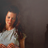
Requested tutorial.
Here is a tutorial requested by dreamt_too_late. Program is PSC2, and it uses curves, selective coloring, color balance and levels.
Example-
From
to
KATE AUSTEN TUTORIAL.
So we are starting with this picture of Kate Austen from Lost.

1. I sampled two colors from Kate's hair #1f0f05 and #291a11 and used smudging to create a background. A more detailed explanation of this technique can be found here. Make sure you choose a color that matches a main component part of the figure. Usually I pick hair or clothing.

to
2. Next I added a new curves layer (Layer - New adjustment layer - Curves). I used the following settings:
RGB:
1st dot (In-6, Ou-0)
2nd dot (In-60, Ou-77)
3rd dot (In-125, Ou-127)
4th dot (In-215, Ou-237)
5th dot (In-255, Ou-247)
Blue:
1st dot (In-120, Out-126)

to
3. Create a new levels layer (Layer - New adjustment layer - Levels). I used the following settings:
RGB:
Input- 2, 1.09, 255
Output- 0, 255

to
4. Create a new layer and fill it with the color #e6e6e6 change the layer to 'Color Burn' and adjust the opacity accordingly. I used 21% but if you find the picture too contrasted than lower the opacity.

to
5. Create a new color balance layer (Layer - New adjustment layer - Color balance).
I used the following settings. This step is too regulate the color of the subjects skin and darken the background, change your settings o fit your image.
Midtones: +12, -3, -16
Shadows: -14, -18, +2
Highlights: -6, +5, -11

to
6. Create a new layer and fill it with the color #393433 change the layer to 'Difference' and adjust the opacity accordingly. I used 23% but if you find the picture too light than you can increase the opacity.

to
7. Create a new hue/saturation layer (Layers - New adjustment layer - Hue/Saturation). I used the following settings. However if your picture needs a little more 'punch' then you can increase the settings.
Master: 0, +9, 0
Reds: -2, 4, 0
Yellows: 0, +4, 0

to
8. Duplicate your base image and bring it to the top. Set the layer to 'Soft Light' too add some contrast. I set the layer at 21% opacity but you can lower or increase it according to your picture.

to
9. Once again duplicate your base image and bring it to the top. Set the layer to 'Screen' to add some brightness to the image. I set the layer at 20% opacity but if it's still too dark you can increase the opacity.

to
10. Next hit Ctrl+A to select your entire image, next hit Shift+Ctrl+C to copy your entire image and finally paste it will Ctrl+V. This is the layer you will sharpen. Go Filter - Sharpen - Sharpen and adjust the opacity of the layer to your preference.

to
11. Create a new selective color layer (Layer - New adjustment layer - Selective color). I used the following settings. If you find your image is turing out too red lower the Cyan and Magenta settings closer to 0 in the red option.
Reds: -30, +13, +15, +11
Yellows: +18, -14, -19, +18
Neutrals: +10, +5, +4, +1
Blacks: 0, 0, 0, -3

to
12. Take this texture:
And set the layer to 'Color Burn' at 35% opacity. If the image is very dark or contrasted then lower the opacity.

to
13. Take this texture:
And set the layer to 'Hard Light' at 42% opacity and 75% fill.

to
14. Fill a new layer with a gradient with these two colors #727272 and #b1b1b1. I set the layer to 'Screen' at 14% opacity. This layer is meant to highlight the background so make sure the darker gray ends up over the figure.

to
15. Fill a new layer with a gradient with these two colors #424242 and #000000. I set the layer to 'Lighten' and lef the opacity at 100%. The layer will cover any black on your icon with the hazy gray color, if you find the effect to strong lower the opacity.

to
16. To highlight Kate I took a soft-edged brush at about 15 px and put a white blob near her forehead. I set the layer to 'Screen' and lowered the opacity to 10%. The blob will look REALLY bad if the opacity remains above 20%, subtle is key.

to
17. LAST STEP :D Create a new Gradient map layer (Layer - New adjustment layer - Gradient map) and select Black & White. Set the layer to 'Soft light' I set the opacity at 24% but your can lower it or increase it depending on the contrast.

to
WOW. That took a while to write out. Hope you liked it.
Leave your comments and questions here so I can respond to them!
Example-
From

to

KATE AUSTEN TUTORIAL.
So we are starting with this picture of Kate Austen from Lost.

1. I sampled two colors from Kate's hair #1f0f05 and #291a11 and used smudging to create a background. A more detailed explanation of this technique can be found here. Make sure you choose a color that matches a main component part of the figure. Usually I pick hair or clothing.

to

2. Next I added a new curves layer (Layer - New adjustment layer - Curves). I used the following settings:
RGB:
1st dot (In-6, Ou-0)
2nd dot (In-60, Ou-77)
3rd dot (In-125, Ou-127)
4th dot (In-215, Ou-237)
5th dot (In-255, Ou-247)
Blue:
1st dot (In-120, Out-126)

to

3. Create a new levels layer (Layer - New adjustment layer - Levels). I used the following settings:
RGB:
Input- 2, 1.09, 255
Output- 0, 255

to

4. Create a new layer and fill it with the color #e6e6e6 change the layer to 'Color Burn' and adjust the opacity accordingly. I used 21% but if you find the picture too contrasted than lower the opacity.

to

5. Create a new color balance layer (Layer - New adjustment layer - Color balance).
I used the following settings. This step is too regulate the color of the subjects skin and darken the background, change your settings o fit your image.
Midtones: +12, -3, -16
Shadows: -14, -18, +2
Highlights: -6, +5, -11

to

6. Create a new layer and fill it with the color #393433 change the layer to 'Difference' and adjust the opacity accordingly. I used 23% but if you find the picture too light than you can increase the opacity.

to

7. Create a new hue/saturation layer (Layers - New adjustment layer - Hue/Saturation). I used the following settings. However if your picture needs a little more 'punch' then you can increase the settings.
Master: 0, +9, 0
Reds: -2, 4, 0
Yellows: 0, +4, 0

to

8. Duplicate your base image and bring it to the top. Set the layer to 'Soft Light' too add some contrast. I set the layer at 21% opacity but you can lower or increase it according to your picture.

to

9. Once again duplicate your base image and bring it to the top. Set the layer to 'Screen' to add some brightness to the image. I set the layer at 20% opacity but if it's still too dark you can increase the opacity.

to

10. Next hit Ctrl+A to select your entire image, next hit Shift+Ctrl+C to copy your entire image and finally paste it will Ctrl+V. This is the layer you will sharpen. Go Filter - Sharpen - Sharpen and adjust the opacity of the layer to your preference.

to

11. Create a new selective color layer (Layer - New adjustment layer - Selective color). I used the following settings. If you find your image is turing out too red lower the Cyan and Magenta settings closer to 0 in the red option.
Reds: -30, +13, +15, +11
Yellows: +18, -14, -19, +18
Neutrals: +10, +5, +4, +1
Blacks: 0, 0, 0, -3

to

12. Take this texture:

And set the layer to 'Color Burn' at 35% opacity. If the image is very dark or contrasted then lower the opacity.

to

13. Take this texture:

And set the layer to 'Hard Light' at 42% opacity and 75% fill.

to

14. Fill a new layer with a gradient with these two colors #727272 and #b1b1b1. I set the layer to 'Screen' at 14% opacity. This layer is meant to highlight the background so make sure the darker gray ends up over the figure.

to

15. Fill a new layer with a gradient with these two colors #424242 and #000000. I set the layer to 'Lighten' and lef the opacity at 100%. The layer will cover any black on your icon with the hazy gray color, if you find the effect to strong lower the opacity.

to

16. To highlight Kate I took a soft-edged brush at about 15 px and put a white blob near her forehead. I set the layer to 'Screen' and lowered the opacity to 10%. The blob will look REALLY bad if the opacity remains above 20%, subtle is key.

to

17. LAST STEP :D Create a new Gradient map layer (Layer - New adjustment layer - Gradient map) and select Black & White. Set the layer to 'Soft light' I set the opacity at 24% but your can lower it or increase it depending on the contrast.

to

WOW. That took a while to write out. Hope you liked it.
Leave your comments and questions here so I can respond to them!