(no subject)
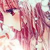
I'll show you how to go from:
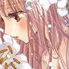
to
Made with Photoshop CS3.
Tutorial is very image heavy with a lot of steps and involves some selective colouring.
I would appreciate if all comments were posted HERE. Thank you!

Start off with our base. Duplicate it, set it to Soft Light and then add a Gaussian Blur of around 1-4 pixels. Normally I don't make use of Gaussian Blur, but it comes out quite nice in the end result.
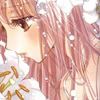
Next thing I do is add a New Adjustment Layer > Curves in order to bring out some of the colours I wanted. In particular, Kobato's hair.
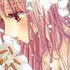

Create a new layer and fill with #021948 and set to Exclusion, 100%. I did this step twice.
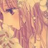

Add a new layer and fill with #4B0D0D and set to Exclusion and lower to opacity. I lowered mine to around 60%, but it's really up to you how much you lower the opacity.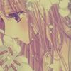

Fill another new layer with #D2F1FE, and set to Color Burn, 100%.
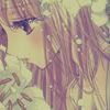

Add a new layer and fill with #FDC2D9, set to Soft Light, 50-80%.
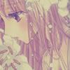
As you can see Kobato is drowning in my colour layers so the next thing do is duplicate my base and bring it to the top. Set the blending mode to Soft Light, 100%.
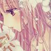
I add a New Adjustment Layer > Color Balance and a New Adjustment Layer > Selective Color. With these two layers, I'm able bring out the red/pink colour scheme I wanted and give the icon some depth (getting rid of the washed out effect).
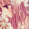
I add a New Adjustment Layer > Channel Mixer. With this, I was trying to give the icon a cold and lonely atmosphere through the colouring. Hence the colouring came out a bit blue.
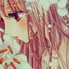
So the icon is looking a bit dark... time to brighten it up! You can do this several ways (Curves, Levels, Bright/Contrast, and more). I choose a combination of a New Adjustment Layer > Levels and a New Adjustment Layer > Brightness/Contrast.
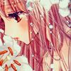

At this point my icon is starting to look pretty nice, but the colours looked too warm for me, so I added a new layer and filled it with #4B0D0D on Exclusion,33%.
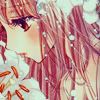
Alrighty! It's obligatory light texture time. This actually isn't mandatory... I just happen to have a love affair with light textures. :3 So I grab some light textures (for this icon nothing with particularly bright or vibrant colours). The textures I used are from ianthinae, soaked and Lovely Trash, respectively. I set them all to Screen and lower their opacity to my liking. Next, I move around some of the textures and erase parts of the texture where I don't want them to be (mostly the top right half of the icon).
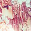
My icon's looking washed out because of all the light textures, so to fix this I add a New Adjustment Layer > Selective Color to give the icon depth and contrast and to bring out the colours. I duplicate my Selective Color and lower the opacity to around 60%.

Lastly, I added a New Adjustment Layer > Channel Mixer and a New Adjustment Layer > Brightness/Contrast as my finishing touches!


to

Made with Photoshop CS3.
Tutorial is very image heavy with a lot of steps and involves some selective colouring.
I would appreciate if all comments were posted HERE. Thank you!

Start off with our base. Duplicate it, set it to Soft Light and then add a Gaussian Blur of around 1-4 pixels. Normally I don't make use of Gaussian Blur, but it comes out quite nice in the end result.

Next thing I do is add a New Adjustment Layer > Curves in order to bring out some of the colours I wanted. In particular, Kobato's hair.


Create a new layer and fill with #021948 and set to Exclusion, 100%. I did this step twice.


Add a new layer and fill with #4B0D0D and set to Exclusion and lower to opacity. I lowered mine to around 60%, but it's really up to you how much you lower the opacity.


Fill another new layer with #D2F1FE, and set to Color Burn, 100%.


Add a new layer and fill with #FDC2D9, set to Soft Light, 50-80%.

As you can see Kobato is drowning in my colour layers so the next thing do is duplicate my base and bring it to the top. Set the blending mode to Soft Light, 100%.

I add a New Adjustment Layer > Color Balance and a New Adjustment Layer > Selective Color. With these two layers, I'm able bring out the red/pink colour scheme I wanted and give the icon some depth (getting rid of the washed out effect).

I add a New Adjustment Layer > Channel Mixer. With this, I was trying to give the icon a cold and lonely atmosphere through the colouring. Hence the colouring came out a bit blue.

So the icon is looking a bit dark... time to brighten it up! You can do this several ways (Curves, Levels, Bright/Contrast, and more). I choose a combination of a New Adjustment Layer > Levels and a New Adjustment Layer > Brightness/Contrast.


At this point my icon is starting to look pretty nice, but the colours looked too warm for me, so I added a new layer and filled it with #4B0D0D on Exclusion,33%.


Alrighty! It's obligatory light texture time. This actually isn't mandatory... I just happen to have a love affair with light textures. :3 So I grab some light textures (for this icon nothing with particularly bright or vibrant colours). The textures I used are from ianthinae, soaked and Lovely Trash, respectively. I set them all to Screen and lower their opacity to my liking. Next, I move around some of the textures and erase parts of the texture where I don't want them to be (mostly the top right half of the icon).

My icon's looking washed out because of all the light textures, so to fix this I add a New Adjustment Layer > Selective Color to give the icon depth and contrast and to bring out the colours. I duplicate my Selective Color and lower the opacity to around 60%.

Lastly, I added a New Adjustment Layer > Channel Mixer and a New Adjustment Layer > Brightness/Contrast as my finishing touches!
