CS3 tutorial, Ruby from 'Supernatural'
This is a CS3 tutorial that features gradient maps, selective colouring and masks. I like helping and offering tutorials so if you have any questions about any icons or wish to see a certain tutorial let me know over here. More tutorials can be found here.
Go from
to this: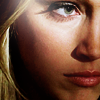
Because I've written out this tutorial, step-by-step, please be aware that I will not give out a psd for it. The steps are quite detailed and I'm more than happy to answer any questions about anything done in it. Experimenting and adopting certain steps into your own icon process is the best way to learn.
When I want to make an icon that focuses on an extreme close up of someone's face or their features it really comes down to the cap. If the cap features a distantly focused subject it's obviously going to be hard to get a good close up. If it's a cap of the person's entire face so it fills the whole cap that doesn't allow for much maneuvering room to find a good position.
It depends on the cap what I focus on. Sometimes it's just the mouth/eyes/nose, etc. This particular cap had a great splash of light that highlighted Ruby's cheekbone and around her eye so it worked out perfectly for me. A happy accident.
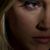
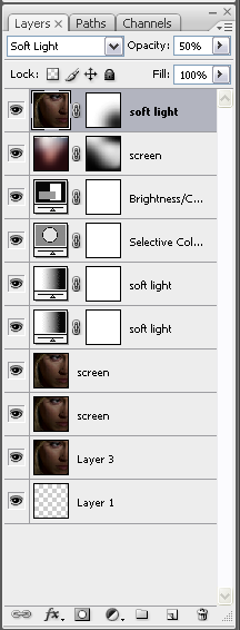
02) 2 duplicate layers of the base, both set to screen, the top layer sharpened.
-->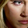
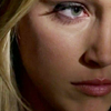
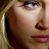
03) Then I applied a gradient map set to soft light. I like this one so much because it brings some slight contrast with colour to an image and highlights the features in an icon.

-->
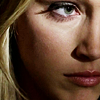
04) Another gradient map, again set to soft light. I used this gradient map to accent the shadows on her face and bring out the brightness of the colour across her cheek.

-->
05) I added a selective colour layer next. Here I fiddled with the red colouring, the yellow, the white, black and neutral levels. Numbers won't work on any other image so I'll tell you why I adjusted what I did and what it did.
On the red level I upped the red and yellow, along with the black to put some colour back into her face.
On the yellow level I upped the cyan and black. While I wanted to bring out the colour in her face I didn't want it to be TOO yellow so the cyan countered that and the black took some of the bright sting out of it.
On the white level I upped the blue and cyan a bit and reduced the black to make the lighter part of the icon just a bit brighter. I don't usually do this, I generally up the black on the white level to make it less bright but because of the nature of this icon, the look I was going for it had to pop from the darker contrast.
On the neutral level I barely upped the red and yellow and reduced the black so the colour wouldn't be lost in something TOO dark.
Finally, on the black level, I upped the black just a little, just because I like contradicting things I just did previously. But there is a method to my maddness. The black level obviously controls the overall black and I REALLY like contrast in icons.
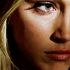
06) To prove that I added a brightness/contrast layer next. This step could probably be skipped, depending on how much YOU like contrast or how much you fiddled with the selective colour layer. I upped the contrast just a little bit and lowered the brightness a bit. It's so slight on this icon I probably could have skipped it.
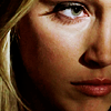
07) I added a texture by drankmywar next. I flipped it upside down and set it to screen. It added the right bit of lightness in the right place and also a bit of soft pink colour to make the colours on Ruby's face a bit softer. I didn't want the bright colour across her whole face, though, only across her eye and cheekbone where the initial brightness was so I masked out the bits along her jawline and at the top of her nose.
-->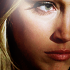
08) Adding the texture on screen made the definition around her eyes and nose a little foggy so to top it all off I duplicated the base layer, dragged it to the top and set it to soft light. I can't say for sure if I sharpened it or not but there's a good chance I did. Sharpened at your own discretion, though, because sometimes, depending on the image, it's not necessary and will only serve as overkill.

In case it helps anyone (I don't know if it does, but it doesn't hurt, I suppose) here's how the final result looks in my layers palette.
Go from
to this:
Because I've written out this tutorial, step-by-step, please be aware that I will not give out a psd for it. The steps are quite detailed and I'm more than happy to answer any questions about anything done in it. Experimenting and adopting certain steps into your own icon process is the best way to learn.
When I want to make an icon that focuses on an extreme close up of someone's face or their features it really comes down to the cap. If the cap features a distantly focused subject it's obviously going to be hard to get a good close up. If it's a cap of the person's entire face so it fills the whole cap that doesn't allow for much maneuvering room to find a good position.
It depends on the cap what I focus on. Sometimes it's just the mouth/eyes/nose, etc. This particular cap had a great splash of light that highlighted Ruby's cheekbone and around her eye so it worked out perfectly for me. A happy accident.
02) 2 duplicate layers of the base, both set to screen, the top layer sharpened.
-->
03) Then I applied a gradient map set to soft light. I like this one so much because it brings some slight contrast with colour to an image and highlights the features in an icon.
-->
04) Another gradient map, again set to soft light. I used this gradient map to accent the shadows on her face and bring out the brightness of the colour across her cheek.
-->
05) I added a selective colour layer next. Here I fiddled with the red colouring, the yellow, the white, black and neutral levels. Numbers won't work on any other image so I'll tell you why I adjusted what I did and what it did.
On the red level I upped the red and yellow, along with the black to put some colour back into her face.
On the yellow level I upped the cyan and black. While I wanted to bring out the colour in her face I didn't want it to be TOO yellow so the cyan countered that and the black took some of the bright sting out of it.
On the white level I upped the blue and cyan a bit and reduced the black to make the lighter part of the icon just a bit brighter. I don't usually do this, I generally up the black on the white level to make it less bright but because of the nature of this icon, the look I was going for it had to pop from the darker contrast.
On the neutral level I barely upped the red and yellow and reduced the black so the colour wouldn't be lost in something TOO dark.
Finally, on the black level, I upped the black just a little, just because I like contradicting things I just did previously. But there is a method to my maddness. The black level obviously controls the overall black and I REALLY like contrast in icons.
06) To prove that I added a brightness/contrast layer next. This step could probably be skipped, depending on how much YOU like contrast or how much you fiddled with the selective colour layer. I upped the contrast just a little bit and lowered the brightness a bit. It's so slight on this icon I probably could have skipped it.
07) I added a texture by drankmywar next. I flipped it upside down and set it to screen. It added the right bit of lightness in the right place and also a bit of soft pink colour to make the colours on Ruby's face a bit softer. I didn't want the bright colour across her whole face, though, only across her eye and cheekbone where the initial brightness was so I masked out the bits along her jawline and at the top of her nose.
-->
08) Adding the texture on screen made the definition around her eyes and nose a little foggy so to top it all off I duplicated the base layer, dragged it to the top and set it to soft light. I can't say for sure if I sharpened it or not but there's a good chance I did. Sharpened at your own discretion, though, because sometimes, depending on the image, it's not necessary and will only serve as overkill.
In case it helps anyone (I don't know if it does, but it doesn't hurt, I suppose) here's how the final result looks in my layers palette.