Lesson #8: More on Coloring
Tutorial#10
Going from this:
to this: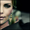
This icon was made in PSP9 but should be easily translated to other programs.
Part 1: Base
Make your base of course. T H I S is the picture I used. I selected an area I thought would make an interesting base, copied/pasted it and resized it to 100x100.

Part 2: Clean it up!
Adjust > Add/Remove Noise > Jpeg Artifact Removal
Set to: LOW, Crispness = 1
Adjust > Sharpness > Sharpen
Adjust > Sharpness > Unsharp Mask
Set to: Radius = 29.00, Strength = 13, Clipping = 19
Duplicate set to Soft Light
Merge Visible

Part 3: Changing the color
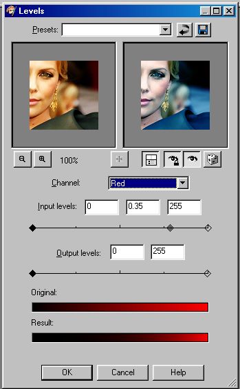
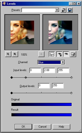
Adjust > Brightness/Contrast > Levels
Before you make these adjustments, take a look at the final product. The way this step turns out will directly effect how your end icon looks. Pink and Blue must be the most recognizable colors after you tweek the levels. Take careful notice of the coloring of the icon after this step. It should be bright and more blue with very little green or red in it.
RED:
BLUE:
GREEN:
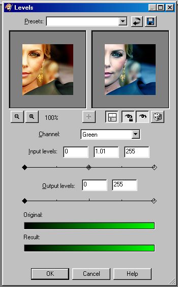
Your icon should look something like this:

Remember it will differ depending on the original coloring/lighting of your icon.
Now...at this point the coloring of the icon is actually rather appealing (imo) and you can stop here if you'd like. But I wanted something with more depth.
Part 4: Using 2 Colors and Layers to change the color
We're using these two colors:


A. New layer filled with beige (#dfd6c7) set to Saturation Legacy 100% Opacity

B. New layer filled with navy (#03010b) set to Difference 100% Opacity

C. New layer filled with beige (#dfd6c7) set to Multiply 100% Opacity
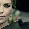
Copy Merged
Paste twice as a new layer ON TOP of your last beige layer
D. Set the first to Screen 66% Opacity

E. Set the second to Screen 30% Opacity

why use 2 seperate screen layers? I tried doing just one at 80-96% & it just didn't seem to yield the same results.
F. New Layer filled with navy (#03010b) set to Soft Light 100% Opacity

Merve all flatten
Part 5: Final Touches
Use your sharpening tool to sharpen the eyes, lips and earring (or anything you want to stand out and seem more intense)
Add a 1px border
(Optional: Add text or a light texture (although that would be overkill imo) if you want and....)
Done!

Variations:
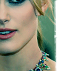
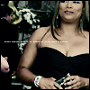
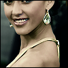
Going from this:
to this:
This icon was made in PSP9 but should be easily translated to other programs.
Part 1: Base
Make your base of course. T H I S is the picture I used. I selected an area I thought would make an interesting base, copied/pasted it and resized it to 100x100.
Part 2: Clean it up!
Adjust > Add/Remove Noise > Jpeg Artifact Removal
Set to: LOW, Crispness = 1
Adjust > Sharpness > Sharpen
Adjust > Sharpness > Unsharp Mask
Set to: Radius = 29.00, Strength = 13, Clipping = 19
Duplicate set to Soft Light
Merge Visible
Part 3: Changing the color
Adjust > Brightness/Contrast > Levels
Before you make these adjustments, take a look at the final product. The way this step turns out will directly effect how your end icon looks. Pink and Blue must be the most recognizable colors after you tweek the levels. Take careful notice of the coloring of the icon after this step. It should be bright and more blue with very little green or red in it.
RED:
BLUE:
GREEN:
Your icon should look something like this:
Remember it will differ depending on the original coloring/lighting of your icon.
Now...at this point the coloring of the icon is actually rather appealing (imo) and you can stop here if you'd like. But I wanted something with more depth.
Part 4: Using 2 Colors and Layers to change the color
We're using these two colors:
A. New layer filled with beige (#dfd6c7) set to Saturation Legacy 100% Opacity
B. New layer filled with navy (#03010b) set to Difference 100% Opacity
C. New layer filled with beige (#dfd6c7) set to Multiply 100% Opacity
Copy Merged
Paste twice as a new layer ON TOP of your last beige layer
D. Set the first to Screen 66% Opacity
E. Set the second to Screen 30% Opacity
why use 2 seperate screen layers? I tried doing just one at 80-96% & it just didn't seem to yield the same results.
F. New Layer filled with navy (#03010b) set to Soft Light 100% Opacity
Merve all flatten
Part 5: Final Touches
Use your sharpening tool to sharpen the eyes, lips and earring (or anything you want to stand out and seem more intense)
Add a 1px border
(Optional: Add text or a light texture (although that would be overkill imo) if you want and....)
Done!
Variations: