Tutorial: Cillian Murphy 'Just Breathe'
helcaxe asked me to make tutes on a couple of icons awhile ago and I've only gotten around to it. Also, I've never actually done a tute before so tell me if this is helpful to you or not.
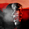
Using PS7 although it should work in all programs.
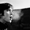
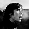
The image was coloured to start with, but all these layers were made to be black and white via Ctrl + Shift + U which is a shortcut for Image > Adjustments > Desaturate. I started by cropping the image the way I liked it, with the fog as the center. But then I decided that it was too simple as it was, and also that it wasn't balanced enough for me.
Set this image to Soft Light, as you will see later. Slight contrasting done with the Levels tool (although you can use Curves, Brightness/Contrast, whatever).
to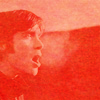
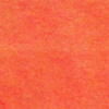
So I added this texture, not sure where I got it from. In any case, pretty much any single-colour, grainy texture will do. I stuck that below the original base.
Photoshop Step: If it says that the original base layer is locked (
), double click that lock and press 'Ok' on the window that pops up. This will change it to a moveable layer and you can drop the texture underneath it.
to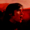
When making any icon, I make about a billion crops and then decide which one I like most. This was one of my "discarded" crops, where his head is centered. I set this on top of the other two layers on Linear Burn. How do I know what layer blend mode to put it on? Trial and error, of course. =)
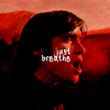
Using a handwritten font (I used Natalie's Sribble) I wrote some words at a small but readable size (7pt) and Right Justified. I decreased the Opacity to 90% so that it wouldn't be so strong, but it is dependent on the icon itself.
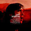
Below the text, I pasted in some nonsense words, also Right Justified and set that to 2pt font size, with 200 tracking/letter spacing so that it looks better. A smaller tracking makes it look strange, personally.
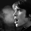
to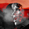
Lastly, another discarded crop had Cillian's face slightly larger, so I took that and pasted it on top, then went Edit > Transform > Flip Horizontal. I then set the layer blend mode to Lighten. I probably used the Levels tool to enhance the contrast in that layer, so that the whites stand out more and the blacks disappear more.

to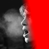
Since I didn't want the top layer to obscure everything else, I created a Layer Mask and masked out the right hand side of it. To do that, I used a black to white gradient dragged from one side to the other. Anything under the black will be masked out (erased, but not gone) and anything under the white will still be visible.
(Note: the red section indicates where it has been masked out.)

And there you have your icon! This was my final layer order:
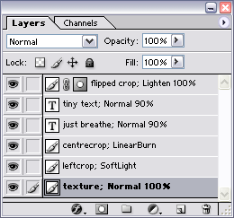
Please do note that this won't work for all icons and you have to get creative yourself for it to work for you. And please please PLEASE don't just copy this tutorial with the exact same image because that's just lame.
Using PS7 although it should work in all programs.
The image was coloured to start with, but all these layers were made to be black and white via Ctrl + Shift + U which is a shortcut for Image > Adjustments > Desaturate. I started by cropping the image the way I liked it, with the fog as the center. But then I decided that it was too simple as it was, and also that it wasn't balanced enough for me.
Set this image to Soft Light, as you will see later. Slight contrasting done with the Levels tool (although you can use Curves, Brightness/Contrast, whatever).
to
So I added this texture, not sure where I got it from. In any case, pretty much any single-colour, grainy texture will do. I stuck that below the original base.
Photoshop Step: If it says that the original base layer is locked (
), double click that lock and press 'Ok' on the window that pops up. This will change it to a moveable layer and you can drop the texture underneath it.
to
When making any icon, I make about a billion crops and then decide which one I like most. This was one of my "discarded" crops, where his head is centered. I set this on top of the other two layers on Linear Burn. How do I know what layer blend mode to put it on? Trial and error, of course. =)
Using a handwritten font (I used Natalie's Sribble) I wrote some words at a small but readable size (7pt) and Right Justified. I decreased the Opacity to 90% so that it wouldn't be so strong, but it is dependent on the icon itself.
Below the text, I pasted in some nonsense words, also Right Justified and set that to 2pt font size, with 200 tracking/letter spacing so that it looks better. A smaller tracking makes it look strange, personally.
to
Lastly, another discarded crop had Cillian's face slightly larger, so I took that and pasted it on top, then went Edit > Transform > Flip Horizontal. I then set the layer blend mode to Lighten. I probably used the Levels tool to enhance the contrast in that layer, so that the whites stand out more and the blacks disappear more.
to
Since I didn't want the top layer to obscure everything else, I created a Layer Mask and masked out the right hand side of it. To do that, I used a black to white gradient dragged from one side to the other. Anything under the black will be masked out (erased, but not gone) and anything under the white will still be visible.
(Note: the red section indicates where it has been masked out.)
And there you have your icon! This was my final layer order:
Please do note that this won't work for all icons and you have to get creative yourself for it to work for you. And please please PLEASE don't just copy this tutorial with the exact same image because that's just lame.