Tutorial: Extending your background
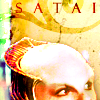
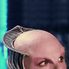
Going from this to this: 
. For Photoshop CS2 - not sure how translatable this is (if you get it to work in another program, let me know! :) Basic to Intermediate difficulty - I hope I've explained things clearly enough that even a fairly new Photoshop user can figure it out :)
Sometimes I want to put the main focus of my icon way off-centre, either to leave room for text, brushwork, or textures, or just because I think it looks nicer that way. However, when you're working with screencaps, it can often be hard to find a shot with enough space left around the subject to crop it so dramatically. But! You can get around this problem by extending your background using the Transform > Scale tool.
Picking the cap you're going to work with is very important here. You want to look for a base image where there is at least a little bit of space around your subject. It doesn't have to be much, but preferably the top of your subject's head should be visible with a small amount of space to spare. It's also preferable if your background isn't very busy, although there are ways of working around this that I'll mention later. A very plain background will generally work best, though, especially if you're trying this for the first time!
Crop your base, going off the edge of the screencap:

Photoshop CS2 doesn't let you just drag your cropping box straight off the edge of your picture - it assumes you want to stay within the lines! But right now, you don't :) Drag it as far as it will allow you, let go, and then grab one of the box's corners and keep dragging - now it will let you go over the boundaries of the original image. You should end up with something like this:

The section outside the original image will be whatever your background colour is currently set as (I made it orange so it would obvious, heh). Don't worry about it, though, we're going to get rid of that blank space right now.
Take your Rectangular Marquee tool and select the bit of background that's above your subject, like so:

Make sure not to get even a little smidgen of their head/hair in your selection! Keeping that area selected, go to Edit > Transform > Scale. Now your selected area will have little squares at the corners and in the middle of each line, like so:

Click on the middle box of the top line. If your selection is particularly narrow, it may be a bit tricky to click on it without hitting one of the other boxes too, but keep trying! Once you have clicked on it, drag the box to the top of your icon. Now it should look something like this:

Ta-da, your background is now stretched to fill the empty space, and you can continue making your neat off-centre icon using this as your new base :)
Sometimes, if your background is more busy, it will look weird when stretched. There are a few options for how to deal with this. One is to use any of the techniques I outlined in my tutorial on background effects to obscure the busy background while leaving the central figure unaffected. However, with this icon I chose to cover much of the background with textures (even though in this case the background is plain enough that it wasn't really necessary - I thought it looked prettier ;) So I'll show you what I did for the rest of the process of making this particular icon. (Non PS users - it involves very minimal use of Curves, but you could easily leave out that step.)
1. I took my new and improved base and duplicated it twice, setting the first duplicated layer to Screen at 100% and the second to Overlay at 46%. This is almost always a good first step when working with screencaps, since it will increase the contrast and just generally make nearly any image look better. Instead of an Overlay layer, sometimes I will use a Soft Light layer - it varies from image to image what looks best. Similarly, adjust the opacities of the various layers until it looks neither too bright nor too dark - it will depend on how dark your base image is. If it's really dark, multiple Screen layers might be necessary. Now it looks like this:

2. I filled a new layer with #f7edc1 (a light yellow) and set it to Multiply at 100% to get this:

3. Next, a new layer filled with #dfe8f8 (pale blue), set on Color Burn at 100%, giving this:

4. And then another new layer filled with #fee8ce (pale peach), also set on Color Burn at 100%. Now we have this:

5. Next, I duplicated my base once more, dragged it to the top (or, for speed and efficiency, I probably just used Layer > Arrange > Bring to Front :) and set it to Soft Light at 100% opacity.

Looking a bit dark and bleh, isn't it? We will fix that soon!
6. I added this texture by colorfilter as a Saturation layer at 100%.

>
7. Then I added this texture, also by colorfilter, as a Linear Dodge layer at 100%.

>
I thought it washed out her face a bit too much, so I added a Layer Mask and took a soft brush set to maybe about 30-40% opacity and applied it just over her face to get this:

8. Another new layer. I took a swirly brush in black, stamped it over her head and set it to Overlay. Then I added my text (Felix Titling, black, 14 pt, tracking at 800 to space the letters far apart, anti-alias set to Strong). Then, still on my text layer, I went Layer > Layer Style > Pattern Overlay and laid an orangey-red texture over the text. Now I had this:

9. I was still thinking her face was too washed out, so I duplicated my base *again*, brought it to the top and set it to Soft Light at 100%. Since I only wanted it to darken her face, I added a Layer Mask and brushed out the background with a soft brush set to 100% opacity:

10. Now, it's just some fine-tuning! New Adjustment Layer > Brightness/Contrast, and I set Brightness to -10, Contrast to +21. This is just to bring out the colours a bit more.

11. A curves layer next - it's not hugely necessary, but I think it adds a little something. On the RGB layer, just slide the bottom dot slightly to the right and the upper dot slightly to the left, like so:

This is just to darken the darks and lighten the lights a little bit, and it's something I often like to do to my icons. Here is the result:

12. Finally, another new Adjustment Layer > Hue/Saturation. Here are the settings I used, because I wanted to accentuate the red and yellow tones:
RGB: Saturation +7
Reds: Saturation +20
Yellows: Saturation +12
Final result:

If you have any questions, let me know and I'll try to answer them. And I'd love to see what results you get from this tutorial, too :)
Credit policy | Friend this journal | Make a request

. For Photoshop CS2 - not sure how translatable this is (if you get it to work in another program, let me know! :) Basic to Intermediate difficulty - I hope I've explained things clearly enough that even a fairly new Photoshop user can figure it out :)
Sometimes I want to put the main focus of my icon way off-centre, either to leave room for text, brushwork, or textures, or just because I think it looks nicer that way. However, when you're working with screencaps, it can often be hard to find a shot with enough space left around the subject to crop it so dramatically. But! You can get around this problem by extending your background using the Transform > Scale tool.
Picking the cap you're going to work with is very important here. You want to look for a base image where there is at least a little bit of space around your subject. It doesn't have to be much, but preferably the top of your subject's head should be visible with a small amount of space to spare. It's also preferable if your background isn't very busy, although there are ways of working around this that I'll mention later. A very plain background will generally work best, though, especially if you're trying this for the first time!
Crop your base, going off the edge of the screencap:

Photoshop CS2 doesn't let you just drag your cropping box straight off the edge of your picture - it assumes you want to stay within the lines! But right now, you don't :) Drag it as far as it will allow you, let go, and then grab one of the box's corners and keep dragging - now it will let you go over the boundaries of the original image. You should end up with something like this:

The section outside the original image will be whatever your background colour is currently set as (I made it orange so it would obvious, heh). Don't worry about it, though, we're going to get rid of that blank space right now.
Take your Rectangular Marquee tool and select the bit of background that's above your subject, like so:

Make sure not to get even a little smidgen of their head/hair in your selection! Keeping that area selected, go to Edit > Transform > Scale. Now your selected area will have little squares at the corners and in the middle of each line, like so:

Click on the middle box of the top line. If your selection is particularly narrow, it may be a bit tricky to click on it without hitting one of the other boxes too, but keep trying! Once you have clicked on it, drag the box to the top of your icon. Now it should look something like this:

Ta-da, your background is now stretched to fill the empty space, and you can continue making your neat off-centre icon using this as your new base :)
Sometimes, if your background is more busy, it will look weird when stretched. There are a few options for how to deal with this. One is to use any of the techniques I outlined in my tutorial on background effects to obscure the busy background while leaving the central figure unaffected. However, with this icon I chose to cover much of the background with textures (even though in this case the background is plain enough that it wasn't really necessary - I thought it looked prettier ;) So I'll show you what I did for the rest of the process of making this particular icon. (Non PS users - it involves very minimal use of Curves, but you could easily leave out that step.)
1. I took my new and improved base and duplicated it twice, setting the first duplicated layer to Screen at 100% and the second to Overlay at 46%. This is almost always a good first step when working with screencaps, since it will increase the contrast and just generally make nearly any image look better. Instead of an Overlay layer, sometimes I will use a Soft Light layer - it varies from image to image what looks best. Similarly, adjust the opacities of the various layers until it looks neither too bright nor too dark - it will depend on how dark your base image is. If it's really dark, multiple Screen layers might be necessary. Now it looks like this:

2. I filled a new layer with #f7edc1 (a light yellow) and set it to Multiply at 100% to get this:

3. Next, a new layer filled with #dfe8f8 (pale blue), set on Color Burn at 100%, giving this:

4. And then another new layer filled with #fee8ce (pale peach), also set on Color Burn at 100%. Now we have this:

5. Next, I duplicated my base once more, dragged it to the top (or, for speed and efficiency, I probably just used Layer > Arrange > Bring to Front :) and set it to Soft Light at 100% opacity.

Looking a bit dark and bleh, isn't it? We will fix that soon!
6. I added this texture by colorfilter as a Saturation layer at 100%.

>

7. Then I added this texture, also by colorfilter, as a Linear Dodge layer at 100%.

>

I thought it washed out her face a bit too much, so I added a Layer Mask and took a soft brush set to maybe about 30-40% opacity and applied it just over her face to get this:

8. Another new layer. I took a swirly brush in black, stamped it over her head and set it to Overlay. Then I added my text (Felix Titling, black, 14 pt, tracking at 800 to space the letters far apart, anti-alias set to Strong). Then, still on my text layer, I went Layer > Layer Style > Pattern Overlay and laid an orangey-red texture over the text. Now I had this:

9. I was still thinking her face was too washed out, so I duplicated my base *again*, brought it to the top and set it to Soft Light at 100%. Since I only wanted it to darken her face, I added a Layer Mask and brushed out the background with a soft brush set to 100% opacity:

10. Now, it's just some fine-tuning! New Adjustment Layer > Brightness/Contrast, and I set Brightness to -10, Contrast to +21. This is just to bring out the colours a bit more.

11. A curves layer next - it's not hugely necessary, but I think it adds a little something. On the RGB layer, just slide the bottom dot slightly to the right and the upper dot slightly to the left, like so:

This is just to darken the darks and lighten the lights a little bit, and it's something I often like to do to my icons. Here is the result:

12. Finally, another new Adjustment Layer > Hue/Saturation. Here are the settings I used, because I wanted to accentuate the red and yellow tones:
RGB: Saturation +7
Reds: Saturation +20
Yellows: Saturation +12
Final result:

If you have any questions, let me know and I'll try to answer them. And I'd love to see what results you get from this tutorial, too :)
Credit policy | Friend this journal | Make a request