Text icon guide
Various people have asked how I go about making my text-only icons. This isn't really a tutorial for any specific icon, more of a general guide. I use Photoshop CS3, so any specific directions are for that program, but the general ideas should be quite translateable.
The first thing I suggest is that you go and read this excellent post by grrliz, because it says many of the same things I would! Go ahead, I'll wait while you check it out...
1. Textures
So, yes, pick good textures. Textures that will add interest without making the words too hard to read. Hit up 100x100textures, icon_textures, neondistrict, etc. and snag a large selection. (Make sure to credit in your user info if the maker asks you to!) Or you can make your own, which is fun too - this tutorial by abernathi and this tutorial by discolore are great places to start if you want to go that route.
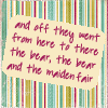
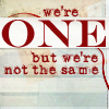
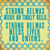
All I'd really add to grrliz's comments on textures is that sometimes, if you have a texture that's too busy, you can still make it work by masking part of it:
2. Fonts
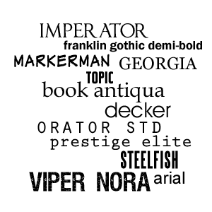
Have a wide selection of fonts. Snag them from dafont, 1001 Free Fonts, Fonts for Peas for handwriting-style fonts... Here are some that I use pretty often:
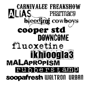
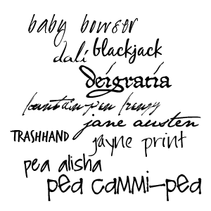
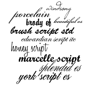
Whenever you try a new font, make sure you check which Anti-Aliasing it looks best with - sharp, crisp, smooth, or strong. Some fonts it won't make a huge difference, but others will look completely crappy with one and awesome with another. Just try them out and see :) Same goes for the kerning (space between letters) - some fonts will basically only look good when the kerning is set to 0, and the letters may go sort of fuzzy and become harder to read if you try to adjust it, but others have quite a bit of flexibility and you can space them out widely or squish them together more to your heart's content.
Pick a quote that's a manageable length. Going over 15-20 words or so often gets complicated, unless you're animating the icon. A long quote limits quite a bit what you can do with the text positioning. I think these are the longest quotes I've fit on an icon, 31 and 32 words:
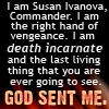
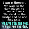
As you can see, I had to just put the bulk of the words in a small, regularly-spaced font, so it's not super-interesting, but it's an option if you have a really long quote you're eager to use.
I generally enter each word as a separate layer. It's more time-consuming, but it also gives me greater flexibility in terms of changing their size, font, and position. Once each word is entered, I basically move them around and fiddle with them until I'm happy with the configuration. I wish I had some better explanation, but it just comes down to experimenting with what looks best!
3. Drawing attention to the text.
So, ways to draw attention to particular words. Sometimes I vary my fonts within an icon:


Sometimes I don't:

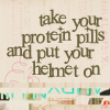
Other times, I'll vary the size of the words:

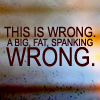
or the colour:
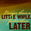

or the angle (Edit -> Transform -> Rotate):
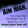
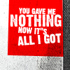
Just depends on what I feel works best in terms of the placement of the words and the overall effect of the icon.
Pick colour(s) for your text that let it show up against the texture you've chosen! Light on top of dark, or dark on top of light, is the simplest way to go about this. White and black can be nice, but I try to pick shades that are found within the texture and then lighten or darken them as necessary, so it's a little more harmonious. There are other ways to make the text stand out, too.
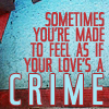
Use Stroke to highlight one or more words (select text layer, go Layer -> Layer Style -> Stroke and pick a suitable colour and thickness - usually 1 or 2 px will be good):
Use Outer Glow to highlight one or more words (select text layer, go Layer -> Layer Style -> Outer Glow, pick a suitable colour and set the opacity as you desire):
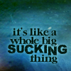
This can be quite effective if you're using dark text on a dark background:
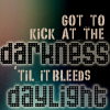
Use Inner Glow to highlight one or more words - works best on chunky/bold text (select text layer, go Layer -> Layer Style -> Outer Glow, pick a suitable colour and set the opacity and size as you desire):
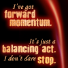
Use Drop Shadow to make words stand out (select text layer, go Layer -> Layer Style -> Drop Shadow, pick a dark colour and set the distance, size, and angle as you wish - Distance 2, Size 3 is often what I wind up with):

Use Gradient Overlay on one or more words to vary the colour (select text layer, go Layer -> Layer Style -> Gradient Overlay and pick colours that suit your texture, adjusting the angle as necessary):
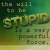
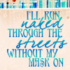
Use custom shapes or brushes to draw attention to particular words:

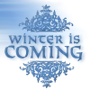
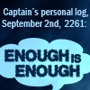
If you're finding that your chosen text has bits that are sticking inconveniently into other lines/words (hanging parts of 'y' or 'p', for instance, or the sticky-uppy parts of 't' or 'b') and you can't find a way to change the size or position so it works, try changing the text to all caps and see if that helps.
4. General design stuff
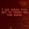
Um... some general principles I try to follow. Just because you have the space, doesn't mean you have to fill it. Icons often look nicer when the text doesn't fill the entire available space:

I try to sort of follow the shape of the texture I'm using, placing the text accordingly, sometimes putting it at an angle if it that makes more sense:

(text above dark band gives a bit of an underlined effect)
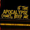
(slight angle to follow the lines of the texture)
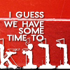
(text arranged around lines of the base texture)

(text confined to dark band across middle of texture)
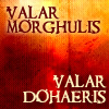
(dark text on light section at the top, light text on darker section)
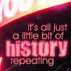
(light texture emulated with inner glow on the word 'history')
If I have one word I really want to emphasize, I sometimes make it relatively huge and then design the rest of the icon around around it:
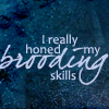
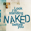
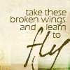
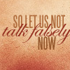
When you use different fonts and colours, you can sometimes sort of layer one line of text over another without compromising its legibility:

So, yeah. I hope this was helpful, even though basically what it comes down to is trying a bunch of different things until something works ;) If you have any questions, let me know and I'll do my best to answer them. Or if you make any icons using this tutorial for inspiration, I'd love to see them :)
Credit policy | Friend this journal | Make a request
The first thing I suggest is that you go and read this excellent post by grrliz, because it says many of the same things I would! Go ahead, I'll wait while you check it out...
1. Textures
So, yes, pick good textures. Textures that will add interest without making the words too hard to read. Hit up 100x100textures, icon_textures, neondistrict, etc. and snag a large selection. (Make sure to credit in your user info if the maker asks you to!) Or you can make your own, which is fun too - this tutorial by abernathi and this tutorial by discolore are great places to start if you want to go that route.
All I'd really add to grrliz's comments on textures is that sometimes, if you have a texture that's too busy, you can still make it work by masking part of it:


2. Fonts
Have a wide selection of fonts. Snag them from dafont, 1001 Free Fonts, Fonts for Peas for handwriting-style fonts... Here are some that I use pretty often:


Whenever you try a new font, make sure you check which Anti-Aliasing it looks best with - sharp, crisp, smooth, or strong. Some fonts it won't make a huge difference, but others will look completely crappy with one and awesome with another. Just try them out and see :) Same goes for the kerning (space between letters) - some fonts will basically only look good when the kerning is set to 0, and the letters may go sort of fuzzy and become harder to read if you try to adjust it, but others have quite a bit of flexibility and you can space them out widely or squish them together more to your heart's content.
Pick a quote that's a manageable length. Going over 15-20 words or so often gets complicated, unless you're animating the icon. A long quote limits quite a bit what you can do with the text positioning. I think these are the longest quotes I've fit on an icon, 31 and 32 words:


As you can see, I had to just put the bulk of the words in a small, regularly-spaced font, so it's not super-interesting, but it's an option if you have a really long quote you're eager to use.
I generally enter each word as a separate layer. It's more time-consuming, but it also gives me greater flexibility in terms of changing their size, font, and position. Once each word is entered, I basically move them around and fiddle with them until I'm happy with the configuration. I wish I had some better explanation, but it just comes down to experimenting with what looks best!
3. Drawing attention to the text.
So, ways to draw attention to particular words. Sometimes I vary my fonts within an icon:


Sometimes I don't:


Other times, I'll vary the size of the words:


or the colour:


or the angle (Edit -> Transform -> Rotate):


Just depends on what I feel works best in terms of the placement of the words and the overall effect of the icon.
Pick colour(s) for your text that let it show up against the texture you've chosen! Light on top of dark, or dark on top of light, is the simplest way to go about this. White and black can be nice, but I try to pick shades that are found within the texture and then lighten or darken them as necessary, so it's a little more harmonious. There are other ways to make the text stand out, too.
Use Stroke to highlight one or more words (select text layer, go Layer -> Layer Style -> Stroke and pick a suitable colour and thickness - usually 1 or 2 px will be good):

Use Outer Glow to highlight one or more words (select text layer, go Layer -> Layer Style -> Outer Glow, pick a suitable colour and set the opacity as you desire):

This can be quite effective if you're using dark text on a dark background:

Use Inner Glow to highlight one or more words - works best on chunky/bold text (select text layer, go Layer -> Layer Style -> Outer Glow, pick a suitable colour and set the opacity and size as you desire):

Use Drop Shadow to make words stand out (select text layer, go Layer -> Layer Style -> Drop Shadow, pick a dark colour and set the distance, size, and angle as you wish - Distance 2, Size 3 is often what I wind up with):

Use Gradient Overlay on one or more words to vary the colour (select text layer, go Layer -> Layer Style -> Gradient Overlay and pick colours that suit your texture, adjusting the angle as necessary):


Use custom shapes or brushes to draw attention to particular words:


If you're finding that your chosen text has bits that are sticking inconveniently into other lines/words (hanging parts of 'y' or 'p', for instance, or the sticky-uppy parts of 't' or 'b') and you can't find a way to change the size or position so it works, try changing the text to all caps and see if that helps.
4. General design stuff
Um... some general principles I try to follow. Just because you have the space, doesn't mean you have to fill it. Icons often look nicer when the text doesn't fill the entire available space:


I try to sort of follow the shape of the texture I'm using, placing the text accordingly, sometimes putting it at an angle if it that makes more sense:

(text above dark band gives a bit of an underlined effect)

(slight angle to follow the lines of the texture)

(text arranged around lines of the base texture)

(text confined to dark band across middle of texture)

(dark text on light section at the top, light text on darker section)

(light texture emulated with inner glow on the word 'history')
If I have one word I really want to emphasize, I sometimes make it relatively huge and then design the rest of the icon around around it:


When you use different fonts and colours, you can sometimes sort of layer one line of text over another without compromising its legibility:


So, yeah. I hope this was helpful, even though basically what it comes down to is trying a bunch of different things until something works ;) If you have any questions, let me know and I'll do my best to answer them. Or if you make any icons using this tutorial for inspiration, I'd love to see them :)
Credit policy | Friend this journal | Make a request