Vintage, Grungy & Aged Icon Tutorial - Corel Photo-Paint 12
I'd written this tutorial some time ago when I was EXTREMELY bored and staying at my grandma's house for the week, but never showed it to anyone except on my now-dead website which hardly had any hits, so I've decided to show it to you guys! Hope you like. The effect is grungy, aged and heavily textured. Don't say you made it and please credit!
(posted at my journal, camelliastar and at icon_tutorial)
Learn to go from
to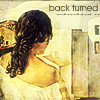
! It's easy peasy lemon-squeezy. Like most other icon tuts out there, it's just a pic with a whole lot of layers piled on top of it.
I use Corel Photo-paint 12, if you're wondering, which isn't too different from PSP or PS - in fact, it's extremely similar, so hopefully you won't have too much trouble translating it to your program ^_^
1. Weeeeell, open up your icon-making program (Microsoft Paint won't work - sorry suckers) and create a new document 100px x 100px. Easy enough.
2. Now, find a picture you wanna make an icon of and import it into your document (in Corel it's File > Import... or Ctrl + I.
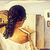
I'm using a purdyful painting by Salvador Dali!

<= click here to enlarge!
3. Nooow resize and move the image around until it looks good. Since we already said we wanted a 100px x 100px document in the beginning, there's no need to crop. As a rule, I never place the subject of an icon bangsmack in the middle, because it doesn't look good. Trust me.
4. You wanna sharpen the image after resizing the pic so it's good quality and not blurry, but not so much that it starts to distort the image quality and ruin your icon! On my program it's Effects > Sharpen, but on others I think it's Filter > Sharpen. Here's what mine looks like after sharpening!
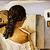
5. Now duplicate the layer, and set to Soft Light at 100% opacity. If you don't know how to do that, ask me! Soft Light kinda 'intensifies' the colours which makes it look good, hehe.
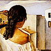
6. It's a bit dark, so I'm gonna duplicate the first layer and set it to Screen at 50% opacity which makes it less harsh and lighter and all this other technical schtuff, ya know?
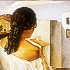
7. Now I wanna give it a sort of faded, muted, look, so create a New Layer and fill with a dark blue colour (I used R:0, G:0, B:102), and set to Exclusion at 40% opacity.
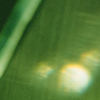
8. Texture time, mwahaha! Use the below texture by colorfilter and set to Overlay at 50% opacity.

9. Since I use Corel, you guys probably won't have the following filter thing on your program, but try to get something similar. Don't leave this step out - it's very important!
What ya do is duplicate the bottom layer. I applied an Impressionist Art Stroke Effect to it then set to Overlay at 40% opacity.
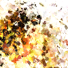

10. Texture time again, heehee! I used a black + white border from absolutetrouble.com, rotated it as shown below, and set to Soft Light at 60% opacity. It sorta frames the woman's face a bit.
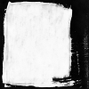

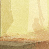
11. Last texture. Her back looks all eww and yellow, so this texture will make it toned down and antique-ish looking. I used the below texture by colorfilter and set it to Saturation at 30% opacity!
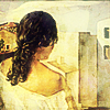
12. Text time! Firstly I did the main font. Seeing as the woman has her back turned to us, I thought it fitting to use the text 'back turned' XD. I used the font Avantgarde Bk Bt, size 9. Font colour is R:51, G:51, B:0.
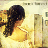
13. I thought it needed a bit more text, so I typed some random text underneath 'back turned'. Font used was Carpenter ICG at size 4.

Weeelllllll there ya have it, folks! We've gone from:

to
.
Hope that was helpful!
And don't mock me - it's the holidays and I have nothing better to do. Oh, and please COMMENT!
(posted at my journal, camelliastar and at icon_tutorial)
Learn to go from
to
! It's easy peasy lemon-squeezy. Like most other icon tuts out there, it's just a pic with a whole lot of layers piled on top of it.
I use Corel Photo-paint 12, if you're wondering, which isn't too different from PSP or PS - in fact, it's extremely similar, so hopefully you won't have too much trouble translating it to your program ^_^
1. Weeeeell, open up your icon-making program (Microsoft Paint won't work - sorry suckers) and create a new document 100px x 100px. Easy enough.
2. Now, find a picture you wanna make an icon of and import it into your document (in Corel it's File > Import... or Ctrl + I.
I'm using a purdyful painting by Salvador Dali!
<= click here to enlarge!
3. Nooow resize and move the image around until it looks good. Since we already said we wanted a 100px x 100px document in the beginning, there's no need to crop. As a rule, I never place the subject of an icon bangsmack in the middle, because it doesn't look good. Trust me.
4. You wanna sharpen the image after resizing the pic so it's good quality and not blurry, but not so much that it starts to distort the image quality and ruin your icon! On my program it's Effects > Sharpen, but on others I think it's Filter > Sharpen. Here's what mine looks like after sharpening!
5. Now duplicate the layer, and set to Soft Light at 100% opacity. If you don't know how to do that, ask me! Soft Light kinda 'intensifies' the colours which makes it look good, hehe.
6. It's a bit dark, so I'm gonna duplicate the first layer and set it to Screen at 50% opacity which makes it less harsh and lighter and all this other technical schtuff, ya know?
7. Now I wanna give it a sort of faded, muted, look, so create a New Layer and fill with a dark blue colour (I used R:0, G:0, B:102), and set to Exclusion at 40% opacity.
8. Texture time, mwahaha! Use the below texture by colorfilter and set to Overlay at 50% opacity.
9. Since I use Corel, you guys probably won't have the following filter thing on your program, but try to get something similar. Don't leave this step out - it's very important!
What ya do is duplicate the bottom layer. I applied an Impressionist Art Stroke Effect to it then set to Overlay at 40% opacity.
10. Texture time again, heehee! I used a black + white border from absolutetrouble.com, rotated it as shown below, and set to Soft Light at 60% opacity. It sorta frames the woman's face a bit.
11. Last texture. Her back looks all eww and yellow, so this texture will make it toned down and antique-ish looking. I used the below texture by colorfilter and set it to Saturation at 30% opacity!
12. Text time! Firstly I did the main font. Seeing as the woman has her back turned to us, I thought it fitting to use the text 'back turned' XD. I used the font Avantgarde Bk Bt, size 9. Font colour is R:51, G:51, B:0.
13. I thought it needed a bit more text, so I typed some random text underneath 'back turned'. Font used was Carpenter ICG at size 4.
Weeelllllll there ya have it, folks! We've gone from:
to
.
Hope that was helpful!
And don't mock me - it's the holidays and I have nothing better to do. Oh, and please COMMENT!