010; shoujo_battle commentary
Late but what's new? :P Now to finish my animanlims commentary! Don't click the commentary cuts if you don't want to read my word vomit! I haz lots of feerings to share. :B Idea taken from whiteplums @ loveburnt.
Okay, so I was kind of nervous when I signed up because, while I read quite a few shoujo series, when it comes to icons, I almost always icon shounen series. The overall theme of Round 5 was Battle of the Bands.
Round 05 - Challenge 01

➨
Won Mod's Choice
Total Points: 11
7th Overall
The idea was to make an icon that would represent our band (our team basically), it had to have a band name and be majority green, the band color. My first icon was a desperate, last minute thrown together piece of crap that was just to ensure that I wasn't DQed for not entering. When inquisitory extended, I made a much nicer one with all of my team members and a catchy name. Well, I like it.
Round 05 - Challenge 02
Won People's Choice
Total Points: 27
3rd Overall
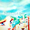
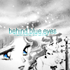
This week, we were assigned roles and each role had a requirement that needed to be our icon. Extra points would be awarded for each additional requirement we used. I was a guitarist and had to have a duplicate of my image, which freaked me out. I hate putting in duplicates, I feel like they make icons look too busy. But I sobbed all the while I made it sucked it up and also chose to add required lyrics and a bottom crop. I initially wanted to make it B&W as well for more points but the lyrics were all about "blue eyes" so I didn't want to take that away.
I simultaneously like and dislike how the icon turned out. I still don't like duplicates but I kinda like how the hair of the smaller image kind of melts into the hair on the side of the larger image. And I like that I didn't need to find a water texture, I just duplicated the original image and blended & masked it to make the wave/sky like texture on top.
Round 05 - Challenge 03
Total Points: 36
3rd Overall
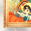
For this week, you had to represent either the past, present, or future in the icon and as I had no idea how to make a present or futuristic icon, I chose the easy theme, past.
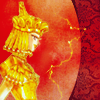
I picked a classic series, Princess Knight, and put her in a frame because it reminded me of a portrait of royalty. I also used lots of old trends: the red & blue selective coloring, the yellow-y coloring from dark blue exclusion layers, just stuff to make it look dated. I used the small light textures to try and create a swirly line up to the sword but I don't think it was very well executed.
Round 05 - Challenge 04


Total Points: 48
5th Overall
This week we had to re-use an element of one of the icons we'd already made during the competition. (I chose to use the same character, since that was the easiest thing to do. |D;) We could also make a second icon that had to show the theme "natural" for extra points.
I knew I wanted them to look somewhat similar, even though not many artists had similar looking covers to their b-side tracks, so idk why I wanted to do that. I quickly picked a sad sounding song title for a caption and a melancholy image to go with it. For natural, I interpreted that as naked lol. These were pretty last minute so I'm not all to happy with them but I do kinda like the coloring of the first one.
Round 05 - Challenge 05

Was voted as team icon
Total Points: 59
4th Overall
So we were reassigned colors and had to make another team icon, this time using purple. This was the week I started really feeling drained of ideas. Since I don't frequently icon shoujo, I was tired of using Sailor Moon but lost as to what else I could use. XD I just wandered around wiki until I found a series I liked that had pretty images and then picked a cute looking one. XD; I added borders to make it look more CD cover-ish? Idk what I was thinking. To be honest, I was surprised deria_hime's NANA icon didn't win. It was loads prettier than mine and actually had a true purple whereas mine only had a vaguely magenta looking color.
Round 05 - Challenge 06

Total Points: 70
4th Overall
This week the bands were "going on tour" and we had to visually represent one country in our icon. We also got bonus points (up to 3 total) for each additional visual element we used. To be honest, I was again at a loss. I pretty much procrastinated until the very last second when I remembered Peach Girl was a shoujo series and I love PG.
When I finally found an image I liked, I then couldn't decide whether or not to make her represent the UK or the USA since I wasn't too sure where rock&roll originated. (I've always thought The Beatles were the first rock&roll band? Someone please let me know, my google-fu is weak.) I finally just went with the USA because the version of "I Love Rock & Roll" that I was listening to was by Joan Jett and she's an American. I photoshopped a flag into her shirt and changed the shape of her shirt since Momo's tan lines looked odd so I wanted them covered up. Then, and here I got lucky, since I completely forgot that I could earn extra points with the extra visual elements, I added stars to match the stars on her shirt, and a caption in the red, white & blue that I used the eye dropper to pick out from her shirt. Threw in the light texture because I love them and because it mimicked and brought attention to her head banging hair & the caption.
I'm rather happy with it since it's very me: a small image with lots of negative space and a tilted caption. The only thing that bugs me with this icon now is that after this round was over, I found a higher quality version of the original image WITHOUT all that purple crap around her hair, which would have make extracting her a hell of a lot easier. XP
I didn't earn enough points over the weeks so I was eliminated this challenge, placing Fourth
Like an idiot, I signed up for the next round, even with less and less time available and no ideas left. I really liked how it sounded! It was going to be short as well as centered on FASHION, and who doesn't love fashion??
Round 06 - Challenge 01

Won People's Choice
Total Points: 18
8th Overall
This week's theme was to take inspiration from various Project Runway clothes, then a photo, and lastly a beautiful Janelle Monáe song. The last two were for extra points. I didn't have any time for the last two things so only one icon from me.
No time or ideas = picking the patterned dress so that I could incorporated elements from it into my icon. I photoshopped polka dots into Momo's dress, then added a ribbon texture to the side that imitated the large bow on the woman's dress. This icon winning surprised the crap out of me considering it was a very last minute icon and has that terribly trite caption.
Round 06 - Challenge 02


Total Points: 35
9th Overall
Again with the out of ideas + last minute icons. The first one was probably made in 20 minutes or less; extract an image, slap some Curves and Selective Color layers, add Hue & Saturation + Brightness & Contrast layers, a couple of light textures and call it a day. It's fug, idk what I was thinking. I got lucky and was able to slip a second icon in because I knew I really needed the points if I wanted to get anywhere. The second icon I like marginally better than the first. I extracted the flower texture and put it in front to try and create a sense of depth. Flower in the foreground, couple in the middle, red texture in the background. You got an additional point for each texture you used so I tried using as many as I could without it looking too busy. It's still meh but at least I got points!
Round 06 - Challenge 03


➨
Won Mod's Choice
Total Points: 52
8th Overall
I was excited for this week because just last week I had asked if there would be any Alexander McQueen (RIP ;~;♥) pieces and this week there were two! I was kinda sad it wasn't the vagina dentata dress though. XD
My first set was, as always, made with minimal effort and entered at the very last second. Which is why when there was an extension, I tossed that crappy trio and made something still iffy but at least a little more cohesive. Again, I wasn't inspired by the provided images so much as I used similar elements. The lace from McQueen's peacock dress found its way into my first and second icons as borders, the taupe/nude coloring of the Galliano dress popped up in my middle icon, etc. I still don't really like how they look, so I was very flattered to have won M.C., but it was the best I could come up with at the time.
I didn't do terribly well in either round but I LOVE THIS BATTLE. It's so creative and fun and has such refreshing themes. Whenever inquisitory opens sign-ups again, I highly recommend joining because it's bound to be amazing.
Things I Learned mostly about myself
· I'm an extremely slow iconmaker. I need to learn to speed up my icon maker process or something because, when coupled with me being a procrastinator, the only thing that I end up with is shitty last minute icons for the LIMS & battles I'm in. ;;
· What inspires me most is a good image. I spend most of my time just trying to find that "perfect" image.
· I suck at making shoujo icons, exceptions being CLAMP and Sailor Moon apparently, and need to practice more with using other fandoms.
· If it's a Battle type LIMS, do everything you can to earn points. Enter that extra icon no matter what, always vote, include those extra requirements for more points, etc. because you need as many points as you can earn.
· I do not have the creative imagination for long LIMS & battles. Omfg, I am so envious of all the iconmakers who can keep churning out amazing icons week after week. XD
· That making icons competitively did help me improve! (Not seen here but when you compare these to my shounenbattle and animalims icons, wow, what a difference. Or that could just be because I'm more comfortable icon-ing shounen? I'm not sure.)
[19] TOTAL Misc. shoujo icons: Sailor Moon, Peach Girl, Utena, Princess Knight, D.N. Angel, etc.

01
02
03
04



05
06
07
08


09
10
11
12


13
14
15
16


17
18
19


Comment & credit please ✯ Watch? ✯ Don't hotlink or edit ✯ Resources
Okay, so I was kind of nervous when I signed up because, while I read quite a few shoujo series, when it comes to icons, I almost always icon shounen series. The overall theme of Round 5 was Battle of the Bands.
Round 05 - Challenge 01

➨

Won Mod's Choice
Total Points: 11
7th Overall
The idea was to make an icon that would represent our band (our team basically), it had to have a band name and be majority green, the band color. My first icon was a desperate, last minute thrown together piece of crap that was just to ensure that I wasn't DQed for not entering. When inquisitory extended, I made a much nicer one with all of my team members and a catchy name. Well, I like it.
Round 05 - Challenge 02

Won People's Choice
Total Points: 27
3rd Overall
This week, we were assigned roles and each role had a requirement that needed to be our icon. Extra points would be awarded for each additional requirement we used. I was a guitarist and had to have a duplicate of my image, which freaked me out. I hate putting in duplicates, I feel like they make icons look too busy. But I sobbed all the while I made it sucked it up and also chose to add required lyrics and a bottom crop. I initially wanted to make it B&W as well for more points but the lyrics were all about "blue eyes" so I didn't want to take that away.
I simultaneously like and dislike how the icon turned out. I still don't like duplicates but I kinda like how the hair of the smaller image kind of melts into the hair on the side of the larger image. And I like that I didn't need to find a water texture, I just duplicated the original image and blended & masked it to make the wave/sky like texture on top.
Round 05 - Challenge 03

Total Points: 36
3rd Overall
For this week, you had to represent either the past, present, or future in the icon and as I had no idea how to make a present or futuristic icon, I chose the easy theme, past.
I picked a classic series, Princess Knight, and put her in a frame because it reminded me of a portrait of royalty. I also used lots of old trends: the red & blue selective coloring, the yellow-y coloring from dark blue exclusion layers, just stuff to make it look dated. I used the small light textures to try and create a swirly line up to the sword but I don't think it was very well executed.
Round 05 - Challenge 04


Total Points: 48
5th Overall
This week we had to re-use an element of one of the icons we'd already made during the competition. (I chose to use the same character, since that was the easiest thing to do. |D;) We could also make a second icon that had to show the theme "natural" for extra points.
I knew I wanted them to look somewhat similar, even though not many artists had similar looking covers to their b-side tracks, so idk why I wanted to do that. I quickly picked a sad sounding song title for a caption and a melancholy image to go with it. For natural, I interpreted that as naked lol. These were pretty last minute so I'm not all to happy with them but I do kinda like the coloring of the first one.
Round 05 - Challenge 05

Was voted as team icon
Total Points: 59
4th Overall
So we were reassigned colors and had to make another team icon, this time using purple. This was the week I started really feeling drained of ideas. Since I don't frequently icon shoujo, I was tired of using Sailor Moon but lost as to what else I could use. XD I just wandered around wiki until I found a series I liked that had pretty images and then picked a cute looking one. XD; I added borders to make it look more CD cover-ish? Idk what I was thinking. To be honest, I was surprised deria_hime's NANA icon didn't win. It was loads prettier than mine and actually had a true purple whereas mine only had a vaguely magenta looking color.
Round 05 - Challenge 06

Total Points: 70
4th Overall
This week the bands were "going on tour" and we had to visually represent one country in our icon. We also got bonus points (up to 3 total) for each additional visual element we used. To be honest, I was again at a loss. I pretty much procrastinated until the very last second when I remembered Peach Girl was a shoujo series and I love PG.
When I finally found an image I liked, I then couldn't decide whether or not to make her represent the UK or the USA since I wasn't too sure where rock&roll originated. (I've always thought The Beatles were the first rock&roll band? Someone please let me know, my google-fu is weak.) I finally just went with the USA because the version of "I Love Rock & Roll" that I was listening to was by Joan Jett and she's an American. I photoshopped a flag into her shirt and changed the shape of her shirt since Momo's tan lines looked odd so I wanted them covered up. Then, and here I got lucky, since I completely forgot that I could earn extra points with the extra visual elements, I added stars to match the stars on her shirt, and a caption in the red, white & blue that I used the eye dropper to pick out from her shirt. Threw in the light texture because I love them and because it mimicked and brought attention to her head banging hair & the caption.
I'm rather happy with it since it's very me: a small image with lots of negative space and a tilted caption. The only thing that bugs me with this icon now is that after this round was over, I found a higher quality version of the original image WITHOUT all that purple crap around her hair, which would have make extracting her a hell of a lot easier. XP
I didn't earn enough points over the weeks so I was eliminated this challenge, placing Fourth
Like an idiot, I signed up for the next round, even with less and less time available and no ideas left. I really liked how it sounded! It was going to be short as well as centered on FASHION, and who doesn't love fashion??
Round 06 - Challenge 01

Won People's Choice
Total Points: 18
8th Overall
This week's theme was to take inspiration from various Project Runway clothes, then a photo, and lastly a beautiful Janelle Monáe song. The last two were for extra points. I didn't have any time for the last two things so only one icon from me.
No time or ideas = picking the patterned dress so that I could incorporated elements from it into my icon. I photoshopped polka dots into Momo's dress, then added a ribbon texture to the side that imitated the large bow on the woman's dress. This icon winning surprised the crap out of me considering it was a very last minute icon and has that terribly trite caption.
Round 06 - Challenge 02


Total Points: 35
9th Overall
Again with the out of ideas + last minute icons. The first one was probably made in 20 minutes or less; extract an image, slap some Curves and Selective Color layers, add Hue & Saturation + Brightness & Contrast layers, a couple of light textures and call it a day. It's fug, idk what I was thinking. I got lucky and was able to slip a second icon in because I knew I really needed the points if I wanted to get anywhere. The second icon I like marginally better than the first. I extracted the flower texture and put it in front to try and create a sense of depth. Flower in the foreground, couple in the middle, red texture in the background. You got an additional point for each texture you used so I tried using as many as I could without it looking too busy. It's still meh but at least I got points!
Round 06 - Challenge 03


➨


Won Mod's Choice
Total Points: 52
8th Overall
I was excited for this week because just last week I had asked if there would be any Alexander McQueen (RIP ;~;♥) pieces and this week there were two! I was kinda sad it wasn't the vagina dentata dress though. XD
My first set was, as always, made with minimal effort and entered at the very last second. Which is why when there was an extension, I tossed that crappy trio and made something still iffy but at least a little more cohesive. Again, I wasn't inspired by the provided images so much as I used similar elements. The lace from McQueen's peacock dress found its way into my first and second icons as borders, the taupe/nude coloring of the Galliano dress popped up in my middle icon, etc. I still don't really like how they look, so I was very flattered to have won M.C., but it was the best I could come up with at the time.
I didn't do terribly well in either round but I LOVE THIS BATTLE. It's so creative and fun and has such refreshing themes. Whenever inquisitory opens sign-ups again, I highly recommend joining because it's bound to be amazing.
Things I Learned mostly about myself
· I'm an extremely slow iconmaker. I need to learn to speed up my icon maker process or something because, when coupled with me being a procrastinator, the only thing that I end up with is shitty last minute icons for the LIMS & battles I'm in. ;;
· What inspires me most is a good image. I spend most of my time just trying to find that "perfect" image.
· I suck at making shoujo icons, exceptions being CLAMP and Sailor Moon apparently, and need to practice more with using other fandoms.
· If it's a Battle type LIMS, do everything you can to earn points. Enter that extra icon no matter what, always vote, include those extra requirements for more points, etc. because you need as many points as you can earn.
· I do not have the creative imagination for long LIMS & battles. Omfg, I am so envious of all the iconmakers who can keep churning out amazing icons week after week. XD
· That making icons competitively did help me improve! (Not seen here but when you compare these to my shounenbattle and animalims icons, wow, what a difference. Or that could just be because I'm more comfortable icon-ing shounen? I'm not sure.)
[19] TOTAL Misc. shoujo icons: Sailor Moon, Peach Girl, Utena, Princess Knight, D.N. Angel, etc.


01
02
03
04


05
06
07
08


09
10
11
12


13
14
15
16


17
18
19


Comment & credit please ✯ Watch? ✯ Don't hotlink or edit ✯ Resources