011; shounenbattle commentary
One last commentary post to come with more walls and walls of text as well. ♥! Commentary idea from whiteplums @ loveburnt.
I was excited for this battle because, like I said before, I tend to gravitate towards shounen & seinen series. I hoped I would do a hell of a lot better here than I did at shoujo_battle. XD shounenbattle's overall theme was 80 Days Around the World.
Challenge 01: Meet & Greet

Total Points: 14
3rd Overall
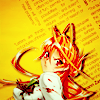
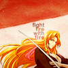
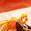
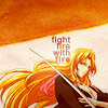
The first challenge was a lot harder than I was expecting a first challenge to be! Not that I minded, that can only mean good things when it comes to future challenges! I felt sorry for whoever got my character though, Askeladd from Vinland Saga, because there aren't any color images of him out there and most people don't read it (THOUGH I DON'T KNOW WHY B/C IT IS AMAZING) so finding images must have been difficult. The idea was to make an icon featuring another participant's character, then choose a cardinal direction that had certain criteria you had to fit onto your icon. I was a pussy and picked the easiest one, South: Bottom crop (I do this all the time), red, (I love my colors!), and fire theme (oh so many trite captions I can use!). In hindsight, I regret choosing the easiest option because me and 75% of the other participants picked it, meaning my icon didn't really stand out that much.
I had initially wanted the text to say "fire in her eyes" but I realized my bottom crop made her eyes too small to see and I don't like captions that don't match the image in the icon. I was okay with everything else though; I like the diagonal cut of the red and my random light blobs adding areas of brightness. One of my comments wished the picture was a little more clear, which I don't quite understand??, but I included a variation where I increased the contrast of Matsumoto. Another didn't like the red at top so I changed it to orange, since no other color looked good, buuuut I still think it looks fug. (I found the comment funny because the entire thing sounded like a critique and I was wondering if the person knew they were supposed to vote for their favorites, not their least favorite.)
Challenge 02: World Cup
Total Points: 27
4th Overall
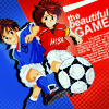
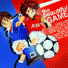
So I was VERY EXCITED for this challenge because it's based on The World Cup!! And La Furia Roja was doing well too! All I had to do was show the theme "sports", which initially had me going for Eyeshield 21 and TeniPuri, but I figured it's a World Cup theme, best to go with soccer. I went with Whistle! because it's one of my favorite under-appreciated sports manga and I don't know any other soccer manga with nice art.
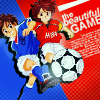
This icon was made at the very last second. Whistle! is so unloved that there were very few HQ images out there and I had to settle for a so-so quality image. I extracted Shou and Tsubasa, rotated them, put a dark duplicate under them to help them pop and then used the pen tool to create the red & blue slanted background and further emphasize that versus feeling. After piling on a million adjustment layers, I noticed the image was pixelated and wondered wtf was wrong before I sadfaced like D8. I completely forgot PS degrades images if they're not rotated at 90/180/270° and I definitely didn't rotate it to any of those. I didn't have the original size saved nor the time to extract the image again, so I threw on some text and light blobs and prayed that no one would notice. Miraculously, only one person did. 8D I remade the icon and, hopefully, this new alternate looks less pixelated. I had one comment liking the light blobs and another finding it distracting, lol conflicting crits, so I made one alternate without the light blobs.
Challenge 03: The Land Down Under
Total Points: 53
2nd Overall
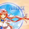
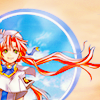
This week we had to take inspiration from one of the 4 provided photos and I chose this one because it has a circle in it and I tend to use circles in my icons anyways. Taking what I learned from shoujo_battle, I knew I had to enter a bonus icon to get those points. The bonus icon required us to use at least 3 consecutive lyrics from any song by an Australian band or musician. I coppedout and picked AC/DC's Highway to Hell. orz
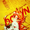
I don't really like the first icon even though it has a circle and a part of the original image "popping out" of the circle. Idk, it's weird looking; I think it's the crop. And the text bugs me but without it, the icon looked too empty. I love the second icon though; it's insanely bright and I had been blessed by the Text God or something because I'm not normally very original with typography. I had a FFFFound texture that was all action-like because of the slanted, every which way tiny text, that I figured would go well with her angry expression and fly away hair. So I masked out parts of it and put in the required lyrics. I knew it was still a little hard to read but I figured it was okay since the human mind only needs the first and last letters to be in place for things to be legible. I did still get critiques about the text so I included a tiny text only alternate. I got another one about how the red was too strong and another saying the icon was over-sharpened (but I never sharpened it in the first place ;~;) and washed out, which surprised me since I thought it was too saturated lol. I tried bringing out her skin color & the white of her shirt while reducing the reds & oranges but I feel like it's lost some of its intensity now.
Challenge 04: A Touch of Color
Points Total: 55
5th Overall
I ⓵ couldn't figure out if Escaflowne was shounen or not and ⓶ didn't read the rules so I didn't know the single color must make up less than 33% of the icon. I ended up being too late anyways and flashily counted me as skipping. XD;
Challenge 05: Welcome to the Jungle

Won People's Choice
Points Total: 74
2nd Overall
I knew I had to try harder this week to earn more points to make up for the ones I missed from last challenge. The theme was to expresses either a jungle or animal theme, which seemed simple enough. At first, I thought I'd try using an animal print as a texture but I couldn't find the right image do go with zebra print. Then I somehow thought of Max and Where the Wild Things Are and knew I had to have that as my caption. I just needed that perfect image of someone going RAWR and looking like this. Dunno how but I luckily thought of Guu and pulled my old DVDs and got a screen shot of her dancing. The icon didn't turn out anything like I imagined it would, it's no where near as cute as I wanted it to be, but every time I remake it, I fail to come up with anything better. The alternate has the orange of the palm tree slightly reduced and the trunk slightly blurred as one of my comments said it looked too sharp.
Challenge 06: I Pledge Allegiance

The first icon tied for Mod's Choice
Points Total: 74
2nd Overall
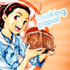
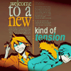
Another lyrical theme but this time as the main theme not a bonus theme. I figured everyone was going to use "Fuck 'em all" (but I was wrong, only two people did!) so I tried to find something I felt no one would use so as to make my icon stand out more. The part I noticed first was "welcome to a new kind of tension" which is REALLY LONG for a caption and I was worried if I could fit in all in but it was the line that grabbed my attention most. I didn't know what image I wanted but I had recently started watching Durarara!! so I browsed their Minitoyo gallery until that Shizuo & Izaya image popped up. Figured it was perfect since the two of them have that hilarious hate/hate tension, which went well with the lyrics and I could easily make it a center bottom crop, leaving me plenty of room for the caption. I liked the tri-color color scheme but there wasn't enough blue imo so I changed Izaya's coat & hair to blue. Then, weirdly enough, I was inspired by the calendar layout in Better Homes and Gardens of all things (it was in the break room of my work place, don't look at me like that!) because its mix of sans serif & serif fonts reminded me of the differences of Shizuo and Izaya. The Yakitate!! icon was made very last second, so I don't really like it? It's got too many textures. BUT I do like that I managed to include the gingham pattern in the circle, because that pattern always makes me think picnic cloth, which worked perfectly for the bonus theme "food".
Challenge 07: When In Rome
Tied for People's Choice
Points Total: 108
1st Overall
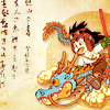
This week I had to make an "aged" looking icon, and I really had no idea what to do. I knew I wanted to use an older animanga series as well as a faded kind of color scheme but beyond that I was lost. XD Threw this together in a 45 minutes? Again with the circles and the drop shadows, but I kind of like the sepia coloring. It was also my luck that the voters felt the Chinese calligraphy I added made the icon looked like a Japanese scroll (or something, I don't 100% remember what the comment said), I didn't even think of that lol.
Challenge 08: In Soviet Russia
Points Total: 118
1st Overall
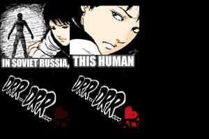
Oh man, a humor theme! Don't get me wrong, I love making funny icons. But they only happen when inspirations strikes and when I'm required to make them, for icontests and the like, it just doesn't work. ;~; I...don't know how this icon came to be. I knew it had to be a Soviet Russia joke, to earn extra points, but other than that I don't know why I picked The Enimga of Amigara Fault. Particularly since that manga usually terrifies the shit out of people. IDK. Looking at this icon again, I must have been really tired and almost late to enter it because why didn't I color the whole thing?? The alternate is fully but terribly colored as I have no idea how a camp fire light source works and the timing of the frames is shorter so that the whole thing runs faster, since one of my comments said it was a little too slow.
Challenge 09: So Saree

Won Mod's Choice
Points Total: 131
1st Overall
This week's theme was provided textures. I have a love/hate relationship with provided texture themes. These weren't too fug, but they still looked kinda dated and I had no clue what to do with any of them. Initially I wanted to do a modern looking icon with the stripes of the fourth texture buuut I couldn't find the right image so I gave up. I switched to the first texture and masked everything out except for those bars and used those. I wanted the icon to have a sense of depth, so I layered the other textures in front and behind her so she would look like she was looking over her shoulder from behind a room partition. I rather like the resulting icon and I got my idea across since one commenter said it looked like she was "hiding behind a wall". The only thing I didn't really like was that the monochrome color scheme was so warm but her skin tone so cold looking. But I when I add a photo filter, it looks too orangey, idk wat to do. ;~; Still included it anyways.
Challenge 10: Time to say Goodbye

➨
➨

First icon won People's Choice Icon
Points Total: 154
Somehow, still 1st
OKAY. I had figured out a while ago that astrokittie was one of my opponents and we were pretty much neck and neck points wise, so I was basically pissing myself in fear of what she would bust out for a Triptych theme. (Did you see her shoujo_battle icons?? Fucking gorgeous. To try and inspire myself I went and looked at old Triptych icons at bishounenawards and I saw some of her icons again & cried at the prettiness.) I really didn't have any ideas whatsoever other than it had to have three characters, who were hopefully a trio, from the same series. At first I thought of Naruto, Sakura, and Sasugay, but I wasn't feeling the art. And to make things worse, it was only on the last day that I realized I had misread the instructions completely. We had to make icons using past themes but only the first icon could use the first three themes, the second the next three, and the third the last three. I thought it was any icon could use any theme. @-@;;
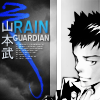
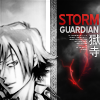
At first, I wanted to do something really different coloring-wise, like, yachiru different, and with a lot of text. But I couldn't make it work. Then I went for negative space + circles + simple yet "sophisticated", but I didn't know where to go from there so I dropped it. Finally, being desperate and tired, I fell back on the old "texture to the side with caption on top" technique. /SHAME Yamamoto, being my favorite, got the most effort, so I was happy he won People's Choice. I really like the blue of the squiggly brush and the glow of the text on each icon. I don't know what I think about this set. I'm happy they look relatively nice but I'm not pleased that I used a technique I've used billions of times before. BUT I WAS VERY EXCITED TO PLACE FIRST! There were tears of joy shed that day.
Needless to say, I had fun at shounenbattle and you should join too if you haven't already! The current round's themes are insanely creative and difficult, it's really inspiring yet proving impossible for me. XD Sign-ups are no longer open but they can always use more voters! Hell, every LIMS/Battle type icontest needs more voters. See if you can figure out who I am! I'm sure some of you already know. :P
Things I Learned mostly about myself
· I use a fuckton of text in my icons! Which is okay, except that I personally don't use icons with text so I feel like I should make & enter more hush icons.
· Found out that I could "build" an icon around a caption, though it still needs that perfect image.
· Seeing my icons next to one another, I realize I use circles, drop shadows, and center bottom crops way too often. I need to work on being more creative because I don't like that I kept using the same techniques and compositions week after week.
· I love trying to figure out who made what when voting comes up and now I'm pretty damn good at recognizing people's styles. I do want to know who made that Akira icon two weeks ago though!
[27] TOTAL Misc. shounen icons: Bleach, Whistle!, Aria, High School of the Dead, Jungle wa Itsumo Hare nochi Guu, Durarara!!, Dragon Ball, Yakitate!! Japan, Katekyo Hitman Reborn!

01
02
03
04

05
06
07
08


09
10
11
12


13
14
15
16


17
18
19
20




21
22
23
24


25
26
27


Comment & credit please! ✯ Watch? ✯ Don't hotlink or edit ✯ Resources
I was excited for this battle because, like I said before, I tend to gravitate towards shounen & seinen series. I hoped I would do a hell of a lot better here than I did at shoujo_battle. XD shounenbattle's overall theme was 80 Days Around the World.
Challenge 01: Meet & Greet

Total Points: 14
3rd Overall
The first challenge was a lot harder than I was expecting a first challenge to be! Not that I minded, that can only mean good things when it comes to future challenges! I felt sorry for whoever got my character though, Askeladd from Vinland Saga, because there aren't any color images of him out there and most people don't read it (THOUGH I DON'T KNOW WHY B/C IT IS AMAZING) so finding images must have been difficult. The idea was to make an icon featuring another participant's character, then choose a cardinal direction that had certain criteria you had to fit onto your icon. I was a pussy and picked the easiest one, South: Bottom crop (I do this all the time), red, (I love my colors!), and fire theme (oh so many trite captions I can use!). In hindsight, I regret choosing the easiest option because me and 75% of the other participants picked it, meaning my icon didn't really stand out that much.
I had initially wanted the text to say "fire in her eyes" but I realized my bottom crop made her eyes too small to see and I don't like captions that don't match the image in the icon. I was okay with everything else though; I like the diagonal cut of the red and my random light blobs adding areas of brightness. One of my comments wished the picture was a little more clear, which I don't quite understand??, but I included a variation where I increased the contrast of Matsumoto. Another didn't like the red at top so I changed it to orange, since no other color looked good, buuuut I still think it looks fug. (I found the comment funny because the entire thing sounded like a critique and I was wondering if the person knew they were supposed to vote for their favorites, not their least favorite.)
Challenge 02: World Cup

Total Points: 27
4th Overall
So I was VERY EXCITED for this challenge because it's based on The World Cup!! And La Furia Roja was doing well too! All I had to do was show the theme "sports", which initially had me going for Eyeshield 21 and TeniPuri, but I figured it's a World Cup theme, best to go with soccer. I went with Whistle! because it's one of my favorite under-appreciated sports manga and I don't know any other soccer manga with nice art.
This icon was made at the very last second. Whistle! is so unloved that there were very few HQ images out there and I had to settle for a so-so quality image. I extracted Shou and Tsubasa, rotated them, put a dark duplicate under them to help them pop and then used the pen tool to create the red & blue slanted background and further emphasize that versus feeling. After piling on a million adjustment layers, I noticed the image was pixelated and wondered wtf was wrong before I sadfaced like D8. I completely forgot PS degrades images if they're not rotated at 90/180/270° and I definitely didn't rotate it to any of those. I didn't have the original size saved nor the time to extract the image again, so I threw on some text and light blobs and prayed that no one would notice. Miraculously, only one person did. 8D I remade the icon and, hopefully, this new alternate looks less pixelated. I had one comment liking the light blobs and another finding it distracting, lol conflicting crits, so I made one alternate without the light blobs.
Challenge 03: The Land Down Under


Total Points: 53
2nd Overall
This week we had to take inspiration from one of the 4 provided photos and I chose this one because it has a circle in it and I tend to use circles in my icons anyways. Taking what I learned from shoujo_battle, I knew I had to enter a bonus icon to get those points. The bonus icon required us to use at least 3 consecutive lyrics from any song by an Australian band or musician. I coppedout and picked AC/DC's Highway to Hell. orz
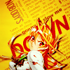
I don't really like the first icon even though it has a circle and a part of the original image "popping out" of the circle. Idk, it's weird looking; I think it's the crop. And the text bugs me but without it, the icon looked too empty. I love the second icon though; it's insanely bright and I had been blessed by the Text God or something because I'm not normally very original with typography. I had a FFFFound texture that was all action-like because of the slanted, every which way tiny text, that I figured would go well with her angry expression and fly away hair. So I masked out parts of it and put in the required lyrics. I knew it was still a little hard to read but I figured it was okay since the human mind only needs the first and last letters to be in place for things to be legible. I did still get critiques about the text so I included a tiny text only alternate. I got another one about how the red was too strong and another saying the icon was over-sharpened (but I never sharpened it in the first place ;~;) and washed out, which surprised me since I thought it was too saturated lol. I tried bringing out her skin color & the white of her shirt while reducing the reds & oranges but I feel like it's lost some of its intensity now.
Challenge 04: A Touch of Color
Points Total: 55
5th Overall
I ⓵ couldn't figure out if Escaflowne was shounen or not and ⓶ didn't read the rules so I didn't know the single color must make up less than 33% of the icon. I ended up being too late anyways and flashily counted me as skipping. XD;
Challenge 05: Welcome to the Jungle

Won People's Choice
Points Total: 74
2nd Overall
I knew I had to try harder this week to earn more points to make up for the ones I missed from last challenge. The theme was to expresses either a jungle or animal theme, which seemed simple enough. At first, I thought I'd try using an animal print as a texture but I couldn't find the right image do go with zebra print. Then I somehow thought of Max and Where the Wild Things Are and knew I had to have that as my caption. I just needed that perfect image of someone going RAWR and looking like this. Dunno how but I luckily thought of Guu and pulled my old DVDs and got a screen shot of her dancing. The icon didn't turn out anything like I imagined it would, it's no where near as cute as I wanted it to be, but every time I remake it, I fail to come up with anything better. The alternate has the orange of the palm tree slightly reduced and the trunk slightly blurred as one of my comments said it looked too sharp.
Challenge 06: I Pledge Allegiance


The first icon tied for Mod's Choice
Points Total: 74
2nd Overall
Another lyrical theme but this time as the main theme not a bonus theme. I figured everyone was going to use "Fuck 'em all" (but I was wrong, only two people did!) so I tried to find something I felt no one would use so as to make my icon stand out more. The part I noticed first was "welcome to a new kind of tension" which is REALLY LONG for a caption and I was worried if I could fit in all in but it was the line that grabbed my attention most. I didn't know what image I wanted but I had recently started watching Durarara!! so I browsed their Minitoyo gallery until that Shizuo & Izaya image popped up. Figured it was perfect since the two of them have that hilarious hate/hate tension, which went well with the lyrics and I could easily make it a center bottom crop, leaving me plenty of room for the caption. I liked the tri-color color scheme but there wasn't enough blue imo so I changed Izaya's coat & hair to blue. Then, weirdly enough, I was inspired by the calendar layout in Better Homes and Gardens of all things (it was in the break room of my work place, don't look at me like that!) because its mix of sans serif & serif fonts reminded me of the differences of Shizuo and Izaya. The Yakitate!! icon was made very last second, so I don't really like it? It's got too many textures. BUT I do like that I managed to include the gingham pattern in the circle, because that pattern always makes me think picnic cloth, which worked perfectly for the bonus theme "food".
Challenge 07: When In Rome

Tied for People's Choice
Points Total: 108
1st Overall
This week I had to make an "aged" looking icon, and I really had no idea what to do. I knew I wanted to use an older animanga series as well as a faded kind of color scheme but beyond that I was lost. XD Threw this together in a 45 minutes? Again with the circles and the drop shadows, but I kind of like the sepia coloring. It was also my luck that the voters felt the Chinese calligraphy I added made the icon looked like a Japanese scroll (or something, I don't 100% remember what the comment said), I didn't even think of that lol.
Challenge 08: In Soviet Russia

Points Total: 118
1st Overall
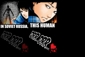
Oh man, a humor theme! Don't get me wrong, I love making funny icons. But they only happen when inspirations strikes and when I'm required to make them, for icontests and the like, it just doesn't work. ;~; I...don't know how this icon came to be. I knew it had to be a Soviet Russia joke, to earn extra points, but other than that I don't know why I picked The Enimga of Amigara Fault. Particularly since that manga usually terrifies the shit out of people. IDK. Looking at this icon again, I must have been really tired and almost late to enter it because why didn't I color the whole thing?? The alternate is fully but terribly colored as I have no idea how a camp fire light source works and the timing of the frames is shorter so that the whole thing runs faster, since one of my comments said it was a little too slow.
Challenge 09: So Saree

Won Mod's Choice
Points Total: 131
1st Overall
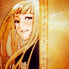
This week's theme was provided textures. I have a love/hate relationship with provided texture themes. These weren't too fug, but they still looked kinda dated and I had no clue what to do with any of them. Initially I wanted to do a modern looking icon with the stripes of the fourth texture buuut I couldn't find the right image so I gave up. I switched to the first texture and masked everything out except for those bars and used those. I wanted the icon to have a sense of depth, so I layered the other textures in front and behind her so she would look like she was looking over her shoulder from behind a room partition. I rather like the resulting icon and I got my idea across since one commenter said it looked like she was "hiding behind a wall". The only thing I didn't really like was that the monochrome color scheme was so warm but her skin tone so cold looking. But I when I add a photo filter, it looks too orangey, idk wat to do. ;~; Still included it anyways.
Challenge 10: Time to say Goodbye

➨

➨


First icon won People's Choice Icon
Points Total: 154
Somehow, still 1st
OKAY. I had figured out a while ago that astrokittie was one of my opponents and we were pretty much neck and neck points wise, so I was basically pissing myself in fear of what she would bust out for a Triptych theme. (Did you see her shoujo_battle icons?? Fucking gorgeous. To try and inspire myself I went and looked at old Triptych icons at bishounenawards and I saw some of her icons again & cried at the prettiness.) I really didn't have any ideas whatsoever other than it had to have three characters, who were hopefully a trio, from the same series. At first I thought of Naruto, Sakura, and Sasugay, but I wasn't feeling the art. And to make things worse, it was only on the last day that I realized I had misread the instructions completely. We had to make icons using past themes but only the first icon could use the first three themes, the second the next three, and the third the last three. I thought it was any icon could use any theme. @-@;;
At first, I wanted to do something really different coloring-wise, like, yachiru different, and with a lot of text. But I couldn't make it work. Then I went for negative space + circles + simple yet "sophisticated", but I didn't know where to go from there so I dropped it. Finally, being desperate and tired, I fell back on the old "texture to the side with caption on top" technique. /SHAME Yamamoto, being my favorite, got the most effort, so I was happy he won People's Choice. I really like the blue of the squiggly brush and the glow of the text on each icon. I don't know what I think about this set. I'm happy they look relatively nice but I'm not pleased that I used a technique I've used billions of times before. BUT I WAS VERY EXCITED TO PLACE FIRST! There were tears of joy shed that day.
Needless to say, I had fun at shounenbattle and you should join too if you haven't already! The current round's themes are insanely creative and difficult, it's really inspiring yet proving impossible for me. XD Sign-ups are no longer open but they can always use more voters! Hell, every LIMS/Battle type icontest needs more voters. See if you can figure out who I am! I'm sure some of you already know. :P
Things I Learned mostly about myself
· I use a fuckton of text in my icons! Which is okay, except that I personally don't use icons with text so I feel like I should make & enter more hush icons.
· Found out that I could "build" an icon around a caption, though it still needs that perfect image.
· Seeing my icons next to one another, I realize I use circles, drop shadows, and center bottom crops way too often. I need to work on being more creative because I don't like that I kept using the same techniques and compositions week after week.
· I love trying to figure out who made what when voting comes up and now I'm pretty damn good at recognizing people's styles. I do want to know who made that Akira icon two weeks ago though!
[27] TOTAL Misc. shounen icons: Bleach, Whistle!, Aria, High School of the Dead, Jungle wa Itsumo Hare nochi Guu, Durarara!!, Dragon Ball, Yakitate!! Japan, Katekyo Hitman Reborn!


01
02
03
04


05
06
07
08


09
10
11
12


13
14
15
16


17
18
19
20


21
22
23
24


25
26
27


Comment & credit please! ✯ Watch? ✯ Don't hotlink or edit ✯ Resources