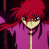
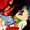
Don't excude me!: A tutorial looking at the blue exclusion layer in a different light
DON'T EXCLUDE ME!
Going from this:
to this:
Difficulty: Remarkably easy, but you must be willing to experiment.
Transferability: Made using PSP7, but should be transferable to all programs
Now, it seems that when people use blue exclusion layers, especially in anime icons, use them to mute colors. So, you'd suppose they can't be used to brighten up colours. Wrong! When combined with other techniques, a blue exclusion layer can be a tool that can bring out colours.
1. I'm gonna start out with this base of Yuusuke and Botan from the anime Yuu Yuu Hakusho;
2. Duplicate your base layer, and blur the duplicated layer. It should now look like this;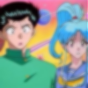
3. Set that layer to hard light at 100%. Your icon should now look like this;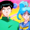
4. Make a new raster layer filled with #0000FF (
), set it to exclusion at somewhere between 13-20%. It really depends on the image. Your icon should look like this;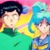
5. Now, time for the magic to happen! Now, make a new raster layer, and fill it with #B70D0E (
). Set this to soft light between 13-70%. Again, depends on the image. Your icon should look like this;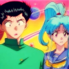
6. Duplicate your base layer, bring it to the top (Layers->Arrange->Bring to top), and desaturate it. Your icon should now look like this;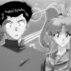
7. Set your desaturated layer to soft light. Soften (Effects->Blur->Soften) it it's too sharp. Your icon should now look like this;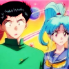
8. And we're done! You can add text and brushes (or textures, if you're adventurous!) if you want to.
Remember, not all images are the same, so every icon may look a little different.
Other icons made using this technique


Going from this:

to this:

Difficulty: Remarkably easy, but you must be willing to experiment.
Transferability: Made using PSP7, but should be transferable to all programs
Now, it seems that when people use blue exclusion layers, especially in anime icons, use them to mute colors. So, you'd suppose they can't be used to brighten up colours. Wrong! When combined with other techniques, a blue exclusion layer can be a tool that can bring out colours.
1. I'm gonna start out with this base of Yuusuke and Botan from the anime Yuu Yuu Hakusho;

2. Duplicate your base layer, and blur the duplicated layer. It should now look like this;

3. Set that layer to hard light at 100%. Your icon should now look like this;

4. Make a new raster layer filled with #0000FF (

), set it to exclusion at somewhere between 13-20%. It really depends on the image. Your icon should look like this;

5. Now, time for the magic to happen! Now, make a new raster layer, and fill it with #B70D0E (

). Set this to soft light between 13-70%. Again, depends on the image. Your icon should look like this;

6. Duplicate your base layer, bring it to the top (Layers->Arrange->Bring to top), and desaturate it. Your icon should now look like this;

7. Set your desaturated layer to soft light. Soften (Effects->Blur->Soften) it it's too sharp. Your icon should now look like this;

8. And we're done! You can add text and brushes (or textures, if you're adventurous!) if you want to.
Remember, not all images are the same, so every icon may look a little different.
Other icons made using this technique
