Making Good Cartoon Icons- Tutorial 1// Tickled Pink
It's that time again. But this time, I've decided to start a series of tutorials to help cartoon icon makers in particular. This is Part 1. :D
Let's go from this to this;
, 'kay?
Difficulty: I pratically hold your hand through the whole thing.
Transferability: Made in PS7, but is 100% transferable.
Step 1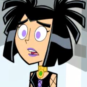
First, we start out with our base image. This isn't high-quality by most standards, but for a cartoon screenshot, this is about as good as it gets. For this tutorial, I'm using a pretty shot of Sam Manson from the Danny Phantom episode Parental Bonding.
Step 2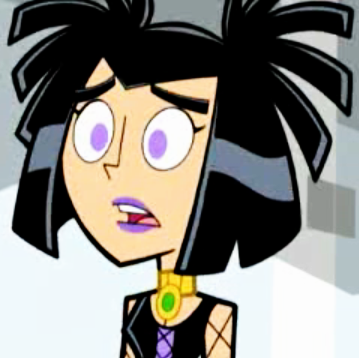
Now, cartoon screenshots usually don't have that much contrast, so I decided to duplicate the layer (Layer > Duplicate) and set it to Soft Light at 100%. Merge your layers (Layer > Merge > Merge All). Subtle, but it adds some zing. Or it will, at least. At the moment Sam's looking a little sickly. But we're gonna fix that.
Step 3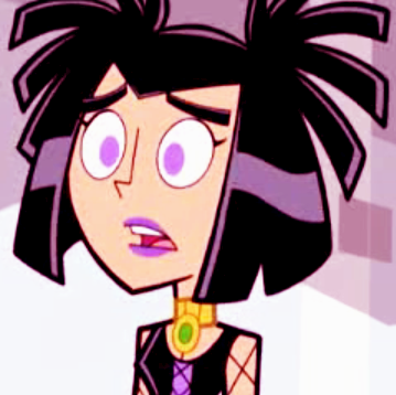
It wasn't very pretty at all, sooo we're gonna make a new raster layer (Layer > New Raster Layer). Fill it with #FF57AE (
if you want to Edit > Paste > As New Layer), which is a lovey-dovey pink. Set to Soft Light at 100%. Don't merge just yet.
Step 4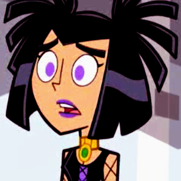
We're still not there yet. Sam does not approve of this icky pink hue attacking her. So, we're going to duplicate our base layer and bring it to the top. To do this in PSP7, go to Layer > Arrange > Bring to top. Set the duplicated layer to Multiply. For this image, I set it at 100%, but it really depends on the image.
Step 5
Now, oversharpening a cartoon icon can be even worse than oversharpening an icon with a live subject. To avoid pixelation when you resize, I usually soften the image. This command can be found under Effects > Blur > Soften. Yeah, it looks three shades of gross right now, but trust me, it'll work in the long run. For PS user, this step may not be necessary, because PS generally resizes nicer.
Step 6
See? And to think you didn't believe me, oh ye of little faith. You can sharpen it if you like. I'm not, though, because I think it looks fine. Now, you can stop right here and have a nice simple base, or icon, depending on how you think. But as for me...
Step 7
...I'm gonna spruce it up a little bit. I totally love the dusty, scratchy look going on right now, but I'm tired of seeing the same old textures. So, for this effect, I used a stock image of an envelope (I forgot the maker, sorry. D:) set to Multiply. You can add any brushes, text, or whatever you want, of course. That stuff is my favorite part.
Now, don't be afraid to experiment with this tutorial! Not every image will yeild the same results, so you might need to tweak it to your liking. For example:
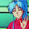
This icon was made by following this tutorial, but I set the Multiply layer to Hard Light.
Also, still icons aren't the only thing this tutorial is good for. Ejemplo Dos:
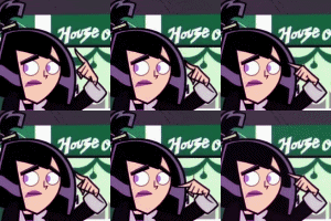
See, it moves! Lookit her go! This was really simple to make. I just followed the tutorial on each frame of the animation. instead of just one image.
REMEMBER, following this step by step then claiming the resulting icon as your own makes you look really stupid, but showing me what you made makes you look really cool. And who doesn't want to look cool?
Let's go from this to this;

, 'kay?
Difficulty: I pratically hold your hand through the whole thing.
Transferability: Made in PS7, but is 100% transferable.
Step 1

First, we start out with our base image. This isn't high-quality by most standards, but for a cartoon screenshot, this is about as good as it gets. For this tutorial, I'm using a pretty shot of Sam Manson from the Danny Phantom episode Parental Bonding.
Step 2

Now, cartoon screenshots usually don't have that much contrast, so I decided to duplicate the layer (Layer > Duplicate) and set it to Soft Light at 100%. Merge your layers (Layer > Merge > Merge All). Subtle, but it adds some zing. Or it will, at least. At the moment Sam's looking a little sickly. But we're gonna fix that.
Step 3

It wasn't very pretty at all, sooo we're gonna make a new raster layer (Layer > New Raster Layer). Fill it with #FF57AE (

if you want to Edit > Paste > As New Layer), which is a lovey-dovey pink. Set to Soft Light at 100%. Don't merge just yet.
Step 4

We're still not there yet. Sam does not approve of this icky pink hue attacking her. So, we're going to duplicate our base layer and bring it to the top. To do this in PSP7, go to Layer > Arrange > Bring to top. Set the duplicated layer to Multiply. For this image, I set it at 100%, but it really depends on the image.
Step 5

Now, oversharpening a cartoon icon can be even worse than oversharpening an icon with a live subject. To avoid pixelation when you resize, I usually soften the image. This command can be found under Effects > Blur > Soften. Yeah, it looks three shades of gross right now, but trust me, it'll work in the long run. For PS user, this step may not be necessary, because PS generally resizes nicer.
Step 6

See? And to think you didn't believe me, oh ye of little faith. You can sharpen it if you like. I'm not, though, because I think it looks fine. Now, you can stop right here and have a nice simple base, or icon, depending on how you think. But as for me...
Step 7

...I'm gonna spruce it up a little bit. I totally love the dusty, scratchy look going on right now, but I'm tired of seeing the same old textures. So, for this effect, I used a stock image of an envelope (I forgot the maker, sorry. D:) set to Multiply. You can add any brushes, text, or whatever you want, of course. That stuff is my favorite part.
Now, don't be afraid to experiment with this tutorial! Not every image will yeild the same results, so you might need to tweak it to your liking. For example:

This icon was made by following this tutorial, but I set the Multiply layer to Hard Light.
Also, still icons aren't the only thing this tutorial is good for. Ejemplo Dos:

See, it moves! Lookit her go! This was really simple to make. I just followed the tutorial on each frame of the animation. instead of just one image.
REMEMBER, following this step by step then claiming the resulting icon as your own makes you look really stupid, but showing me what you made makes you look really cool. And who doesn't want to look cool?