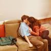
coloring tutorial
How to go from this

to

THIS COLORING DOES NOT WORK WITH ALL IMAGES!!!!
Start out with your image. I'm going to start out with a screencap of Tyra from Friday Night Lights. Screencaps are from In A Dream.
Crop it how you would like and resize it to 200x200 (Or 100x100, I just like starting larger because it makes the image more crisp in my opinion)

Pretty picture of Tyra, but wayyyy too dark. So, let's lighten it up a bit eh? Duplicate your layer and set it to screen. You now have this...

Brighter, but not contrasted enough... So select all of your image and go to Edit: Copy Merged then paste and set this layer to Soft Light

Next we want to add some coloring, so we're going to add a selective coloring layer with these settings:
CYANS;
Cyan: 100%
Magneta: -100%
Yellow: -100%
Black: 100%
BLUES;
Cyan: 100%
Magneta: -100%
Yellow: -100%
Black: 100%
NEUTRALS;
Cyan: -33%
Magneta: 12%
Yellow: 26%
Black: -11%
You should end up with something like this...

Looks better already, but I'd like to have it a little sharper. So, go back to your screen layer and sharpen. I like to sharpen the screen layer because you can sharpen it without over sharpening the whole icon.

We're getting there, but I feel the icon is still too dark, so I duplicate the screen layer (keeping it under the softlight layer)

Then just for fun, I sharpen the new duplicated screen layer once.

Now we're in the home stretch. Resize your icon to 100x100

Now, just for my own personal preference I like sharp, crisp icons. So I sharpen the screen layer one more time.

Then, again, for my personal preference, I dont like how sharp the background is so I use the smudge tool to sharpen it on the base layer. Not that much of a difference, but I like it better.

VIOLA. NOW YOU HAVE A BRIGHT, SHINY, CRISP ICON :]
Enjoy and Feel free to ask any questions you have! :]
Other Friday Night Light Examples:


EXAMPLES OF THIS COLORING IN VARIOUS FANDOMS!
some are modified a little :]
arrested development
bones
grey's anatomy
lost


the oc
the office
prison break
smallville


to

THIS COLORING DOES NOT WORK WITH ALL IMAGES!!!!
Start out with your image. I'm going to start out with a screencap of Tyra from Friday Night Lights. Screencaps are from In A Dream.
Crop it how you would like and resize it to 200x200 (Or 100x100, I just like starting larger because it makes the image more crisp in my opinion)

Pretty picture of Tyra, but wayyyy too dark. So, let's lighten it up a bit eh? Duplicate your layer and set it to screen. You now have this...

Brighter, but not contrasted enough... So select all of your image and go to Edit: Copy Merged then paste and set this layer to Soft Light

Next we want to add some coloring, so we're going to add a selective coloring layer with these settings:
CYANS;
Cyan: 100%
Magneta: -100%
Yellow: -100%
Black: 100%
BLUES;
Cyan: 100%
Magneta: -100%
Yellow: -100%
Black: 100%
NEUTRALS;
Cyan: -33%
Magneta: 12%
Yellow: 26%
Black: -11%
You should end up with something like this...

Looks better already, but I'd like to have it a little sharper. So, go back to your screen layer and sharpen. I like to sharpen the screen layer because you can sharpen it without over sharpening the whole icon.

We're getting there, but I feel the icon is still too dark, so I duplicate the screen layer (keeping it under the softlight layer)

Then just for fun, I sharpen the new duplicated screen layer once.

Now we're in the home stretch. Resize your icon to 100x100

Now, just for my own personal preference I like sharp, crisp icons. So I sharpen the screen layer one more time.

Then, again, for my personal preference, I dont like how sharp the background is so I use the smudge tool to sharpen it on the base layer. Not that much of a difference, but I like it better.

VIOLA. NOW YOU HAVE A BRIGHT, SHINY, CRISP ICON :]
Enjoy and Feel free to ask any questions you have! :]
Other Friday Night Light Examples:


EXAMPLES OF THIS COLORING IN VARIOUS FANDOMS!
some are modified a little :]
arrested development
bones
grey's anatomy
lost


the oc
the office
prison break
smallville


