[12] #005 tutorial and pimpage

Oh I just wanted to pimp the Asian Iconist Awards to the members of this community, I just found it today and I thought it was cool since I am one too. Nominate your favorite iconnists! Of course it doesnt have to be me, just anyone you like who does asian (dramas/idols/music/movies) entertainment icons. Check it out yo!
Anyways, the real reason of my post is I have just forced my lazy butt out of hiatus temporarily to wake up the community again lol with a tutorial requested by
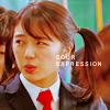
lovehello. :) I do not have the original screencap for #11, but I did save the coloring I used on the icon so I hope thats okay. :)
to this:
*using CS(uses selective color)
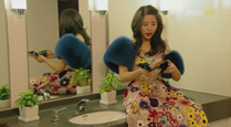
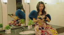
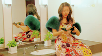
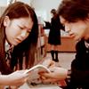
1. Choose your image, and sharpen once and resize it to your standards. I usually do not crop till the end, but just do what you feel like doing. The image I am using is from the korean drama Goong, screen capped by
dinadorama
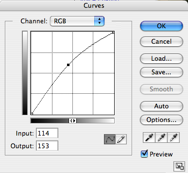
2. Now lighten up the picture slightly with Curves (layer>>new adjustment layer>>Curves...). Ive recently preferred that using curves as opposed to duplicating the image and screening it. It just seems like I can adjust the lighting better. Click a point on the grid for the RGB channel, and change the settings to Input: 114 and Output: 153 Change the opacity to 25%. SCREENCAPTURE The picture now looks like this:
3. Now create a new layer and fill it with #FEF5D7 (layer>>new fill layer>>solid color...). Set to Softlight 100% opacity . * May vary with different images, since you do not want it to look to pasty (not sure if this is the word I want to say) in the end. Well, it can cause details in the picture to be lost. The image now looks like:
4. I am using Selective Colouring now, to isolate certain colours and brighten/manipulate the tones of the colours in the picture. *Settings vary according to the colours present in the image, so just play around with the settings until you get a colouring you personally like. Input the following settings:
REDS
cyan: -100
magenta: +10
black: +68
GREENS
cyan: +100
magenta: -100
yellow: +100
black: +100
CYANS
cyan: +100
magenta: -100
yellow: +100
black: +100
WHITES
cyan: +100
magenta: -49
yellow: -35
black: -30
NEUTRALS
cyan: -25
magenta: -18
yellow: -30
black: +20
BLACKS
black: +100
Done, now the image looks like this:

5. The picture looks a little too washed out so to darken it, I used Levels (layer>>new adjustment layer>>levels...). Levels control the white, black, and gray values in the image. Input the following settings for levels (RGB Channel):
Input values: 31, 1.00, 255 SCREENCAPTURE The picture now looks like this:
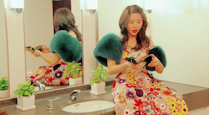
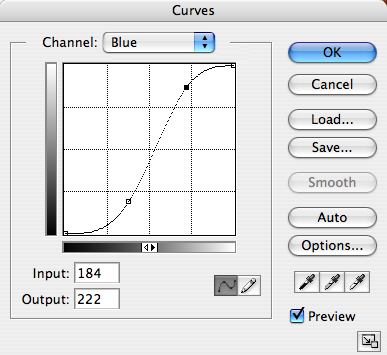
6. I am using Curves again, but now to accent blueish highlights and yellow lowlights into the image. (layer>>new adjustment layer>>Curves...) Click a point on the grid for the Blue channel, and change the settings to Input: 96 and Output: 48. Make another point on the same grid and change the settings to Input: 184 and Output: 222. Set the opacity to 35%. SCREENCAPTURE The picture now looks like this:
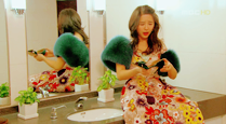
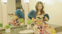
7. You can stop at #6, but I just wanted to darken the overall image a little but still keep the colours generally bright. Create a new fill layer #E1E1E1. Set to Color Burn 60% opacity. The end picture looks like this:
8. Crop, add text and do whatever you like to finish it off.
Other samples of this colouring with some minor tweaks: It looks like they have really different colouring, but it just depends on the quality/colours in the original picture.
*If you are lazy, since there are lots of adjustment layers I uploaded a PSD DL: here @ box.net
Do not follow it exactly; tweak the settings to suit your picture to get best results.
***Have fun, and show me your creations please!!
- Feedback is always appreciated.
- Do not direct link at all.
- Resources & Suggestions & Affiliates?
- Comment, I love reading comments! <-Most Important BTW.
- Please Friend the community if you like the graphics!!! :)