Tutorial #1: Gossip Girl screencap tutorial
wyelinchiu asked how I changed screencaps into the images I use for picspams or banners, so here's a tutorial on fixing screencaps.
I'm using an example from my picspam for Gossip Girl 2.01 Summer kind of wonderful and credit for the cap goes to marishna.
So we're going from
to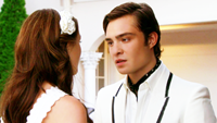
in Photoshop CS3.
Start with the picture you want to patch up. I took a screencap from Gossip Girl 2.01 by marishna. (For size purposes, I've scaled it down. It's originally sized 1680x946 pixels.)

As you can see, there's a CW logo in the bottom right corner. When you have time and it's relatively possible to remove it, always do so. It just looks better, like you actually took the time to make the image look good.
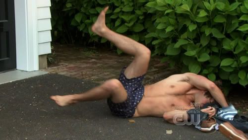
Not all images are workable, however. On this screencap of Nate, removing the logo would have taken too much effort - as you can see, it's place all over him, right where the focus of the image is:
But this screencap of Chuck and Blair is relatively workable.
You zoom in on the logo and then select the Clone Stamp tool from your toolbar.
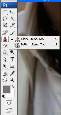
The clone stamp tool is very straight-forward. It clones part of your picture to another part of your picture.
To see how it works, place the tool a little next to the part you want to have erased. Then press the ALT key on your keyboard and click with your mouse.
You have now marked the area you want to clone - try moving you mouse a little until it's on the area you want to erase and click with your mouse. You'll see how it somewhat 'brushes' over it.

What you have to be careful of is the distance you move your brush. It will clone a certain area, but only in the 'old' picture. It moves with you as it were. I'll try to explain it by showing it as well. Let's say I put my mouse next to the CW logo, right where the red dot is in the picture, and select it (I'm using a large brush).

If I then start brushing over the CW logo, it works great at first, until my selection point reaches the original logo. Then this is what you get:

See how the logo has been 'moved' as it were?
So remember that the range of your brush depends on the distance you put between the object you want to remove and the part of the image you want to replace it with.
Sometimes, you'll need to select a new area to clone from every other second, because the space is very limited. Like here when you want to replace the letters within the circle:
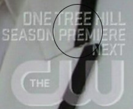
You have to draw cloning material from right next to the letters, because when you draw from further away, the colours won't match and it will show on the jacket. But since the space is limited, you'll probably have to select, stroke once, move mouse, select the area you've just brushed and stroke once - and so on.
As you can see on the eventual result, I was a bit hasty. His black lining is a bit blurred, but for a picspam, it's not that big of a deal. The focus of the image isn't on it, anyway.
Remember that selecting a different size brush with a different opacity can be very useful - you just have to play around with it to find out what works for you and what works for which pictures.
Now for the actual focus of the picture and how to make it look good.
The first thing you notice when you open up a screencap, is how grainy the skin of the people in the picture can look. If you resize the picture, this usually helps a lot. Screencaps are really large, this one was 1680x946 pixels, so if you use them for picspams or for banners, you're going to be resizing them anyway. I put mine to 500x282 pixels.
You have a choice here: either you first patch up the skin or you first resize and fix your base (this screencap is a little dark) and than patch up the skin.
There's not one way to do this: for some pictures it doesn't matter what you do first, but for really dark caps from night scenes, you can fix the skin and then lighten up the image only to find that the skin is still too grainy and you have to blur that again.
But let's be practical here:
I resized the image and then prepared my base. What I mean by preparing my base in this case is duplicating the background layer twice and setting the first layer to soft light and the top layer to screen.
This lightens up the image (the screen layer) and gives it more contrast (the soft light layer). Play with the settings or add another screen layer if the image is still to dark for your liking.
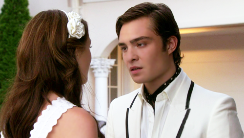
Now for fixing that grainy skin. First select all the layers you have in your image and flatten the image so that there's only one layer left. (Otherwise you'll only be blurring one layer at the time and that takes tons of work!)
Then zoom in on the skin and select the blur tool from your layers palette. Choose the settings for your blur tool: how big is the brush and at what opacity are you going to use it?
Here are a few guidelines (not rules!):
- Don't use a 100% opacity. I know that sounds as a rule, but it's more like a preference. Start with a lower opacity - if it's not blurring enough, you can always brush over the same area again.
With a 100% opacity, it gives the maximum effect right away and it will look fake quite quickly. As you start fixing caps up more and more, you'll easily see what I mean.
- Don't move over lines, especially in the face. Stay away from the eyes, lips, ears and the nose. You can blur the skin of a nose, but don't blur the lines between different parts of the face (or body, for that matter).
- Try to use lower opacities for men than for women. Men can afford to look a little rougher. ;)
- Also use different opacities for different parts of the face and body. I always use the highest opacity for cheeks and forehead and a much lower opacity for people's necks, for instance.
- Just practise. I'm not perfect at it either. Some of my fixed caps look too air-brushed, others look too grainy. Just try and learn to work with the tools.
Here's what I got with a soft brush set to around 60% opacity, see the difference between the two pictures:
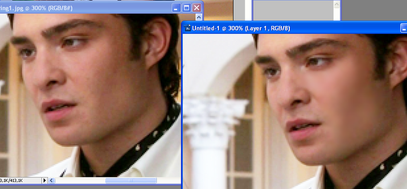
When you've fixed the skin to your liking (as you can see, I did Blair's shoulder and side of her face as well), you can decide on whether or not you think your caps needs to have the surroundings blurred a little as well.
Sometimes, you can blur the part where you erased a logo so it won't stand out as much - or sometimes, a side of a building will look ugly-grainy and just off in the picture and you find you need to fix that as well. Whatever it is you want your screencap to look like, just do it. :)
With that, your screencap's quality is fixed and it's time for your colouring. My way is really simple, though.
I just add one selective colouring layer where I only bring out a little more of the colours already in the picture. So in this picture, it was a little green for the bushes and a little yellow and red for their skin and that's it.
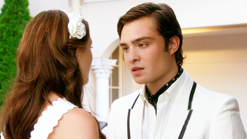
Then what I sometimes do is duplicate my base again, set it to soft light (sometimes I bring it to the top, sometimes I don't) and adjust the opacity to give it just the depth I like.
And that's how I got this:

I hope this has given you a bit of a look into how I work with screencaps to use them for picspams - and usually icons or banners after that. I hope it has been helpful, but if you have any questions or feedback or anything else, don't hesitate to leave a comment! :)
I've asked this before, but I'm doing it again: please don't use the images for something other than resizing without my consent. If you're resizing them, please credit marishna for the cap and me for the colouring and patching up. And please, please don't hotlink. :)
I'm using an example from my picspam for Gossip Girl 2.01 Summer kind of wonderful and credit for the cap goes to marishna.
So we're going from

to

in Photoshop CS3.
Start with the picture you want to patch up. I took a screencap from Gossip Girl 2.01 by marishna. (For size purposes, I've scaled it down. It's originally sized 1680x946 pixels.)

As you can see, there's a CW logo in the bottom right corner. When you have time and it's relatively possible to remove it, always do so. It just looks better, like you actually took the time to make the image look good.
Not all images are workable, however. On this screencap of Nate, removing the logo would have taken too much effort - as you can see, it's place all over him, right where the focus of the image is:

But this screencap of Chuck and Blair is relatively workable.
You zoom in on the logo and then select the Clone Stamp tool from your toolbar.

The clone stamp tool is very straight-forward. It clones part of your picture to another part of your picture.
To see how it works, place the tool a little next to the part you want to have erased. Then press the ALT key on your keyboard and click with your mouse.
You have now marked the area you want to clone - try moving you mouse a little until it's on the area you want to erase and click with your mouse. You'll see how it somewhat 'brushes' over it.

What you have to be careful of is the distance you move your brush. It will clone a certain area, but only in the 'old' picture. It moves with you as it were. I'll try to explain it by showing it as well. Let's say I put my mouse next to the CW logo, right where the red dot is in the picture, and select it (I'm using a large brush).

If I then start brushing over the CW logo, it works great at first, until my selection point reaches the original logo. Then this is what you get:

See how the logo has been 'moved' as it were?
So remember that the range of your brush depends on the distance you put between the object you want to remove and the part of the image you want to replace it with.
Sometimes, you'll need to select a new area to clone from every other second, because the space is very limited. Like here when you want to replace the letters within the circle:

You have to draw cloning material from right next to the letters, because when you draw from further away, the colours won't match and it will show on the jacket. But since the space is limited, you'll probably have to select, stroke once, move mouse, select the area you've just brushed and stroke once - and so on.
As you can see on the eventual result, I was a bit hasty. His black lining is a bit blurred, but for a picspam, it's not that big of a deal. The focus of the image isn't on it, anyway.
Remember that selecting a different size brush with a different opacity can be very useful - you just have to play around with it to find out what works for you and what works for which pictures.
Now for the actual focus of the picture and how to make it look good.
The first thing you notice when you open up a screencap, is how grainy the skin of the people in the picture can look. If you resize the picture, this usually helps a lot. Screencaps are really large, this one was 1680x946 pixels, so if you use them for picspams or for banners, you're going to be resizing them anyway. I put mine to 500x282 pixels.
You have a choice here: either you first patch up the skin or you first resize and fix your base (this screencap is a little dark) and than patch up the skin.
There's not one way to do this: for some pictures it doesn't matter what you do first, but for really dark caps from night scenes, you can fix the skin and then lighten up the image only to find that the skin is still too grainy and you have to blur that again.
But let's be practical here:
I resized the image and then prepared my base. What I mean by preparing my base in this case is duplicating the background layer twice and setting the first layer to soft light and the top layer to screen.
This lightens up the image (the screen layer) and gives it more contrast (the soft light layer). Play with the settings or add another screen layer if the image is still to dark for your liking.

Now for fixing that grainy skin. First select all the layers you have in your image and flatten the image so that there's only one layer left. (Otherwise you'll only be blurring one layer at the time and that takes tons of work!)
Then zoom in on the skin and select the blur tool from your layers palette. Choose the settings for your blur tool: how big is the brush and at what opacity are you going to use it?
Here are a few guidelines (not rules!):
- Don't use a 100% opacity. I know that sounds as a rule, but it's more like a preference. Start with a lower opacity - if it's not blurring enough, you can always brush over the same area again.
With a 100% opacity, it gives the maximum effect right away and it will look fake quite quickly. As you start fixing caps up more and more, you'll easily see what I mean.
- Don't move over lines, especially in the face. Stay away from the eyes, lips, ears and the nose. You can blur the skin of a nose, but don't blur the lines between different parts of the face (or body, for that matter).
- Try to use lower opacities for men than for women. Men can afford to look a little rougher. ;)
- Also use different opacities for different parts of the face and body. I always use the highest opacity for cheeks and forehead and a much lower opacity for people's necks, for instance.
- Just practise. I'm not perfect at it either. Some of my fixed caps look too air-brushed, others look too grainy. Just try and learn to work with the tools.
Here's what I got with a soft brush set to around 60% opacity, see the difference between the two pictures:

When you've fixed the skin to your liking (as you can see, I did Blair's shoulder and side of her face as well), you can decide on whether or not you think your caps needs to have the surroundings blurred a little as well.
Sometimes, you can blur the part where you erased a logo so it won't stand out as much - or sometimes, a side of a building will look ugly-grainy and just off in the picture and you find you need to fix that as well. Whatever it is you want your screencap to look like, just do it. :)
With that, your screencap's quality is fixed and it's time for your colouring. My way is really simple, though.
I just add one selective colouring layer where I only bring out a little more of the colours already in the picture. So in this picture, it was a little green for the bushes and a little yellow and red for their skin and that's it.

Then what I sometimes do is duplicate my base again, set it to soft light (sometimes I bring it to the top, sometimes I don't) and adjust the opacity to give it just the depth I like.
And that's how I got this:

I hope this has given you a bit of a look into how I work with screencaps to use them for picspams - and usually icons or banners after that. I hope it has been helpful, but if you have any questions or feedback or anything else, don't hesitate to leave a comment! :)
I've asked this before, but I'm doing it again: please don't use the images for something other than resizing without my consent. If you're resizing them, please credit marishna for the cap and me for the colouring and patching up. And please, please don't hotlink. :)