Making things bright, colorful, and not too crazy.
Wow, subject sounds like Rachel. x3
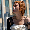
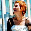
->
Made with Photoshop CS2
Selective Color sorry. :(
I think it's slightly based on a tutorial I can't find anymore. D:
I believe it's intermediate.
I got asked how I make my icons colorful. Experimenting with hue/saturation, curves, selective coloring and the occasional color/texture layer is how I tend to do it. Selective coloring is a touchy subject at times. It is not just there to bring out the reds and blues. There are already tutorials out there that give more options with selective coloring. You just got to ease up, know when to stop the slider before your base looks like it ate tons of hot sauce.
So I shall try and explain to my best on how to highlight colors, and bring them out with selective coloring and give you other options and ideas.
We start fairly easy only a few layers and nothing drastic but makes the difference between dim and dull to colorful and bright.

Step 1: Make your base.
Open your image. I used a live photo of Rachel Stolte (Great Northern) that I had found on flickr. I copied the image and pasted it in a 100x100 pixel 72 dpi new document. I then resized it, clicking the chain button;
; to keep the image constrained as I used the boxes;
; that appear in the corner of the image to resize it. Then when I got what I want, I clicked the check mark;
;. I duplicated the image three times and merged it because when you resize instead of crop you get faded edges. **I duplicated the image only once this time and sharpened (Filter > Sharpen > Sharpen) it. I changed the opacity to 50% and merged the duplicate to the image. Now you got the base.
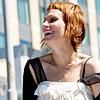
Step 2: Duplicate your base.**
Set to: Screen
Opacity: 100%
The opacity will depend on your base. If it's already bright and you might think it needs darken, put this duplicate to Multiply and change the opacity, if you think it's just fine then don't duplicate the layer and move on. But to make sure if you need this layer or not, go to the next step and add the color burn layer, then adjust your image as needed under the color burn layer.
I really put it at 100% because I didn't really like how dim it was. And I knew the next layer would darken it some.
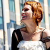
Step 3: Create New Layer.**
Fill: #dddddd
Set to: Color Burn
Opacity: 100%
Again, after doing this you might want to adjust the screen layer, or add it, or remove it, depending on your taste. You can also adjust this layer to your taste as well, specially if you don't want to mess with the screen layer, it's your choice. This also kind of brings the dominate colors out. In my icon the reds, yellows and blue's where brought out nicely and the deeper shadows where darkened creating contrast.
This layer was most likely based on tutorial that I can't find. So I don't have a reason for using it other than following a tutorial, I don't know if the 100% was my choice or what I read. However I know that it works beautifully.

Step 4: Selective Coloring.
This is our only selective coloring layer. You might have to change the settings on each slider to your image. Too much red or blue in your image you will have to move the sliders in REDS and BLUES areas.
Each slider tends to change how much of that color is in the specified color. For example the [yellow] slider in REDS can add or remove the yellow undertones in red of the image. Notice in the base and my icon Rachel's hair is red, in the base it's dull and red/brownish but in the icon it looks more red with yellow highlights, same with her skin being pink and there be a yellow glow.
You really have to find a balance between the colors. Experiment and mess around with images, and check out what happens when you move the sliders to the right or to the left and what combos you get.
[colors][cyan][magenta][yellow][black]REDS;-40+20+10-10YELLOWS;-1000+1000GREENS;0-10000CYANS;+100+100-100+20BLUES;+100+20-100-10MAGENTAS;+20-100-1000WHITES;+1000-500NEUTRALS;00+100BLACKS;000+40
Finished!
Any brush or texture you want to add go ahead. It's all you. ;) You will have to be careful with them, choose colors that won't clash with image, change opacities, and layer modes. Just experiment, don't always be set on one single layer mode, go through them all.
Use black or gray textures with different shades in the color burn layer.
Enjoy yourself.
Then you just merge all the layers and save it as a Jpeg or a PNG.
**ADDITIONAL NOTES:
1. You don't have to duplicate your base and click 'sharpen' and change the opacity of the base so the sharpen isn't too much. On Photoshop CS2, you just click sharpen then go to Edit > Fade or Shift + Ctrl + F and then just move the slider to get the right amount of sharpening you want. Be careful of over sharpening, it's the leader in crummy icons next to over usage of selective coloring, color layers, and textures... in the same icon. :3
2. The screen and Color Burn layer could be replaced by a curves layer or a brightness/contrast layer. However there are variables with each option, so it might not look the same.
For Brightness/Contrast I suggest:
Brightness = -15
Contrast = +14
For curves I suggest:
RBG;
1 Click; input: 80 output: 50
2 Click; input: 140 output: 128
3. This tends to be a base in some selective coloring settings. In order to get pink skin, or pink something.
REDS; -100 0 +100 0
YELLOWS; +100 0 -100 0
It's a bit extreme, again you have to find the balance. What I do is move those changed sliders around and stop when I see I got the right amount of red to yellow in the REDS, and then I try and take it a step further with the YELLOWS. Sometimes you don't even need the YELLOWS and can leave all the sliders at 0/zero.
Also not show is BLACKS. BLACKS is mostly used to darken a color or the opposite, brighten it. But it brightens it to the color's base color.
When messing with [blue] the blues of your image will appear as this COLOR instead of your color lightened like this COLOR.
BLACKS [black] will turn darker/deeper colors, black(er).
Another thing about selective coloring. Each slider, when you slide to the right will enhance the color it represents and will do some dulling things the opposing color it too represents in each menu color.
The blacks show a purest example of such. Be careful with the WHITES, again, they can turn anything white into a different hue of white. Because in most images, white isn't very pure and has an underlying color.
I hope I made sense. If not here's the psd:

Have fun making those icons.
DO NOT HOTLINK OR COPY MY ICONS/IMAGES PLEASE.
Any questions, just ask?
Comments are always nice.
And I'd like to to see what you've done with the tutorial.
My Resources
Join imfraudulent if you like. :D
-Bunny

->
Made with Photoshop CS2
Selective Color sorry. :(
I think it's slightly based on a tutorial I can't find anymore. D:
I believe it's intermediate.
I got asked how I make my icons colorful. Experimenting with hue/saturation, curves, selective coloring and the occasional color/texture layer is how I tend to do it. Selective coloring is a touchy subject at times. It is not just there to bring out the reds and blues. There are already tutorials out there that give more options with selective coloring. You just got to ease up, know when to stop the slider before your base looks like it ate tons of hot sauce.
So I shall try and explain to my best on how to highlight colors, and bring them out with selective coloring and give you other options and ideas.
We start fairly easy only a few layers and nothing drastic but makes the difference between dim and dull to colorful and bright.

Step 1: Make your base.
Open your image. I used a live photo of Rachel Stolte (Great Northern) that I had found on flickr. I copied the image and pasted it in a 100x100 pixel 72 dpi new document. I then resized it, clicking the chain button;

; to keep the image constrained as I used the boxes;

; that appear in the corner of the image to resize it. Then when I got what I want, I clicked the check mark;

;. I duplicated the image three times and merged it because when you resize instead of crop you get faded edges. **I duplicated the image only once this time and sharpened (Filter > Sharpen > Sharpen) it. I changed the opacity to 50% and merged the duplicate to the image. Now you got the base.

Step 2: Duplicate your base.**
Set to: Screen
Opacity: 100%
The opacity will depend on your base. If it's already bright and you might think it needs darken, put this duplicate to Multiply and change the opacity, if you think it's just fine then don't duplicate the layer and move on. But to make sure if you need this layer or not, go to the next step and add the color burn layer, then adjust your image as needed under the color burn layer.
I really put it at 100% because I didn't really like how dim it was. And I knew the next layer would darken it some.

Step 3: Create New Layer.**
Fill: #dddddd
Set to: Color Burn
Opacity: 100%
Again, after doing this you might want to adjust the screen layer, or add it, or remove it, depending on your taste. You can also adjust this layer to your taste as well, specially if you don't want to mess with the screen layer, it's your choice. This also kind of brings the dominate colors out. In my icon the reds, yellows and blue's where brought out nicely and the deeper shadows where darkened creating contrast.
This layer was most likely based on tutorial that I can't find. So I don't have a reason for using it other than following a tutorial, I don't know if the 100% was my choice or what I read. However I know that it works beautifully.
Step 4: Selective Coloring.
This is our only selective coloring layer. You might have to change the settings on each slider to your image. Too much red or blue in your image you will have to move the sliders in REDS and BLUES areas.
Each slider tends to change how much of that color is in the specified color. For example the [yellow] slider in REDS can add or remove the yellow undertones in red of the image. Notice in the base and my icon Rachel's hair is red, in the base it's dull and red/brownish but in the icon it looks more red with yellow highlights, same with her skin being pink and there be a yellow glow.
You really have to find a balance between the colors. Experiment and mess around with images, and check out what happens when you move the sliders to the right or to the left and what combos you get.
[colors][cyan][magenta][yellow][black]REDS;-40+20+10-10YELLOWS;-1000+1000GREENS;0-10000CYANS;+100+100-100+20BLUES;+100+20-100-10MAGENTAS;+20-100-1000WHITES;+1000-500NEUTRALS;00+100BLACKS;000+40
Finished!
Any brush or texture you want to add go ahead. It's all you. ;) You will have to be careful with them, choose colors that won't clash with image, change opacities, and layer modes. Just experiment, don't always be set on one single layer mode, go through them all.
Use black or gray textures with different shades in the color burn layer.
Enjoy yourself.
Then you just merge all the layers and save it as a Jpeg or a PNG.
**ADDITIONAL NOTES:
1. You don't have to duplicate your base and click 'sharpen' and change the opacity of the base so the sharpen isn't too much. On Photoshop CS2, you just click sharpen then go to Edit > Fade or Shift + Ctrl + F and then just move the slider to get the right amount of sharpening you want. Be careful of over sharpening, it's the leader in crummy icons next to over usage of selective coloring, color layers, and textures... in the same icon. :3
2. The screen and Color Burn layer could be replaced by a curves layer or a brightness/contrast layer. However there are variables with each option, so it might not look the same.
For Brightness/Contrast I suggest:
Brightness = -15
Contrast = +14
For curves I suggest:
RBG;
1 Click; input: 80 output: 50
2 Click; input: 140 output: 128
3. This tends to be a base in some selective coloring settings. In order to get pink skin, or pink something.
REDS; -100 0 +100 0
YELLOWS; +100 0 -100 0
It's a bit extreme, again you have to find the balance. What I do is move those changed sliders around and stop when I see I got the right amount of red to yellow in the REDS, and then I try and take it a step further with the YELLOWS. Sometimes you don't even need the YELLOWS and can leave all the sliders at 0/zero.
Also not show is BLACKS. BLACKS is mostly used to darken a color or the opposite, brighten it. But it brightens it to the color's base color.
When messing with [blue] the blues of your image will appear as this COLOR instead of your color lightened like this COLOR.
BLACKS [black] will turn darker/deeper colors, black(er).
Another thing about selective coloring. Each slider, when you slide to the right will enhance the color it represents and will do some dulling things the opposing color it too represents in each menu color.
The blacks show a purest example of such. Be careful with the WHITES, again, they can turn anything white into a different hue of white. Because in most images, white isn't very pure and has an underlying color.
I hope I made sense. If not here's the psd:
Have fun making those icons.
DO NOT HOTLINK OR COPY MY ICONS/IMAGES PLEASE.
Any questions, just ask?
Comments are always nice.
And I'd like to to see what you've done with the tutorial.
My Resources
Join imfraudulent if you like. :D
-Bunny