(no subject)
Learn how to make animations like this....

...in GIMP 2.0.
I spent four hours teaching myself how to do this, and because I've never actually seen an animation tutorial quite like this for GIMP, I thought it might be appreciated. :D
Plus - I know that there may be some more animation-savvy users out there who may know a quicker, less tedious way of doing this.
We're going to be making this -
- in GIMP 2.0.
You will also need some sort of video clip on your computer, and a way of making caps. I use Windows Movie Maker, which, if you're running Windows, you should have installed on your computer.
A Very Short Tutorial On How To Make Caps In Windows Movie Maker
(Skip this step if you already have a perfectly fine process for making caps, already know how to use WMM to make caps, and/or aren't running Windows.)
Import your video into the program by clicking on File -- Import Into Collections. Once it's in the program, drag the file onto the storyboard. The first frame should appear in the video slot overhead.
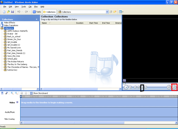
The little button in the red rectangle is the 'Take Picture' button, and it is your best friend. :D
The little button in the black rectangle is the 'Next Frame' button, which is your other best friend.
Move the slider to where the clip you want to use is, and start taking pictures. Make sure to note whether there is movement taking place in each frame; as in, if the picture's changed in any way. If not, click the 'next frame' button until there is; you don't need extra frames clogging up your animation. It'll just increase the file size.
Save all the frames you need until the sequence you want is complete.
If you don't have this program...
There's a whole section in the memories on screencapping at icon_tutorial.
-
Once you've got all your frames saved, it's time to open up the ole' GIMP.
Start by opening the first frame in your animation. Don't worry about how big the file size is just yet - we'll fix that. Then, open all the others as layers by using the File -- Open As Layer option. When you're finished, your layer palette should look something like this.
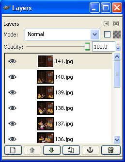
Your animation should start at the background frame and end at the last frame added.
Next, make sure you're on the top layer, and crop the image however you wish. All the other layers will be cropped as well.
Same thing with resizing. It can be whatever size you feel comfortable with, but if you want your clip to work with the frame I'm about to provide for you, it needs to be around 60 x 60.
Now, comes the tedious part. If, for whatever reason, the quality is not that great, and you want to spruce it up a little - as in, brightness/contrast, sharpening, etc - you're going to have to perform the action on every single frame.
For this particular animation, all that I see that is necessary is some sharpening.
Once you're done with that, you're ready to add your border.
Here is the one that I use -
It came from sidewalk_doctor, who used it for their own mini-movie tutorial in Adode ImageReady. I hope he/she doesn't mind that I'm using it.
You can't tell on this white background, but the middle of the frame is transparent. Something I learned early on while teaching myself how to make animations was that borders won't work unless the part you want the animation to show through is transparent. Who knew?
Open it as a new layer in the file.
And now, another tedious part. For the animation to be consistent, duplicate the border so that there's enough for each frame. Then, move each one using the arrows on your layers palette to a specific frame; then right-click and select Merge Layer. Repeat this step until every frame has its own border. Make sure to leave one border without any frame - you'll need it for the text frame you're about to create.
let's take another look at your layers palette.
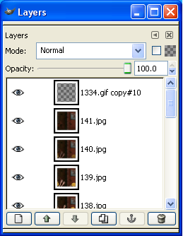
Not too different. But do make sure to check that you haven't left a frame without a border. It'll seriously screw up your animation in the end.
Now it's time for the text. Create a new 60x60 layer and fill it with white.
Then, use the text tool to create a new text layer. For my icon, I used Comic Sans MS at 13 pt. Because I didn't like how the words were spaced, I actually created a layer for each seperate word, but this is not necessary, of course. ;D I then lowered the text's opacity to 57% to give it a softer look. Make sure to place the extra frame layer on top (but don't merge it just yet) so that you can see if any of the letters stick out of the border.
This is what my text layer looks like...

Now, for a very important step - make sure to merge your text layer with your white layer. If you do not do this, your text will not show up!
Then, merge it with your border.
An update of the layers palette...
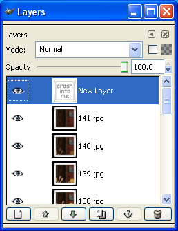
Now, we're in the homestretch! ;D
Make sure you have all your borders, your text is merged with a white layer, and everything is fine - then, find and click on this command.
Filters - Animation - Optimize (As GIF)
This is going to create a whole new image that is identical to the whole one - except for one thing.
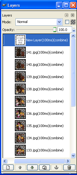
You will see that now, there are speeds listed on each frame. This is how long each one will be on the screen.
The speeds you want to use for your frames is completely up to you. In my experience, though, if you want to have a smooth animation, leave it like it's set - at 100ms. If you think it moves a little fast, try 150ms.
I do, however, change my text layer to 1000ms. If you don't, you're going to end up with something that looks like this...

...which you definitely don't want.
When you have all your speeds set, you're pretty much finished! Click on File - Save As and change your file type to .gif.
This screen will pop up...
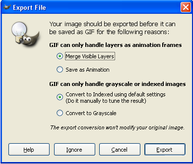
Change 'merge visible layers' to 'save as animation', and leave the other option as it is.
Then, this screen...
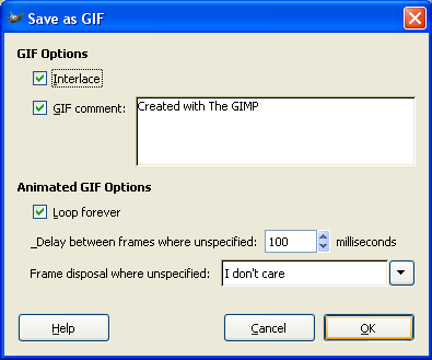
Make SURE that Interlace and Loop Forever are checked. Sometimes, they aren't. I don't think it matters if the middle one is.
And...there you are!

It's not my best (the images could be fixed up a little more) but it serves its purpose well enough.
Two more things you might want to know about...
-- The only real flaw with icons made like this is their size. You can't see it on this background, but the frame is only 60x60, so your icon will come out that size. I don't know if that bothers anyone that the icons will be so small - it is possible to work with a larger frame, but you have to 1, enlarge your canvas to 100x100 and 2, move every single frame into the new transparent spot. Tackle it if you'd like.)
-- Once you've saved your animation, make sure and check out how big the file size is. If it's over 40kb, it won't upload to Livejournal. The only way to make it smaller is to go back and remove some of the frames. If you're forced to do this, look for frames that are very, very close to other frames - as in, the picture hasn't changed much. This way, you can prevent your animation from becoming more jerky and less fluid. The one I made came out to around 35kb.
*deep breath*
I'm not very good at writing tutorials, so if anything I said was unclear in any way, just ask me to explain it and I gladly will. :D I hope GIMP users get some use out of this.

...in GIMP 2.0.
I spent four hours teaching myself how to do this, and because I've never actually seen an animation tutorial quite like this for GIMP, I thought it might be appreciated. :D
Plus - I know that there may be some more animation-savvy users out there who may know a quicker, less tedious way of doing this.
We're going to be making this -

- in GIMP 2.0.
You will also need some sort of video clip on your computer, and a way of making caps. I use Windows Movie Maker, which, if you're running Windows, you should have installed on your computer.
A Very Short Tutorial On How To Make Caps In Windows Movie Maker
(Skip this step if you already have a perfectly fine process for making caps, already know how to use WMM to make caps, and/or aren't running Windows.)
Import your video into the program by clicking on File -- Import Into Collections. Once it's in the program, drag the file onto the storyboard. The first frame should appear in the video slot overhead.

The little button in the red rectangle is the 'Take Picture' button, and it is your best friend. :D
The little button in the black rectangle is the 'Next Frame' button, which is your other best friend.
Move the slider to where the clip you want to use is, and start taking pictures. Make sure to note whether there is movement taking place in each frame; as in, if the picture's changed in any way. If not, click the 'next frame' button until there is; you don't need extra frames clogging up your animation. It'll just increase the file size.
Save all the frames you need until the sequence you want is complete.
If you don't have this program...
There's a whole section in the memories on screencapping at icon_tutorial.
-
Once you've got all your frames saved, it's time to open up the ole' GIMP.
Start by opening the first frame in your animation. Don't worry about how big the file size is just yet - we'll fix that. Then, open all the others as layers by using the File -- Open As Layer option. When you're finished, your layer palette should look something like this.

Your animation should start at the background frame and end at the last frame added.
Next, make sure you're on the top layer, and crop the image however you wish. All the other layers will be cropped as well.
Same thing with resizing. It can be whatever size you feel comfortable with, but if you want your clip to work with the frame I'm about to provide for you, it needs to be around 60 x 60.
Now, comes the tedious part. If, for whatever reason, the quality is not that great, and you want to spruce it up a little - as in, brightness/contrast, sharpening, etc - you're going to have to perform the action on every single frame.
For this particular animation, all that I see that is necessary is some sharpening.
Once you're done with that, you're ready to add your border.
Here is the one that I use -

It came from sidewalk_doctor, who used it for their own mini-movie tutorial in Adode ImageReady. I hope he/she doesn't mind that I'm using it.
You can't tell on this white background, but the middle of the frame is transparent. Something I learned early on while teaching myself how to make animations was that borders won't work unless the part you want the animation to show through is transparent. Who knew?
Open it as a new layer in the file.
And now, another tedious part. For the animation to be consistent, duplicate the border so that there's enough for each frame. Then, move each one using the arrows on your layers palette to a specific frame; then right-click and select Merge Layer. Repeat this step until every frame has its own border. Make sure to leave one border without any frame - you'll need it for the text frame you're about to create.
let's take another look at your layers palette.

Not too different. But do make sure to check that you haven't left a frame without a border. It'll seriously screw up your animation in the end.
Now it's time for the text. Create a new 60x60 layer and fill it with white.
Then, use the text tool to create a new text layer. For my icon, I used Comic Sans MS at 13 pt. Because I didn't like how the words were spaced, I actually created a layer for each seperate word, but this is not necessary, of course. ;D I then lowered the text's opacity to 57% to give it a softer look. Make sure to place the extra frame layer on top (but don't merge it just yet) so that you can see if any of the letters stick out of the border.
This is what my text layer looks like...

Now, for a very important step - make sure to merge your text layer with your white layer. If you do not do this, your text will not show up!
Then, merge it with your border.
An update of the layers palette...

Now, we're in the homestretch! ;D
Make sure you have all your borders, your text is merged with a white layer, and everything is fine - then, find and click on this command.
Filters - Animation - Optimize (As GIF)
This is going to create a whole new image that is identical to the whole one - except for one thing.

You will see that now, there are speeds listed on each frame. This is how long each one will be on the screen.
The speeds you want to use for your frames is completely up to you. In my experience, though, if you want to have a smooth animation, leave it like it's set - at 100ms. If you think it moves a little fast, try 150ms.
I do, however, change my text layer to 1000ms. If you don't, you're going to end up with something that looks like this...

...which you definitely don't want.
When you have all your speeds set, you're pretty much finished! Click on File - Save As and change your file type to .gif.
This screen will pop up...

Change 'merge visible layers' to 'save as animation', and leave the other option as it is.
Then, this screen...

Make SURE that Interlace and Loop Forever are checked. Sometimes, they aren't. I don't think it matters if the middle one is.
And...there you are!

It's not my best (the images could be fixed up a little more) but it serves its purpose well enough.
Two more things you might want to know about...
-- The only real flaw with icons made like this is their size. You can't see it on this background, but the frame is only 60x60, so your icon will come out that size. I don't know if that bothers anyone that the icons will be so small - it is possible to work with a larger frame, but you have to 1, enlarge your canvas to 100x100 and 2, move every single frame into the new transparent spot. Tackle it if you'd like.)
-- Once you've saved your animation, make sure and check out how big the file size is. If it's over 40kb, it won't upload to Livejournal. The only way to make it smaller is to go back and remove some of the frames. If you're forced to do this, look for frames that are very, very close to other frames - as in, the picture hasn't changed much. This way, you can prevent your animation from becoming more jerky and less fluid. The one I made came out to around 35kb.
*deep breath*
I'm not very good at writing tutorials, so if anything I said was unclear in any way, just ask me to explain it and I gladly will. :D I hope GIMP users get some use out of this.