alleycatfish
in
itut
Tutorial: Tips and Tricks for Photoshop
Tutorial Type: Program
Skill level: Any, really.
Program used: PSCS2
Notes: These are just a few tips and tricks for Photoshop. I use CS2, but I think these should work on all versions. If not, let me know. I don't know how well this will translate to other programs, sorry!
Under the cut: Easy B&W from a Color Image, Levels, Curved Text
Easy B&W from a Color Image:
Desaturating a color image usually leaves it dull. To fix that, one would have to fiddle around with brightness/contrast or other tools. Why do that when all you have to do is make an adjustment layer?
I'll start with this image:
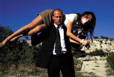
This is the image desaturated:
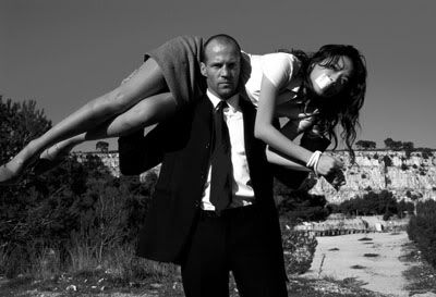
Not so pretty.
Go to Layer>>New Adjustment Layer>>Channel Mixer OR click on the half-black/half-white circle at the bottom of the layers window.
When the window pops up, make sure the red is set to 100%, check the little box beside Monochrome and click ok.
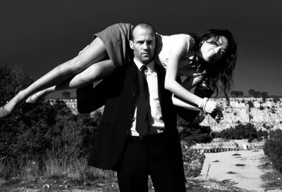
Nice, yeah?
Another trick with this Channel Mixer layer:
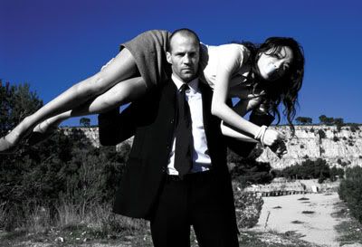
To get this effect, just change the Channel Mixer layer to lighten - it will get rid of all colors but blue (notice his shirt still has a blue tint).
If you change the red back to 0%, green to 0%, and blue to 100%, it will turn the sky gray (while still on lighten mode).
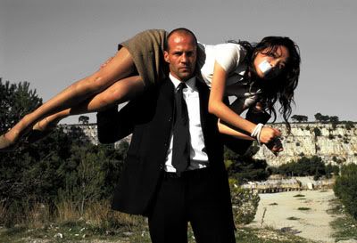
Fun stuff.
Keeping with the Adjustment Layers - let's move on to Levels:
To me, Levels are like the bastard child(ren?) of Curves. They are much easier to work with but are less exact than Curves.
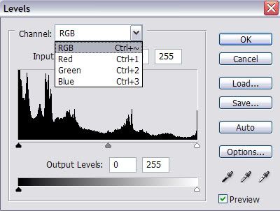
There are 3 different adjustment sliders:
The Black - Shadows
The Grey - Midtones
The White - Highlights
In RGB mode, moving the sliders to the right will make the icon darker - moved to the left will lighten.
In Red mode, moving the sliders to the right will give a tealish coloring - moving to the left will redden.
In Green mode, moving the sliders to the right will give a magenta coloring - moving to the left will green.
In Blue mode, moving the sliders to the right will give a yellow coloring - moving to the left will be bluish.
Play around until you are happy with the results.
Before:
After:
Settings for the after icon:
RGB: 0, 1.51, 204
Red: 22, 0.85, 255
Green: 24, 1.00, 225
Blue: 0, 1.15, 220
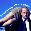
For the last tip/trick, I will show how to do curved text. When I read this tutorial by swirlin, she mentioned using paths to give shape/tilt/whatever to text. Here's how to do it.
First, you must make a new path. To do so, go to your layers window, click on the 'paths' tab, and click the square icon at the bottom.
Choose the pen tool and make a line where you want the text.

Now choose the text tool and move the cursor over the pen-line until it changes. Type in whatever, and there you go.
Feedback/questions are always welcome!
Skill level: Any, really.
Program used: PSCS2
Notes: These are just a few tips and tricks for Photoshop. I use CS2, but I think these should work on all versions. If not, let me know. I don't know how well this will translate to other programs, sorry!
Under the cut: Easy B&W from a Color Image, Levels, Curved Text
Easy B&W from a Color Image:
Desaturating a color image usually leaves it dull. To fix that, one would have to fiddle around with brightness/contrast or other tools. Why do that when all you have to do is make an adjustment layer?
I'll start with this image:

This is the image desaturated:

Not so pretty.
Go to Layer>>New Adjustment Layer>>Channel Mixer OR click on the half-black/half-white circle at the bottom of the layers window.
When the window pops up, make sure the red is set to 100%, check the little box beside Monochrome and click ok.

Nice, yeah?
Another trick with this Channel Mixer layer:

To get this effect, just change the Channel Mixer layer to lighten - it will get rid of all colors but blue (notice his shirt still has a blue tint).
If you change the red back to 0%, green to 0%, and blue to 100%, it will turn the sky gray (while still on lighten mode).

Fun stuff.
Keeping with the Adjustment Layers - let's move on to Levels:
To me, Levels are like the bastard child(ren?) of Curves. They are much easier to work with but are less exact than Curves.

There are 3 different adjustment sliders:
The Black - Shadows
The Grey - Midtones
The White - Highlights
In RGB mode, moving the sliders to the right will make the icon darker - moved to the left will lighten.
In Red mode, moving the sliders to the right will give a tealish coloring - moving to the left will redden.
In Green mode, moving the sliders to the right will give a magenta coloring - moving to the left will green.
In Blue mode, moving the sliders to the right will give a yellow coloring - moving to the left will be bluish.
Play around until you are happy with the results.
Before:
After:
Settings for the after icon:
RGB: 0, 1.51, 204
Red: 22, 0.85, 255
Green: 24, 1.00, 225
Blue: 0, 1.15, 220
For the last tip/trick, I will show how to do curved text. When I read this tutorial by swirlin, she mentioned using paths to give shape/tilt/whatever to text. Here's how to do it.
First, you must make a new path. To do so, go to your layers window, click on the 'paths' tab, and click the square icon at the bottom.
Choose the pen tool and make a line where you want the text.
Now choose the text tool and move the cursor over the pen-line until it changes. Type in whatever, and there you go.
Feedback/questions are always welcome!