my first icon tutorial :o
Tutorial for this icon in PS7:

1) I start off with this image (image credit goes to emmy-rossum.net). I resize it to 45% and then I crop it to make the image below.

(base/background layer)
2) I apply the following gradients (all made by crumblingwalls and theonewithicons) at the following settings.

Linear Dodge
(layer 1)

Hard Light
(layer 2)

Pin Light
(layer 3)

Overlay, 47% opacity
(layer 4)
3) Next I use a brush by innocenceagain (download here; the thumbnail of the brush I'm talking about looks like this). I apply it in white at 70% opacity on layer 5. Now my icon looks like this:

4) Then I use a text brush which I believe is by ohpaintbrush (download here) and a heart brush by teh_indy (download here) resized to 59px (layer 6) at the color #FA5A27 and 78% opacity.
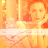
5) Then I flatten the whole image (image > flatten image) so it's all one layer. Duplicate the layer twice so you have three layers: background, background copy, and background copy 2.
6) Move background copy 2 a little to the left. You don't have to move it the exact pixels as I've moved mine, but here's what mine looks like now:

7) Now move background copy to the right until it looks okay. Now the icon looks like this:

8) Now I make a new layer (it will be automatically titled layer 1 by photoshop) and select a strip of area where background copy 2 and background copy meet. You don't have to do it exactaly like what I have, but this is what I selected:
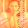
9) Now I use the gradient I last used (shown below) and used it to fill in the selected area. Deselect once you've filled it in (ctrl+d). Set the layer to soft light.

(what it looks like with the settings set to "normal". You need to set it to soft light though.)
10) Duplicate layer 1. Now you should have background, background copy, background copy 2, layer 1, and layer 1 copy. Set layer 1 copy to hard light, 39% opacity. Move it to the left a little. Now the icon looks like this:

11) I make a new layer (layer 2) and use another one of those flashy brushes from the set I was talking about before (this time the thumbnail looks like this) at white, opacity 64%. Now it looks like this:
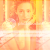
12) I decide I don't like how the images are positioned, so I decide to move background copy to the left a little and also move background copy 2 to the left a little so it's aligned right. I also move layer 1 and layer 1 copy (the two gradient strips) so they're aligned where the two images meet. Now the icon looks like this:

13) I make a new layer (layer 3) and I select another area. See below:

Fill it in with the same gradient we used for the other strips.

Deselect (ctrl+d), set it to pin light and opacity 35%.
14) Now you get to apply font. I used Georgia, bold italic, size 9, color #E45C2F, opacity 89%. You can, of course, put antything you want, but I put "pretty". Yay, now you have a finished product!

How to use a tutorial: (quoted from teh_indy)
If you come across a full icon tutorial, do not follow each step exactly to create an icon that looks just like the one in the tutorial. Instead, use certain steps to learn new things and develop your own ways of applying them. It’s not cool to see a hundred icons that all look the same.
I'd love to see what icons you've created using this tutorial. :D Feel free to comment with them to show me!
(oh, and adding to memories is more than fine with me. ;))
<3 oddshiz
ps: check out antmicontest
1) I start off with this image (image credit goes to emmy-rossum.net). I resize it to 45% and then I crop it to make the image below.

(base/background layer)
2) I apply the following gradients (all made by crumblingwalls and theonewithicons) at the following settings.

Linear Dodge
(layer 1)

Hard Light
(layer 2)

Pin Light
(layer 3)

Overlay, 47% opacity
(layer 4)
3) Next I use a brush by innocenceagain (download here; the thumbnail of the brush I'm talking about looks like this). I apply it in white at 70% opacity on layer 5. Now my icon looks like this:

4) Then I use a text brush which I believe is by ohpaintbrush (download here) and a heart brush by teh_indy (download here) resized to 59px (layer 6) at the color #FA5A27 and 78% opacity.

5) Then I flatten the whole image (image > flatten image) so it's all one layer. Duplicate the layer twice so you have three layers: background, background copy, and background copy 2.
6) Move background copy 2 a little to the left. You don't have to move it the exact pixels as I've moved mine, but here's what mine looks like now:

7) Now move background copy to the right until it looks okay. Now the icon looks like this:

8) Now I make a new layer (it will be automatically titled layer 1 by photoshop) and select a strip of area where background copy 2 and background copy meet. You don't have to do it exactaly like what I have, but this is what I selected:

9) Now I use the gradient I last used (shown below) and used it to fill in the selected area. Deselect once you've filled it in (ctrl+d). Set the layer to soft light.

(what it looks like with the settings set to "normal". You need to set it to soft light though.)
10) Duplicate layer 1. Now you should have background, background copy, background copy 2, layer 1, and layer 1 copy. Set layer 1 copy to hard light, 39% opacity. Move it to the left a little. Now the icon looks like this:

11) I make a new layer (layer 2) and use another one of those flashy brushes from the set I was talking about before (this time the thumbnail looks like this) at white, opacity 64%. Now it looks like this:

12) I decide I don't like how the images are positioned, so I decide to move background copy to the left a little and also move background copy 2 to the left a little so it's aligned right. I also move layer 1 and layer 1 copy (the two gradient strips) so they're aligned where the two images meet. Now the icon looks like this:

13) I make a new layer (layer 3) and I select another area. See below:

Fill it in with the same gradient we used for the other strips.

Deselect (ctrl+d), set it to pin light and opacity 35%.
14) Now you get to apply font. I used Georgia, bold italic, size 9, color #E45C2F, opacity 89%. You can, of course, put antything you want, but I put "pretty". Yay, now you have a finished product!
How to use a tutorial: (quoted from teh_indy)
If you come across a full icon tutorial, do not follow each step exactly to create an icon that looks just like the one in the tutorial. Instead, use certain steps to learn new things and develop your own ways of applying them. It’s not cool to see a hundred icons that all look the same.
I'd love to see what icons you've created using this tutorial. :D Feel free to comment with them to show me!
(oh, and adding to memories is more than fine with me. ;))
<3 oddshiz
ps: check out antmicontest