Results Challenge # 1 Session Two
Hello people! Challenge # 1 is closed. This time we have one eliminated and two winners.
Eliminated:

overevery
Thanks for participation! Hope to see you next session!
People's choice:
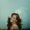
vol4itca
Banner
Congrats!!!
Mod's choice:
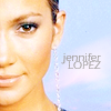
hel_lansky - Cropping is great, soft colouring attracts icon so much. It looks original.
Banner
Results:
1. + +
2.
3. + + + + +
4. - / +
5. + +
6. - - / +
7. - - / + +
8. - - - / + +
9. - - - / +
10. -
11. - - - - - / +
12. - - - / +
13. +
14. +
Reasons:
negative:
# 4
- the coloring is very unflattering.
# 6
- The icon is way too washed out
- too pale
# 7
- the coloring isn't very good at all, it's very unflattering.
- the coloring really makes jennifer's skin tone unflattering and the cropping is unoriginal.
# 8
- oversharpened, textures and colors dont match each other, text and pic in circle and lights are overloading icon.
- too sharpened and busy
- too much red color, oversharpen (especially her hair), textures distract the icon
# 9
- icon is too dark
- the black part is overpowering the icon
- too much blue
# 10
- i like the concept, but the texture is doesn't compliment the picture of jennifer at all.
# 11
- oversharpened in some parts, color seem to be kind of "dirty-grey" and it doesnt bright or contrast the pic enough so it looks like dark and crop's not original.
- The icon is too softned.
- if there'd be some coloring or textures icon didn't become worse
- icon look really simple and her face is blurry as waxen complexion
- too pale colouring and cropping is to central, her forehead is damaged.
# 12
- her skin it too blue, also the lights are partially on the pic, they'd look better only in the background
- too dark and too much blue and yellow in colouring (looks so unnatural), light texture doesn't fit
- it's too dark
positive:
# 1
- enough bright and contrasted, soft coloring dont overload picture and makes it gentle and relaxed. love it :)
- great cropping. :)
# 3
- very nice crop, the text/tiny text fits very well; a little on the dark side, but still great.
- great cropping and coloring
- mostly because of great long cropping and text use. Icon looks so amazing!
- though it's dark, love colouring and textures used
- the coloring is nicely done and the text in the background is perfect.
# 4
- excellent use of text and tiny text, crop is good
# 5
- I like the place of text and coloring
- good texture use and colouring. Also I like the cropping, it's so effective!
# 6
- the coloring and texture are very unique, it fits well.
# 7
- simple and great soft coloring, catches attention and calms eyes.
- Great coloring!
# 8
- style of this icon is very nice^^
- creative and neat composition
# 9
- Fun and creative use of textures
# 11
- simply but nice coloring, i like it
# 12
- nice composition
# 13
- fantastic use of texture
# 14
- i like the luminosity of this icon
And pimping:
Join second session @ hathaway_lims!

Eliminated:

overevery
Thanks for participation! Hope to see you next session!
People's choice:

vol4itca
Banner
Congrats!!!
Mod's choice:

hel_lansky - Cropping is great, soft colouring attracts icon so much. It looks original.
Banner
Results:
1. + +
2.
3. + + + + +
4. - / +
5. + +
6. - - / +
7. - - / + +
8. - - - / + +
9. - - - / +
10. -
11. - - - - - / +
12. - - - / +
13. +
14. +
Reasons:
negative:
# 4
- the coloring is very unflattering.
# 6
- The icon is way too washed out
- too pale
# 7
- the coloring isn't very good at all, it's very unflattering.
- the coloring really makes jennifer's skin tone unflattering and the cropping is unoriginal.
# 8
- oversharpened, textures and colors dont match each other, text and pic in circle and lights are overloading icon.
- too sharpened and busy
- too much red color, oversharpen (especially her hair), textures distract the icon
# 9
- icon is too dark
- the black part is overpowering the icon
- too much blue
# 10
- i like the concept, but the texture is doesn't compliment the picture of jennifer at all.
# 11
- oversharpened in some parts, color seem to be kind of "dirty-grey" and it doesnt bright or contrast the pic enough so it looks like dark and crop's not original.
- The icon is too softned.
- if there'd be some coloring or textures icon didn't become worse
- icon look really simple and her face is blurry as waxen complexion
- too pale colouring and cropping is to central, her forehead is damaged.
# 12
- her skin it too blue, also the lights are partially on the pic, they'd look better only in the background
- too dark and too much blue and yellow in colouring (looks so unnatural), light texture doesn't fit
- it's too dark
positive:
# 1
- enough bright and contrasted, soft coloring dont overload picture and makes it gentle and relaxed. love it :)
- great cropping. :)
# 3
- very nice crop, the text/tiny text fits very well; a little on the dark side, but still great.
- great cropping and coloring
- mostly because of great long cropping and text use. Icon looks so amazing!
- though it's dark, love colouring and textures used
- the coloring is nicely done and the text in the background is perfect.
# 4
- excellent use of text and tiny text, crop is good
# 5
- I like the place of text and coloring
- good texture use and colouring. Also I like the cropping, it's so effective!
# 6
- the coloring and texture are very unique, it fits well.
# 7
- simple and great soft coloring, catches attention and calms eyes.
- Great coloring!
# 8
- style of this icon is very nice^^
- creative and neat composition
# 9
- Fun and creative use of textures
# 11
- simply but nice coloring, i like it
# 12
- nice composition
# 13
- fantastic use of texture
# 14
- i like the luminosity of this icon
And pimping:
Join second session @ hathaway_lims!
