Results Challenge # 6 Session Three
Hello everyone! I'm closing Challenge # 6 Session Three. Actually we don't have enough votes, but I think waiting for your votes more is useless.
This time we have one eliminated and two winners.
Eliminated:
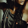
kreengles
So sorry! Thanks for participation! Hope to see you next session!
People's choice:
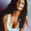
ira_seregina
Banner
Congrats!!!
Mod's choice:
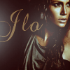
i_we_you
Скщззштоп is great, colouring is nice and soft, texture suits perfectlty!
Banner
Results:
1. -7+2=-5
2. -2+4=+2
3. -3+1=-2
4. +3
5. -3+1=-2
6. -1+3=+2
7. -1+3=+2
8. -1+1=0
Reasons:
negative:
# 1
- It's really dark and cropping half her face off looks really odd here.
- doesn't seem to have a focal point. icon is a bit dark
- the icon is overcontrasted
- too dark and the crop is really awkward - why focus on her armpit?
- Bad crop, color is too dark
- it's too dark and colorless, the texture doesn't fit the icon
- too dark, light texture doen't fit it.
# 2
- Her features are too dark, there's no equal balance of light or shade. The text takes up more space then the image itself. It steals the focus away with it's colour and font.
- the icon is oversharp
# 3
- The colouring does nothing to liven up her features. It's very plain with only one colour to define the icon. The cloudy mist(?)
texture across her chest almost proves to be unnecessary. Maybe it's wrongly positioned? Again it doesn't do anything to liven up the icon
- Bad color, textures don't fit the icon
- coloring is kinda dull
# 5
- coloring gives jlo an green hue that makes her look a bit sickly. the text/box seem out of place.
- poor coloring, too much blue in her face
- the text box doesn't look necessary, it's distracting
# 6
- Her face is way too over lightened and background makes this visible even more.
# 7
- the second lo isn't good really,it doesn't fit the icon, neither the tiny-text does
# 8
- a little oversharpen, text doesn't go
positive:
# 1
- It's strangely compositioned, which is a nice change. It has a unique cropping and that's what really stood out to me. The use of contrast and brightness gives it a kind of sensual mood. Also, with the addition of pixie lights sprinkled across the icon it gives it a nice, mellow touch. Good work.
- interesting crop and the lights are well placed and complement the icon
# 2
- wonderful cropping and the text really flows with the icon.
- simple, elegant, and dramatic
- use of text is really amazing
- the icon has atmosphere, gorgeous use of light; maybe the text is a bit too big, but font choice is great
# 3
- colors are very good, and using of textures is really nice
# 4
- great colouring and cropping
- Very good color
- amazing colouring!
# 5
- very good coloring
# 6
- good colouring and use of tiny text
- fantastic use of color
- Nice color and texture use
# 7
- really original to combinate two images, it's works really well here.
- This icon deals with a lot of different elements. The maker did a beautiful job with the back image. The blue/white colour really brings out her features. The littler images in the front looks like a magazine article. Especially with how the image is cropped and desaturated. It's very well compositioned. Nice job.
- interesting composition, good colouring
# 8
- cropping is a bit safe, but the coloring and use of light textures really work well for the icon.
This time we have one eliminated and two winners.
Eliminated:

kreengles
So sorry! Thanks for participation! Hope to see you next session!
People's choice:

ira_seregina
Banner
Congrats!!!
Mod's choice:

i_we_you
Скщззштоп is great, colouring is nice and soft, texture suits perfectlty!
Banner
Results:
1. -7+2=-5
2. -2+4=+2
3. -3+1=-2
4. +3
5. -3+1=-2
6. -1+3=+2
7. -1+3=+2
8. -1+1=0
Reasons:
negative:
# 1
- It's really dark and cropping half her face off looks really odd here.
- doesn't seem to have a focal point. icon is a bit dark
- the icon is overcontrasted
- too dark and the crop is really awkward - why focus on her armpit?
- Bad crop, color is too dark
- it's too dark and colorless, the texture doesn't fit the icon
- too dark, light texture doen't fit it.
# 2
- Her features are too dark, there's no equal balance of light or shade. The text takes up more space then the image itself. It steals the focus away with it's colour and font.
- the icon is oversharp
# 3
- The colouring does nothing to liven up her features. It's very plain with only one colour to define the icon. The cloudy mist(?)
texture across her chest almost proves to be unnecessary. Maybe it's wrongly positioned? Again it doesn't do anything to liven up the icon
- Bad color, textures don't fit the icon
- coloring is kinda dull
# 5
- coloring gives jlo an green hue that makes her look a bit sickly. the text/box seem out of place.
- poor coloring, too much blue in her face
- the text box doesn't look necessary, it's distracting
# 6
- Her face is way too over lightened and background makes this visible even more.
# 7
- the second lo isn't good really,it doesn't fit the icon, neither the tiny-text does
# 8
- a little oversharpen, text doesn't go
positive:
# 1
- It's strangely compositioned, which is a nice change. It has a unique cropping and that's what really stood out to me. The use of contrast and brightness gives it a kind of sensual mood. Also, with the addition of pixie lights sprinkled across the icon it gives it a nice, mellow touch. Good work.
- interesting crop and the lights are well placed and complement the icon
# 2
- wonderful cropping and the text really flows with the icon.
- simple, elegant, and dramatic
- use of text is really amazing
- the icon has atmosphere, gorgeous use of light; maybe the text is a bit too big, but font choice is great
# 3
- colors are very good, and using of textures is really nice
# 4
- great colouring and cropping
- Very good color
- amazing colouring!
# 5
- very good coloring
# 6
- good colouring and use of tiny text
- fantastic use of color
- Nice color and texture use
# 7
- really original to combinate two images, it's works really well here.
- This icon deals with a lot of different elements. The maker did a beautiful job with the back image. The blue/white colour really brings out her features. The littler images in the front looks like a magazine article. Especially with how the image is cropped and desaturated. It's very well compositioned. Nice job.
- interesting composition, good colouring
# 8
- cropping is a bit safe, but the coloring and use of light textures really work well for the icon.