Tutorial: Time Stands Still
So we're going from this
to my icon (that I'm posting with)
which won this: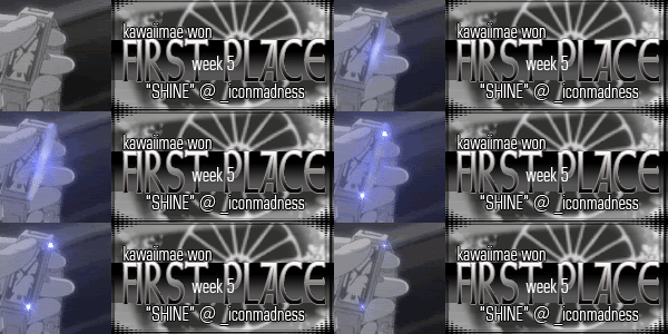
(banner maker sky_dark)
using the GIMP. I'll warn you this right now -
1) it's probably not translatable, I've never heard of a 'Supernova' filter elsewhere.
2) it's very time consuming.
3) it's very sloppy, as a tutorial goes. I didn't write down every step along the way because it was so complex and I really didn't know what I was doing, and I'm almost positive following this tutorial will come up with a different result...
x-posted to gimp_users, icon_tutorial, itutorial (upon approval)
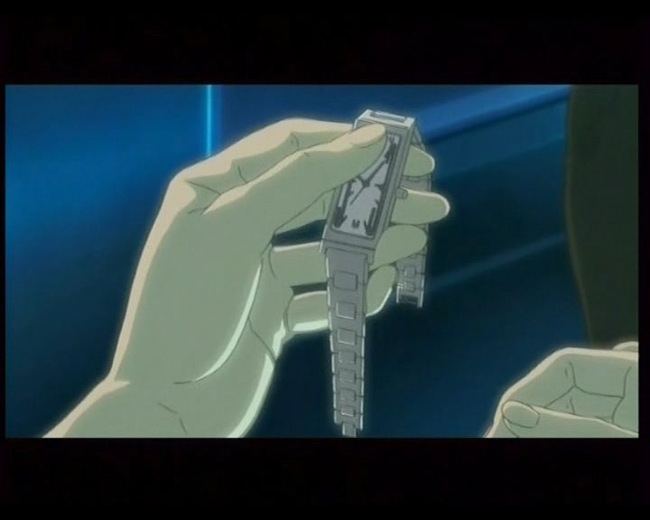
First, the screenshot, from episode 25 of Ghost in the Shell: Stand Alone Complex 1st GiG. I think someone on koukakukidoutai gave me this one.
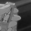
Crop to 100x100 pixels, then go to Layers->Colors->Desaturate, to get this. (For your base, you may not want/need to desaturate - however, what I found was that otherwise the icon gets so *big* it's somewhat ridiculous.)
Duplicate this base, a *lot* - I think I used four, but originally created six. You can always delete extra bases, anyway.
Zoom in to 400%, and find the coordinates for where you want your flare to begin - in this case, the middle of the right edge of the icon. How to do this? I personally use the pointer on the 'Rectangular Marquee' tool and note the coordinates on the bottom of my screen, like so:
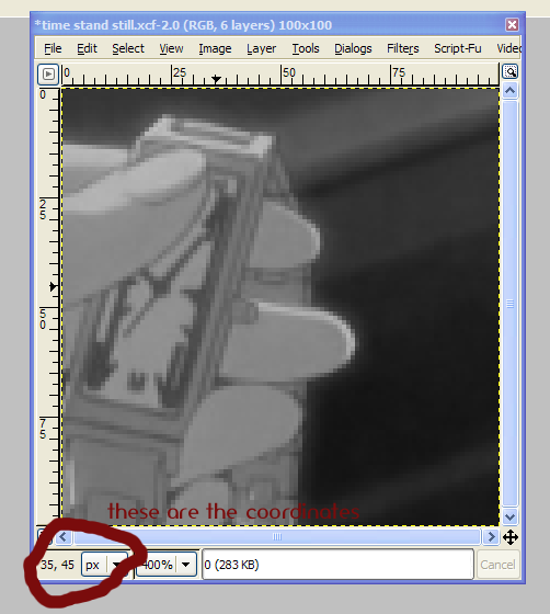
Write these down somewhere, and mark them as 'Frame 1 coordinates.'
Depending on how your flare works, you're going to need a certain number of coordinates - I use five. They are:
frame 1: (35, 25)
frame 2: (40, 35) and (35, 60)
frames 3-5: (25, 75) and (45, 20)
Control-click on the 'eye' of the second-to-last layer making it the only one visible. Make sure it's the one selected to be worked on, too. (Obviously you won't be able to tell at this point, but trust me, you will in a bit.)
Now create a new layer directly above this one layer you're working on.
Now, with those coordinates written down where you can see them, go to Filters -> Light Effects -> Supernova...
You'll end up with something like this.
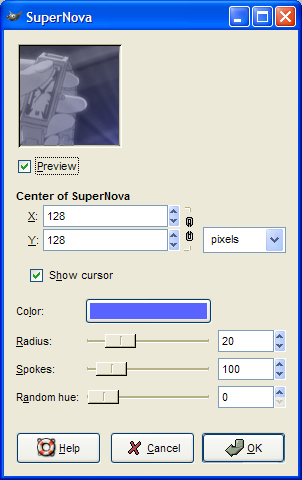
For the 'Center of Supernova' boxes, put in the numbers of your first coordinates.
I kept the light blue color - you can change it if you like, for a different feel.
Keep the radius low (I put it on 5 for this layer) - if it's too bright, the icon lighting wil be too light, and that's bad.
I used 100 spokes; more is excessive, or at least I think so, it's up to you. Write down this number underneath your coordinates; you'll need it for that fadeout in the end.
'Random hue' adds some color in related shades to your spokes - I'd recommend not to use it for this, though for other icons it creates really cool effects.
So now you'll get something a little like this.
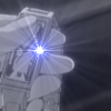
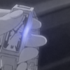
Now here comes either the fun part or the messy part, depending on who you talk to. Take your 'Smudge' tool - it looks like a finger poking at something. Using this, the Blur tool (it looks like a water droplet) occasionally, and the Dodge tool (it looks like a gray stick in some sort of black circle) a bit liberally, smudge out that Supernova until it merely looks like shine on an icon. (If it's too shiny, feel free to just erase some and smudge over that.) I can't tell you how to do this, unfortunately - just run along the edge of the object, and keep in mind what you're creating. Feel free to use whatever size brush necessary, hard edge or soft edge, that sort of thing -- it's really something you learn on your own. And it takes *time*.
Perhaps you'll have something like this, perhaps you'll have something prettier.
With the Supernova'd layer selected, Merge Down and duplicate the new shiny layer.
Create a new layer right on top of *that*, and repeat Supernova *twice* (for this icon, anyway) - use the same settings, except a slightly lowered radius (I used 3), and the coordinates you wrote down earlier. Smudge that up too, to your liking. Duplicate, then merge down the bottom of these two smudgy layers.
Select an untouched base layer right above all of this insanity, create a new transparent one on top of that, and do your Supernova twice *again* - put the radius back up to 5, though, and use the new coordinates. Don't smudge this one, though. Take that duplicated last smudged Supernova and place it between the untouched base and the new sparkly Supernovas. Erase and lower opacity and whatever else you feel fit, then merge down both this and the shiny Supernova onto that untouched base.
On a layer right above *another* untouched base, repeat the Supernovas - on thse last new coordinates, exact same settings as last time. Merge down.
Yet another untouched base, new layer, repeat the Supernovas on the same coordinates - but a lowered radius. (this gives the impression that it's fading.) Merge down.
Now these are your frames (cuz you know, in the GIMP, each layer is a frame.) So now it's time to convert this thing. Go to Image -> Mode -> Indexed...., and you'll come to this.
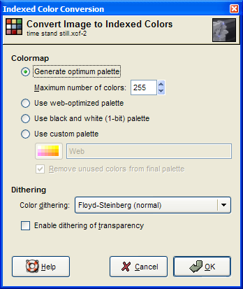
Use these settings, press OK. At this point, it may be wise to rename your layers, for easy reference - what I've done is merely numbered them, from bottom to top. Now go to Filters -> Animation -> Optimize for GIF. A new image will pop up, untitled, with each layer labeled (for example) '0(100ms)(combine)', where '0' is the original name of your frame.
ms are milliseconds - they are your measure of time per frame. 'Combine' means that each layer is transluscent and 'combines' with the last frame, rather than replacing it. The main problem is that if you keep it at 100 ms, it turns out really bad...so. I personally made each frame last for 200ms, except for the bottom one (the one without any sort of flare), which I put at 1500 ms.
Now save this as a .gif. Upon prompting, choose to 'Save as Animation', and ignore the settings (since you've manually set how long each frame is going to take, and the GIMP has already determined they will 'combine'.
Now if you're lucky, this'll automatically be under 40k. If *not*, places like Spinwave will do some compression for you by reducing colors, or you can do that yourself (by changing the number of colors you choose when indexing.)
I hope this isn't entirely useless! ^^;;;
Kawa
PS: Icon's up for grabs: just comment and credit!
to my icon (that I'm posting with)
which won this:
(banner maker sky_dark)
using the GIMP. I'll warn you this right now -
1) it's probably not translatable, I've never heard of a 'Supernova' filter elsewhere.
2) it's very time consuming.
3) it's very sloppy, as a tutorial goes. I didn't write down every step along the way because it was so complex and I really didn't know what I was doing, and I'm almost positive following this tutorial will come up with a different result...
x-posted to gimp_users, icon_tutorial, itutorial (upon approval)
First, the screenshot, from episode 25 of Ghost in the Shell: Stand Alone Complex 1st GiG. I think someone on koukakukidoutai gave me this one.
Crop to 100x100 pixels, then go to Layers->Colors->Desaturate, to get this. (For your base, you may not want/need to desaturate - however, what I found was that otherwise the icon gets so *big* it's somewhat ridiculous.)
Duplicate this base, a *lot* - I think I used four, but originally created six. You can always delete extra bases, anyway.
Zoom in to 400%, and find the coordinates for where you want your flare to begin - in this case, the middle of the right edge of the icon. How to do this? I personally use the pointer on the 'Rectangular Marquee' tool and note the coordinates on the bottom of my screen, like so:
Write these down somewhere, and mark them as 'Frame 1 coordinates.'
Depending on how your flare works, you're going to need a certain number of coordinates - I use five. They are:
frame 1: (35, 25)
frame 2: (40, 35) and (35, 60)
frames 3-5: (25, 75) and (45, 20)
Control-click on the 'eye' of the second-to-last layer making it the only one visible. Make sure it's the one selected to be worked on, too. (Obviously you won't be able to tell at this point, but trust me, you will in a bit.)
Now create a new layer directly above this one layer you're working on.
Now, with those coordinates written down where you can see them, go to Filters -> Light Effects -> Supernova...
You'll end up with something like this.
For the 'Center of Supernova' boxes, put in the numbers of your first coordinates.
I kept the light blue color - you can change it if you like, for a different feel.
Keep the radius low (I put it on 5 for this layer) - if it's too bright, the icon lighting wil be too light, and that's bad.
I used 100 spokes; more is excessive, or at least I think so, it's up to you. Write down this number underneath your coordinates; you'll need it for that fadeout in the end.
'Random hue' adds some color in related shades to your spokes - I'd recommend not to use it for this, though for other icons it creates really cool effects.
So now you'll get something a little like this.
Now here comes either the fun part or the messy part, depending on who you talk to. Take your 'Smudge' tool - it looks like a finger poking at something. Using this, the Blur tool (it looks like a water droplet) occasionally, and the Dodge tool (it looks like a gray stick in some sort of black circle) a bit liberally, smudge out that Supernova until it merely looks like shine on an icon. (If it's too shiny, feel free to just erase some and smudge over that.) I can't tell you how to do this, unfortunately - just run along the edge of the object, and keep in mind what you're creating. Feel free to use whatever size brush necessary, hard edge or soft edge, that sort of thing -- it's really something you learn on your own. And it takes *time*.
Perhaps you'll have something like this, perhaps you'll have something prettier.
With the Supernova'd layer selected, Merge Down and duplicate the new shiny layer.
Create a new layer right on top of *that*, and repeat Supernova *twice* (for this icon, anyway) - use the same settings, except a slightly lowered radius (I used 3), and the coordinates you wrote down earlier. Smudge that up too, to your liking. Duplicate, then merge down the bottom of these two smudgy layers.
Select an untouched base layer right above all of this insanity, create a new transparent one on top of that, and do your Supernova twice *again* - put the radius back up to 5, though, and use the new coordinates. Don't smudge this one, though. Take that duplicated last smudged Supernova and place it between the untouched base and the new sparkly Supernovas. Erase and lower opacity and whatever else you feel fit, then merge down both this and the shiny Supernova onto that untouched base.
On a layer right above *another* untouched base, repeat the Supernovas - on thse last new coordinates, exact same settings as last time. Merge down.
Yet another untouched base, new layer, repeat the Supernovas on the same coordinates - but a lowered radius. (this gives the impression that it's fading.) Merge down.
Now these are your frames (cuz you know, in the GIMP, each layer is a frame.) So now it's time to convert this thing. Go to Image -> Mode -> Indexed...., and you'll come to this.
Use these settings, press OK. At this point, it may be wise to rename your layers, for easy reference - what I've done is merely numbered them, from bottom to top. Now go to Filters -> Animation -> Optimize for GIF. A new image will pop up, untitled, with each layer labeled (for example) '0(100ms)(combine)', where '0' is the original name of your frame.
ms are milliseconds - they are your measure of time per frame. 'Combine' means that each layer is transluscent and 'combines' with the last frame, rather than replacing it. The main problem is that if you keep it at 100 ms, it turns out really bad...so. I personally made each frame last for 200ms, except for the bottom one (the one without any sort of flare), which I put at 1500 ms.
Now save this as a .gif. Upon prompting, choose to 'Save as Animation', and ignore the settings (since you've manually set how long each frame is going to take, and the GIMP has already determined they will 'combine'.
Now if you're lucky, this'll automatically be under 40k. If *not*, places like Spinwave will do some compression for you by reducing colors, or you can do that yourself (by changing the number of colors you choose when indexing.)
I hope this isn't entirely useless! ^^;;;
Kawa
PS: Icon's up for grabs: just comment and credit!