Eternity remixed
Still in reaction to Indigo.
Because it was requested after I mentioned that I kept every draft and variation of the eternal knot diagram, well, here they are.
For starters, the endpoint of all this. I'm going to do this in reverse order, so if you swing that way, crank the Devo and watch pieces fall away.
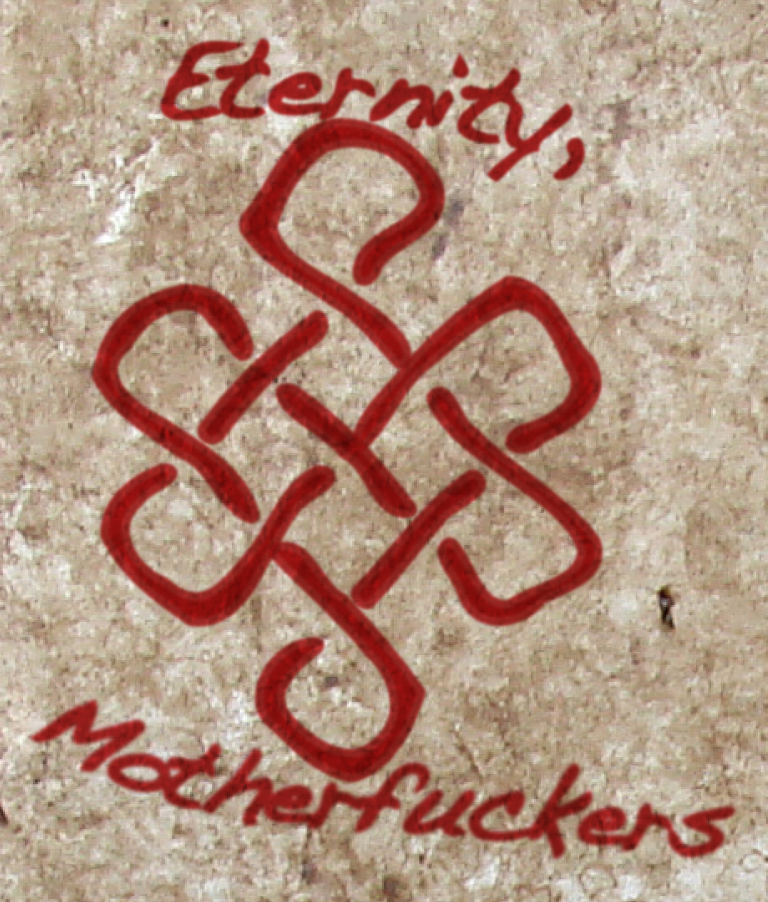
The last bit to be added was the context. A slice of a picture of a wall, a few tweaks of transparency effects and a blurred halo around all elements.
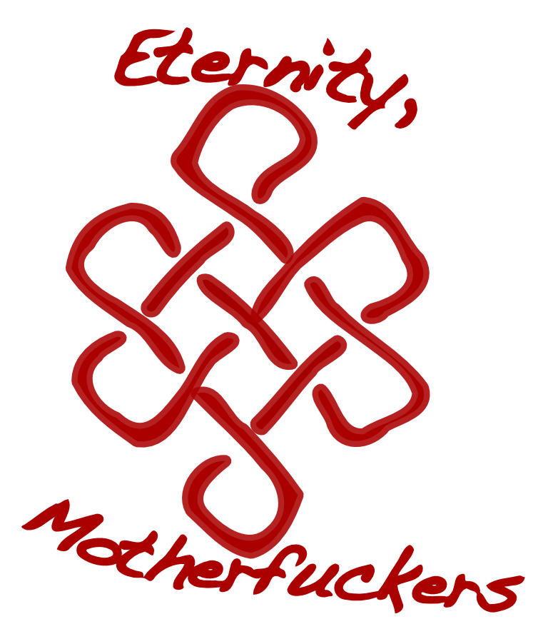
The text was changed from a clean, legible Helvetica to a handwriting font, picked for its name. Dakota.
Then, the text was laid out along a path. Approximately the path my hand follows when holding something and miming spraying letters on a wall.
Finally, each letter was converted to a filled outline and expanded until it looked, well, sloppy.

This was the big anal-retentive step. Every piece of the knot got tweaked until it actually curved and looped and looked vaguely like a brush stroke.
There's a step or two before this, namely a first drawing to remind me what the Eternal Knot is supposed to look like and a second that looks like this without the individual 'strands' showing the pattern of over and under, but they weren't important to me, so they're gone.
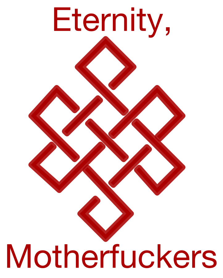
This was just a thought; a "clean version" of the design. I didn't go with it because the underlying idea, while the same, didn't disturb me enough.
This was where I stopped before. However, just for fun, I added the variant evolution below.

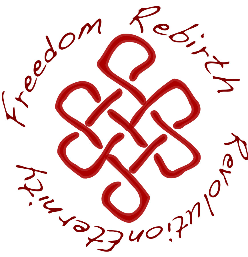
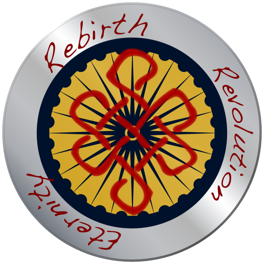
Because the previous version felt unbalanced, I decided to complete the visual pun with two more words. In retrospect, I'd consider "Rebirth. Revolution. Eternity." around the knot, with "Freedom" separate. Mostly because it doesn't really fit in the cycle.
It's there because I was trying to balance "Revolution" and "Eternity" with related words within the theme.

This time, I changed the text first. I didn't make it sloppy this time because, well, the two upside down words mean that faking 'handwritten' feels bizarre.

And the final iteration. Like a manufactured corporate logo for militant reincarnated anarchy.
Were I going somewhere further in this direction, I'd add a double ring, above and below the letters, likely with a gold/brass fill underneath the knot and the colour on the ring fading from gold to purple to recall eyebeams' pretty logo for the Antipodean. Well, and actually adjust the background accordingly, rather than having it be fitted to the version at the top of the page.
ETA: Right. Insomnia and obsession combined and got me to add what I think it would look like when paired with the Antipodean badge. "Freedom" was removed, because, in the context of the rest of the symbols, it's out of place. It was supposed to represent a form of Moksha, but willingly engaging Samsara as a revolutionary act implies rejecting Moksha.
So, yeah, fuck enlightenment until the fighting's over.
All vessel-oriented iconography was deliberately removed, to leave only a symbol of the commonwealth, defaced by subgroup and belief.
And I'm done with this, I think. As the two endpoints manage to distress me equally. Apparently it does work (for me) both as an individual statement of intent and a statement of membership in a group.
And here it is as a usericon, to complete the derivative works.
All this is why, even (especially) for a simple logo and words, I'm in the habit now of using vector graphics software. That and I still can't find the pen for my tablet.