Fonts, fonts, fonts
sgmajorshipper : Not exactly an icon tutorial request, but I was curious what some of your favorite fonts are at the moment? Or any techniques/things you like to do with text?
caution: this post is really image-heavy!
Favorite Fonts
Ironically enough - given that most of my icons are textless - I love fonts. I have so many on my computer, I have to archive them on a regular basis as having them all installed slows down my otherwise powerful iMac.
note: icons shown can be found by browsing here, larger images are from my tumblr.
My All-Time Favorite Font

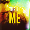
→ League Gothic
I love how it balances boldness and elegance and I have yet to find better for titles. I do have a preference for using uppercase though, and generally use it on bigger graphics rather than icons (I find it takes up a little too much space on icons)



Bold/Title Fonts

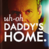
→ Twentieth Century
Probably the font I use the most on my icons! Again, I have a preference for the bold uppercase. It's pretty much my icon go to font, when all else fails :)



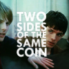
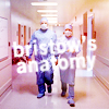


→ Nouvelle Vague
This is a new found font for me, but I have been loving it so far!
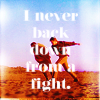
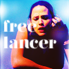


→ Museo Regular Slab Sans

→ Rockwell
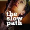
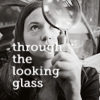
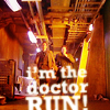
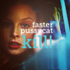


→ PTF Nordic
I don't use this as much as I used to, but it's still on my fave list!
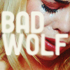
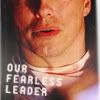

Hand Written/Script Fonts
I often hand write the text myself when I want a handwritten font, but the following fonts also do the job nicely!

→ Levi Marker
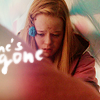


→ Bon Iver
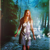


→ Rabiohead


Classic Fonts

→ Sorts Mill Goudy
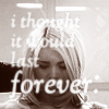
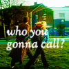

(uh-oh)

Other Fonts

→ St Marie


→ La Fraktouille

Using Fonts
→ You know how you say that if you don't have anything nice to say, don't say anything? Well regarding text on icons/graphics, I always say 'if you don't have anything smart to say, don't say anything'. That would probably be my biggest font/text tip :p
Character Toolbox

→ I like playing around with font weights & styles (bold, italic, uppercase, small caps...).
→ With handwritten fonts, playing around with the baseline can really help add an authentic look (when you write, it's rarely on a perfectly straight line)
→ Basically playing around with the settings in the character toolbox will allow for some fun results.
Blur/Soft text

→ I know some people hate blurry text, but I hate sharp text :p I always soften my text, at least lightly, with the blur tool. Tip: placing the blurred text layer under a colour edit layer will allow for some extra coloured glow/softness round the text.
caution: this post is really image-heavy!
Favorite Fonts
Ironically enough - given that most of my icons are textless - I love fonts. I have so many on my computer, I have to archive them on a regular basis as having them all installed slows down my otherwise powerful iMac.
note: icons shown can be found by browsing here, larger images are from my tumblr.
My All-Time Favorite Font

→ League Gothic
I love how it balances boldness and elegance and I have yet to find better for titles. I do have a preference for using uppercase though, and generally use it on bigger graphics rather than icons (I find it takes up a little too much space on icons)


Bold/Title Fonts

→ Twentieth Century
Probably the font I use the most on my icons! Again, I have a preference for the bold uppercase. It's pretty much my icon go to font, when all else fails :)


→ Nouvelle Vague
This is a new found font for me, but I have been loving it so far!


→ Museo Regular Slab Sans

→ Rockwell


→ PTF Nordic
I don't use this as much as I used to, but it's still on my fave list!


Hand Written/Script Fonts
I often hand write the text myself when I want a handwritten font, but the following fonts also do the job nicely!

→ Levi Marker


→ Bon Iver


→ Rabiohead


Classic Fonts

→ Sorts Mill Goudy


(uh-oh)

Other Fonts

→ St Marie


→ La Fraktouille

Using Fonts
→ You know how you say that if you don't have anything nice to say, don't say anything? Well regarding text on icons/graphics, I always say 'if you don't have anything smart to say, don't say anything'. That would probably be my biggest font/text tip :p
Character Toolbox

→ I like playing around with font weights & styles (bold, italic, uppercase, small caps...).
→ With handwritten fonts, playing around with the baseline can really help add an authentic look (when you write, it's rarely on a perfectly straight line)
→ Basically playing around with the settings in the character toolbox will allow for some fun results.
Blur/Soft text

→ I know some people hate blurry text, but I hate sharp text :p I always soften my text, at least lightly, with the blur tool. Tip: placing the blurred text layer under a colour edit layer will allow for some extra coloured glow/softness round the text.