(no subject)
ah, yes, an update from me, once again. This is just a tutorial, but an icon post will be coming up either later tonight or tomorrow morning. :)
Get a Selective Coloring look, without Selective Coloring.
From: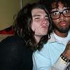
To: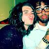
Step 1:
Prep your base. Normally, I crop, resize and sharpen mine. Depending on how dark it is, sometimes I duplicate it and set to to screen. In this case, I duplicated it and set it to Screen at 60%.
Step 2:
New Color Balance layer.
Settings:
Midtones: 40, 27, 0
Shadows: -50, 21, 51
Highlights: 0, 0, -20
Make sure Preserve Luminance is checked.
Result: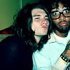
Step 3:
New layer. Fill with #9FC3F5 (
). Set on Softlight at 50%.
Result:
Step 4:
New Layer. Fill with #DEF5B7 (
). Set on Softlight at 50%.
Result:
Step 5:
New Layer. Fill with #100B4F (
). Set on Screen at 52%.
Result:
Step 6:
New Layer. Fill with #F9F0E5 (
). Set on Burn at 100%.
Result:
Step 7:
New Layer. Fill with #F6A788 (
). Set on Softlight at 100%.
Result:
Step 8:
New Layer. Fill with #DBDBDB (
). Set on Burn at 100%.
Result:
Step 9:
New Hue/Saturation/Lightness Layer. Set Saturation to +30-50 (depends on image). On this icon, I set Saturation to +40.
Result:
Optional, Step 10:
I decided I wanted to give it an older look, so I took a lovely scratchy texture (by rxyangl) and moved it around until I found a spot I like, then I set it to Screen at 100%.
Result:
Other icons made with this technique:


I would LOVE to see what you made out of this. :)
Get a Selective Coloring look, without Selective Coloring.
From:

To:

Step 1:
Prep your base. Normally, I crop, resize and sharpen mine. Depending on how dark it is, sometimes I duplicate it and set to to screen. In this case, I duplicated it and set it to Screen at 60%.
Step 2:
New Color Balance layer.
Settings:
Midtones: 40, 27, 0
Shadows: -50, 21, 51
Highlights: 0, 0, -20
Make sure Preserve Luminance is checked.
Result:

Step 3:
New layer. Fill with #9FC3F5 (

). Set on Softlight at 50%.
Result:

Step 4:
New Layer. Fill with #DEF5B7 (

). Set on Softlight at 50%.
Result:

Step 5:
New Layer. Fill with #100B4F (

). Set on Screen at 52%.
Result:

Step 6:
New Layer. Fill with #F9F0E5 (

). Set on Burn at 100%.
Result:

Step 7:
New Layer. Fill with #F6A788 (

). Set on Softlight at 100%.
Result:

Step 8:
New Layer. Fill with #DBDBDB (

). Set on Burn at 100%.
Result:

Step 9:
New Hue/Saturation/Lightness Layer. Set Saturation to +30-50 (depends on image). On this icon, I set Saturation to +40.
Result:

Optional, Step 10:
I decided I wanted to give it an older look, so I took a lovely scratchy texture (by rxyangl) and moved it around until I found a spot I like, then I set it to Screen at 100%.
Result:

Other icons made with this technique:


I would LOVE to see what you made out of this. :)