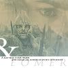
Icon Tutorial: Eomer's White Stripe Icon
Made on request: Eomer's White Stripe Icon Tutorial by Ladyeterea
I was asked by more than one person how I made this particular icon. I eventually decided to write a tutorial, hoping you'll find it useful somehow.
NOTE: To follow and understand this tutorial, you need a basic knowledge of Adobe Photoshop and its tools, in particular blending modes, masks, brushes.
First of all, choose the pictures you want to use. In this case, I decided to use a publicity still of Eomer from a poster of The Two Towers, and a screencap of Eomer finding Théodred near the river in the Extended Edition of the movie. You can download them here: poster.jpg and river.jpg.
Now, create a new 100x100 px document. Drag the river.jpg image into this new document, so that it'll be pasted there. With the Ctr+T tool, resize it until it looks like this:
a)
If the picture looks out of focus, just apply the Sharpen filter to make it clearer (if it gets too sharp, just click CTRL+SHIFT+F to dissolve the effect a bit). Now, duplicate this layer, and set the copy's blending mode to Multiply. Duplicate it again, and set the copy on the top to Screen. This is what you should obtain:
b)
Now, resize, paste and eventually sharpen the poster.jpg picture until it looks like this:
a)
At this point, add a mask to this layer. Just play with the brush tool at a very low opacity until you obtain something like this, it should not be too difficult:
b)
Now, duplicate the newly masked layer, and set it to Multiply. Duplicate it again, and set the copy to Screen - exactly as you did with the previous picture. The only catch in this case is that the duplicated masks could look weird, you might want to adjust them slightly:
c)
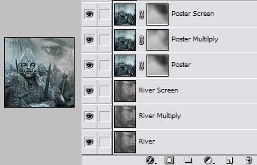
To give you a better idea of what we've done so far, here is how your layers composition should look like at the moment:
Now, we'll use a few layers to adjust the colors of the icons. The gradients (c) and (d) come from crumblingwalls.
a)
#C3B9A0, Multiply >>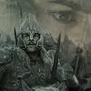
b)
#033750, Exclusion >>
c)
28% Opacity, Overlay >>
d)
40% Opacity, Screen >>
Select now from the main menu Layer >> New adjusting layer >> Hue/Saturation. Set its blending mode to Soft Light. Do not touch Hue and Luminosity, but set Saturation to 0. It's a useful trick to add a few contrast to the picture without altering it too much (looks neat in screen too, for other purposes though). Here is what the icon should look like now:

I then added on a new layer a white brush from freak_icons's icontextures2 pack (sampled brush # 9) and set the layer to 77% opacity, to lighten the lower part of the image (a). On top of that, I added a new layer with a white rectangle. Size can vary, just as long as it looks nice (b). Thirdly, I used the Text tool to make a "&" white symbol. I used the font "Requiem Text" at 60px, but anything similiar will do (c). I put the "&" in a corner, half on top of the white stripe, for purely decorative purposes.
a)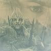
>> b)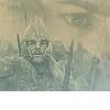
>> c)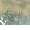
And now comes the text. I wrote EOMER in black with the font Trajan, 14 px high, setting the distance between the letters to 500. I then lowered the layer's
opacity to 17%, so that it might be barely visible (d). Finally, I added two text layers using always the Requiem Text font, this time 4px high, because I felt the icon was missing some decoration (e).
d)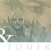
>> e)
Aaand, the icon is finished! I just hope the tutorial was easy enough to follow. If not, just comment and I'll try to help you. ^_-
I was asked by more than one person how I made this particular icon. I eventually decided to write a tutorial, hoping you'll find it useful somehow.

NOTE: To follow and understand this tutorial, you need a basic knowledge of Adobe Photoshop and its tools, in particular blending modes, masks, brushes.
First of all, choose the pictures you want to use. In this case, I decided to use a publicity still of Eomer from a poster of The Two Towers, and a screencap of Eomer finding Théodred near the river in the Extended Edition of the movie. You can download them here: poster.jpg and river.jpg.
Now, create a new 100x100 px document. Drag the river.jpg image into this new document, so that it'll be pasted there. With the Ctr+T tool, resize it until it looks like this:
a)

If the picture looks out of focus, just apply the Sharpen filter to make it clearer (if it gets too sharp, just click CTRL+SHIFT+F to dissolve the effect a bit). Now, duplicate this layer, and set the copy's blending mode to Multiply. Duplicate it again, and set the copy on the top to Screen. This is what you should obtain:
b)

Now, resize, paste and eventually sharpen the poster.jpg picture until it looks like this:
a)

At this point, add a mask to this layer. Just play with the brush tool at a very low opacity until you obtain something like this, it should not be too difficult:
b)

Now, duplicate the newly masked layer, and set it to Multiply. Duplicate it again, and set the copy to Screen - exactly as you did with the previous picture. The only catch in this case is that the duplicated masks could look weird, you might want to adjust them slightly:
c)

To give you a better idea of what we've done so far, here is how your layers composition should look like at the moment:

Now, we'll use a few layers to adjust the colors of the icons. The gradients (c) and (d) come from crumblingwalls.
a)

#C3B9A0, Multiply >>

b)

#033750, Exclusion >>

c)

28% Opacity, Overlay >>

d)

40% Opacity, Screen >>

Select now from the main menu Layer >> New adjusting layer >> Hue/Saturation. Set its blending mode to Soft Light. Do not touch Hue and Luminosity, but set Saturation to 0. It's a useful trick to add a few contrast to the picture without altering it too much (looks neat in screen too, for other purposes though). Here is what the icon should look like now:

I then added on a new layer a white brush from freak_icons's icontextures2 pack (sampled brush # 9) and set the layer to 77% opacity, to lighten the lower part of the image (a). On top of that, I added a new layer with a white rectangle. Size can vary, just as long as it looks nice (b). Thirdly, I used the Text tool to make a "&" white symbol. I used the font "Requiem Text" at 60px, but anything similiar will do (c). I put the "&" in a corner, half on top of the white stripe, for purely decorative purposes.
a)

>> b)

>> c)

And now comes the text. I wrote EOMER in black with the font Trajan, 14 px high, setting the distance between the letters to 500. I then lowered the layer's
opacity to 17%, so that it might be barely visible (d). Finally, I added two text layers using always the Requiem Text font, this time 4px high, because I felt the icon was missing some decoration (e).
d)

>> e)

Aaand, the icon is finished! I just hope the tutorial was easy enough to follow. If not, just comment and I'll try to help you. ^_-