ICON TUTORIAL #2
Ten (curve-free) steps to 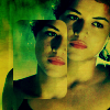
.
Well, my last icon post seems to be going over pretty well, so since so many commented on my texturing, I decided to make a tutorial. Yay! Everyone got their crack ready?
Again, I used Photoshop CS, but this handy dandy curves!FREE tutorial should be pretty easy to translate on any program.

Remembering that exact centering not only makes the baby Jesus cry, but Buddha as well, I made my base. I chose this promo shot from Lost, once again featuring the lovely Michelle Rodriguez as Ana-Lucia. Hurray!

Now we're going to do an insanely basic prep of the base. Duplicate your base/layer three times. Set the blend mode of the middle layers to Screen. Set the top layer to Soft Light. Sometimes, I used the Sharpen effect on my Soft Light layer, but for this image, it wasn't necessary. Use your own judgement. XD Create a new layer on top of everything, fill it with a dark blue, and set the layer to Exclusion. Looks ugly, no? Don't worry about that yet. Create another new layer on top of everything. Hit CTRL + ALT + SHIFT + E. It copies all of your previous layers in one. This probably won't work in other programs, you'll have to merge. But I hate merging. I avoid merging and do this whenever possible. I am batshit insane like that. Anyway, set this layer to Soft Light.
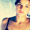
Go back to your blue layer. Right now, all of the work we're going to do is directly below your top layer. Create a new layer (again, this new layer should be between your exclusion layer, and your top soft light layer). Flood fill this with a very pale blue (I used #81D4FF). Set this layer to Color Burn. We are getting considerably sexier, no?
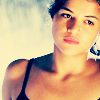
Another new layer! This layer should be between your color burn layer and your top soft light layer. Set this layer to Overlay at a very low opacity, depending on your image, and flood-fill with red. The opacity of this layer should depend on the coloring of your image, but as a general rule, I never do less than 10% or more than 30%. For this image, I used 18%.
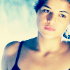
Another new layer! Le gasp! Again, between your top two layers. Last time we're doing this, don't worry. XD This layer should be set to Soft Light, somewhere from 60% - 80% in opacity, and flood-filled with Cyan. ...Don't look at me like that, you moron. Cyan is the aqua blue/green color. I used #0FEBFF, and for this image, I used 70% opacity. But LS, you say, the image loses it's sexiness! You silly bitch, I reply. This helps us later. Trust me. We want it looking bright and ugly. Really, my precious, we do.

Go back to the top again! Yes, we finally get to work on top. Just how we likes it, no? *cough* Duplicate your Color Burn layer, and drag that to the top. You may need to adjust the opacity, but I like the bold color, so I leave it at 100%. OMG, it's looking cool again. WELL SHAME ON YOU FOR EVER DOUBTING ME!
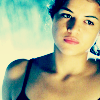
New layer! We are also putting this one on Color Burn, and at 100% Opacity. Flood fill with a pale yellow (I used #FFFAC1). At this point, we are ready to start playing with textures! E gads!!!
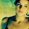
gender is my texture goddess, and should be yours as well. Make a new layer on top of everything, and take this texture by her, paste it in, and set it to Multiply. Do not fiddle with the opacity, you silly thing, it is perfect like this.
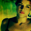
Create another new layer, and use this texture, again by gender, and set it to Overlay. My image was looking too bright for my taste, so I went all the way down to my second layer (one of the Screen layers), and lowered the opacity to 47%. Naturally, this will depend on your image. Depending on the picture, I've had to use anywhere from one to four screen layers. You'll really have to play around and find what looks right for you.
At this point, you may consider your icon finished. A lot of times, I feel that the image simply needs no more, and stop there. But if you're feeling particularly creative, there are several other things you may choose to do. My favorite thing to do is to play with boxes. ...Get your mind out of the gutter, you fucking pig. I'm serious. Rounded rectangles are your friend. So here's what we're going to do...

Merge everything. Flatten. BOOM! PANCAKE! WHEE! *cough* Wrong tut. Yes, merge. Then duplicate. You should have two identical layers. Add a layer mask to your top layer. Flood fill the mask with black, and then select your Rounded Rectangle tool. You'll want it on Fill Pixels mode, with a 5-10 px Radius. Make sure Anti-aliased is checked. Using white, make your first box! Right-click on your layer mask, and Apply Layer Mask. Move where you want it. Doesn't that look spiffy?
Play around, and as always, don't be a douche and use the same image and create the same icon I did. That's NOT cool. For kicks, here are some other icons I created using this method.
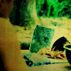
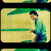
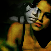
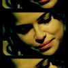
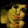
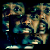
See what can happen when you play around?
Thanks for reading my second tutorial, and I hope it helped. Feel free to comment, question, and as always, I LOVE seeing what you make with it (even if I don't always have time to comment back >.<).
SUPPORT YOUR LOCAL CRACKFIEND! My paid account is running out soon, so I'm always accepting donations;) *cough* I'm going to hell. Or, you can up my street team points, and check out a wonderful singer named Lennon. If you click the banner below, you'll be taken to a website where you can stream her new album, and enter to win a spiffy guitar! Best yet, I get points everytime you click it or enter the contest. ;)

.
Well, my last icon post seems to be going over pretty well, so since so many commented on my texturing, I decided to make a tutorial. Yay! Everyone got their crack ready?
Again, I used Photoshop CS, but this handy dandy curves!FREE tutorial should be pretty easy to translate on any program.
Remembering that exact centering not only makes the baby Jesus cry, but Buddha as well, I made my base. I chose this promo shot from Lost, once again featuring the lovely Michelle Rodriguez as Ana-Lucia. Hurray!
Now we're going to do an insanely basic prep of the base. Duplicate your base/layer three times. Set the blend mode of the middle layers to Screen. Set the top layer to Soft Light. Sometimes, I used the Sharpen effect on my Soft Light layer, but for this image, it wasn't necessary. Use your own judgement. XD Create a new layer on top of everything, fill it with a dark blue, and set the layer to Exclusion. Looks ugly, no? Don't worry about that yet. Create another new layer on top of everything. Hit CTRL + ALT + SHIFT + E. It copies all of your previous layers in one. This probably won't work in other programs, you'll have to merge. But I hate merging. I avoid merging and do this whenever possible. I am batshit insane like that. Anyway, set this layer to Soft Light.
Go back to your blue layer. Right now, all of the work we're going to do is directly below your top layer. Create a new layer (again, this new layer should be between your exclusion layer, and your top soft light layer). Flood fill this with a very pale blue (I used #81D4FF). Set this layer to Color Burn. We are getting considerably sexier, no?
Another new layer! This layer should be between your color burn layer and your top soft light layer. Set this layer to Overlay at a very low opacity, depending on your image, and flood-fill with red. The opacity of this layer should depend on the coloring of your image, but as a general rule, I never do less than 10% or more than 30%. For this image, I used 18%.
Another new layer! Le gasp! Again, between your top two layers. Last time we're doing this, don't worry. XD This layer should be set to Soft Light, somewhere from 60% - 80% in opacity, and flood-filled with Cyan. ...Don't look at me like that, you moron. Cyan is the aqua blue/green color. I used #0FEBFF, and for this image, I used 70% opacity. But LS, you say, the image loses it's sexiness! You silly bitch, I reply. This helps us later. Trust me. We want it looking bright and ugly. Really, my precious, we do.
Go back to the top again! Yes, we finally get to work on top. Just how we likes it, no? *cough* Duplicate your Color Burn layer, and drag that to the top. You may need to adjust the opacity, but I like the bold color, so I leave it at 100%. OMG, it's looking cool again. WELL SHAME ON YOU FOR EVER DOUBTING ME!
New layer! We are also putting this one on Color Burn, and at 100% Opacity. Flood fill with a pale yellow (I used #FFFAC1). At this point, we are ready to start playing with textures! E gads!!!
gender is my texture goddess, and should be yours as well. Make a new layer on top of everything, and take this texture by her, paste it in, and set it to Multiply. Do not fiddle with the opacity, you silly thing, it is perfect like this.
Create another new layer, and use this texture, again by gender, and set it to Overlay. My image was looking too bright for my taste, so I went all the way down to my second layer (one of the Screen layers), and lowered the opacity to 47%. Naturally, this will depend on your image. Depending on the picture, I've had to use anywhere from one to four screen layers. You'll really have to play around and find what looks right for you.
At this point, you may consider your icon finished. A lot of times, I feel that the image simply needs no more, and stop there. But if you're feeling particularly creative, there are several other things you may choose to do. My favorite thing to do is to play with boxes. ...Get your mind out of the gutter, you fucking pig. I'm serious. Rounded rectangles are your friend. So here's what we're going to do...
Merge everything. Flatten. BOOM! PANCAKE! WHEE! *cough* Wrong tut. Yes, merge. Then duplicate. You should have two identical layers. Add a layer mask to your top layer. Flood fill the mask with black, and then select your Rounded Rectangle tool. You'll want it on Fill Pixels mode, with a 5-10 px Radius. Make sure Anti-aliased is checked. Using white, make your first box! Right-click on your layer mask, and Apply Layer Mask. Move where you want it. Doesn't that look spiffy?
Play around, and as always, don't be a douche and use the same image and create the same icon I did. That's NOT cool. For kicks, here are some other icons I created using this method.
See what can happen when you play around?
Thanks for reading my second tutorial, and I hope it helped. Feel free to comment, question, and as always, I LOVE seeing what you make with it (even if I don't always have time to comment back >.<).
SUPPORT YOUR LOCAL CRACKFIEND! My paid account is running out soon, so I'm always accepting donations;) *cough* I'm going to hell. Or, you can up my street team points, and check out a wonderful singer named Lennon. If you click the banner below, you'll be taken to a website where you can stream her new album, and enter to win a spiffy guitar! Best yet, I get points everytime you click it or enter the contest. ;)
