Tutorials.
Just pretty simple ones, using a lot of curves (+ selective coloring/color balance) because I'm lazy like that. Hee. Anyhoo, these were requested eons ago, sorry it took me long, but I suck at explaining things. So I'll try my best to sound coherent.
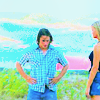
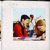
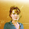
-----------------------
+ uno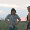
->
Just a note, this doesn't work for ALL caps. Especially ones that are on the reddish/orange-ish side.
1. Crop the pic, tra la la. Then duplicate, and set to Screen, opacity %100. The change the mode of the image to Lab Color.
Image > Mode > Lab Color
2. Layer > New Layer Adjustment > Curves
Lightness-
I: 36, O: 33
I: 62, O: 75
a-
I: -14, O: -45
I: 47, O: 91
b-
I: -2, O: -29
I: 47, O: 97
3. Image > Mode > RGB Color (Flatten) .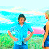
.
You can leave it at that? But it's way too red. Although it is the summer so the sunburned look isn't exactly frowned upon.
4. Layer > New Layer Adjustment > Curves
RGB-
I: 115, O: 128
Red-
I: 132, O: 132
Green-
I: 126, O: 117
I: 170, O: 159
I: 200, O: 190
Blue-
I: 71, O: 64
I: 109, O: 91
168, 196
Erase the sky part.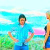
5. To further brighten the greens, among other subtle things.
Layer > New Layer Adjustment > Selective Color
Greens-
Cyan: -100
Magenta: -100
Yellow: +100
Black: +100
Neutrals-
C: +1
M: +3
Y: +2
B: -2
Blacks-
Black: +100
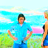
6. Layer > New Layer Adjustment > Curves
RGB-
I: 118, O: 147
I: 197, O: 199
Green-
I: 112, O: 128
Blue-
I: 106, O: 132
I: 209, O: 216
Erase the green part/people part.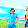
7. Add a new [color] layer, #E5E5E5.
Set it to Multiply. Opacity %40. Then go to selective color again.
Layer > New Layer Adjustment > Selective Color
Cyans-
Cyan: -38
Finished.
Like I said, it doesn't apply to a lot of caps. But for example, this cap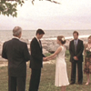
.
Apply the same steps, but stop at the third one, and don't duplicate and screen, unless you think that looks better.
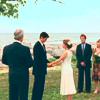
It's too orange, so to apply more blue. Go to Layer > New Layer Adjustment > Curves
RGB
I: 106, O: 118
Green-
I: 112, O: 99
I: 194, O: 194
Blue-
I: 128, O: 94
I: 172, O: 206
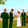
And it's done. I think colorings like these are not suitable for close-up shots of faces and the like. It usually works for sceneries, and when the people are at a great distance.
-----------------------
+ dos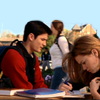
->
1. Duplicate. Screen. Opacity %16.
Layer > New Layer Adjustment > Curves
RGB
I: 97, O: 150
I: 190, O: 194
Red-
I: 129, O: 112
I: 222, O: 217
Green-
I: 116, O: 110
I: 181, O: 204
Blue-
I: 105, O: 101
I: 165, O: 208
Layer > New Layer Adjustment > Hue/Saturation
Master-
Hue: -1
Saturation: +15
Lightness: +7
Flatten.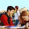
2. Change image size to 65x65, then put it atop this texture from blimey_icons.
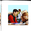
You can leave it at that, or add another texture so there's not a lot of white space. Place this texture [from elli] on Multiply, opacity %55. Flatten.
Image > Adjustment > Brightness/Contrast
Brightness: +5
Contrast: +9
Fin.
-----------------------
+ tres this ->
1. Crop around the subject.
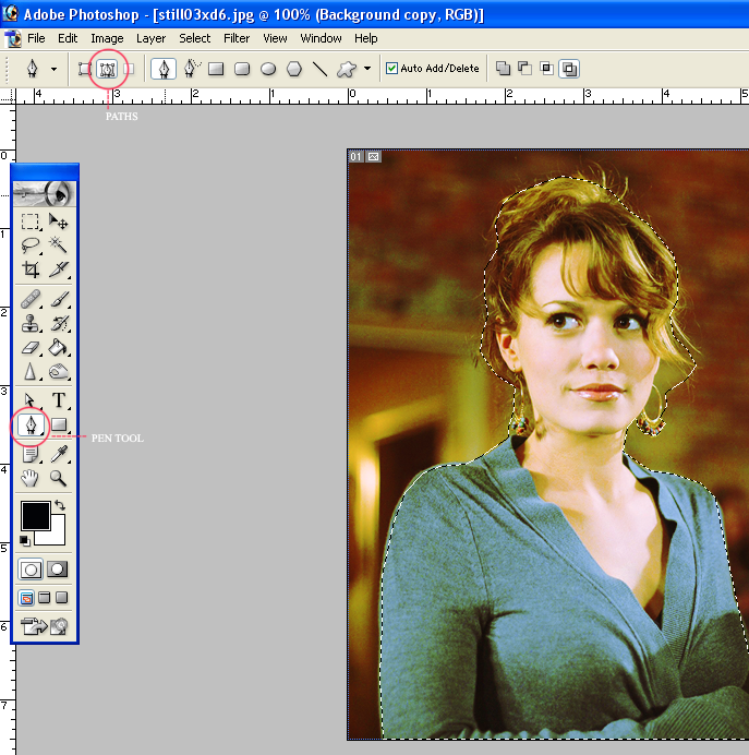
2. Put the subject at center, or where ever you like.
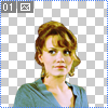
3. Place this texture from loveicon under your first.
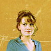
4. Set this gradient on top then change the blending mode to Soft Light, opacity depending on how you like it.
5. Flatten.
Layer > New Layer Adjustment > Curves
Red-
I: 115, O: 129
I: 206, O: 210
Green-
I: 126, O: 124
Blue-
I: 121, O: 113
Then erase some of the top part using a soft round brush, with a white color layer underneath. Flatten.
Done.
So that's all. I hope they're useful. Heh.
-----------------------
+ uno
->
Just a note, this doesn't work for ALL caps. Especially ones that are on the reddish/orange-ish side.
1. Crop the pic, tra la la. Then duplicate, and set to Screen, opacity %100. The change the mode of the image to Lab Color.
Image > Mode > Lab Color
2. Layer > New Layer Adjustment > Curves
Lightness-
I: 36, O: 33
I: 62, O: 75
a-
I: -14, O: -45
I: 47, O: 91
b-
I: -2, O: -29
I: 47, O: 97
3. Image > Mode > RGB Color (Flatten) .
.
You can leave it at that? But it's way too red. Although it is the summer so the sunburned look isn't exactly frowned upon.
4. Layer > New Layer Adjustment > Curves
RGB-
I: 115, O: 128
Red-
I: 132, O: 132
Green-
I: 126, O: 117
I: 170, O: 159
I: 200, O: 190
Blue-
I: 71, O: 64
I: 109, O: 91
168, 196
Erase the sky part.
5. To further brighten the greens, among other subtle things.
Layer > New Layer Adjustment > Selective Color
Greens-
Cyan: -100
Magenta: -100
Yellow: +100
Black: +100
Neutrals-
C: +1
M: +3
Y: +2
B: -2
Blacks-
Black: +100
6. Layer > New Layer Adjustment > Curves
RGB-
I: 118, O: 147
I: 197, O: 199
Green-
I: 112, O: 128
Blue-
I: 106, O: 132
I: 209, O: 216
Erase the green part/people part.
7. Add a new [color] layer, #E5E5E5.
Set it to Multiply. Opacity %40. Then go to selective color again.
Layer > New Layer Adjustment > Selective Color
Cyans-
Cyan: -38
Finished.
Like I said, it doesn't apply to a lot of caps. But for example, this cap
.
Apply the same steps, but stop at the third one, and don't duplicate and screen, unless you think that looks better.
It's too orange, so to apply more blue. Go to Layer > New Layer Adjustment > Curves
RGB
I: 106, O: 118
Green-
I: 112, O: 99
I: 194, O: 194
Blue-
I: 128, O: 94
I: 172, O: 206
And it's done. I think colorings like these are not suitable for close-up shots of faces and the like. It usually works for sceneries, and when the people are at a great distance.
-----------------------
+ dos
->
1. Duplicate. Screen. Opacity %16.
Layer > New Layer Adjustment > Curves
RGB
I: 97, O: 150
I: 190, O: 194
Red-
I: 129, O: 112
I: 222, O: 217
Green-
I: 116, O: 110
I: 181, O: 204
Blue-
I: 105, O: 101
I: 165, O: 208
Layer > New Layer Adjustment > Hue/Saturation
Master-
Hue: -1
Saturation: +15
Lightness: +7
Flatten.
2. Change image size to 65x65, then put it atop this texture from blimey_icons.
You can leave it at that, or add another texture so there's not a lot of white space. Place this texture [from elli] on Multiply, opacity %55. Flatten.
Image > Adjustment > Brightness/Contrast
Brightness: +5
Contrast: +9
Fin.
-----------------------
+ tres this ->
1. Crop around the subject.
2. Put the subject at center, or where ever you like.
3. Place this texture from loveicon under your first.
4. Set this gradient on top then change the blending mode to Soft Light, opacity depending on how you like it.
5. Flatten.
Layer > New Layer Adjustment > Curves
Red-
I: 115, O: 129
I: 206, O: 210
Green-
I: 126, O: 124
Blue-
I: 121, O: 113
Then erase some of the top part using a soft round brush, with a white color layer underneath. Flatten.
Done.
So that's all. I hope they're useful. Heh.