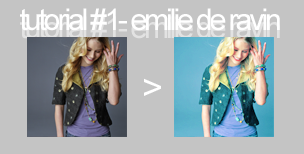
Tutorial #1 - Emilie de Ravin

from

to

STEP ONE: Find a base; crop, resize, screen, multiply, whatever
For this icon, i duplicated the base and screened the layer. At the end, if the icon colouring is too intense, just alter the percentage of the screen layer.

>

STEP TWO: make a colour balance adjustment layer (Layer> Adjustment Layer> Colour Balance) with the settings below:
Shadows: +15, +17, +21
Midtones: -20, -10, +3
Highlights: -10, -9, -21

>

STEP THREE: new hue/saturation adjustment layer
Saturation: +45

>

STEP FOUR: new selective colour adjustment layer
Reds: -24, 0, 0, 0
Yellows: -28, -83, -5, +13
Neutrals: 0, -33, +5, -8

>

STEP FIVE: another selective colour adjustment layer
Reds: -100, 0, +100, +100
Yellows: -11, 0, -43, 0

>

STEP SIX: another selective colour adjustment layer (last one, i promse :D)
Reds: -100, 0, +100, +100
Yellows: -11, 0, -43, 0

>

And you're done!
.psd downloadable here
other icons with the same colouring:


