(no subject)
As asked for by xx_ella_xx months ago (sorry!) , a font guide!

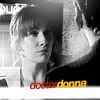

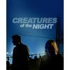
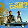

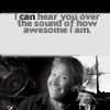
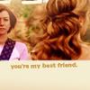
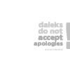

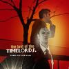
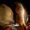


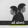
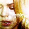

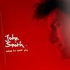
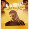

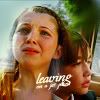
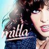

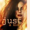
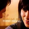

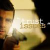

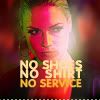
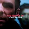



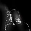
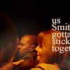
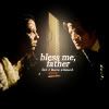
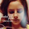




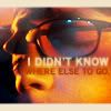

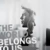
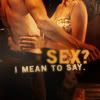

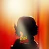
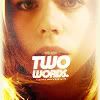

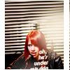

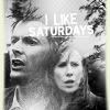



I think you can find them all at dafont, Font Freak or in your default fonts. If not, a quick Google search should do the trick.
If you want to know which font I used on another icon, feel free to ask. I can't promise I can remember, though...
I can already say I won't know which font I used in these icons:
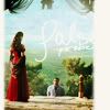
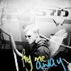
because I lost these fonts with a computer crash and can't find them again :( So, if you know what they are, I'd be eternally grateful if you told me:)
5 general tips & tricks for text:
1. Experiment, experiment, experiment! A small change in your settings can do so much! Try to change the color of one word, try to change the size of a part of your sentence, try out some different widths between your letters or between your lines of text,... Sometimes rotating one line of 2 can already make such a difference.
2. Leave the text for last. Text gets pixellated fast, so try to limit the layers above it. If you arrange the text in the beginning and it gets on every layer you put on soft light above it, by the end of it your text will probably not looks as pretty as it did in the beginning.
3. Use the color pipette to pick a color. If you, like I suggested;) , want to experiment with colors, it's easy to choose a color that's already in your icon by using the color pipette(or whatever it's called in english). Sometimes it won't be very readable so you'll have to make it lighter/darker or choose a color in the area, but use the colors in your icons as a guide point. This way, even if you use more than 2 colors, the colors of your text will still match your icon.
4. Use double layers of your text. If your text is too light when it's small, that is (Courier New and Georgia have this, for example). That can be very frustratring when you've finally found the right size and placement. So instead of making your text bigger or using a shadow, try to put a copy of your text layer above it first (on normal). Ususally that helps a lot already. You might have to put the densitiy of that layer below 100% if your text seems pixellated because of it.
5. Don't be afraid of the blur tool. As I've mentioned already, text gets pixellated fast. I usually end by sharpening a layer of the final icon, but I almost always erase the parts with text. Sometimes I even blur it. Not too much, because your text still has to be readable, but just enough to get rid of the parts that are too sharp. You can control this by blurring your text and then go Edit > fade blur until you're satisfied.
I personally even like to blur some fonts just-a-bit-too-much, like Old Sans Black. If your font is bold enough and your colors light enough, it can give very nice effects. So, that was it for text! I'd love to hear if you found it useful.
Now for something completely different! If you ever wondered where I get my inspiration, this is the answer. It's a map full of icons by other makers. I've been saving them for a long time, so there's a LOT of icons. 815 to be exact. It's 14 MB of what I find to be the prettiest, most creative and/or hilarious icons ever. Instant inspiration for everyone! ;) No really, just looking at that map always makes me want to try out new things.
All the icons are named after their makers, so drop them a line if you like their icons! Enjoy.