Week thirty-one winners
Here are this week's winners.
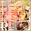
1st
kerilu
2nd
angeleros
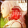
2nd (TIE)
kerilu

Critique
Both five and six seem rather blurry to me.
1: Bit plain. Would look nicer if a scratchy texture had been used, or maybe some light textures. Also, a more close-up shot of Riku's face would have been more interesting.
2: A little oversharpened. that's all, everything else is pretty
5: kind of blurry. also, the 'R' is squinched, and looks kind of bad. Not a variety of colors, it'd look better if there were. Text should stand out more.
6: some kind of color alteration would make it better.
Congrats to winners. I guess I'll... do banners this week. Spring break, ya'll. Heck yeah!
1st
kerilu
2nd
angeleros
2nd (TIE)
kerilu
Critique
Both five and six seem rather blurry to me.
1: Bit plain. Would look nicer if a scratchy texture had been used, or maybe some light textures. Also, a more close-up shot of Riku's face would have been more interesting.
2: A little oversharpened. that's all, everything else is pretty
5: kind of blurry. also, the 'R' is squinched, and looks kind of bad. Not a variety of colors, it'd look better if there were. Text should stand out more.
6: some kind of color alteration would make it better.
Congrats to winners. I guess I'll... do banners this week. Spring break, ya'll. Heck yeah!