005 Tutorial: Charmed
Requested tutorial by lettere. She requested a tutorial for this, but since I didn't save the .psp file I had to recreate it. The outcome is fairly similar though, I hope at least.
I use PSP8, however this does translate.
Not Image Heavy.
Beginner Friendly-ish.
TO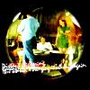
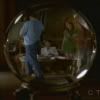
..01 Grab your picture. Here is the original, should you decide to follow along with the same cap. Or just use the base provided. Make a 100x100 base.

..02 Go to Adjust >> Brightness & Contrast >> Curves.
Put in the following settings (if it isn't mentioned, leave it be):
RGB:
Point One - I: 127 O: 201
Point Two - I: 70, O:103
Now the point at the bottom left hand corner (I:0, O: 0), move the point to the right so it reads I: 14, O: 0. (Screenshot)
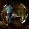
This is your new base.
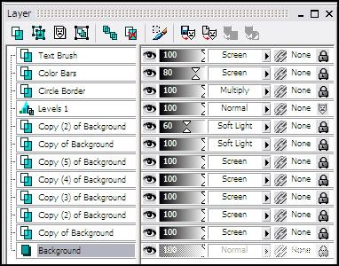
..03 Duplicate your base FIVE times, set them all the SCREEN.
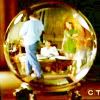
..04 Duplicate your base, bring it to the top and set it to SOFT LIGHT. Duplicate this layer, and set it to Soft Light at 60%.
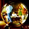
..05 Layers >> New Adjustment Layers >> Levels.
Put in the following settings (if it isn't mentioned, leave it be):
RGB: Input: 40, 1.11, 243
Red: Input: 0, 0.9, 255
Green: Input: 0, 1.11, 255
Blue: Input: 0, .83, 255
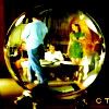
..06 Layers >> New Raster Layer. Flood fill with #00000 (Black). Set the layer to MULTIPLY. Grab your Eraser, and put in the following settings.
Shape: Circle
Size: 87
Hardness: 100
(You may need to lower the opacity, to see where you want to stamp the circe.)
Click!

..07 While still on the Multiplied layer, go to Adjust >> Blur >> Average.
Put in the following settings:
Filter: 3
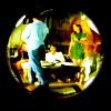
..08 Grab this Text Brush by, I wanna say either unmasked_icons or fangirls_inc (if you know for sure, please let me know).
I never actually make brushes out of image packs, I just keep them as individual bases, and then when I need them grab them. I generally always either have the brush set to White or to Black, and then depending on which mode I want it, I select Multiply or Screen. Inverting it, if necessary.
Invert it, so that what is black will now be white, and visa versa. Adjust >> Negative Image.
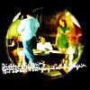
Make a new layer over at your icon, and paste it. Set it to SCREEN, and place it whereever you want it.
>>
>>
..09 Layers >> New Raster Layer.
Grab your Selection Tool. Zoom into your icon. Make two rectangles, whatever shape you want, in two colors. I chose Red (#FF0000) and Yellow (#FFFF40). Then just fill in the two rectangles with those colors.
I'm making the Text Brush Layer invisible so you can see what I'm referring to.
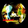
Set this layer to SCREEN (80%) and move it so it is below your Text Brush Layer.

Done!
Layers for those that need it.

The Level settings were for this particular cap. For different caps, you'll obviously need diffent settings. In my cap, I could tell I had a lot of green/yellow/blue that I wanted to make Pop. Hence why I upped those, I also wanted to make the icon to be highly contrasted/saturated. In yours, just look at what colors you want to pop, and fiddle with those settings. If all you're looking for is a general contrasted icon, mess with only the RGB settings, and bring in the two points at the end (the white and the black) closer together).
Love to see what people come up with.
Any questions, please ask!

TO

..01 Grab your picture. Here is the original, should you decide to follow along with the same cap. Or just use the base provided. Make a 100x100 base.

..02 Go to Adjust >> Brightness & Contrast >> Curves.
Put in the following settings (if it isn't mentioned, leave it be):
RGB:
Point One - I: 127 O: 201
Point Two - I: 70, O:103
Now the point at the bottom left hand corner (I:0, O: 0), move the point to the right so it reads I: 14, O: 0. (Screenshot)

This is your new base.
..03 Duplicate your base FIVE times, set them all the SCREEN.

..04 Duplicate your base, bring it to the top and set it to SOFT LIGHT. Duplicate this layer, and set it to Soft Light at 60%.

..05 Layers >> New Adjustment Layers >> Levels.
Put in the following settings (if it isn't mentioned, leave it be):
RGB: Input: 40, 1.11, 243
Red: Input: 0, 0.9, 255
Green: Input: 0, 1.11, 255
Blue: Input: 0, .83, 255

..06 Layers >> New Raster Layer. Flood fill with #00000 (Black). Set the layer to MULTIPLY. Grab your Eraser, and put in the following settings.
Shape: Circle
Size: 87
Hardness: 100
(You may need to lower the opacity, to see where you want to stamp the circe.)
Click!

..07 While still on the Multiplied layer, go to Adjust >> Blur >> Average.
Put in the following settings:
Filter: 3

..08 Grab this Text Brush by, I wanna say either unmasked_icons or fangirls_inc (if you know for sure, please let me know).
I never actually make brushes out of image packs, I just keep them as individual bases, and then when I need them grab them. I generally always either have the brush set to White or to Black, and then depending on which mode I want it, I select Multiply or Screen. Inverting it, if necessary.
Invert it, so that what is black will now be white, and visa versa. Adjust >> Negative Image.
Make a new layer over at your icon, and paste it. Set it to SCREEN, and place it whereever you want it.

>>

>>

..09 Layers >> New Raster Layer.
Grab your Selection Tool. Zoom into your icon. Make two rectangles, whatever shape you want, in two colors. I chose Red (#FF0000) and Yellow (#FFFF40). Then just fill in the two rectangles with those colors.
I'm making the Text Brush Layer invisible so you can see what I'm referring to.

Set this layer to SCREEN (80%) and move it so it is below your Text Brush Layer.

Done!
Layers for those that need it.
