i was scared, tired and underprepared
Alias Icons. Experimental batch using pretty parchment and ornament brushes, as well as tons of gradients. Oh, and there's some David Anders icons, as well as two from his appearance on CSI.
Usual rules apply (comment; credit; don't direct link; don't customize blanks without my permission).
Preview: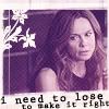
( Read more... )
Usual rules apply (comment; credit; don't direct link; don't customize blanks without my permission).
Preview:
( Read more... )
Comments 30
Reply
Reply
Mind if I ask what brush sets you used? I have parchement 1 and 2 from 1greeneye.net, but is there a new one up? Or are you just using them in new and cooler ways than I do?
Yes, I am a TOTAL brush geek, if you couldn't tell. ;)
Reply
The parchment brushes are the same ones you're using--I usually don't resize them and use cropped bits on them on two layers underneath a gradient layer (set at around 30%--the gradient is usually reminicent of the final coloring I use). The first layer is using a creamish color and the second layer is the same as the first, only set to screen. Of course, to add a bit more texture, you've just got to duplicate and rotate the layers around a bit, making them darker and/or lighter, etc.
I have a few PSD's of some of the icons up there if you're interested. And there's nothing wrong with being a brush geek. :D
Reply
Reply
cheers.
--Lex
Reply
Leave a comment