R06-C08-Results
THE ELIMINATION
DANA_PANTS
LOST_COSMOS
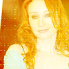

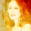
PEOPLE'S CHOICE
NERVOUS__GIRL
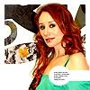
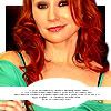
KREENGLES

Thank you to everyone to voted! It really did come down to the last couple of votes!
VOTING
You can find your set/icon numbers here.
NEGATIVE SET VOTES
01 - too much yellow and far too washed out on all the images
01 - The coloring is too harsh, and really washes out her face, especially in the third icon
01 - the orangey texture is too heavy over the icons and makes Tori appear washed out
01 - A great style, just slightly hard to see her face in the first and last icons of the set.
01 - yellow is like white-wash
01 - The cropping is really good but it seems like the set is too faded and blurry, like they've been over-screened. Adding a soft light layer might fix that.
02 - The pictures are very pixelly, and the way they were cut out is a little sloppy (a piece of her arm is missing in the third icon, for example)
02 - the icons seem over-saturated, and the film-type borders don't work
02 - Good concept, but the images of Tori seem washed out and the one on the left seems slightly distorted somehow. The third icon looks the best, but the other two aren't really consistent with that.
02 - oversharpening is a little harsh here.
02 - I like the polaroid thing but I'm just not sure about the colouring
02 - base icons are extremely blurry / colorization is too polorized
02 - Nice use of layered textured but overall the coloring and sharpness of the images makes them look fake, which is the only way I can think to describe them and I'm not sure how that could be fixed.
03 - The icons have the appearance of simple crops, as if nothing was done to them except cutting them out from a large image.
04 - The cropping on Tori could have been better, and the lightburst effect just looks clichéd, out of place and attention-grabbing (when the attention should be on Tori).
04 - The black and white doesn't match very well with the images, and it seems plain. It also doesn't look like they are textures, it looks like the backgrounds were made with a really soft brush in Photoshop. Also, the icons are too similar; they all look like different attempts at the same icon, but trying it out with a different picture. It doesn't seem like a whole set.
04 - Just not a fan of the black and white background
04 - The gradient somehow draws attention away from Tori.
05 - appreciate how you tried to connect them all with the bubble and small text but it seems too distracting to me, plus the centre icon has tori's head top chopped off too abruptly in the crop
05 - contrast is set too high on these icons.
POSITIVE SET VOTES
01 - The colors are very creative and different. Good job stepping out of the box. It may have looked better with some text, because the heavy colors leave what looks like a lot of negative space that text would fill really well.
03 - The cropping and coloring is just beautiful!
03 - good coloration / good clarity / not blending into background but the origional base isn't changed in anyway and you see her still
04 - like the cleanliness of the set and of tori. the white spot does draw the eye a bit too much though with the negative space around it.
04 - very simple set... and very effective
05 - The images link together well, creating a continuity of color and style.
05 - The way the set flows from one icon to the other is really cute
05 - love the bright colouring
05 - I love the fact that all these icons link together. The sharpness of the image is great :)
05 - Great use of text brushes. The coloring is great too.
POSITIVE ICON VOTES
02 - Very pretty with the flower and the color. The way the color doesn't lay over the white adds really attractive negative space.
02 - gorgeous colouring
03 - It looks like a film cel about to burn through, a really cool effect.
07 - simple and pretty icon
08 - Very nice coloring
08 - Very soft and perfectly colored; the balance of tone is great and it looks very graceful.
08 - Love the colouring
09 - good crop and good colouring on tori
09 - excellent crop
09 - Beautiful natural coloring and a great crop. You see just enough of her body to get a feel of her mood (confident).
09 - clarity and coloration wins
09 - Great crop and coloring - the saturation of her hair looks awesome.
11 - Good crop, and the picture blends nice with the background
13 - like the sharpening on tori here and the crop. the placement of tori in the icon works very well in accordance to the background she has as well.
13 - Great coloring and I love the text blurb's position!
13 - Lovely image crop and the coloring is fabulous. Nice use of text also.
14 - What a great capture of that smirk!
14 - the crop is lovely
14 - nice exageration on the head pop over the borderline
15 - The balance of the whole icon is great.
and don't forget, if you want to enter in Round 07, SIGN-UPS are now up and ready for you guys to enter!
This round is going to be quite different in that it really is all up to you, you get to pick the era you want to work with and all images. You will be making the icons you want to make with minimal guidelines to follow.

[JOIN] [PROFILE] [SIGN-UP]