Tutorials
Tired of me yet? XD
Tutorials are kinda fun. But tedious. Anyway. I tend to do things the hard way, but that's just me. ^_^;; I didn't write down everything I did, so at some points I may be guessing. The icon should turn out close to the original, though.
And on another note, some people may use the Adobe Color Picker, but I'm so used to the Windows Color Picker that I view colors as RGB. ^^;; I'll give hexadecimal values, too, though. Well, on to the tutorial!
First, take this image of Rikku and go to Image>Image Size. Type 500 in the first box (which should automatically adjust the second value), then go to Select>Select All (or just Ctrl+A) and copy it (Edit>Copy or Ctrl+C). Open a new 100x100 image, and position the resized image like so:

Next, go to Image>Adjustments>Desaturate, then drag the layer onto the icon next to the little trash can in the Layers palette to Duplicate it (or just go to Layers>Duplicate Layer). Set it to Overlay and Merge the current layers. You'll have this:
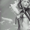
And now, a gradient map! This feature is really neat, 'cause you can get some really interesting effects going. Anyhar, take this gradient by crumblingwalls and apply it to the desaturated image.

>
Duplicate this layer (yes, I looove to duplicate), desaturate it, then set it to Darken, 65%. It'll fade the image a little.
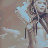
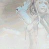
Now, on to brushes. After creating a new layer, I used a brush by eightyfour__, the color RGB 255 255 255 (#FFFFFF), a.k.a. white, the opacity set to 85%.

>
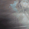
For the next layer, I used the same brush, the color RGB 0 0 0 (#000000), a.k.a. black, with no change in opacity.

>
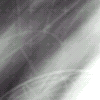
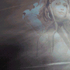
Woo, another layer! With another of eightyfour__'s brushes, in black, the Blend Mode set to Soft Light.
>
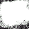
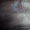
W00t, we're almost there! Next, I used this brush by dorky_duck on a new layer, the color black, the Blend Mode Soft Light.
>
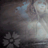
For a bit of decoration to go with the lyrics, I used a decorative brush by crumblingwalls on a new layer, the color RGB 192 192 192 (#C0C0C0), a light-ish grey, and positioned it like so. I lowered the opacity to 23%.

>
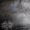
Lastly, I took lyrics from Jack Off Jill's song "Girlscout," because I felt the title related to Rikku's cheerful nature, and this icon was part of a set, after all. All the text is set to the font 18th Century and centered; the song title is 9pt and the lyrics are 5pt. Next, select it all, and in the Character Palette, change the settings to this:
All Caps, Leading 3pt, Kearning/Tracking 20, Anti-Alias Crisp, Color white.
Position the text over the flower and lower the opacity to 52%, and voila! This is what it'll look like:

>
And voila! The icon is done! I hope I didn't make someone's brain explode!
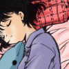
I'll be explaining how to go from black and white line art (in this case a manga scan) to a colored icon. This uses Channels instead of Multiply layers, which allows you to paint under the lines, or even change the color of the lines. Very, very useful.
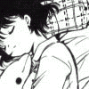
->
I've used Photoshop 7 for this, basic knowledge a plus. I don't think the steps would be the same with PSP, however, because I never really attempted doing something like this in PSP. I don't know. And on another note, you can do this with any bit of line art, huge or small (see here).
Before getting started, make sure the image is in RGB Color mode. If it isn't, change it now, because if you wait until the last minute, it'll cause a lot more hassle than you need. That done? Okay. Moving on.
Open your line art and resize it. Create a new 100x100 image and paste the scan in it, positioning it as you see fit (copying and pasting the image is simpler with this type of icon because it removes a step you'd have to do if you cropped the image).

Nextly, with the layer with the line art selected, click the Channels tab next to where the Layer tab is. From there, click on the button that looks like a dotted circle. It'll select the white parts of the picture.
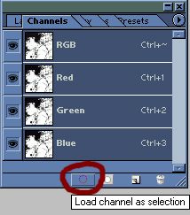
Click back on the Layers tab, and with the same layer selected, hit Delete, the deselect the image. Now you're probably like, "OMGGGZ THE LINEZ ARE SO LITE!!!" Well, that's easily fixed. See that little button above the layers with the little checkerboard? Click it.
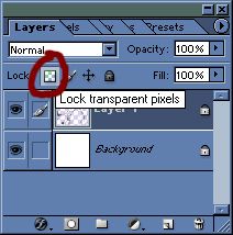
Now, with your brushes set to the default ones, take a brush tip at maybe 19px or more, and with the color set to black, paint over the lines. Now they're dark again! Wahoo! And now it's time to color.
Create a new layer that's under the lines but above the background layer, and fill in things. Since this image is so small, I just use the paintbrushes instead of the fill tool, because it doesn't turn out as nicely. However, if you do want to use the Fill tool, just make sure All Layers is checked, or filling won't work.
After filling in all the base colors, it looks like this:
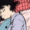
If you're confident, you can put several different colors on a single layer (like putting the lavender of Yumi's PJs and her skin color on the same layer), but I recommend putting each color on a seperate layer. It'll make editing easier, so if you paint a little out of the lines, you can just erase things without touching other colors. And as you create new layers, put things under the layer you just created, or you may end up painting over what you just put on.
So, with just the filled in bits, the icon looks sort of bland, right? Let's finish it up with shading! Just use the Eyedropper tool to pick up any colors you've used before and darken them (still putting colors on seperate layers). As for painting the shading on, I switch between brushes sized from 1-13 pixels. Have fun with it! This is your work of art. Once I was done, I got this:

And there you have it! Colored! From this point on, you can merge the layers and make your icon however you see fit. Add a border, some gradients, some brushes--make it pretty! But most of all, have fun!
If anything was confusing or you need a bit more help with something, don't be afraid to comment. :)
Yes, I'm shutting up now. Sorry if things were very wordy. n.n;;
Tutorials are kinda fun. But tedious. Anyway. I tend to do things the hard way, but that's just me. ^_^;; I didn't write down everything I did, so at some points I may be guessing. The icon should turn out close to the original, though.
And on another note, some people may use the Adobe Color Picker, but I'm so used to the Windows Color Picker that I view colors as RGB. ^^;; I'll give hexadecimal values, too, though. Well, on to the tutorial!
First, take this image of Rikku and go to Image>Image Size. Type 500 in the first box (which should automatically adjust the second value), then go to Select>Select All (or just Ctrl+A) and copy it (Edit>Copy or Ctrl+C). Open a new 100x100 image, and position the resized image like so:

Next, go to Image>Adjustments>Desaturate, then drag the layer onto the icon next to the little trash can in the Layers palette to Duplicate it (or just go to Layers>Duplicate Layer). Set it to Overlay and Merge the current layers. You'll have this:

And now, a gradient map! This feature is really neat, 'cause you can get some really interesting effects going. Anyhar, take this gradient by crumblingwalls and apply it to the desaturated image.

>

Duplicate this layer (yes, I looove to duplicate), desaturate it, then set it to Darken, 65%. It'll fade the image a little.

Now, on to brushes. After creating a new layer, I used a brush by eightyfour__, the color RGB 255 255 255 (#FFFFFF), a.k.a. white, the opacity set to 85%.

>

For the next layer, I used the same brush, the color RGB 0 0 0 (#000000), a.k.a. black, with no change in opacity.

>

Woo, another layer! With another of eightyfour__'s brushes, in black, the Blend Mode set to Soft Light.

>

W00t, we're almost there! Next, I used this brush by dorky_duck on a new layer, the color black, the Blend Mode Soft Light.

>

For a bit of decoration to go with the lyrics, I used a decorative brush by crumblingwalls on a new layer, the color RGB 192 192 192 (#C0C0C0), a light-ish grey, and positioned it like so. I lowered the opacity to 23%.

>

Lastly, I took lyrics from Jack Off Jill's song "Girlscout," because I felt the title related to Rikku's cheerful nature, and this icon was part of a set, after all. All the text is set to the font 18th Century and centered; the song title is 9pt and the lyrics are 5pt. Next, select it all, and in the Character Palette, change the settings to this:
All Caps, Leading 3pt, Kearning/Tracking 20, Anti-Alias Crisp, Color white.
Position the text over the flower and lower the opacity to 52%, and voila! This is what it'll look like:

>

And voila! The icon is done! I hope I didn't make someone's brain explode!
I'll be explaining how to go from black and white line art (in this case a manga scan) to a colored icon. This uses Channels instead of Multiply layers, which allows you to paint under the lines, or even change the color of the lines. Very, very useful.

->

I've used Photoshop 7 for this, basic knowledge a plus. I don't think the steps would be the same with PSP, however, because I never really attempted doing something like this in PSP. I don't know. And on another note, you can do this with any bit of line art, huge or small (see here).
Before getting started, make sure the image is in RGB Color mode. If it isn't, change it now, because if you wait until the last minute, it'll cause a lot more hassle than you need. That done? Okay. Moving on.
Open your line art and resize it. Create a new 100x100 image and paste the scan in it, positioning it as you see fit (copying and pasting the image is simpler with this type of icon because it removes a step you'd have to do if you cropped the image).

Nextly, with the layer with the line art selected, click the Channels tab next to where the Layer tab is. From there, click on the button that looks like a dotted circle. It'll select the white parts of the picture.

Click back on the Layers tab, and with the same layer selected, hit Delete, the deselect the image. Now you're probably like, "OMGGGZ THE LINEZ ARE SO LITE!!!" Well, that's easily fixed. See that little button above the layers with the little checkerboard? Click it.

Now, with your brushes set to the default ones, take a brush tip at maybe 19px or more, and with the color set to black, paint over the lines. Now they're dark again! Wahoo! And now it's time to color.
Create a new layer that's under the lines but above the background layer, and fill in things. Since this image is so small, I just use the paintbrushes instead of the fill tool, because it doesn't turn out as nicely. However, if you do want to use the Fill tool, just make sure All Layers is checked, or filling won't work.
After filling in all the base colors, it looks like this:

If you're confident, you can put several different colors on a single layer (like putting the lavender of Yumi's PJs and her skin color on the same layer), but I recommend putting each color on a seperate layer. It'll make editing easier, so if you paint a little out of the lines, you can just erase things without touching other colors. And as you create new layers, put things under the layer you just created, or you may end up painting over what you just put on.
So, with just the filled in bits, the icon looks sort of bland, right? Let's finish it up with shading! Just use the Eyedropper tool to pick up any colors you've used before and darken them (still putting colors on seperate layers). As for painting the shading on, I switch between brushes sized from 1-13 pixels. Have fun with it! This is your work of art. Once I was done, I got this:

And there you have it! Colored! From this point on, you can merge the layers and make your icon however you see fit. Add a border, some gradients, some brushes--make it pretty! But most of all, have fun!
If anything was confusing or you need a bit more help with something, don't be afraid to comment. :)
Yes, I'm shutting up now. Sorry if things were very wordy. n.n;;