Tutorial 2 | Harry Potter and Hermione Granger
Not image heavy. Just coloring and examples.
Accompany me to show you how to get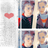
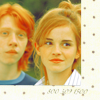
from this.
Coloring
Post-Coloring


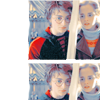
Accompany me to show you how to get

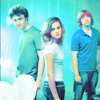
from this.
Coloring
- Fix your base as you always would. I never resize it until I’m finished coloring, but that’s your choice. I did two screen layers at 100 opacity.
- New Selective Color Layer:
R: -100, 44, 100, 0
Y: 100, 0, -100, 0
N: 9, -8, 36, 0 - New Selective Color Layer:
R: 0, 9, 82, 0
Y: 0, 0, -48, 0
N: 9, -10, -40, 0 - New Selective Color Layer:
R: -21, 0, 71, 0
Y: 0, 0, -100, 0
N: -6, -15, 0, 0 - New Hue/Saturation Layer:
Master Saturation: 20
Post-Coloring
- Resize your image to 70 height, select the canvas, copy and paste it into a new 100 x 100 canvas. When I resize, the dimensions aren’t usually equal. I set one of the dimensions to 100 and see whether the other dimension is over 100 or under 100. If it’s under 100, I set that dimension to 100 so the other dimension is over 100. Make sense?
- In the canvas, set the image at the top right corner, duplicate the layer and move it directly under the first image, so a small strip of white shows between both the images.
- Click on the Pen Tool and set it to Freeform by right-clicking it. Select the rounded rectangle and set the radius to 5 pixels. Then create a path on the left side of the layer. Make a new layer above all the layers, and set the opacity to 70.
- Right-click the rounded rectangle path and select the Fill Path option. Fill it with white.
- Before you panic about the path still showing, just hit CTRL + H and it will disappear.
- Now the square looks very boring. Select the rectangle by using the Magic Wnad Tool and Inversing the selection by hitting SHIFT + CTRL + I. Take this
by ewanism and paste into the selection by hitting SHIFT + CTRL + V. Set the opacity to 40 and merge it down. - It still looks boring. Use the Burn Tool (right-click the Dodge Tool and select Burn Tool). Set the exposure to 50 at Shadows and brush the rounded rectangle layer a little bit. Then select Highlights at 20 Exposure and brush the layer again. Burn it until it looks like it blends into the background even more.
- Motion Blur this layer.
Angle: 90
Distance: 10 - Take THIS

grainy texture (modified by me) and paste it on top of the rounded rectangle. Set the opacity to 80 and merge it with the rounded rectangle layer. - Click on the Pen Tool and set it to Freeform by right-clicking it. Select the rounded rectangle and set the radius to 5 pixels. Then create a path on the right side of the layer. This rectangle should only have one side inside the icon. You don’t want the other sides to show for this. Make a new layer above all the layers.
- Select the Paintbrush tool and select a small, rounded 3 pixel brush. Reselect the Freeform Pen Tool and right-click your path. Select Stroke Path and Brush from the dropdown menu. The one side of the rectangle should show up after you hit CTRL + H.
- Duplicate this layer, flip it horizontally and move it a little bit away from the two images (mine is the HP cap duplicated and positioned under the first).
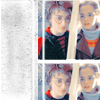
- Take this heart

(made by using a custom shape) and paste it at the top of the layer palette. Set the opacity to 50. - Add any brushes, text, etc. And you should be finished.

Ask for .PSD.
