tutorial #3
requested by ophelia_ayu, from this icon post. most of the icons in that post were made using a very similar style, but if you see a specific one (not ayumi, though, 'cause they were all made basically the same) that you'd like a tutorial of, feel free to ask, as well!
anyway.
we will be going from this to this: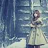
this icon was made in Photoshop CS2, and I'm not sure if it's translatable because it uses not only Curves but Variations. if anyone knows if these tools are found in other programs, or how to get similar effects, let me know!
1. open the original image. what we're going to do first is select a good portion of it, don't worry about the size. now open a new image (CTRL + N), copy (CTRL + C) the resized image and paste (CTRL + V) it into the new image.
once you've got something vaguely like this, resize it (Image > Image Size) to about 130x160 pixels (wow. that worked out nicely. o.o;)
again, open a new image (100x100 pixels), copy the resized image, and paste it into the new image, shifting around until you've got it positioned like you want.
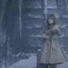
2. from here we want to sharpen the image (Filter > Sharpen > Sharpen), to give you this. duplicate the layer (CTRL + J), and set the blend mode to screen, giving the layer an opacity of 60% (should look like this). duplicate again, set the blend mode to soft light. make sure the opacity is 100%!
you should now have something like this: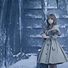
3. this is where we get to the tricky part. what we're going to be doing here is using curves, to bring out the contrast and add some nice coloring to it. if you'd like a tutorial on curves before trying this out, I'd recommend this one. it's where I learned the basics, and it is a HUGE help. I'm still slowly figuring things out on my own, but that's definitely where to go first.
anyhoo.
the best way to get to the curves tool is by opening the layers palette (which, personally, I think you should always have open while making graphics). at the bottom of the palette is a series of 7 icons. one of them should be a circle, half black, half white. click that, and go up the menu till you see "Curves..." my settings, for those who are confused.
once you've opened the curves tool, you'll notice there's a box in the middle with a grid and a line going straight through it. that is what you're going to be playing with. once again, I'd recommend reading through the tutorial I linked to above if you decide to try these on your own, but for what we're doing here you can really just use the exact settings I have. now, at the top of the box you'll notice a drop-down menu. we're going to be using the RGB, Red and Green settings.
in the RGB, click anywhere in the box (with the grid and the diagonal line). at the bottom of the window you'll notice two boxes that read "Input" and "Output." fill them in with the following settings: 188, 209 (in that order). your settings should look like this, and if you look back at the image, you'll see this: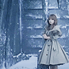
notice the image is a little brighter?
now, move on to the Red (just go down the drop-down menu at the top). click anywhere in the box, and in the Input/Output boxes type the following: 27, 18. click again, and type in 225, 241. settings should look like this, and your image like this: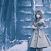
interesting, isn't it? but it's a little too green, a little too red for my tastes.
so now we go to the Green (once again, down the drop-down menu). clicking anywhere in the box, type 27, 14 in the Input/Output boxes. click again, and type in 226, 244. my settings, and the result: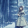
now, that's much better.
let's compare. before we had
, but with the curves we have
4. now, once you've got the curves done, open a new layer (CTRL + SHIFT + N). using the fill tool (the little spilling paintbucket on the tools palette), fill the new layer with 03031d by clicking anywhere on the image. make sure you've got the new layer selected before clicking, because otherwise you'll screw up the curves layer. XD; set this new layer's blend mode to exclusion.
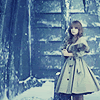
the effect is very subtle, but it's there. if you zoom in and look at it from there, you'll notice that everything close to black in color is now blue, and everything close to white is somewhat yellow/brown-ish.
5. fifth and final step, now. XD here, you can do one of two things. you can merge all the layers (CTRL + SHIFT + E), or you can copy them all (CTRL + SHIFT + C).
if you choose to merge them all (which is, admittedly, probably easier), duplicate the layer. if you choose to copy them all, paste them in a new layer.
once you've got the duplicate of everything, go to Image > Adjustments > Variations. make sure the image is set to "original" (look here if you're confused). this is just to make sure, in case you've recently used variations, that the image you'll be changing is the original one, and not the previous colors you may have used. basically, I'm just confusing you all (sorry), and if you've never used variations before? don't worry about it. XD;
anyhoo. now that I've confused everyone, you'll notice that there are three main boxes (one at the top, with the original and your current pick), one on the left (the largest box, with six different settings and your current pick in the middle), and one on the right (with lighter, current pick, and darker). what you want is the one with the six different color settings.
from here, click the one that says "More Red" (giving you this). notice how the one that says "current pick" is now redder? that's what you want! now that you've done that, click "More Green", making the icon just a tad bit greener.
the end result of the variations layer is this: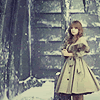
now, we're going to set this new layer to Color 40%, giving you something that is just slightly greener and redder than what you had before the variations. I was definitely going for subtle with this style. XD;
so, once again.
from this, to this:
other icons made using this technique: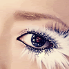
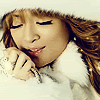
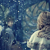
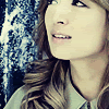
NOTE: keep in mind, the settings for each icon are often different. some icons might require more than one screen layer, others might require none. the curves settings were also different for all of them; some of them didn't have anything in the RGB section of the curves. the only things that remain the same for each icon was the sharpening, the soft light layer, the blue in the exclusion layer, and the variations. experiment! it's fun.
so yes, if I've confused anyone, please. let me know, and I'll try to make things clearer!
anyway.
we will be going from this to this:

this icon was made in Photoshop CS2, and I'm not sure if it's translatable because it uses not only Curves but Variations. if anyone knows if these tools are found in other programs, or how to get similar effects, let me know!
1. open the original image. what we're going to do first is select a good portion of it, don't worry about the size. now open a new image (CTRL + N), copy (CTRL + C) the resized image and paste (CTRL + V) it into the new image.
once you've got something vaguely like this, resize it (Image > Image Size) to about 130x160 pixels (wow. that worked out nicely. o.o;)
again, open a new image (100x100 pixels), copy the resized image, and paste it into the new image, shifting around until you've got it positioned like you want.

2. from here we want to sharpen the image (Filter > Sharpen > Sharpen), to give you this. duplicate the layer (CTRL + J), and set the blend mode to screen, giving the layer an opacity of 60% (should look like this). duplicate again, set the blend mode to soft light. make sure the opacity is 100%!
you should now have something like this:

3. this is where we get to the tricky part. what we're going to be doing here is using curves, to bring out the contrast and add some nice coloring to it. if you'd like a tutorial on curves before trying this out, I'd recommend this one. it's where I learned the basics, and it is a HUGE help. I'm still slowly figuring things out on my own, but that's definitely where to go first.
anyhoo.
the best way to get to the curves tool is by opening the layers palette (which, personally, I think you should always have open while making graphics). at the bottom of the palette is a series of 7 icons. one of them should be a circle, half black, half white. click that, and go up the menu till you see "Curves..." my settings, for those who are confused.
once you've opened the curves tool, you'll notice there's a box in the middle with a grid and a line going straight through it. that is what you're going to be playing with. once again, I'd recommend reading through the tutorial I linked to above if you decide to try these on your own, but for what we're doing here you can really just use the exact settings I have. now, at the top of the box you'll notice a drop-down menu. we're going to be using the RGB, Red and Green settings.
in the RGB, click anywhere in the box (with the grid and the diagonal line). at the bottom of the window you'll notice two boxes that read "Input" and "Output." fill them in with the following settings: 188, 209 (in that order). your settings should look like this, and if you look back at the image, you'll see this:

notice the image is a little brighter?
now, move on to the Red (just go down the drop-down menu at the top). click anywhere in the box, and in the Input/Output boxes type the following: 27, 18. click again, and type in 225, 241. settings should look like this, and your image like this:

interesting, isn't it? but it's a little too green, a little too red for my tastes.
so now we go to the Green (once again, down the drop-down menu). clicking anywhere in the box, type 27, 14 in the Input/Output boxes. click again, and type in 226, 244. my settings, and the result:

now, that's much better.
let's compare. before we had

, but with the curves we have

4. now, once you've got the curves done, open a new layer (CTRL + SHIFT + N). using the fill tool (the little spilling paintbucket on the tools palette), fill the new layer with 03031d by clicking anywhere on the image. make sure you've got the new layer selected before clicking, because otherwise you'll screw up the curves layer. XD; set this new layer's blend mode to exclusion.

the effect is very subtle, but it's there. if you zoom in and look at it from there, you'll notice that everything close to black in color is now blue, and everything close to white is somewhat yellow/brown-ish.
5. fifth and final step, now. XD here, you can do one of two things. you can merge all the layers (CTRL + SHIFT + E), or you can copy them all (CTRL + SHIFT + C).
if you choose to merge them all (which is, admittedly, probably easier), duplicate the layer. if you choose to copy them all, paste them in a new layer.
once you've got the duplicate of everything, go to Image > Adjustments > Variations. make sure the image is set to "original" (look here if you're confused). this is just to make sure, in case you've recently used variations, that the image you'll be changing is the original one, and not the previous colors you may have used. basically, I'm just confusing you all (sorry), and if you've never used variations before? don't worry about it. XD;
anyhoo. now that I've confused everyone, you'll notice that there are three main boxes (one at the top, with the original and your current pick), one on the left (the largest box, with six different settings and your current pick in the middle), and one on the right (with lighter, current pick, and darker). what you want is the one with the six different color settings.
from here, click the one that says "More Red" (giving you this). notice how the one that says "current pick" is now redder? that's what you want! now that you've done that, click "More Green", making the icon just a tad bit greener.
the end result of the variations layer is this:

now, we're going to set this new layer to Color 40%, giving you something that is just slightly greener and redder than what you had before the variations. I was definitely going for subtle with this style. XD;
so, once again.
from this, to this:

other icons made using this technique:


NOTE: keep in mind, the settings for each icon are often different. some icons might require more than one screen layer, others might require none. the curves settings were also different for all of them; some of them didn't have anything in the RGB section of the curves. the only things that remain the same for each icon was the sharpening, the soft light layer, the blue in the exclusion layer, and the variations. experiment! it's fun.
so yes, if I've confused anyone, please. let me know, and I'll try to make things clearer!