Tutorial - How to use Textures
Tutorial requested by psychodids to show how to use textures when making icons. All of the texture used in the tutes are made by me and if you'd like can be downloaded in their respective sets at my journal, just hit the tags to find them or check memories. :)
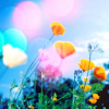
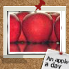
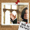
Learn how to makes these icons
1.
2.
3.
I used the bases as is but please don't feel you have to aswell. By all means I'd prep the bases even more when making icons myself with colouring/brushes and what not, I didn't use any because I wanted to show you the effects of what you can do with textures/blending modes alone.
The table layout codes were inspired by one of 10000_pixels tutorials. If anyone would like to create a table like this they can do so at TableMaker.
Light Textures
Layers
Description - Using Light Textures
Stages
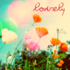
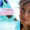
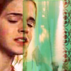
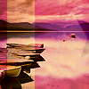
Light textures are the easiest things to use, but can really add a little something special from an ordinary icon. Simply open up your base (I used one made by by evitaporter and paste the light texture you want to use on top of your base and set it to screen (move the light texture if necessary). Depending on your picture you might have to erase any bits covering your image (Eg. like a face)..

It seems like you haven't done much but the light texture really gives a pretty effect of sunlight flares. It looks nice as is but I played around with saturation and colour balance to give it a bit of a nostalgic feeling. Follow this order to achieve this colour.
Hue - 5
Saturation - 10
Red + 24
Yellow - 24
Added some text and it's finished.
Screening Textures
Layers
Description - Screening Textures
Stages

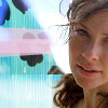
I started out with this base of Kate from Lost by zeppo1630 because I was feeling too lazy to crop a pic to 100x100! :p Prep your base image and change the colour etc to your liking, I left mine as is.
Then open up the texture you want to use. Paste that layer onto your base image and set to screen.
I moved the texture layer a little to the left, but it doesn't really matter as we'll get rid of everything covering the face anyway. Edit: Now use your eraser tool.
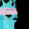
Erase the bits that are covering her face. The left layer shows you what your erased layer should look like if it wasn't set to screen. That's it! Add any text/brushes if you wish and your done. :)
Multiplying Textures
Layers
Description - Multiplying Textures
Stages
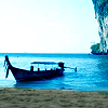
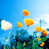
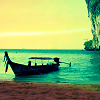
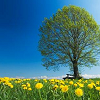
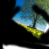
This is another easy thing to do to add some colour to your icons. I know there are some great tutorials that achieve wonderful colouring but then they have a thousand steps of burn layer/dodge etc. Something different to try out is multiplying a texture layer on to your base. You'd be surprised by the effects! Though you might have to play around to see how well it works depending on your base. Anyway, I started of with this base by evitaporter and this yellow texture.
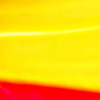
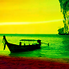
I set the texture to multiply 100%. A little too bright so I changed the opacity to 49% (Again this will depend on your base). Experiment with hue/saturation for a completely different look.
Layers
Description - Multiplying Textures
Stages
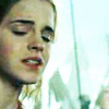
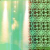
I started out with this base of Hermione by shadowshamrock and this texture
I adjusted the colour of the base by playing with Hue and increased the amount of red. Set the texture layer to multiply 100% and then moved it a littler to the left. Edit: Now use your eraser tool and erase the bits that are covering her face. Add any text etc…
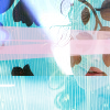
Overlaying Textures
Layers
Description - Overlaying Textures
Stages
As with multiplying texture to add a little colour, why not try overlaying too? (Again it might depend on your base at how well this effect works) I started of with this base by letmypidgeonsgo and this texture.

I set the texture to overlay 100%. Experiment with hue/saturation/opacity for a completely different look - I tried it myself and gave it even more of a sunset feel.
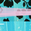
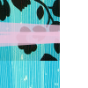
Layered Textures
Layers
Description - Using Layered Textures
Stages
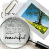
I thought I'd write up a quick tute on how to use the layered textures that I created in my last set of texture sets. I started of with this base by evitaporter and this texture.


Rotate the base image to 20 degrees CW then set the texture to screen 100%. Move the layer accordingly to fit the size of the polaroid. Edit: Now use your eraser tool. Erase the unwanted bits. The right layer shows you what your erased layer should look like if it wasn't set to screen.
I added this text brush by radon_ and set it to multiply 100%. Added the word "beautiful" and the icon is done.
Other Examples using layered texture set and following the above tute
Hope these tutes were some what helpful for those wondering how to use textures and by all means post your finished icons here - I'd love to see what you all made. Feel free to use any of the finished icons if you'd like.
The most important thing to remember when making icons is that there is a lot of trial and error involved - experimenting is half the fun! Somethings work really well and others just don't, just try to have a little fun and you'll be surprised with what you can come up with! :)
Learn how to makes these icons
1.
2.
3.
I used the bases as is but please don't feel you have to aswell. By all means I'd prep the bases even more when making icons myself with colouring/brushes and what not, I didn't use any because I wanted to show you the effects of what you can do with textures/blending modes alone.
The table layout codes were inspired by one of 10000_pixels tutorials. If anyone would like to create a table like this they can do so at TableMaker.
Light Textures
Layers
Description - Using Light Textures
Stages
Light textures are the easiest things to use, but can really add a little something special from an ordinary icon. Simply open up your base (I used one made by by evitaporter and paste the light texture you want to use on top of your base and set it to screen (move the light texture if necessary). Depending on your picture you might have to erase any bits covering your image (Eg. like a face)..
It seems like you haven't done much but the light texture really gives a pretty effect of sunlight flares. It looks nice as is but I played around with saturation and colour balance to give it a bit of a nostalgic feeling. Follow this order to achieve this colour.
Hue - 5
Saturation - 10
Red + 24
Yellow - 24
Added some text and it's finished.
Screening Textures
Layers
Description - Screening Textures
Stages
I started out with this base of Kate from Lost by zeppo1630 because I was feeling too lazy to crop a pic to 100x100! :p Prep your base image and change the colour etc to your liking, I left mine as is.
Then open up the texture you want to use. Paste that layer onto your base image and set to screen.
I moved the texture layer a little to the left, but it doesn't really matter as we'll get rid of everything covering the face anyway. Edit: Now use your eraser tool.
Erase the bits that are covering her face. The left layer shows you what your erased layer should look like if it wasn't set to screen. That's it! Add any text/brushes if you wish and your done. :)
Multiplying Textures
Layers
Description - Multiplying Textures
Stages
This is another easy thing to do to add some colour to your icons. I know there are some great tutorials that achieve wonderful colouring but then they have a thousand steps of burn layer/dodge etc. Something different to try out is multiplying a texture layer on to your base. You'd be surprised by the effects! Though you might have to play around to see how well it works depending on your base. Anyway, I started of with this base by evitaporter and this yellow texture.
I set the texture to multiply 100%. A little too bright so I changed the opacity to 49% (Again this will depend on your base). Experiment with hue/saturation for a completely different look.
Layers
Description - Multiplying Textures
Stages
I started out with this base of Hermione by shadowshamrock and this texture
I adjusted the colour of the base by playing with Hue and increased the amount of red. Set the texture layer to multiply 100% and then moved it a littler to the left. Edit: Now use your eraser tool and erase the bits that are covering her face. Add any text etc…
Overlaying Textures
Layers
Description - Overlaying Textures
Stages
As with multiplying texture to add a little colour, why not try overlaying too? (Again it might depend on your base at how well this effect works) I started of with this base by letmypidgeonsgo and this texture.
I set the texture to overlay 100%. Experiment with hue/saturation/opacity for a completely different look - I tried it myself and gave it even more of a sunset feel.
Layered Textures
Layers
Description - Using Layered Textures
Stages
I thought I'd write up a quick tute on how to use the layered textures that I created in my last set of texture sets. I started of with this base by evitaporter and this texture.
Rotate the base image to 20 degrees CW then set the texture to screen 100%. Move the layer accordingly to fit the size of the polaroid. Edit: Now use your eraser tool. Erase the unwanted bits. The right layer shows you what your erased layer should look like if it wasn't set to screen.
I added this text brush by radon_ and set it to multiply 100%. Added the word "beautiful" and the icon is done.
Other Examples using layered texture set and following the above tute
Hope these tutes were some what helpful for those wondering how to use textures and by all means post your finished icons here - I'd love to see what you all made. Feel free to use any of the finished icons if you'd like.
The most important thing to remember when making icons is that there is a lot of trial and error involved - experimenting is half the fun! Somethings work really well and others just don't, just try to have a little fun and you'll be surprised with what you can come up with! :)