(no subject)
There was a request by chipping for a tutorial of this icon, so here it is!

enjoy :D
I can't find the picture in it's original size, but this is the base I used for my icon:

with almost every icon I make I start with the same basic steps:
-duplicate the base and desaturate it completely, you can do that in a fast way by holding down ctrl alt u
- duplicate the base again (the colored version) and set it above the desaturated layer. Set this layer to soft light (100%)
It will now look like this:

- Now duplicate the 'soft light' layer and leave this on soft light (100%)
- Duplicate your second layer (the desaturated one) and set it on top of all your other layers. Set the opacity to soft light (100%).
The icon looks like this:

Now I know I said I always do the same basics steps with every icon. However, I never do exactly the same. What I mean is that I always duplicate the layer and desaturate it. The other steps may vary: sometimes it's better to set a few layer to screen or multiply. After trying different things I found that I liked it best this time with all the layers set to 'soft light'.
Anyway, to continue:
- create a new layer, fill it with a dark blue color (I did 020210) and set the layer to exclusion. it hardly makes any difference, but whatever :P

Now here comes the tricky part:
- Create another new layer, set it to exclusion and set your color to a light pink (I can't remember exactly what color I did, something like F4E1F3). Now fill the layer with a gradient. If everything goes well you will get a gradient that flows from the light pink color to white/transparent!. Change the angle of the gradient to something like 45 degrees.
Make sure you have your gradient set to transparency, otherwise it won't work.
The icon looks something like this:

Hmm now you can only see her face, but nothing of her neck of anything.
- Duplicate the desaturated layer, drag it above the exclusion layer you just made, and set it so 'soft light'(64%). Now you can see a bit of her neck and collar, but it all looks a bit..vague..

- Duplicate the desaturated layer again (don't worry, this is the last time) and set it to soft light (43%).

Now we need to make it all look 'one', the blueish hair in the corner looks a bit weird. Make a new layer, set it to exclusion. fill the layer with this gradient, which I think is by crumblingwalls, correct me if I'm wrong :)

As you can see I changed the angle of the gradient a bit. Drag the layer under the desaturated layer, the one that is set to 43%. Does it look something like this:

good :)
- Make a new layer, fill it with this gradient, also by crumblingwalls

Set it to Color burn (70%), and make sure it is on top of all the other layers:

Well to finish the icon I added a brush, on a new layer. it is this brush, and I'm not sure who made it..
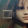
Anyway, I did the brush using a white color. Then I resized it to make it a small box (you can use ctrl t). I dragged the brush layer under the last three layers (the two gradients and the desaturated layer). Then I copied it, dragged it all the way up, and set it to 50%.
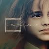
The same goes for the tiny text brush I used.
well, that was it. If you have any questions feel free to ask. If you take the icon please comment and credit. I'd love to see how you used the tutorial for an icon you made :D
(Oh and I think you can imagine that I won't be happy if you just make the exact same icon and claim it as yours).
Hope it was all clear!
enjoy :D
I can't find the picture in it's original size, but this is the base I used for my icon:
with almost every icon I make I start with the same basic steps:
-duplicate the base and desaturate it completely, you can do that in a fast way by holding down ctrl alt u
- duplicate the base again (the colored version) and set it above the desaturated layer. Set this layer to soft light (100%)
It will now look like this:
- Now duplicate the 'soft light' layer and leave this on soft light (100%)
- Duplicate your second layer (the desaturated one) and set it on top of all your other layers. Set the opacity to soft light (100%).
The icon looks like this:
Now I know I said I always do the same basics steps with every icon. However, I never do exactly the same. What I mean is that I always duplicate the layer and desaturate it. The other steps may vary: sometimes it's better to set a few layer to screen or multiply. After trying different things I found that I liked it best this time with all the layers set to 'soft light'.
Anyway, to continue:
- create a new layer, fill it with a dark blue color (I did 020210) and set the layer to exclusion. it hardly makes any difference, but whatever :P
Now here comes the tricky part:
- Create another new layer, set it to exclusion and set your color to a light pink (I can't remember exactly what color I did, something like F4E1F3). Now fill the layer with a gradient. If everything goes well you will get a gradient that flows from the light pink color to white/transparent!. Change the angle of the gradient to something like 45 degrees.
Make sure you have your gradient set to transparency, otherwise it won't work.
The icon looks something like this:
Hmm now you can only see her face, but nothing of her neck of anything.
- Duplicate the desaturated layer, drag it above the exclusion layer you just made, and set it so 'soft light'(64%). Now you can see a bit of her neck and collar, but it all looks a bit..vague..
- Duplicate the desaturated layer again (don't worry, this is the last time) and set it to soft light (43%).
Now we need to make it all look 'one', the blueish hair in the corner looks a bit weird. Make a new layer, set it to exclusion. fill the layer with this gradient, which I think is by crumblingwalls, correct me if I'm wrong :)
As you can see I changed the angle of the gradient a bit. Drag the layer under the desaturated layer, the one that is set to 43%. Does it look something like this:
good :)
- Make a new layer, fill it with this gradient, also by crumblingwalls
Set it to Color burn (70%), and make sure it is on top of all the other layers:
Well to finish the icon I added a brush, on a new layer. it is this brush, and I'm not sure who made it..
Anyway, I did the brush using a white color. Then I resized it to make it a small box (you can use ctrl t). I dragged the brush layer under the last three layers (the two gradients and the desaturated layer). Then I copied it, dragged it all the way up, and set it to 50%.
The same goes for the tiny text brush I used.
well, that was it. If you have any questions feel free to ask. If you take the icon please comment and credit. I'd love to see how you used the tutorial for an icon you made :D
(Oh and I think you can imagine that I won't be happy if you just make the exact same icon and claim it as yours).
Hope it was all clear!