Full icon tutorial
I quickly wrote up the tutorial (sorry if there are errors!), on how to acheive this sort of style:

Written for PSP8.
1. So I started with this image, from Lost Media. It's fairly huge, so I had to crop it to a 338x338px square. I went to Image -> Resize and resized it to 100x100px. It was too blurry, so sharpened it by going Adjust -> Sharpness -> Sharpen. I ended up with this:

2. Then, I did the good old blue exclusion layer thing. I made a new Raster layer and flood-filled it with colour #080A1C. I copied the bottom layer and pasted it as a new image (Edit -> Paste -> Paste as New Image). I made this image black and white (Image -> Greyscale) and copied it. Then, I went back to the first image with the blue exclusion layer and pasted it on top, set to Soft Light. The layers looked like this:

(Soft Light 100%)

(Exclusion 100%)

(Background Image, Normal 100%)
I merged all of the layers (Layers -> Merge -> Merge All (Flatten)). This was the result:

3. I copied this new merged image and pasted it as a new image. I cropped the new image to 50px x 76px, like this:

Then I copied this and pasted it as a new layer on my other image (sorry if this is getting confusing). I used the move tool to move it around and came up with this:
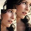
4. I created a new Raster layer and used the paintbrush tool (the square default brush set at size 1) to outline the smaller picture of Kate in white (#FFFFFF).
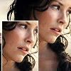
5. I created another new Raster layer and selected another brush (the default round one, size 9, hardness set to 10). I painted a rough line going from the bottom half of the right side to the bottom left (all in white).
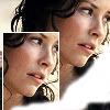
I gaussian blurred it (Just realized I've been calling that Gaucassian blur for forever). Adjust -> Blur -> Gaussian Blur. Radius should be set to 8. I ended up with this:
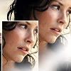
Now, flatten the image again (Layers -> Merge -> Merge All (Flatten).
6. I duplicated the layer (Layer -> Duplicate). Then, I played around with some gradients and eventually picked out this one, by crumblingwalls.
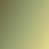
I flood-filled the bottom layer with the gradient, leaving the top layer untouched. There was no visible difference, since the top layer was set to normal. I changed the blending mode of that top layer from Normal to Screen (100%). It looked like this:

Ah hah. It was a little too faded, so I copied the screened layer (of Kate), pasted it as a new image, and made it black and white (Image -> Greyscale). I copied that and pasted it back on the image with the gradient, on top of the other layers. I set it to Soft Light.

Still not quite right, so I duplicated the screened (coloured) layer again, set it to Soft Light, and brought the opacity down to 42%.

I added a new layer to the very top and filled it with black (#000000). I set the blend mode to Soft Light, and brought the opacity down to 42%. This is what I had at this point:

I merged (flattened) all of the layers.
7. It came time for text. I made a new layer. I like my &'s so I went with one of those, in white. The font was Georgia, size 30. I set the blend mode for the layer to soft light.

I decided to just do some small text, it wouldn't get too cluttered. I love love love small text. I made a new layer for it, and used Georgia size 2 with the colour #252810 (picked out from the icon with the eyedropper). I used lyrics from Leonard Cohen's 'Hallelujah': "It's a cold and it's a broken hallelujah". I did the text in all capitals with a space between each letter and two spaces between each word, except for 'hallelujah' which was much more spread out below. I brought the opacity of that text layer down to 72%.

8. I was feeling self-concious about not using enough brushes, so I used one of teh_indy's texture brushes:
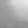
I placed it on a separate layer on top of the others, in white, and set to 'Soft Light'.

9. Finally, I grabbed the simplest border brush I could (one I picked up a long long time ago):

I placed it on a separate layer, in black, set to Multiply at about 6 percent. I used a soft round eraser brush to erase the places where the border covered the white parts I'd done before.
This was my finished product:

Not a particularly amazing icon, but it gives you an idea of how to achieve the effect. I'm sorry if this was too confusing or not detailed enough. Let me know if you have any questions and I'll try to help. Hope this was somewhat helpful! :)

Written for PSP8.
1. So I started with this image, from Lost Media. It's fairly huge, so I had to crop it to a 338x338px square. I went to Image -> Resize and resized it to 100x100px. It was too blurry, so sharpened it by going Adjust -> Sharpness -> Sharpen. I ended up with this:

2. Then, I did the good old blue exclusion layer thing. I made a new Raster layer and flood-filled it with colour #080A1C. I copied the bottom layer and pasted it as a new image (Edit -> Paste -> Paste as New Image). I made this image black and white (Image -> Greyscale) and copied it. Then, I went back to the first image with the blue exclusion layer and pasted it on top, set to Soft Light. The layers looked like this:

(Soft Light 100%)

(Exclusion 100%)

(Background Image, Normal 100%)
I merged all of the layers (Layers -> Merge -> Merge All (Flatten)). This was the result:

3. I copied this new merged image and pasted it as a new image. I cropped the new image to 50px x 76px, like this:

Then I copied this and pasted it as a new layer on my other image (sorry if this is getting confusing). I used the move tool to move it around and came up with this:

4. I created a new Raster layer and used the paintbrush tool (the square default brush set at size 1) to outline the smaller picture of Kate in white (#FFFFFF).

5. I created another new Raster layer and selected another brush (the default round one, size 9, hardness set to 10). I painted a rough line going from the bottom half of the right side to the bottom left (all in white).

I gaussian blurred it (Just realized I've been calling that Gaucassian blur for forever). Adjust -> Blur -> Gaussian Blur. Radius should be set to 8. I ended up with this:

Now, flatten the image again (Layers -> Merge -> Merge All (Flatten).
6. I duplicated the layer (Layer -> Duplicate). Then, I played around with some gradients and eventually picked out this one, by crumblingwalls.

I flood-filled the bottom layer with the gradient, leaving the top layer untouched. There was no visible difference, since the top layer was set to normal. I changed the blending mode of that top layer from Normal to Screen (100%). It looked like this:

Ah hah. It was a little too faded, so I copied the screened layer (of Kate), pasted it as a new image, and made it black and white (Image -> Greyscale). I copied that and pasted it back on the image with the gradient, on top of the other layers. I set it to Soft Light.

Still not quite right, so I duplicated the screened (coloured) layer again, set it to Soft Light, and brought the opacity down to 42%.

I added a new layer to the very top and filled it with black (#000000). I set the blend mode to Soft Light, and brought the opacity down to 42%. This is what I had at this point:

I merged (flattened) all of the layers.
7. It came time for text. I made a new layer. I like my &'s so I went with one of those, in white. The font was Georgia, size 30. I set the blend mode for the layer to soft light.

I decided to just do some small text, it wouldn't get too cluttered. I love love love small text. I made a new layer for it, and used Georgia size 2 with the colour #252810 (picked out from the icon with the eyedropper). I used lyrics from Leonard Cohen's 'Hallelujah': "It's a cold and it's a broken hallelujah". I did the text in all capitals with a space between each letter and two spaces between each word, except for 'hallelujah' which was much more spread out below. I brought the opacity of that text layer down to 72%.

8. I was feeling self-concious about not using enough brushes, so I used one of teh_indy's texture brushes:

I placed it on a separate layer on top of the others, in white, and set to 'Soft Light'.

9. Finally, I grabbed the simplest border brush I could (one I picked up a long long time ago):

I placed it on a separate layer, in black, set to Multiply at about 6 percent. I used a soft round eraser brush to erase the places where the border covered the white parts I'd done before.
This was my finished product:

Not a particularly amazing icon, but it gives you an idea of how to achieve the effect. I'm sorry if this was too confusing or not detailed enough. Let me know if you have any questions and I'll try to help. Hope this was somewhat helpful! :)