MAGICMAKERS INTERVIEW (PART II)
part one.
THE PARTICIPANTS


darlingbones ohgollygeedamn hopeitallaway fouroux delorentoes
bussbuss realproof justmyb0nes eamesie spud66cat
mm3butterfly shrimpy_19 raiindust blue_emotion rahelcs
please consider that not all of us are native english speakers!
WHAT IS YOUR FAVOURITE COLOUR TO WORK WITH WHILE ICONING?

PURPLE. Noone who has seen my posts will argue with you here! Colour scheme wise I lean towards the Early Sunset gradient from early Microsoft products
LOL

Oh, I just love reds/pinks in icons. Quite frequently I have to make a conscious effort just to do anything else or go in a different direction when it wouldn’t suit the icon!

i tend to have a lot of blue and purple going on. and i always try to work with the colors the cap already has. sometimes i want to push it in another coloring-directions though. it can be challenging and often takes me a long time, because coloring can turn my icons into something i hate. (and i give up very easily, if it's going in the wrong direction.)

this one should be obvious: GREEN. I'm sure some people are already rolling their eyes at me, but it's the colour I have the most fun with these days. I really adore a nice blue/purple colouring as well, but it doesn't come all that naturally to me (if that makes any sense).

I just try to pick out the dominant colours in the icon and enhance them. I like working with yellow though and I also love working with red-haired subjects because their hair is always good to colour (I’m looking at you Jessica and Sophie-Ann!)

RED. SEE!


Blue? No green... uhm, I have not idea, actually. XD
I did some swatches for certain-makers on my flist a while back, with colours that I thought represented them. I have no idea, what my own colours are, though. Probably some apple green, sky blue and beige...

I love to work with yellows/blues and recently I added magentas. It really depends on the cap though. I always work according to the cap and not according to what I want.

Blue. I love the many different shades and it’s easy to combine with most other colors.

While my favorite color is blue, I don't really feel like I have a favorite color to work with while iconing. I usually prefer to work with and enhance the the colors that are already in a cap before trying anything else. If I do go for a different coloring, it varies on a case by case basis depending on what works best with a particular image.

Black. lol. I like dark shadows. :) But also Yellow, even if too much of it gets fug. Everything I make has a tendency to turn yellow. It's a bit frustrating, to be honest. I wish I used more reds and purples and greens, I really like those colors, but... I forget. :P

I’ve taken quite a liking to purple in my recent icons. I like to work with every colour though! I think it all depends on the cap and the mood you’re trying to create. I like cooler colours because you can create quite a dramatic mood with them but warm colours can make you feel more optimistic and happy.

YELLOW: I think it's my love of vibrancy and sunflowers and daffodils. For some reason, I love putting yellow into an image and playing around with it. It may also be my obsession with blonde haired characters that makes me love yellow as well.

I don’t think I can pick just one, I love green & yellow tones together, but I really enjoy working with cyans and purples too! Normally I just see where an icon takes me.

i don't think i have any.
DO YOU PREFER MAKING COLOURED ICONS OR BLACK/WHITE ICONS? EXPLAIN WHY.

COLOUR. My life is a rainbow. I only use black & white when I can't get the colours to play together nicely.

Generally I make more coloured icons. I love b&w too but there is something really satisfying about seeing colouring come together. Some icons I colour and then just realise they were ‘meant’ to be b&w though. :)

i think i prefer colored icons above b&w, just because you have a lot more stuff going on, on colored icons. not saying i don't like black and white icons. i really would like to get more into good b&w icons, one day.

I used to prefer making b/w icons, and I can still appreciate a good b/w icon (though much rather made by others than by me), but I'm all about colours these days. why? probably because of the current vibrant trend and because there is simply more variety when it comes to colours.

I like making both. Seeing a coloured icon finished and looking well is always a great reward for the time you’ve spent working on it. I especially like comparing the original cap with the icon to see how much I have changed the colouring. I am definitely guilty of sticking a monochromatic gradient map on a cap whose colouring isn’t working but sometimes it really is for the best.

I guess I don't really have a preference. I like both and I think both have their place. I still tend to make more colored icons than b&w.

I always try to go for colours, if I can. (Though if there are nice shadows, b/w icons can be great to do. :)) I think most of the time colours will help emphasize the mood of the scene you're trying to capture.

It is a tough one!!! I love both and can't answer that. I love to do black and white icons but I love to do coloured ones too. I'd say it depends on the cap (yes again). When I snag a cap, I know if I want a black and white or a coloured icon out of it so I really can't tell. Both are complex to do and I enjoy doing both.
I can't live without both though. Does that answer?

I prefer colored icons. Actually, I only make b&w icons if I can’t find a coloring for a cap I desperately want to use. I know it sounds funny, and I don’t see it that way with other icon makers, but for me all my b&w icons are a kind of failure at coloring.

Although I've had several people compliment me on my black & white icons, I really love color. I think thats because one of the things that draws me to an images are the colors, and I naturally want to bring those out and brighten them. I also feel like its more challenging in a way. The reason I got so good at making B & W icons is because I sucked at coloring for so long. So when color failed me, I opted for B&W and aimed to make it the best that I could. Now that I've mastered coloring, I don't think to try B & W as often.

Coloured. Because I like colors and colorful things, not much explanation to it, haha. But I can appreciate a perfectly contrasted and sharpened BW just as well (good sharpening is an art, imho.) Kudos to justmyb0nes and quiddity_ for mastering BW.

That’s a really hard one to decide but I’m going to say black and white. While there are a lot of colours to work with, you can just do so many amazing things with just the colours black and white and I think that’s amazing. I usually only end up making b&w icons when I’m working on a colour icon and it doesn’t feel right so I change it to black and white. I suppose that’s why it is such an achievement for me as well, because it came from something that originally wasn’t that pretty.

I love vibrancy, so I've been drawn to coloured icons for a very long time now... however recently, I've gotten back into the swing of it with b&w and am really enjoying pursuing the freedom that it offers. I think in my heart though, I'll always be drawn to colour, and how it can express exactly what's happening for a character or completely change the emotions behind a screencaps.

Coloured hands down. This is two fold 1) I like my colours! 2) I feel I can never get black and white icons to look quite right, so I tend to stick with what I know.

colored, without a doubt. i just love coloring, there're much more possibilities.
HOW DO YOU WORK WITH TEXT ON YOUR GRAPHICS?

Carefully! No but seriously, most icon makers are scared of using text on icons and it's taken me years to gain any sort of confidence. I will always colour my text with colours taken from the icon, I tend to always rotate my text a little to make sure it fits well. The main focus for me is for the text to look like it is PART of the icon versus just put on top. Varying kerning, spacing and size is a big thing and I also love to play with the baseline shift to give it a sort of typewriter feel.

I try to avoid it at all costs! It is one of those things I should work on but whenever I try I almost always like the icon better without it. MY icons that is, other people can add text brilliantly! Although just recently I have been experimenting so I don’t really have a set method yet but I am getting there. :D

i don't. or if i ever do, it's hell. because text doesn't seem to like me and i hardly know what to write, too. though i really love typography and i would love to experiment with it, in the future. text on bigger graphics is easier to accomplish, because obviously you have more space to work on. but text on 100x100px is a big weakness of mine. the key is to experiment and that's what i do, even though i end up deleting it, most of the time.

AHAHAHA. like. not at all. I'm sure there are other text experts at magicmachine, I couldn't possibly give you guys any tips. sorry :c

I don’t, is the short answer to that LOL. I don’t like working with text because I see makers who have such a great command of typography and no matter how many tutorials I read on the matter I always seem to turn out lacklustre results so I just tend to stay away from it. Even when I’m making tumblr graphics, text is something I struggle with, and that’s on a larger canvas!

I DON'T, nor do I usually like text in icons. I definitely respect the people that are good at it though because I definitely am not.

I usually don't, and if I do, it's to add some atmosphere, by adding some scraggly tiny text in the background, or for comedy-icons. I try to make the text not stick out too much and make it work as part of the icon.

I don't use text. Or only if I really have to as in a challenge for example.

I rarely use text, tbh. Not because I think it’s difficult, quite the contrary, but because I never know what to say. I almost always rotate my text slightly, and I try to make one part or a single word stand out, by using different fonts or colors.

I don't use text too often, and when I do, its a struggle to get the right font, size, color, and position on the icon. One tip I will offer is something I frequently do to keep the edges from looking to pixellated, because even with anit-alias on, sometimes text will look too sharp. What I do is to duplicate the text and then run it through the blur filter once or twice, and lower the opacity, to soften the edges without making the text look too blurry. I do something similar if the text doesn't stand out very well from the background. For instance, if I have white text on an icon where parts of the image are a lighter and the letters are hard to make out, I'll duplicate the text and change the color using the eye drop tool to select a darker shade from another point in the icon. Then, I'll drag that darker text layer underneath the original, light colored text, blur it a few times, and lower the opacity. It gives the text a little bit more contrast with the underlying image so its easier to make out, but by using a dark shade already in the icon and lowering the opacity, it usually blends in rather than looking like a dark halo around the text.

RARELY AND CAREFULLY. I hardly use text, mostly because I can't come up with good things to write. And I wouldn't dare wasting a good icon with bad text. But when I do, I make the entire icon in 200x200px, add text as one of the last layers (to avoid the sharpening that comes with coloring layers on top of it), make to copies of it, blur one a bit and lower the opacity of the unblurred one. I wish I was more creative with text, though. I have thousands of fonts installed, barely use them. I love the colorful text raiindust and absolutelybatty can pull of :)

I don’t! I have a passionate fear of text and I very rarely use it on an icon. No matter what I do with it, it either doesn’t look right or doesn’t read well. I’ve looked at so so many tutorials on text and still haven’t done anything great with it so I only experiment with it on icons that I feel really need text and even then it usually doesn’t work out anyway :’(

Vary rarely, if ever. It has to fit perfectly and give meaning to the image for me to want to include it. And if I do include it, a lot of stuff is considered before it's actually posted. I love changing the colour of the text so it works with the image (although sometimes it's good to truly contrast against it) and I play around with many, many fonts and font effects before I'm satisfied. In the last year I've embraced bevel and emboss in all it's glory, which has been fun, and has actually helped my font use a lot I think.

Like textures, I don’t use a lot of text, although I am trying to use it a little more. I love text on an icon, but if I’m not happy with how it looks I always take it off. I like to use more than one font when using text, normally something plain and something more fancy, and I tend to keep it smaller rather than larger. I also like to rotate it slightly, as I just think it looks a little softer that way. I also blur my text layers using a slight Gaussian blur.

i find colors that compliment both the graphic and each other, try and emphasize the words i want emphasized, i fool around with all caps and spaces between the words/letters.
WHICH ARE YOUR CURRENT TOP 3 FONTS?

Metroscript, Modern No. 20 and Gloucester MT Extra Condensed. I very much recommend checking out the font posts @ velvetb0x.

When I do use fonts I stick to simple usually default fonts like ‘Arial’ and ‘Chalkduster’ which are easy to read at tiny sizes, but I also like ‘Complete in Him’ which is available on dafont.

→ arial (all kind of variations) → folks → nouvelle vague

I wish I had the skill to actually use them: loremipsum, orator std and nouvelle vague.

Bon Iver.
Nouvelle Vague.
Edition.

The only font I am capable of working with is arial black, lol.

Helvetica, always and forever. I finally got this for windows last year, and I had been having craaaavings.
Folks, always nice when you need something readable, but less harsh and edgy.
I really just go through my long list of fonts and see what works, I’m of no help here. XD

See above.

On 80% of my icons I use Helvetica, it’s the perfect font to me. Other than that I use Desyrel and Letter Gothic Std at the moment.

Roadway (http://www.dafont.com/roadway.font) and Folks bold (http://www.dafont.com/folks.font) are definitely my favorite fonts. If I had to choose a third, I guess I'd say maybe…cataclysmic (http://www.dafont.com/cataclysmic.font). But really, there are a bunch of fonts that are in a dead heat for my third fav.

I'm a FONT NERD. As I said above, I've got thousands of fonts. Picking 3 is just evil.


Although I’m text-disabled, I have a bunch of them on Photoshop. My favourites at the moment are Nouvelle Vague, Katy Perry and Roadway.

Headline, Vinyl Stickons & Splurge.

The ones I use the most are :
Folks
Times New Roman
Christopher hand
But they’re not necessarily my favourites, I just find these easier to work with on a 100x100 pixel canvas than some of the others I’ve tried.

gill sans family, geosans light, berlin email family.
DISCUSS YOUR FAVOURITE ICONING TRENDS, AND HOW THEY POTENTIONALLY PRESENT THEMSELVES IN YOUR ICONS.

I don't really have a lot to say on trends. In general I'm not a fan of a lot of them, I preach HARD OUT that you need to do what‘s best for the BASE image, and a lot of trends mean taking a specific direction that can often result in a juxtaposition of colour & mood or loss of quality. They are fun to watch but mainly stay true to your likes and style and you'll be happy as a pig in mud. Pigs love mud ;)

Bright colouring and soft, dreamy lighting! I love this style of icon and it definitely inspires me.

well to be honest, i don't think i orientate on icon trends. or at least not intentional. so i really can't say a lot about this.

I like strong colours that make your eyes pop and bleed rainbows. I'm afraid the trend is slowly retreating from the iconing world, but I'll probably stay a fan forever. I also like dark, grungy icons that look a little weathered. I'm not sure this is exactly a trend? same with blocking, although a lot of makers seem to be trying to do it these days, and I lvoe it (: so interesting to look at. I'll also forever love negative space (espcially in combination with a colourful background). I think I'm using all of these trends now and then, though the very first one (eg vibrant colourings) is on top of my list. I have a hard time tuning it down.

I really like the vibrant, glossy looking icon trend that is about but I like icons to be vibrant and not radioactive! I try to make vibrant looking icons, with strong colouring and contrast but also icons that look simple and not overly complex.

Well I love negative space, so tiny subjects in big fields always appeals to me. I also love color so I love how vibrant icons are these days, but ummm the whole over saturation/explode your brain with color thing is getting really old. I want to retain my vision until my old age thank you. But now I guess blurry is the new sharp? I don't even know.

Well, I’m often going for the soft-lighting look, but trying not to emulate the big-ones in that by now dated trend over much.
I like clean and simple icons these days and not over-saturated colouring. I think that is pretty evident in what I do myself, even though I don’t think it is an especially big trend right now, as things are still pretty saturated and often overtexturized. Don’t get me wrong, I am in awe of people that do more complicated icons than I do, but only if done right, and oftentimes things just... aren’t. But that wasn’t the question.
So, yes, clean, simple, nice cropping, negative space...

I have the feeling to be back to university LOL.
I'm not the best at analyzing trends as I never pay attention and it all depends on which coms you are watching. I've always found there are different streams more than trends. I guess nowadays the main stream is colorful icons? If yes then I think I'm not original at all and follow the trend. I love to try to make the colors pimp.
There's a stream of soft coloured and contrasted icons (daynawashere, calikalie, vermili, wildpages for example) which is something I'm absolutely not good at but I adore this style. I do contrasted icons though.

Blocking and crazy colors. They’re mostly what I use while making icons, simply because I only make icons for my enjoyment and to my own liking and not for others. I’ve always liked bold and colorful icons, so I make my icons like that. I wouldn’t call it a trend, more a personal preference.

Honestly, I don't pay attention to trends, so I don't have much to say on this. I feel stupid for saying this, but I don't really know what all trends there are because that's not something I pay attention to or think about. Basically, I just try do what I feel looks good. If it happens to fall into a trend, so be it. I guess bright, vibrant coloring is a trend right now, but I was making bright, vibrant icons back when washed out pink was the "in" thing.

I'm not sure what makes a trend? I do know vibrant colorful icons is one, and I love it because I love colors. I'm pretty sure this trend is the result of PSCS4 coming out with the vibrancy tool. Light blobs is another, I think, and also gradients? And blurred icons. I'm pretty sure I follow all of them, haha. But I'd make my icons that way even if they weren't trendy, because I like them that way.

I don’t know whether you can really consider it a trend because it generally just appeals to me as a person, but the whole ‘vibrant colours’ concept is my favourite. Seeing bright and shiny colours all around just makes me feel happy and being able to create to create those bright and shiny colours makes me feel even better. I naturally aim to create vibrant colours in most of my icons (save for a few) so it’s a ‘trend’ that’s featured a lot in what I do.

VIBRANCY. I have embraced this trend in all it's glory and (possibly) abused it beyond belief. I also think playing with very intense colours has also become a little bit of a trend (hard intense rather than soft... if that makes sense). The sort of colouring that lends itself to pop-art is what I think I'm talking about. I'm enjoying playing around with that kind of intensity (especially when it comes to direct yellows) in my icons. I can also go both ways when it comes to sharpening/blurriness. Sometimes I think really sharp icons are more favoured, while other times the blurred icon makes many an appearance, but both tend to show up in my icon batches from post to post.

Vibrant colours: I love this trend, and it is very dominant in my icons.
Blocking: I’ve only recently started bringing this into my icons, but I admire the people who can do it so flawlessly, and would like to use it more in the future.
Very soft focus: I love this look, and I feel my icons are a lot softer these days than they were a while ago, so I think it’s something I’ve been trying to incorporate more and more, although I like to keep a hint of sharpness there too.

vivid colors, simple negative space icons with, again, vivid colors for backgrounds, i think these are the ones that influenced me the most, the ones i find the prettiest and the ones i love doing the most.
WHAT IS THE HARDEST PART ABOUT MAKING ICONS/GRAPHICS?

I think it's realising when to rubbish an icon. I spend AGES on some icons and when I realise it's just not working, it's very hard for me to give it up. Personally, seeing icons around of mine that I don't stand behind is what made me start a new icon comm, my goal now is to never share an icon that I wouldn't use myself.

Hmm, taking on challenge communities which are sometimes very outside of what I normally make. These places push me out of my comfort zone but it is an important step to improving.

complexed icons with: a lot different caps or a lot of good texture use or heavy coloring.

to keep your muse entertained, I suppose. because once you don't look, the bitch is off to god knows where and you sit there staring at your graphics programme with no inspiration. not being able to make something of a cap is so damn annoying.

I think trying to get the best finish to your icon. It’s horrible when you see icons that have great colouring and such but they are just a little bit too sharp or blurred. I work on a 200x200 canvas so I’m always aware of how resizing my icon will affect the finish and I’m always nervous whether the quality will be decreased.

ICON BLOCK. I can't tell you how many times I open up photoshop and then I just sit there and stare at or if I open up a cap and then just nothing happens. So frustrating.

Finding that right moment, where you want to make icons and your muse is right there with you and you're all excited about the subject and things just flow. Sometimes it's there, and it's beautiful, but often it's not and you signed up for challenges anyway, and then you just make things... Try to experiment in those moments, chances are the juices aren't flowing anyway and you'll lose, so you may as well try new things now... if you fall on your face, it doesn't matter. Plus, there's always the chance, those new things get your muse back.

The hardest is to find good caps. It is always the longest, hardest and most boring part.

Actually opening Photoshop and not closing it again immediately. I’m a compulsive icon maker and always make loads of icons in one go or no icons at all, and often it’s hard to overcome my I-suck-and-can't-icon-at-all mood. Then comes cropping, which I loathe. Everything after that is easy peasy.

The hardest thing for me is finding caps/images. It takes forever to sift through image galleries, and I just don't have the patience for it.

The frustration when you can't do anything you like. :'(

The hardest part about icon making for me is executing something creative into your icons. I find it quite easy to think of a great idea or concept but actually bringing it to life is a different thing. I’m very comfortable with ‘simple’ icons so I would like to see myself to try to make things that are more creative.

For me, it's knowing when to stop adding stuff to an icon - or alternatively, knowing when to add a little something extra. My icons are extremely detailed with a bazillion steps because I don't have any real process to them. I just sort of, play around until I end up with something I like. And if I can't work with an image? Either b&w or discarded. Because I really can't be bothered to persevere. So I think they are definitely the hardest things for me.

Hmmm, for me I think it’s probably working with poorer quality caps. I find it hard to retain image quality in caps that aren’t HQ, but some of my favourite shows don’t have the best quality caps, and obviously I still want to icon them, so it becomes a bit of a challenge.

for me it's making complex icons, working with multiple pictures. as i answered in the 'HOW DO YOU GO ABOUT CREATING AN ICON' question, i usually do resizing early on in the iconmaking process. and when you basically start out working on a tiny 100x100 pixels canvas, it's harder to make it work. but since i've been doing more medium sized graphics, i can see i'm getting more experimental with icons as well.
PICK 3 ICONS YOU'RE REALLY PROUD OF AND EXPLAIN WHY.

This icon looks a lot more complex than it is! I have been fangirling old makeitlarger entries and I just don't understand how people work stock images into their walls so well. So I attempted it. It's harder to tell on a small scale but I used Sky and Grass and I think they added vital balancing shades of colours. Will and the text were after thoughts but they really balance it too, I love the font (though tumblr is trying to make me sick of it!). I'm just happy I achieved something close to what I was setting out to do!
For me this is a mash up of two of my icon idols. Colouring-wise took a chance and headed more in shoqolad's style, I really love how her single toned icons work, the sort of flatness they can have and their sharpness. I have NEVER been able to pull off big text, takethewords makes me jealous everytime she does it and over all I think this is me finally pulling it off.
This icon was a FLUKE. I was using my favourite texture (green/red) to add light to the middle of the icon and when I hit screen the white fell on Alicia's eyes. I was already steering towards the blind prompt but this was PERFECT, it really places the focus on Will's side of the relationship and looking over his shoulder. ITS PREFECT. The texture threw the colouring off so i went Black and White and I think that helps focus on Will's expression also.

I like the way the way the textures came together without overpowering the subject too much and I am happy with the text!
I was really happy with the colouring. It was a gorgeous cap (it has Karen in it so of course it is!) and I actually feel like I did it justice. I made this icon after a bit of a hiatus so I am attached to it because at the time liked it enough to keep making more. :)
In this icon I was determined to have a solid contrast between the blues of the background and the reds of Robb’s features and I am satisfied with the result.

→ this: because i really love how the close crop turned out and the coloring is so clean. also i think the crop represents the mood of this icon perfectly.
→ this: i like how the negative space turned out, with the soft coloring. eveytime i look at it, i still like it.
→ this: first of all i really love to icon hawaii five-o. it's such a wonderful show. and i remember how much fun i had while working on this batch. however, i picked this icon, because i am proud of how the actual image flows into the background.

looking at my recent icons, I'll go with these:
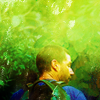
I haven't made any LOST icons in a long time. I made a couple for an activity here, but this one is part of a 20+ batch I posted in july. I was so super satisfied with the colouring. people described it as lush, which I thought is the perfect word to describe these. I'm proud of this one, though, because when I picked the cap I'd never have thought I'd end up with this. it was just a cap of jack walking away into the jungle, but the icon looks like so much more. plus, I love the background. I remember the cap ended right over his head, so I copied parts of the jungle in the picture and smudged and blended them in there, and it turned out amazing imo :D
this one is part of the first batch I posted at my new icon journal after my "return". I think I discovered my love with greens here, but I'm especially proud of this because I managed to erase part of a deer that was on the cap and peeked into the icon, and I don't think anyone ever noticed xD on the contrary, the grass looks very much alive, imo. like it's moving in the wind, and yet the character in the middle gives it such a still/calm feeling...
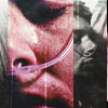
this one was done for the much talked about complexity challenge at 20inspirations. I struggled so much with this theme, but then something clicked and I churned out this batch of supernatural icons I'm still so, so proud of. I picked this one especially because a) I used blocking, something I wasn't comfortable with until that point b) it got both a coloured and b/w part in it, which is again something I'd never done before, and c) it's not green, lol.


This was one of the first True Blood icons I had ever made and even now, when I don’t really like anything else in that particular post, I still love this icon. I love the colouring, the crop and everything about it. I think this icon was probably the starting point for my current icon-making style.

With this icon, I remember it took me ages to get the negative space to work. It was a lot of smudging and patch selection to try and get the red all uniform. Once I got that done, the rest was quite simple and I just went through my usual steps. I just like the colouring and the gloss of this icon, as well as the crop and use of negative space.

Oh look, another TB icon *gasp*. I chose this icon because it’s from my latest post, which was my claim for 20inspirations. I just like how these two caps work so well together, how the caps aren’t exactly the same size and the crops of each other caps. I just love it :D

This is hard because I feel like my favorite icons that I make aren't anyone elses... lol.
This was frankly a really hard manip to make. I wanted them to look as natrual as possible and it just wasn't working... I had the hardest time fining caps that could be resized so that they would be same size... and then coloring them to look the same and then finding a background that didn't look stupid... It was hard, so I'm proud that it worked out so well.

I just really like how this one turned out I suppose. I like the spacing and the coloring. And yeah it was my default for a really long time.

I love this icon and it's Twilight, not even a fandom that I love but guh, it is so shiny and I think it has a lot of emortion and I know their faces are kind of floating but I think it is kind of cool. And I like the red.


The one where I actually did use a lot of textures and I didn’t hate it. I’ve mentioned before, how I’m trying to get away from over-texturizing and want more clean and simple icons, but 20inspirations often makes me break my own rules, and in this instance I thought they worked out. I had trouble with the cap at first, and things just looked boring, but then the textures actually did help, and the gradient didn’t look bland and like I was trying to rip off emily_reich (whenever I use gradient-maps not in overlays, I feel I am using her style, even if I vary a lot... I have issues)

This is pretty much the opposite of the Ned icon. But it is clean and deceptively simple. I battle with close crops a lot, if you cut off part or all of the chin, faces just end up looking weirdly distorted and it can lead to very bad results, and I was so glad when it worked, here. That and the colours are nice and natural, as it should be.

The most recent of the 3, this was a case of... oh, I like this cap, but it needs to be red, so let’s just use burning Camelot and then colour it red. And so i did, and all along things just *bugged me* really, I knew where I wanted to go, and usually I just play around a lot and hope at some point inspiration strikes (Well, when picking a cap I usually have an idea for a crop, but that’s it.), with this I knew what was supposed to happen, and for a long time it didn’t. The colours looked bad and clashed and he looked badly cropped, even if it was so very detailed. But then by magic, when I was done it looked like this and I still don’t know exactly how. Not, that I don’t know the steps, but it’s so very special, when things just come together. I so want to use this icon too, but as much as I like Sir Leon, it’s not enough for a spot in my 15. Poor Sir Leon.

Aong the last icons I did:

I'm proud of this one because I struggled during months on that freaking cap. It is one of my favorite of the movie and I was working on it over and over again and a few days ago, it finally worked and I had a result I love. The black and white is well balanced and contrasted and the light exactly like I imagined it should be.
It is the kind of icons I would olvoe to do all the time. The contrast (imo) is perfect. I love when there is darkness on a side and a lot of colors on the others. It increases the emotion of the icon.

I'm proud of this one because it was made for a challenge where we had to use given textures and as I rarely work with textures, it was a challenge for me. I love the outcome. The contrast is well balanced with the light and the colors stand out well. Even if I used the texture, the icon still looks quite simple like I like them.

I know it probably sounds strange, but I don’t have icons I’m proud of. I have icons I like more than others, but I always find flaws with them.

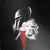
More thought went into the composition of this icon than probably any other icon I've ever made. Technically, I made it for bsgpassiton, but the idea/concept for this icon had been rolling around in my head for a few weeks prior to making it. I had been listening to a BSG podcast and decided it would be cool to make an icon depicting the different stages of cylon evolution. I initially wanted to have all 4 types of cylons (2 types of centurions and 2 types of human forms) but I just didn't have the space on a 100 x 100 canvas. I ended up with several variations, but I like this one the best. I love how the composition is balanced and centered around Six. Plus, when it comes to cylon icons, you cant go wrong with a black & white with a splash of red.
I really, really, really love how the coloring on this icon turned out. I was able to really bring out the red highlights in her hair, and I love how it just pops against the bright blues and greens in the texture I used in the background.
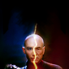
This one was inspired by some dialogue in Star Trek: Nemesis. Picard's line to Shinzon, "I'm a mirror for you as well," really resonated with me, and I thought it would be cool to show the two sides of the mirror, so to speak. Although one character is a clone of the other, the actors are clearly different, so it took a bit of tweaking to line the facial features up, plus the use of a squiggly light texture, to give the illusion of two people who are near identical except for differences in personality, shaped by their experiences. Now, if only the actor for Shizon didn't have Dumbo ears or such low shoulders, this would be perfect. But in the end, I was quite pleased with the results.


1. When I first saw this scene, I knew I had to make an icon of it. Then I did, and it turned out the way I wanted. Atta girl :)
2. I made this for a challenge at trope_overdosed, and the theme was "Design Student", which required stretching my composition muscles, because I don't usually make complex icons, and I was really proud of it when I finished. Looking at it now, I'd change lots of things about it, but I still like the idea behind it (Starks, different colors = different destinies, the direwolf sigil) and the general composition.
3. Again, the composition. I get proud of myself when I go outside my comfort zone. Plus, Rory + Clock = Waiting, get it? And the BW is really nice. And it has an obvious texture, which is something I'm a bit scared of as well.


1. I usually always love the Fringe icons that I post because Fringe is my favourite show to icon and this icon is no different. I love the yellow and the negative space and I’m just really happy with the final product.
2. This icon was a great surprise for me because it came out of nowhere! The colouring was a bit of an experiment and BSG are quite hard to work with in the first place but when I started experimenting with composition...well then, ~things started getting real.
3. This was an interest icon I made so I’m not familiar with the fandom and I wasn’t expecting anything great to come from it but I was surprisingly happy with the outcome. The shadows over his face combined with the colours in the top half just makes me smile :’)


To me, this icon feels like a different time and a different place, especially in terms of how my style has developed. Yet I still find myself looking at this icon and thinking 'Wow'. There's a sheer simplicity in terms of everything here that sometimes I wish I could recapture. Nothing is overly vibrant, the colours are so muted sometimes the background appears to fade into the foreground, and in the back of my mind I know it needs more contrast but I still love it the way that it is, flaws and all.

I had lots of fun making this icon, and I think that's part of the reason why I really like it. Everything came together in a really cohesive manner, the images worked together, the textures complimented the colouring of the images, and the text complimented everything, and to me, that's what makes a really good icon. I can still see some flaws (Anna's face could be a little too bright on some monitors, because on mine she's just dancing that line between bright enough and too bright) but again, everything can't always be perfect.

This icon has about 40 layers and was so very hard to work, and I still am not entirely convinced by the colouring of the right hand side, but at the same time, I really love it. The crop itself is what I appreciate the most - I avoid working with close crops unless I know I can pull them off and this is that icon that screams close crop. There's also a really lovely clarity to the icon, in that it's not overshadowed by texture work that I also adore completely. And this very well could be the icon that started my love affair with yellow colouring. Who knows?

I’ve always found the ‘bad wolf’ scene really difficult to icon, and when I made this one I was so happy with it, plus I actually managed to pull of using text and like it.
I loved the challenge of the complex round of , it led to me stepping outside me comfort zone. As mentioned previously I don’t really use textures, but I love what they added to this icon.
another one of my 20inspiration Luther icons, but like I said, they challenged me to experiment more, and in some case I’m really proud of the results. I’ve wanted to make icons with this type of composition for ages, but rarely get a result I’m happy with so began giving them a wide berth, but this one has given me renewed hope that I can pull off more swishy composition sometimes.

i definitely don't consider these my favorite icons of mine or even the best, they're just icons that i'm proud of for some reason

it's the oldest of the three, two and a half years old but i still absolutely love the cropping and the coloring.

this one's not so old, i'm mostly proud of it because of the coloring. i stepped out of my comfort zone with this one, its color tone is very monotone and quite unnatural but i still think it works

this one starts out from the icons i love doing the most, negative space with vivid background but once again, i stepped out of my comfort zone and did a little twist.
WHAT WAS THE FIRST ICON YOU'VE MADE THAT YOU REMEMBER BEING REALLY PROUD OF?

Christ, IDEK? When I moved from ohbambi to snorkjuice the oldest icon that I kept (in an archive post) was this one:

and this one:
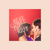

I instantly thought of this icon! It was my default for years I was so in love with it. I made it for a 100 LotR icons challenge and I am pretty sure I picked it to be on the completion banner too haha!

when i first worked on fringe icons. basically the whole batch but i've picked this one as example.

unfortunately, I don't have many old icons saved (the really old ones will forever be lost in the www), but maybe someone remembers this one:
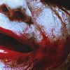
everyone was making joker icons at the time. I remember being especially satisfied with the crop. I loved how the red mouth was the main focus :3


Looking back, I remember being so proud of all my icons but really, they were hideous! With this icon, I remember being so happy with the result. Hex was my favourite thing to icon back in the day. I just loved how the background looked, I remember liking the colouring and contrast and I loved the textures used as well. The halftone and Polaroid texture were all the rage back then (I think this was 2008). At the time, I remember trying to get the same sort of colouring as starsburn but it never really worked out but yeah, I loved this icon way back when and it was the best thing, in my mind at least, that I made for a while.

*jumps into time machine*
There were a couple that I remember making when I was like 'GUUUUURL YOU CAN REALLY MAKE AN ICON! UP ARE THE BEST AT PS' So here are three from 2008 that I was super proud of!

I have a hard time remembering early icons, but thankfully my old PB still works. I liked my BSG icons from S2, made in 2005, or early 2006, I think...
To be fair, I made icons for a while then, and seeing as I had done art before and received some praise form friends at least, I had a healthy ego even then. Sure, I always admitted there were people that were better, but, dude, I never thought I was terrible. Checking some of my earlier art and icons... well, times change, ok. I have seen the truth! I was baaaaad. This just makes you rather mellow when people are proud of their first icons.
Hm, ok now I'm finding older icons... I'll just spam this stuff, it's ancient history, and history is cool, mkay? (late 04/early 05 stuff)
I liked the colouring on this Firefly icon:
oh and some Garden State
Ok, I don't think I was proud of it, but for the lolz:
what is even on that? It's from Veronica Mars and I think it may have something to do with soap. XD good times...
I actually remember friends using this:
Ah, fandom. We were so ecstatic when they finally kissed. hmm.

I don't remember. I will sound like a shrew but I'm rarely proud of my icons. I only use a few as userpics. I rarely like what I do.

See question above.

I remember experimenting more with new textures and smudging on this icon than I had before that. I like how it has an almost water color type feel too it.


BUFFY! I bet you weren't expecting that, were you? This was one of my favorites of the batch, it had the negative space thing all the cool kids were doing. It was a very daring icon for me. Today, I see the potential there, but I think it's poorly executed.


This was the first icon that I wasn’t just happy with but also really proud. I’m proud of the crop, b&w, sharpness etc. I wouldn’t change anything about it.

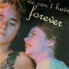
(December 07)
I remember loving the font and text work, and thinking that the sort of old-ish style colouring was beautiful. Looking at it now, I can still see why I loved it like I did.

This is years old and I’m not proud of it now lol, but I was proud of it at the time because it was one of the first icons where I played with composition and used colouring and a light texture. Up until this point it had mainly been crop and whack some hideous frame type textures on it ^^;


END PART II.
(spotted any mistakes, wrong coding etc? please let me know!)