Ask the maker filled request 4 of ?
Ask the maker fills for setentpet.
Everything is in spoiler cuts. If anything isn't clear, feel free to ask questions! :D

[The Hound]
I didn't find the exact screencap that I used but it's from season 4 episode 7, if anyone wants to look for one. I picked this one that was the closest to the original so you can use it for this tutorial if you want.
First you're going to crop to your liking then go to Image > Auto Contrast > Auto Tone > Auto Color. Copy the layer and sharpen to your liking.
Create a Brightness/Contrast layer and erase the mask from the sky parts and change the settings. Brightness: 42 and Contrast: 32.
Make a new layer and take this rather gross looking brown/yellow #b38e46 (lol) and paint with a soft brush over the white sky in the background. Set to Multiply at 26%.
Next, take this color #be8f6d and with a medium sized soft brush splotch it around the canvas and then use blur so it looks something like this
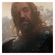
Set to Hard Light at 40%.
This is how it looks so far
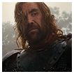
Next we're going to take this texture of unknown origins and apply it to the top of the icon only. Set to Soft Light at 64%.
Next you'll need this gradient map, set to Soft Light at 42%.
Create a Levels layer and change the settings to 14, 1.00, 241.
Create a Color Balance layer, set to Color, and in midtones change the settings to -6, -6, -8.
Next take this color #eedab2 and over the right side of his face with a medium sized soft brush on a low opacity, paint over the right side of his face. Set to Overlay.
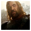
You'll need this gradient map next, as you can see in the mask, the bottom half has be partially erased. Set it to Soft Light.
Next is this texture (maker unknown), set to Soft Light.
Then add this texture (maker unknown), set to Screen at 55%.
Create another Levels layer, erase the mask from the sky and change the settings to; 3, 1.00, 246.
Create a new layer and take a medium grey paint with a soft brush around the left side of the icon, in a rough half circle the blur it so the edges are nice and faded out. Set to Overlay. Copy the layer and reduce the opacity to 70%.
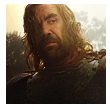
Apply this texture (maker unknown), set to Screen.
Create a new layer and stamp everything (ctrl + shift + alt + e) then sharpen to your liking.
Create another Levels layer, erase everything but his face, change the settings to; 9, 1.04, 238. Change the opacity to 58%.
The final layer is a Brightness/Contrast layer. Change the setting to; Brightness: 2 and Contrast: 17. Erase the mask from the sky on the right side only.
Flatten, save, and you're done!


[Erica]
I can't find the cap for this one either, but this is the base we'll be working with.

I'm going to assume that I've done some pre-editing to this before I tell you what the next steps are, as that's what I usually do. Which is either a curves layer to brighten things up or using the auto adjustments under the Image drop down menu.
So the next steps are topaz and sharpening. If you want the end result to look like mine, you're going to need Topaz Clean. It can be done without it unless you want the smooth, painted look. I never use any settings, I just hit the randomize button until I get something I like. The results are this
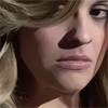
I lowered the opacity to 53%. Then I copied it and erased everything but her hair and sharpened that to my liking.
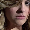
That's the end of the 'pre-editing', so now let's move on to the coloring...
Create a Brightness/Contrast layer and make sure "Use Legacy" is checked. Brightness: 6 and Contrast: 4.
Make a new layer and with this yellow #e5da2c paint all over her hair with a small soft brush. Set to Overlay at 23%.
Create a new layer paint over her lips with this pink #eda2ba. Set to Multiply at 79%.
Create a new layer and with the same pink, with a medium soft brush on a low opacity, put two dots on her cheeks, set to Soft light at 51%.
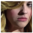
Make a new layer and using this yellow #eee6a2 with a medium soft brush, paint over like so
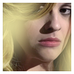
Set to Soft Light at 48% then copy the layer once.
Create a Hue/Saturation layer and change the saturation to +15 and set the layer to Color. Erase a line on the left side from the mask where it's a bit too orangey. Like so,

Create a Levels layer and change the settings to 12, 1.12, 230.
Annd this is where we're at so far...
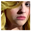
Next are 5 painted layers of tiny details so it's rather hard to explain; hopefully the provided pictures are helpful..
First are highlights; I had to copy this layer 4 times just so the lines showed up clearly where they're located + zoom in the first picture. The second picture is what you should be seeing when you paint them on! I just used white and a size 2 hard brush to paint these on.
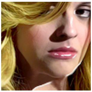
>>>
Leave it set to Normal, then copy the layer and set to Soft Light. The changes are pretty subtle but look great in the end!
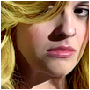
Again, tiny details! This next one is with a purple color #482b55. Using the same brush, go over these spots. Remember: the second image is what you will be seeing! The first one is just so you know where to paint. :D
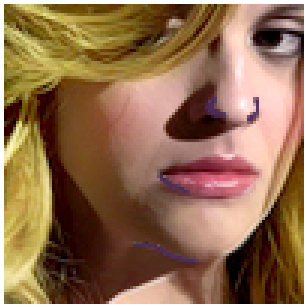
>>>
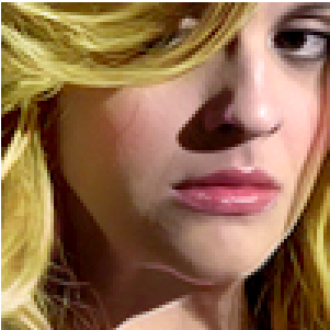
This next part I had to copy the layer several times for it to show clearly where you are to paint. So when you actually paint, I recommend zooming in so you can see what you're doing better if you're working with a 100x100 canvas. Use this color #df8f67 to paint over the hair shown below. I think I used a size 1 or 2 brush on hard. Set to Linear Dodge.
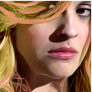
>>>>
Next, use these colors #ed8998 & #e587aa in a large soft brush all over around the edges, leaving the middle mostly clear. Make sure the colors are almost completely blended together. Set to Screen at 67%.
Take this color texture (maker unknown) & set to Screen.
Create a Hue/Saturation layer, set to Color. Set the Saturation to +28.
Make a Levels layer and change the settings to 39, 0.77, 249.
Make another Levels layer and change the settings to 37, 1.24, 255
Create a Vibrancy layer, set to Color. Change Vibrance to +29 and Saturation to +8. Erase roughly in the places as shown below,

This next part is weird. I think I must have added some kind of contrast at one point, stamped the layer and merged it together because I can't get the end result the same. Sorry! I guess you'll have to play around to get similar colors in the end. It currently looks like this,
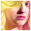
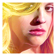
After that there's a grey painted layer, set to Soft Light at 63%. Paint in the areas shown below with a darkish grey in a soft brush.
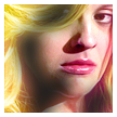
>>>
The next layer I don't know why I did it now lol it just makes her hair greenish? soo you can skip this part if you like. :P Anyways, you need to make a Color Balance layer, set to color and erase from the parts shown below

Change the settings in Midtones to, +3, +26, -22.
Final layer is another Levels layer. Change the settings to 0, 1.08, 255. Erase from the left side as shown.

Flatten, save, and you're done!


[Spike]
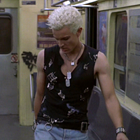
You're going to need one of these screencaps. Which aren't the same as mine but they should work. If you want to look for yourself it's from 5x7.
From playing around with the other caps, it looks like I used Auto Contrast and Auto Color on mine originally. Along with a bit of Topaz Clean as it looks a lot smoother than the others. So you can leave that off if you like. If you do use it, use it minimally and to only smooth and sharpen the edges some. Here's my base,
Make a Hue/Saturation layer, set to Color. Set saturation to +17.
Create a Brightness/Contrast layer and set Brightness to 37 and Contrast to 33.
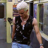
Next take this blue #3e4f89 and paint his pants. Set to Multiply at 64%.
Create a new layer and with this yellow #e5dc44 and paint over any yellow in the background, set to Multiply.
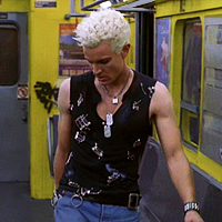
Make a new layer and paint over the grey areas shown below with this color #9da0b4. Set to Multiply.
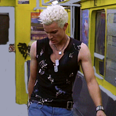
>>>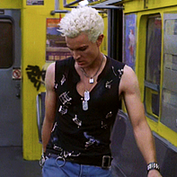
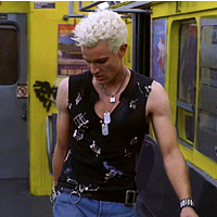
Create a new layer and with this grey #3c3c3c paint over the spots shown below. Set to Soft Light.
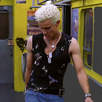
>>>
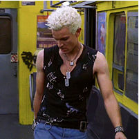
Create a new layer and with this grey #b9b9b9 go over all the little details like shown below. Set to Multiply.
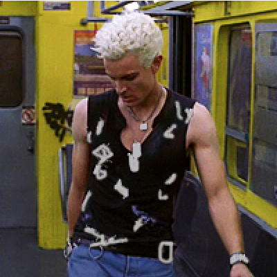
>>>
Next take this skin tone #c9b4b3 and paint over his skin. Set to Multiply at 60%.
Paint over his hair with this color #f4f3f8 and set to Multiply.
Create a Levels layer and change the settings to 12, 1.18, 215. Erase from his hair.
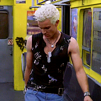
Make a Curves layer and in RGB set to Output: 143 and Input: 125.
Create a Brightness/Contrast layer and change Brightness to 16 and Contrast to 13. Erase from his hair.
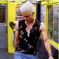
Create a new layer and with this yellow #f4e660 and roughly paint over the places shown below with a large soft brush on a low opacity. I duplicated the layer once so you can see where to paint. Set to Divide.
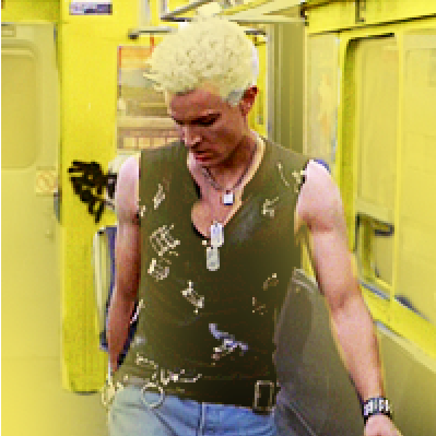
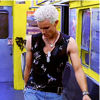
>>>
Make a new layer take this color #6262c3 and paint over the sections shown below. Set to Soft Light.
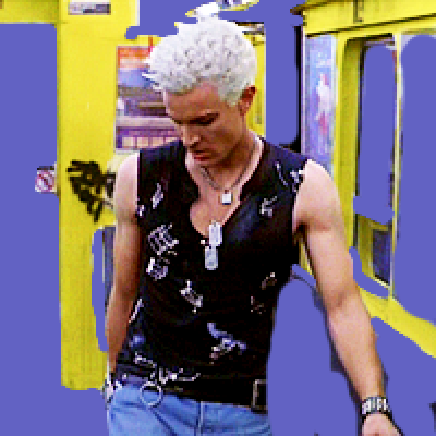
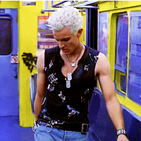
>>>
Create a Levels layer and change the settings to 0, 1.00, 246.
Create a Vibrance layer set to Color and change Vibrancy to +32 and Saturation to +3.
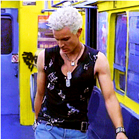
Make a new layer and with a small soft brush paint in black over the bottom edges like below, then use Motion Blur set to vertical. Set to Soft Light at 57%.
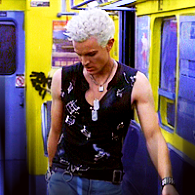
>>>
Next take this color #dbcfe6 and paint over the top edges with a large soft brush then use Motion Blur on vertical again. Then use Gaussian Blur to fade it out further. Set to Overlay at 75%.
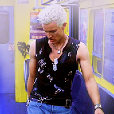
>>>
Go back to the last Levels layer you did and drag it up to the top. Erase from his hair and the white right above his head, the dog tags and the tops of his shoulders.
Create a Hue/Saturation layer, set to Color. Set Saturation to +21. Erase from his right arm. Then his face, neck and ear erase, then go to Edit > Fade Eraser and adjust to your liking. If I was making this now I would have gone back in at the end with a Color Balance layer and cooled his skin tone down a bit, it's too orange-y now for my liking. So if you want to do this, you can of course!
Make another Vibrance layer, set to Color. Set Vibrance to +35 and Saturation to +7. Erase from the window on the left in the back and from his face to your liking.
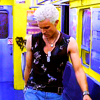
Create a new layer and stamp the layers. Set to Screen at 40%.
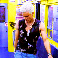
Next resize to 100x100, flatten, save, and you're done!

Everything is in spoiler cuts. If anything isn't clear, feel free to ask questions! :D

[The Hound]
I didn't find the exact screencap that I used but it's from season 4 episode 7, if anyone wants to look for one. I picked this one that was the closest to the original so you can use it for this tutorial if you want.
First you're going to crop to your liking then go to Image > Auto Contrast > Auto Tone > Auto Color. Copy the layer and sharpen to your liking.
Create a Brightness/Contrast layer and erase the mask from the sky parts and change the settings. Brightness: 42 and Contrast: 32.
Make a new layer and take this rather gross looking brown/yellow #b38e46 (lol) and paint with a soft brush over the white sky in the background. Set to Multiply at 26%.
Next, take this color #be8f6d and with a medium sized soft brush splotch it around the canvas and then use blur so it looks something like this
Set to Hard Light at 40%.
This is how it looks so far
Next we're going to take this texture of unknown origins and apply it to the top of the icon only. Set to Soft Light at 64%.
Next you'll need this gradient map, set to Soft Light at 42%.
Create a Levels layer and change the settings to 14, 1.00, 241.
Create a Color Balance layer, set to Color, and in midtones change the settings to -6, -6, -8.
Next take this color #eedab2 and over the right side of his face with a medium sized soft brush on a low opacity, paint over the right side of his face. Set to Overlay.
You'll need this gradient map next, as you can see in the mask, the bottom half has be partially erased. Set it to Soft Light.
Next is this texture (maker unknown), set to Soft Light.
Then add this texture (maker unknown), set to Screen at 55%.
Create another Levels layer, erase the mask from the sky and change the settings to; 3, 1.00, 246.
Create a new layer and take a medium grey paint with a soft brush around the left side of the icon, in a rough half circle the blur it so the edges are nice and faded out. Set to Overlay. Copy the layer and reduce the opacity to 70%.
Apply this texture (maker unknown), set to Screen.
Create a new layer and stamp everything (ctrl + shift + alt + e) then sharpen to your liking.
Create another Levels layer, erase everything but his face, change the settings to; 9, 1.04, 238. Change the opacity to 58%.
The final layer is a Brightness/Contrast layer. Change the setting to; Brightness: 2 and Contrast: 17. Erase the mask from the sky on the right side only.
Flatten, save, and you're done!


[Erica]
I can't find the cap for this one either, but this is the base we'll be working with.

I'm going to assume that I've done some pre-editing to this before I tell you what the next steps are, as that's what I usually do. Which is either a curves layer to brighten things up or using the auto adjustments under the Image drop down menu.
So the next steps are topaz and sharpening. If you want the end result to look like mine, you're going to need Topaz Clean. It can be done without it unless you want the smooth, painted look. I never use any settings, I just hit the randomize button until I get something I like. The results are this
I lowered the opacity to 53%. Then I copied it and erased everything but her hair and sharpened that to my liking.
That's the end of the 'pre-editing', so now let's move on to the coloring...
Create a Brightness/Contrast layer and make sure "Use Legacy" is checked. Brightness: 6 and Contrast: 4.
Make a new layer and with this yellow #e5da2c paint all over her hair with a small soft brush. Set to Overlay at 23%.
Create a new layer paint over her lips with this pink #eda2ba. Set to Multiply at 79%.
Create a new layer and with the same pink, with a medium soft brush on a low opacity, put two dots on her cheeks, set to Soft light at 51%.
Make a new layer and using this yellow #eee6a2 with a medium soft brush, paint over like so
Set to Soft Light at 48% then copy the layer once.
Create a Hue/Saturation layer and change the saturation to +15 and set the layer to Color. Erase a line on the left side from the mask where it's a bit too orangey. Like so,
Create a Levels layer and change the settings to 12, 1.12, 230.
Annd this is where we're at so far...
Next are 5 painted layers of tiny details so it's rather hard to explain; hopefully the provided pictures are helpful..
First are highlights; I had to copy this layer 4 times just so the lines showed up clearly where they're located + zoom in the first picture. The second picture is what you should be seeing when you paint them on! I just used white and a size 2 hard brush to paint these on.
>>>
Leave it set to Normal, then copy the layer and set to Soft Light. The changes are pretty subtle but look great in the end!
Again, tiny details! This next one is with a purple color #482b55. Using the same brush, go over these spots. Remember: the second image is what you will be seeing! The first one is just so you know where to paint. :D
>>>
This next part I had to copy the layer several times for it to show clearly where you are to paint. So when you actually paint, I recommend zooming in so you can see what you're doing better if you're working with a 100x100 canvas. Use this color #df8f67 to paint over the hair shown below. I think I used a size 1 or 2 brush on hard. Set to Linear Dodge.
>>>>
Next, use these colors #ed8998 & #e587aa in a large soft brush all over around the edges, leaving the middle mostly clear. Make sure the colors are almost completely blended together. Set to Screen at 67%.
Take this color texture (maker unknown) & set to Screen.
Create a Hue/Saturation layer, set to Color. Set the Saturation to +28.
Make a Levels layer and change the settings to 39, 0.77, 249.
Make another Levels layer and change the settings to 37, 1.24, 255
Create a Vibrancy layer, set to Color. Change Vibrance to +29 and Saturation to +8. Erase roughly in the places as shown below,
This next part is weird. I think I must have added some kind of contrast at one point, stamped the layer and merged it together because I can't get the end result the same. Sorry! I guess you'll have to play around to get similar colors in the end. It currently looks like this,
After that there's a grey painted layer, set to Soft Light at 63%. Paint in the areas shown below with a darkish grey in a soft brush.
>>>
The next layer I don't know why I did it now lol it just makes her hair greenish? soo you can skip this part if you like. :P Anyways, you need to make a Color Balance layer, set to color and erase from the parts shown below
Change the settings in Midtones to, +3, +26, -22.
Final layer is another Levels layer. Change the settings to 0, 1.08, 255. Erase from the left side as shown.

Flatten, save, and you're done!


[Spike]
You're going to need one of these screencaps. Which aren't the same as mine but they should work. If you want to look for yourself it's from 5x7.
From playing around with the other caps, it looks like I used Auto Contrast and Auto Color on mine originally. Along with a bit of Topaz Clean as it looks a lot smoother than the others. So you can leave that off if you like. If you do use it, use it minimally and to only smooth and sharpen the edges some. Here's my base,
Make a Hue/Saturation layer, set to Color. Set saturation to +17.
Create a Brightness/Contrast layer and set Brightness to 37 and Contrast to 33.
Next take this blue #3e4f89 and paint his pants. Set to Multiply at 64%.
Create a new layer and with this yellow #e5dc44 and paint over any yellow in the background, set to Multiply.
Make a new layer and paint over the grey areas shown below with this color #9da0b4. Set to Multiply.
>>>
Create a new layer and with this grey #3c3c3c paint over the spots shown below. Set to Soft Light.
>>>
Create a new layer and with this grey #b9b9b9 go over all the little details like shown below. Set to Multiply.
>>>
Next take this skin tone #c9b4b3 and paint over his skin. Set to Multiply at 60%.
Paint over his hair with this color #f4f3f8 and set to Multiply.
Create a Levels layer and change the settings to 12, 1.18, 215. Erase from his hair.
Make a Curves layer and in RGB set to Output: 143 and Input: 125.
Create a Brightness/Contrast layer and change Brightness to 16 and Contrast to 13. Erase from his hair.
Create a new layer and with this yellow #f4e660 and roughly paint over the places shown below with a large soft brush on a low opacity. I duplicated the layer once so you can see where to paint. Set to Divide.
>>>
Make a new layer take this color #6262c3 and paint over the sections shown below. Set to Soft Light.
>>>
Create a Levels layer and change the settings to 0, 1.00, 246.
Create a Vibrance layer set to Color and change Vibrancy to +32 and Saturation to +3.
Make a new layer and with a small soft brush paint in black over the bottom edges like below, then use Motion Blur set to vertical. Set to Soft Light at 57%.
>>>
Next take this color #dbcfe6 and paint over the top edges with a large soft brush then use Motion Blur on vertical again. Then use Gaussian Blur to fade it out further. Set to Overlay at 75%.
>>>
Go back to the last Levels layer you did and drag it up to the top. Erase from his hair and the white right above his head, the dog tags and the tops of his shoulders.
Create a Hue/Saturation layer, set to Color. Set Saturation to +21. Erase from his right arm. Then his face, neck and ear erase, then go to Edit > Fade Eraser and adjust to your liking. If I was making this now I would have gone back in at the end with a Color Balance layer and cooled his skin tone down a bit, it's too orange-y now for my liking. So if you want to do this, you can of course!
Make another Vibrance layer, set to Color. Set Vibrance to +35 and Saturation to +7. Erase from the window on the left in the back and from his face to your liking.
Create a new layer and stamp the layers. Set to Screen at 40%.
Next resize to 100x100, flatten, save, and you're done!
