Tutorial Two
to
Using Photoshop 7.
I stongly urge you to use this as a guide and not a step by step process. Results will vary widely according to the image you use. I colour my icons according to the eye - in other words, I add and remove until I like the end result.
This tutorial was requested by deppaholic47 (sorry it's taken me so long! /sheepish).
Pre-step one - I've been asked a few times how I get my icons to look so clear. Three reasons. One, and the most obvious, is the image itself. Obviously, whenever you are working w/an HQ image, the end result (unless you do something really bad along the way) will be clear. But that doesn't really answer the question b/c I'm usually using screen caps and I'm not a capping goddess (my own caps initally tend to look blah and like crap). So that takes us to number two, as you will see below, I do not 'crop' a cap, I resize the whole thing (I resize in PSP 7 b/c it's easier and I'm lazy; to resize the whole cap and not make your subject either reeeeeally wide or reeeeally tall, check the box to maintain the aspect ratio). As for number three, that is v. simple. I keep my damn hands away from the bloody awful sharpen tool. As we all who love to play w/colour know, when you do curves, selective colouring, etc., your image will take on a more sharpened look. Sometimes too much so - a few of my earlier icons do have a slightly too sharpened look to them. Eh. We live to learn. Anyway, that is how I get them to look clear. Hopefully this helps anyone who has asked in the past. Now, onto the tutorial/guide - emphasis on guide.

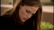
This is the cap, resized and untouched. Just a plain cap. No sharpening no nothing. Notice that the aspect ratio has been maintained. Click the ticky-box (mentioned above). Ticky-boxes are love. Carrying on...
Step one - Duplicate base 3x's.
- First layer Screen 100
- Second layer Screen 52
- Third layer Soft Light 67
Step two - Create a new adjustment layer (Selective Colour) and use the following settings:
Reds: (c) -45, (m) +21, (y) +44, (b) -3
Yellows: (c) -40, (m) -26, (y) +27, (b) +16
Neutrals: (c) +46, (m) -11, (y) -27, (b) +16
Step three - Create a new adj layer (Curves) and use the following settings:
RGB: 117, 134
Step four - Create a new adj layer (Sel Col) and use the following settings:
Reds: (c) +37, (m) +64, (y) +37, (b) -10
Step five - Flatten the image. Select the flattened image and copy it. Go back and unmerge the previous layers and paste your copied image on top. (I know that there is a much quicker way to do this but I cannot remember the command at the moment, sorry!)
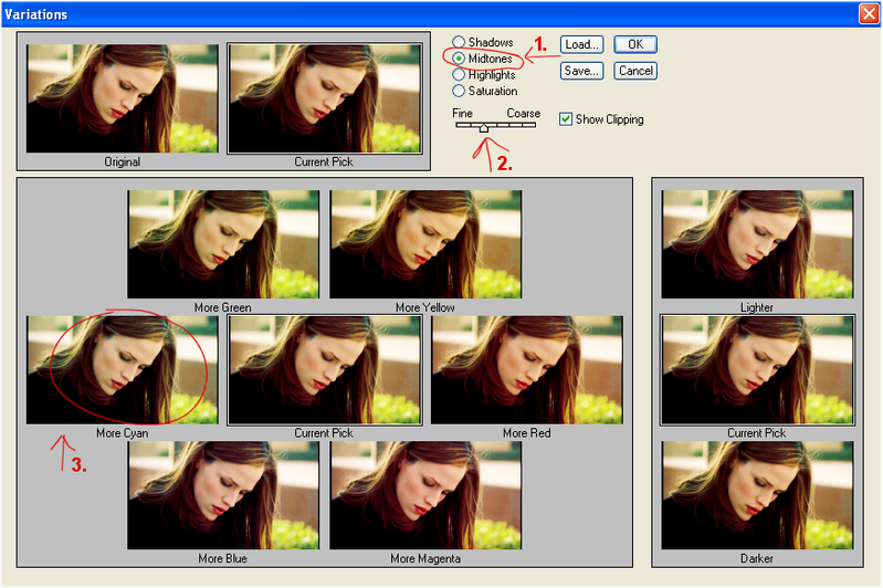
Step six - Variations.

1. Make sure you have 'midtones' selected.
2. The strength should be at the second point (see the image).
3. Click 'More Cyan' (as shown in the image) once. Then click 'okay'.
Step seven - Create a new adj layer (Sel Col) and use the following settings:
Reds: (c) -11, (m) +13, (y) +18, (b) 0
Yellows: (c) 0, (m) +68, (y) +23, (b) -42
Neutrals: (c) +8, (m) +4, (y) +7, (b) +2
Step eight - This is almost the same as step five. Flatten, select, and copy the flattened image. Go back and unmerge and then paste the copied 'flattened' image ontop of everything. Set to screen at 20% op.
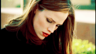
And it's finished.
