tutorial...sort of
Ok this is a sort of tutorial. More of a coloring thing then anything else really, but there you. This is mostly for deadwillwalk. Because I love her and I want to lick her. And she asked. Kind of. :p Anyway, this is for PS7. I'm not quite sure how translatable it is to PSP, but I'll leave that up to you lot.
We'll be doing these two icons:
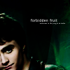
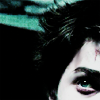
Right. Dan first. So I used this picture from the US Weekly shoot. It's not the highest quality, but its good for icons anyway.
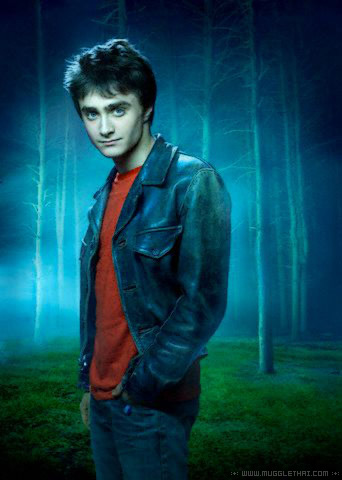
Now for the simple icons I like, it's all in the cropping. I tend to favor cropping either to the extreme left or right depending on the picture. Don't ask me why, it's purely for my own pleasure. Anyway, crop thy pic to your desire:
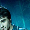
Now the next step is a crucial one in my icon making. I never not do it, as it can improve an icon greatly. I always choose either auto levels or auto contrast, again depending on prefences and the picture. Sometimes one or the other will either completely wash out your subject or it'll turn it a fabulous shade of green, red, yellow, etc. Sometimes both will do it, in which case fade comes in mighty handy. For this pic, auto levels works just fine with no fade at all.
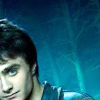
Next you want to duplicate your layer. Next, of course, we have the famously used twice duplicated layers of screen and softlight. These are my two most used layers, but don't be afraid to experement! Often times hadlight, overlay, pin light, multiply, whatever can be an interesting choice too. See what works best for you. Never be afraid to play with opacity and fill either, it can make for some neat effects.
For this icon though, I've just stuck with soft light. Using screen just washes it out too much and lowering the opacity really has no effect at all. Sharpen this layer once. A helpful tip with sharpen that I've found usefull is to not sharpen your base. I know alot of icon makers do this before they duplicate, but I think it ends up too sharpened for my taste. More often than not, I usually sharpen the screen layer, but since we're not using it, I've sharpened the soft light one instead.
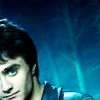
Next you want to merge your layers and smooth out the skin. I find the smudge tool works best for me with a nice round, soft brush (usually about size 5) with the strength set at 16%. Don't go overboard those, you'll end up with one of those scary zombie people and that's just weird looking. Unless, of course, that's the effect you're going for.
Duplicate your base layer. Next up is brightness/contrast. Yes, I know we've already used auto levels to lighten up our image, but I wanted a little extra...just cause. I don't remember the exact settings I used, but it wasn't much so just play around with it until you get something decent.
Now we move onto hue/saturation. I've recently been playing around with this with some interesting results. Most everything I do is the of the "point and click variety" anyway. If I don't like the results then a big shout of "ew, that sucks! Undo! Undo!" and try something else.
ANYWAY, the settings I've used here are: hue: -24, saturation: -51 and lightness: -19. Again, experiment with the settings as you see fit as these are just the settings that work well for this icon.
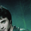
Set this layer to multiply and duplicate it. Set that layer to hard light.
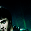
Notice the nice lovely greens? That's courtesy of the hue/saturation layer and I think it looks better than the blue myself. But on to our next step. I have a strange facination with the color red and most of my icons tend to include that color in some form or another. So next we add a favorite gradient of mine. Unfortunately, I've forgotten who orignally made is, as I've had it for quite some time, so if you happen to be reading this gradient maker, give me a shout and I'll happily add the credit.
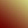
Set this layer to soft light.

Duplicate your previous hard light layer and bring it above this one. Set this layer to pin light.
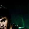
I don't much use textures anymore, but for whatever reason, I decided to with this one. So I headed to my lovely texture folder and selected a recent upload of dorky_duck, who I really love. Her textures, artwork and icons are absolutely amazing. I bow down before her with my intermediate skills.
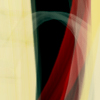
This layer is again set at soft light. I didn't like the yellowish effect the texture had on Dan's face. So, I erased it.
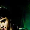
And that's it. You can add text if you wish to, or you can leave it textless. It looks great either way.
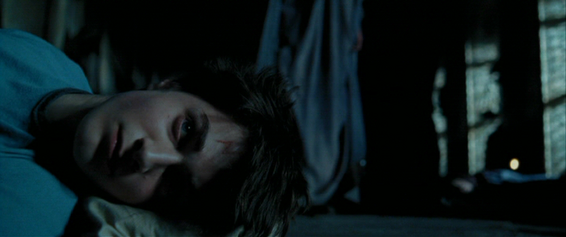
Now for the bright, vivid colors in the next icon. I used this crop of Harry laying down in the Great Hall with Dumbledore and Snape in the background. Let us all take a moment to curse Photobucket for resizing caps.
Again, crop it to your desire. I chose the top half of his face and a slight part of the scar. It seemed to fit the emotion of the icon really.
As you can see, it's really dark. I tend to favor these caps mostly because of the darkness. When you lighten it it tends to bring a rather nice cool blue, which is a favorite in my iconing. It also makes for more vivid colors if done correctly. Again, we break out the trusty auto levels with little to no fade. It greatly improves the icon and you can actually see what the hell you're looking at. *smirk*
Duplicate twice, setting the middle layer to screen and the top to soft light. Play around with the opacity if you like, I didn't though.
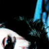
Merge your layers and again smooth out the skin. Try to avoid the scar, eyes, edge of the nose, lips and things like that. I then rotated the icon by 90 degrees just to see what effect it would bring and effectively making it that much more difficult to determine what scene it actually came from. :p
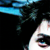
Again with the brightness/contrast, just to give it a little flavor. Only a little though, +5 on the brightness side of things and -6 on the contrast. Not much to notice, but I'm anal. Next up is the hue/saturation again. Hue being -25, saturation -33 and lightness -10.
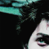
Leave this layer on normal. Duplicate your layer, desaturate it and set it to soft light. And wham, you're done!

Well, that's about it. I'm off to finish re-reading the final few chapters of HBP. I still haven't seen GOF yet, probably won't for a while. And of course, that's all anyone can talk about. Hmph.
We'll be doing these two icons:


Right. Dan first. So I used this picture from the US Weekly shoot. It's not the highest quality, but its good for icons anyway.

Now for the simple icons I like, it's all in the cropping. I tend to favor cropping either to the extreme left or right depending on the picture. Don't ask me why, it's purely for my own pleasure. Anyway, crop thy pic to your desire:

Now the next step is a crucial one in my icon making. I never not do it, as it can improve an icon greatly. I always choose either auto levels or auto contrast, again depending on prefences and the picture. Sometimes one or the other will either completely wash out your subject or it'll turn it a fabulous shade of green, red, yellow, etc. Sometimes both will do it, in which case fade comes in mighty handy. For this pic, auto levels works just fine with no fade at all.

Next you want to duplicate your layer. Next, of course, we have the famously used twice duplicated layers of screen and softlight. These are my two most used layers, but don't be afraid to experement! Often times hadlight, overlay, pin light, multiply, whatever can be an interesting choice too. See what works best for you. Never be afraid to play with opacity and fill either, it can make for some neat effects.
For this icon though, I've just stuck with soft light. Using screen just washes it out too much and lowering the opacity really has no effect at all. Sharpen this layer once. A helpful tip with sharpen that I've found usefull is to not sharpen your base. I know alot of icon makers do this before they duplicate, but I think it ends up too sharpened for my taste. More often than not, I usually sharpen the screen layer, but since we're not using it, I've sharpened the soft light one instead.

Next you want to merge your layers and smooth out the skin. I find the smudge tool works best for me with a nice round, soft brush (usually about size 5) with the strength set at 16%. Don't go overboard those, you'll end up with one of those scary zombie people and that's just weird looking. Unless, of course, that's the effect you're going for.
Duplicate your base layer. Next up is brightness/contrast. Yes, I know we've already used auto levels to lighten up our image, but I wanted a little extra...just cause. I don't remember the exact settings I used, but it wasn't much so just play around with it until you get something decent.
Now we move onto hue/saturation. I've recently been playing around with this with some interesting results. Most everything I do is the of the "point and click variety" anyway. If I don't like the results then a big shout of "ew, that sucks! Undo! Undo!" and try something else.
ANYWAY, the settings I've used here are: hue: -24, saturation: -51 and lightness: -19. Again, experiment with the settings as you see fit as these are just the settings that work well for this icon.

Set this layer to multiply and duplicate it. Set that layer to hard light.

Notice the nice lovely greens? That's courtesy of the hue/saturation layer and I think it looks better than the blue myself. But on to our next step. I have a strange facination with the color red and most of my icons tend to include that color in some form or another. So next we add a favorite gradient of mine. Unfortunately, I've forgotten who orignally made is, as I've had it for quite some time, so if you happen to be reading this gradient maker, give me a shout and I'll happily add the credit.

Set this layer to soft light.

Duplicate your previous hard light layer and bring it above this one. Set this layer to pin light.

I don't much use textures anymore, but for whatever reason, I decided to with this one. So I headed to my lovely texture folder and selected a recent upload of dorky_duck, who I really love. Her textures, artwork and icons are absolutely amazing. I bow down before her with my intermediate skills.

This layer is again set at soft light. I didn't like the yellowish effect the texture had on Dan's face. So, I erased it.

And that's it. You can add text if you wish to, or you can leave it textless. It looks great either way.
Now for the bright, vivid colors in the next icon. I used this crop of Harry laying down in the Great Hall with Dumbledore and Snape in the background. Let us all take a moment to curse Photobucket for resizing caps.

Again, crop it to your desire. I chose the top half of his face and a slight part of the scar. It seemed to fit the emotion of the icon really.

As you can see, it's really dark. I tend to favor these caps mostly because of the darkness. When you lighten it it tends to bring a rather nice cool blue, which is a favorite in my iconing. It also makes for more vivid colors if done correctly. Again, we break out the trusty auto levels with little to no fade. It greatly improves the icon and you can actually see what the hell you're looking at. *smirk*

Duplicate twice, setting the middle layer to screen and the top to soft light. Play around with the opacity if you like, I didn't though.


Merge your layers and again smooth out the skin. Try to avoid the scar, eyes, edge of the nose, lips and things like that. I then rotated the icon by 90 degrees just to see what effect it would bring and effectively making it that much more difficult to determine what scene it actually came from. :p

Again with the brightness/contrast, just to give it a little flavor. Only a little though, +5 on the brightness side of things and -6 on the contrast. Not much to notice, but I'm anal. Next up is the hue/saturation again. Hue being -25, saturation -33 and lightness -10.

Leave this layer on normal. Duplicate your layer, desaturate it and set it to soft light. And wham, you're done!

Well, that's about it. I'm off to finish re-reading the final few chapters of HBP. I still haven't seen GOF yet, probably won't for a while. And of course, that's all anyone can talk about. Hmph.