A Guide to Making a Manip - "Bug Off"
The Making of "Bug Off"
For those who've shown an interest in & asked questions about how my manips are made. I will not be explaining all the tools and steps as I am guessing the people who might want to do this will already have experience with Photoshop or something similar (I use PS 6.0). The process probably is kinda obvious, but I've written in a few tips, stuff that I learned in my 2 years of manipping. If you would like greater explanation on something, feel free to email me - midnighta [at] gmail [dot] com. If you have any tips to share, please do so! I'm still learning as well.
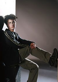
1. The main images:
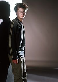
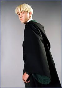
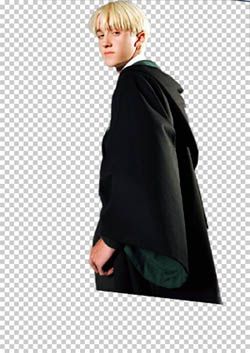
2. Draco's leaning a bit far to the left, such that he would cover too much of Harry's face, so I rotate the image a bit to the right. I then use a mask, with the outline feathered 1-2 pixels, to hide the parts of the image that I don't want. In this case, the background. Draco is then moved into Harry's picture.
Tip #1: Masks are important! If you don't know how to use one, I recommend learning it. Masks enable you to make touchups by revealing/hiding parts of the picture. Deleting means you've lost the data for good. I usually feather the outline of the mask 1 pixel at least, so the image blends in smoother with the background and doesn't look like a flat cutout.
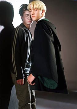
3. I think you'll agree that Harry's expression up above doesn't look very good. I chose another headshot then.
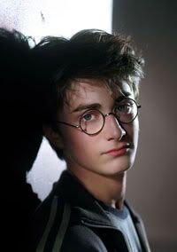
It's from the same photo shoot so it should be easier to blend in. I use a mask to cut out Harry's face and then minimize it, using the original head as a size reference.
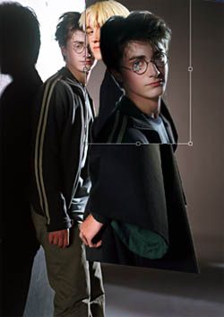
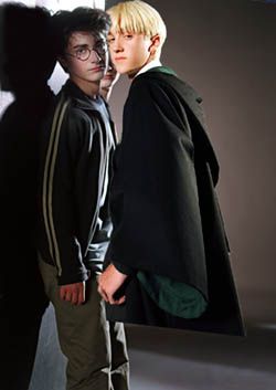
In the last image, you'll notice Harry has a different shadow behind his head. I undid some of the mask to reveal the natural shadow that was there in Harry's headshot.
Tip #2: When blending two images, use an airbrush so that the feathered edge will make a smoother, gradual blend. Here, I used a large airbrush on the mask and just let the edges of the airbrush touch the edges of the image. I use this method to blend in hair with the background as well. Hair is usually hard to cut around because of strands sticking out here and there. Use smaller brushes for smaller groups of hairs so you don't lose definition. It's just a lot of do and undo work really. Keep trying different ways until it looks good to you :)
Tip #3: If the edges of an image are too hard against the background, AVOID using the smudge tool to blend the pictures together. I've seen this done a lot of times and the results are usually, well, not very good. The blur tool makes more sense although I still recommend working with airbrushes. Even if you have to redo and readjust the mask several times, it looks better.
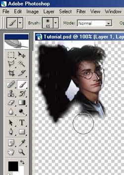
4. I then adjust Draco's layer, placing him in front of Harry's face and moving him a bit higher.
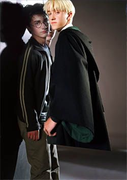
5. Time to fix up the background. I use the cloning stamp to paint over the other Harry's face.
Tip #4: For cloning uneven-colored surfaces, do not clone the same section over and over, because a pattern will form and the cloning becomes more obvious. Again, use an airbrush. If a cloned area does look too repetitive, set the airbrush to a low-medium opacity and clone over a few spots again. You might change the size of the airbrush as well so slightly different tones will show up.
Tip #5: Another thing you could do is find an image that can cover that particular spot. For example: Harry had many photos taken in the same location and lighting conditions as the one I used in my manip. I could search for one where his head isn't blocking that particular spot of the wall, then cut and paste it into my manip. In another manip, "Snow Hug", I completely substituted the background with one in a similar picture, because I couldn't erase all of Ron or Hermione out.
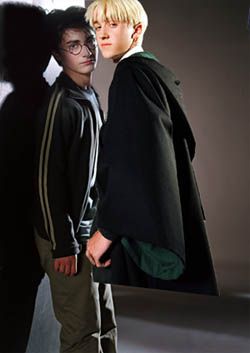
6. Now I thought it sucked that Draco and Harry seemed so close and yet so distant to one another, so I moved Draco's arm. I copied the area and pasted it in a new layer, once again using a mask to hide the area I didn't need. Then I rotated his hand to touch Harry and cloned over the sleeve in the old picture.
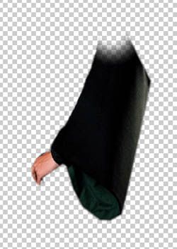
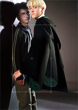
7. Another picture to add into the mix now. From this one, I borrow Harry's collar, sleeve, and hand. The collar addition is not that noticeable, but it's there in the final image :)
8. I manipulate the perspective and coloring a bit and this is what I get.
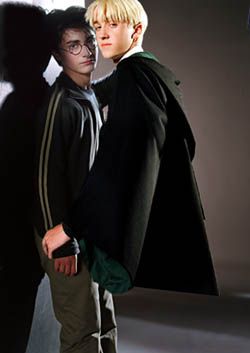
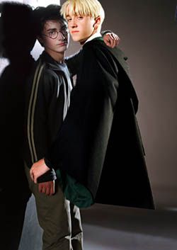
Perspective really is difficult to work with. That's why I try to avoid putting together two images that are very different in perspective. If you do change the perspective dramatically, you must change the width or height of the picture as well. This isn't a major concern in this manip, so I won't go into specifics.
9. Now it's time to crop and do the final touchups. Check lighting and add shadows where necessary - they really help add realistic depth. Adjust saturation, brightness, contrast in all photos to get as even a look as possible. You have to admit Harry looked like a corpse compared to Draco up there :)
Tip #6: For shadows, I usually use the burn tool. If burning makes the color look oversaturated, paint the shadow in with a brush at medium opacity and using a dark gray. Consider the distance the object is from where it is casting the shadow. If it is immediately on top of it, there will be a dark, dark shadow right at the points where they are touching.
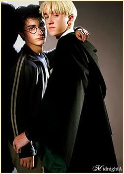
I hope you enjoyed seeing the process and I hope some of the tips were helpful!
Cheers,
~midnighta
EDIT: What sucks is that after writing this tutorial, I realized how Harry is a bit oversaturated. *Grrr* Too late to fix now, but yeah, I'm a perfectionist that way :p *Grrr*
Edited 3/31/06
For those who've shown an interest in & asked questions about how my manips are made. I will not be explaining all the tools and steps as I am guessing the people who might want to do this will already have experience with Photoshop or something similar (I use PS 6.0). The process probably is kinda obvious, but I've written in a few tips, stuff that I learned in my 2 years of manipping. If you would like greater explanation on something, feel free to email me - midnighta [at] gmail [dot] com. If you have any tips to share, please do so! I'm still learning as well.
1. The main images:


2. Draco's leaning a bit far to the left, such that he would cover too much of Harry's face, so I rotate the image a bit to the right. I then use a mask, with the outline feathered 1-2 pixels, to hide the parts of the image that I don't want. In this case, the background. Draco is then moved into Harry's picture.
Tip #1: Masks are important! If you don't know how to use one, I recommend learning it. Masks enable you to make touchups by revealing/hiding parts of the picture. Deleting means you've lost the data for good. I usually feather the outline of the mask 1 pixel at least, so the image blends in smoother with the background and doesn't look like a flat cutout.


3. I think you'll agree that Harry's expression up above doesn't look very good. I chose another headshot then.

It's from the same photo shoot so it should be easier to blend in. I use a mask to cut out Harry's face and then minimize it, using the original head as a size reference.


In the last image, you'll notice Harry has a different shadow behind his head. I undid some of the mask to reveal the natural shadow that was there in Harry's headshot.
Tip #2: When blending two images, use an airbrush so that the feathered edge will make a smoother, gradual blend. Here, I used a large airbrush on the mask and just let the edges of the airbrush touch the edges of the image. I use this method to blend in hair with the background as well. Hair is usually hard to cut around because of strands sticking out here and there. Use smaller brushes for smaller groups of hairs so you don't lose definition. It's just a lot of do and undo work really. Keep trying different ways until it looks good to you :)
Tip #3: If the edges of an image are too hard against the background, AVOID using the smudge tool to blend the pictures together. I've seen this done a lot of times and the results are usually, well, not very good. The blur tool makes more sense although I still recommend working with airbrushes. Even if you have to redo and readjust the mask several times, it looks better.

4. I then adjust Draco's layer, placing him in front of Harry's face and moving him a bit higher.

5. Time to fix up the background. I use the cloning stamp to paint over the other Harry's face.
Tip #4: For cloning uneven-colored surfaces, do not clone the same section over and over, because a pattern will form and the cloning becomes more obvious. Again, use an airbrush. If a cloned area does look too repetitive, set the airbrush to a low-medium opacity and clone over a few spots again. You might change the size of the airbrush as well so slightly different tones will show up.
Tip #5: Another thing you could do is find an image that can cover that particular spot. For example: Harry had many photos taken in the same location and lighting conditions as the one I used in my manip. I could search for one where his head isn't blocking that particular spot of the wall, then cut and paste it into my manip. In another manip, "Snow Hug", I completely substituted the background with one in a similar picture, because I couldn't erase all of Ron or Hermione out.

6. Now I thought it sucked that Draco and Harry seemed so close and yet so distant to one another, so I moved Draco's arm. I copied the area and pasted it in a new layer, once again using a mask to hide the area I didn't need. Then I rotated his hand to touch Harry and cloned over the sleeve in the old picture.


7. Another picture to add into the mix now. From this one, I borrow Harry's collar, sleeve, and hand. The collar addition is not that noticeable, but it's there in the final image :)

8. I manipulate the perspective and coloring a bit and this is what I get.


Perspective really is difficult to work with. That's why I try to avoid putting together two images that are very different in perspective. If you do change the perspective dramatically, you must change the width or height of the picture as well. This isn't a major concern in this manip, so I won't go into specifics.
9. Now it's time to crop and do the final touchups. Check lighting and add shadows where necessary - they really help add realistic depth. Adjust saturation, brightness, contrast in all photos to get as even a look as possible. You have to admit Harry looked like a corpse compared to Draco up there :)
Tip #6: For shadows, I usually use the burn tool. If burning makes the color look oversaturated, paint the shadow in with a brush at medium opacity and using a dark gray. Consider the distance the object is from where it is casting the shadow. If it is immediately on top of it, there will be a dark, dark shadow right at the points where they are touching.

I hope you enjoyed seeing the process and I hope some of the tips were helpful!
Cheers,
~midnighta
EDIT: What sucks is that after writing this tutorial, I realized how Harry is a bit oversaturated. *Grrr* Too late to fix now, but yeah, I'm a perfectionist that way :p *Grrr*
Edited 3/31/06