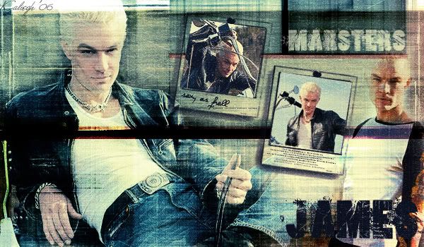
James Marsters Banner tutorial
See how to make this BANNER
Done in PS 7…will probably translate fairly easily.
Moderately image heavy
Please note that this tutorial is only to be used as a guideline. Follow it, but not exactly. Add your own touches…make it yours. And I’ve been asked by a few why I don’t provide the pictures that I’ve used with my tutorials. Simply because I want people to find their own pictures to use…not the same ones as I’m using :)
Okay, first I start out with the texture that I have decided to use for the background. I chose this one from Hyrbid Genesis

Next I chose the first picture that I want to use…this one will be the focus picture. So after finding what I want to use and preparing it(sharpening, and whatever), I copy and paste it onto the texture, scale if need be and set it to Soft Light 100%. Then I took my eraser and erased away the parts of the picture that I didn’t want showing. You could also use a layer mask for this step and I usually do prefer to use masks, but since I wasn’t doing any really fine, detailed erasing, I just used the eraser. Then I duplicated the layer and set it to Overlay at 89%

Next I added a gradient map to darken up the picture and give it a bit more depth. So with black as your foreground and white in the background, go to LAYER>>NEW ADJUSTMENT LAYER>>GRADIENT MAP. Set the blend mode to Multiply and click okay. You may need to play with the slider a bit to set the lightness and darkness to your liking.

That looks hella good already! (course look at the subject!) :)
Okay, next I chose the picture that I want to do next. Once I decided, I copy and pasted it, set it to Soft Light 100% and erased away the parts I didn’t want. Then I duplicated the layer and set it to Hard Light 100%


Next I take this brush and I think its from Damnedinblack.net but I’m not entirely sure. I’ve spent like the last hour trying to figure it out. I loaded all of my polaroid brush sets and couldn't find where it belonged. I looked through my other graphics and saw that I’d last used it like 9 months ago and I’m ashamed to say that I didn’t keep very good track of resources then like I do now. So if anyone know for sure where this is from, I’d really appreciate knowing so I can credit.
Anyway….As I was saying take this brush in black and on 2 new layers, place it twice on your texture…I made the layers just above my texture.

Now I pick the pictures (and btw all these lovely scans are from Scantastic and Elegance PIXELFIED) that I want to put in the Polaroid frames. So I’ve got those in there and each one is duplicated and set to Screen 100%

Okay, now I take this texture from Scooly…the link I had to the site isn’t working anymore unfortunately. I give it a motion blur FILTER>>BLUR>>MOTION BLUR then I set it to Color Burn at 19%


Then I took this texture from meleada and pasted it on top of everything. I set it to Soft Light 47% and erased the parts that I thought were covering his face too much. You can get the full size of this texture at her journal


Now all that’s really left is text, brushes and whatever else you’d like to add. The text I did in loserboi grunge at 60pt and on sharp. On the one Polaroid I wrote sexy as hell with the Violation font at 12pt and used a tiny text brush from PoshPixel. On the other one, I added some tiny text from amethystia and lastly I took this line brush and on a new layer set to Overlay I used it here and there.

And all done! =)

Here's another one that I did using the same technique

Done in PS 7…will probably translate fairly easily.
Moderately image heavy
Please note that this tutorial is only to be used as a guideline. Follow it, but not exactly. Add your own touches…make it yours. And I’ve been asked by a few why I don’t provide the pictures that I’ve used with my tutorials. Simply because I want people to find their own pictures to use…not the same ones as I’m using :)
Okay, first I start out with the texture that I have decided to use for the background. I chose this one from Hyrbid Genesis

Next I chose the first picture that I want to use…this one will be the focus picture. So after finding what I want to use and preparing it(sharpening, and whatever), I copy and paste it onto the texture, scale if need be and set it to Soft Light 100%. Then I took my eraser and erased away the parts of the picture that I didn’t want showing. You could also use a layer mask for this step and I usually do prefer to use masks, but since I wasn’t doing any really fine, detailed erasing, I just used the eraser. Then I duplicated the layer and set it to Overlay at 89%

Next I added a gradient map to darken up the picture and give it a bit more depth. So with black as your foreground and white in the background, go to LAYER>>NEW ADJUSTMENT LAYER>>GRADIENT MAP. Set the blend mode to Multiply and click okay. You may need to play with the slider a bit to set the lightness and darkness to your liking.

That looks hella good already! (course look at the subject!) :)
Okay, next I chose the picture that I want to do next. Once I decided, I copy and pasted it, set it to Soft Light 100% and erased away the parts I didn’t want. Then I duplicated the layer and set it to Hard Light 100%


Next I take this brush and I think its from Damnedinblack.net but I’m not entirely sure. I’ve spent like the last hour trying to figure it out. I loaded all of my polaroid brush sets and couldn't find where it belonged. I looked through my other graphics and saw that I’d last used it like 9 months ago and I’m ashamed to say that I didn’t keep very good track of resources then like I do now. So if anyone know for sure where this is from, I’d really appreciate knowing so I can credit.
Anyway….As I was saying take this brush in black and on 2 new layers, place it twice on your texture…I made the layers just above my texture.

Now I pick the pictures (and btw all these lovely scans are from Scantastic and Elegance PIXELFIED) that I want to put in the Polaroid frames. So I’ve got those in there and each one is duplicated and set to Screen 100%

Okay, now I take this texture from Scooly…the link I had to the site isn’t working anymore unfortunately. I give it a motion blur FILTER>>BLUR>>MOTION BLUR then I set it to Color Burn at 19%


Then I took this texture from meleada and pasted it on top of everything. I set it to Soft Light 47% and erased the parts that I thought were covering his face too much. You can get the full size of this texture at her journal


Now all that’s really left is text, brushes and whatever else you’d like to add. The text I did in loserboi grunge at 60pt and on sharp. On the one Polaroid I wrote sexy as hell with the Violation font at 12pt and used a tiny text brush from PoshPixel. On the other one, I added some tiny text from amethystia and lastly I took this line brush and on a new layer set to Overlay I used it here and there.

And all done! =)

Here's another one that I did using the same technique
