Requested Tutorials
Okay, have a few tutorial requests so I thought I'd get them all done in one post.
These were done in PS CS2, but should translate fairly easily.


Okay, first I'll be doing this one

I started out first with this texture from peoplemachines

I then opened up the picture that I wanted to use and after extracting it from the background, I drug it over to my texture. I used the pen tool to cut my image, but you can use whatever method works best for you.

The first thing I noticed is that I didn't like how the picture looked over the black side of the texture. So after moving it around and flipping it back and forth I decided to use my rectangular marquee tool and select a piece of the black part of the texture and then I pasted that over the edge of my picture to cover up what I didn't like.

Alright, next I made a new layer beneath the picture of Brett and added the star burst in red using one of the PS Custom Shapes. I also added a drop shadow and 2px stroke in white to make it pop more.
Here are the image for PSP or other program users that don't have the shape in their program. It's saved as png(transparent) so you should just be able to drag it onto your graphic(???)

And what it looks like so far:

I made another new layer beneath the star burst and added this brush from _bitter_endings


Next I wanted to add some text so I made a new layer above the star burst and used the Stereofidelic font in white. I added a drop shadow and a 3px stroke in black. I also used the warp effect to make the text bend upward.
These were my setting but play around with it to your liking

I also added some text on the bottom and a tiny text brush from fangirls_inc

Next I made a new layer above everything and filled it with #01133c and set it to Exclusion at 48% opacity. I erased what was over the black side of the texture because it didn't look good at all.
Lastly I made a new layer just above the texture. Then I made a new file about 50x50 and with a white background. Take your brush tool and with the default 1px round brush make some dots on the white background. Then go to Edit>>Define Pattern. Now go back to the new layer that you just made on the graphic and with the fill tool, fill that layer in with the pattern that you just made. Set the blend mode to Darken or Multiply and adjust the opacity to your liking.
All done :)

*****
Alright, for these next two tutorials, I didn't do any of the blending. They were blends that were posted at 300dpi for the Add Effects challenges. So I'll only be showing how to achieve the effects on these.
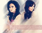
On the Mandy Moore blend, I just duplicated the blend layer and added a motion blur to the duplicate layer. Then I took the eraser(or you could use a layer mask instead) and erased on the blurred layer where her face and some of her body were.

Next I made a new layer and with the eye dropper tool, I selected a pinkish color off of the graphic. I then took the rectangular marquee tool and made a narrow box the width of the graphic and then filled it with the pinkish color. I left the blend mode on Normal, but put the opacity down to 58% so that it would look more blended in with the picture. To blend it in just a bit more, I took the eraser tool again and with a large, soft brush, I erased away one side of the box.

On a new layer above that I added my text using the Passions Conflict and Times New Roman fonts and I also added a flower brush from ca_pris
And that's it :)

*****
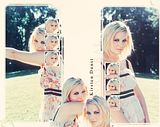
And finally for the Kirsten Dunst graphic... I took the blend that was supplied for the challenge and added a new layer and filled it with white. I also added a layer mask. Then with the layer mask activated, I took this brush and rotated it 90 degrees counter clock wise. To do this if you don't know how open your brush window(Window>>Brushes and then click on where it says Brush Tip Shape and then you'll see a circle that has an arrow going through. You click and drag the arrow to rotate your brushes.

Okay so I have my brush from elizabethswan

And I said above, I first rotated it 90 degrees counter clock wise and then with the layer mask activated, I applied the brush in black on the left side of the blend where the picture of Kirsten is. Then I rotated the brush again back the other way and applied it again on the right side.

Next I wanted to fill in those little white boxes so for the ones on the left I copied a portion of the picture on the right and sized it down to about 50x50 and then drug it over above the boxes. I duplicated the layer twice and drug them down to the remaining two boxes. I did the same on the right except using the picture on the left.

Next I wanted to add pictures to the space between the two so I made a new file and copied the background picture over to there. I cut out the picture on the left first and placed it down near the bottom of the graphic and rotated it. I then cut out the other one and pasted it beside the other one and rotated that one as well.

I didn't like the white that I had used on the layer mask...too bright and glaring so to tone it down, I made a new layer and filled it with a dark blue and set it to Exclusion at 44% opacity. I also added this texture from tihana and after giving it a good motion blur, I set it to Softlight at 26%.

(click for full size)

Finally I added some text using Times New Roman. The word 'Natural' is done in black with all caps with a space between each letter. It is set to Softlight and the layer duplicated.

These were done in PS CS2, but should translate fairly easily.


Okay, first I'll be doing this one

I started out first with this texture from peoplemachines

I then opened up the picture that I wanted to use and after extracting it from the background, I drug it over to my texture. I used the pen tool to cut my image, but you can use whatever method works best for you.

The first thing I noticed is that I didn't like how the picture looked over the black side of the texture. So after moving it around and flipping it back and forth I decided to use my rectangular marquee tool and select a piece of the black part of the texture and then I pasted that over the edge of my picture to cover up what I didn't like.

Alright, next I made a new layer beneath the picture of Brett and added the star burst in red using one of the PS Custom Shapes. I also added a drop shadow and 2px stroke in white to make it pop more.
Here are the image for PSP or other program users that don't have the shape in their program. It's saved as png(transparent) so you should just be able to drag it onto your graphic(???)

And what it looks like so far:

I made another new layer beneath the star burst and added this brush from _bitter_endings


Next I wanted to add some text so I made a new layer above the star burst and used the Stereofidelic font in white. I added a drop shadow and a 3px stroke in black. I also used the warp effect to make the text bend upward.
These were my setting but play around with it to your liking

I also added some text on the bottom and a tiny text brush from fangirls_inc

Next I made a new layer above everything and filled it with #01133c and set it to Exclusion at 48% opacity. I erased what was over the black side of the texture because it didn't look good at all.
Lastly I made a new layer just above the texture. Then I made a new file about 50x50 and with a white background. Take your brush tool and with the default 1px round brush make some dots on the white background. Then go to Edit>>Define Pattern. Now go back to the new layer that you just made on the graphic and with the fill tool, fill that layer in with the pattern that you just made. Set the blend mode to Darken or Multiply and adjust the opacity to your liking.
All done :)

*****
Alright, for these next two tutorials, I didn't do any of the blending. They were blends that were posted at 300dpi for the Add Effects challenges. So I'll only be showing how to achieve the effects on these.
On the Mandy Moore blend, I just duplicated the blend layer and added a motion blur to the duplicate layer. Then I took the eraser(or you could use a layer mask instead) and erased on the blurred layer where her face and some of her body were.

Next I made a new layer and with the eye dropper tool, I selected a pinkish color off of the graphic. I then took the rectangular marquee tool and made a narrow box the width of the graphic and then filled it with the pinkish color. I left the blend mode on Normal, but put the opacity down to 58% so that it would look more blended in with the picture. To blend it in just a bit more, I took the eraser tool again and with a large, soft brush, I erased away one side of the box.

On a new layer above that I added my text using the Passions Conflict and Times New Roman fonts and I also added a flower brush from ca_pris
And that's it :)

*****
And finally for the Kirsten Dunst graphic... I took the blend that was supplied for the challenge and added a new layer and filled it with white. I also added a layer mask. Then with the layer mask activated, I took this brush and rotated it 90 degrees counter clock wise. To do this if you don't know how open your brush window(Window>>Brushes and then click on where it says Brush Tip Shape and then you'll see a circle that has an arrow going through. You click and drag the arrow to rotate your brushes.

Okay so I have my brush from elizabethswan

And I said above, I first rotated it 90 degrees counter clock wise and then with the layer mask activated, I applied the brush in black on the left side of the blend where the picture of Kirsten is. Then I rotated the brush again back the other way and applied it again on the right side.

Next I wanted to fill in those little white boxes so for the ones on the left I copied a portion of the picture on the right and sized it down to about 50x50 and then drug it over above the boxes. I duplicated the layer twice and drug them down to the remaining two boxes. I did the same on the right except using the picture on the left.

Next I wanted to add pictures to the space between the two so I made a new file and copied the background picture over to there. I cut out the picture on the left first and placed it down near the bottom of the graphic and rotated it. I then cut out the other one and pasted it beside the other one and rotated that one as well.

I didn't like the white that I had used on the layer mask...too bright and glaring so to tone it down, I made a new layer and filled it with a dark blue and set it to Exclusion at 44% opacity. I also added this texture from tihana and after giving it a good motion blur, I set it to Softlight at 26%.

(click for full size)

Finally I added some text using Times New Roman. The word 'Natural' is done in black with all caps with a space between each letter. It is set to Softlight and the layer duplicated.
