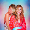
Round #13 - Challenge #6 - Results
Thank you to my four voters. I really appreciate you taking the time to vote!
Sadly we are saying goodbye to 1 icon maker tonight:

( Read more... )
Sadly we are saying goodbye to 1 icon maker tonight:

( Read more... )
Comments 2
Reply
Negative:
#1 - over-saturated.
#1 - Although the colouring is pretty and I love the use of texture the skin looks a little red.
01 - The colouring is too pinkish and makes it hard on the eyes. Also the texure does not fit, it makes the whole icon a jumble of rainbowish colours.
Positive:
#1 - Great vibrant, yet natural colouring. The background texture compliments the colouring without being too similar or too different from the colouring of the original image.
Reply
Leave a comment