Post #5: Icon Tutorial.
I decided to make this tutorial because I love the results. As this is my first tutorial ever, it might be confusing but please comment with your questions and doubts and I'll try to solve them :).
Go from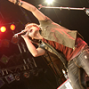
to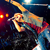
1. Resize your image, crop it as you prefer and sharpen it until you get what you want.

2. Create a new Selective color layer:
RED: -58, +21, +100, 0
YELLOW: -20, 0, +53, 0
GREEN: +15, 0, 0, 0
CYAN: +100, 0, 0, 0
NEUTRALS: +38, -5, -34, 0
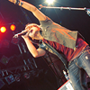
3. Duplicate the Selective color layer -just select it and press CTRL + J-.
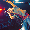
4. Duplicate your base, paste it to the top and set it to Soft Light 50%.
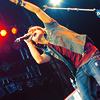
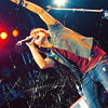
5. Add this scratch texture by ewanism and set it to Lighten.
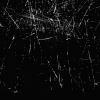
-->
6. Create a new Brightness/Contrast layer.
Brightness: -3
Contrast: +13
Don't forget to select the "Use legacy" option.

And that's all! In six easy steps you get a brand new icon :).
Download .PSD
Remember that you'll have to play with the settings because the tutorial doesn't work with all images.
If you like what you see, JOIN.
Go from

to

1. Resize your image, crop it as you prefer and sharpen it until you get what you want.

2. Create a new Selective color layer:
RED: -58, +21, +100, 0
YELLOW: -20, 0, +53, 0
GREEN: +15, 0, 0, 0
CYAN: +100, 0, 0, 0
NEUTRALS: +38, -5, -34, 0

3. Duplicate the Selective color layer -just select it and press CTRL + J-.

4. Duplicate your base, paste it to the top and set it to Soft Light 50%.

5. Add this scratch texture by ewanism and set it to Lighten.

-->

6. Create a new Brightness/Contrast layer.
Brightness: -3
Contrast: +13
Don't forget to select the "Use legacy" option.

And that's all! In six easy steps you get a brand new icon :).
Download .PSD
Remember that you'll have to play with the settings because the tutorial doesn't work with all images.
If you like what you see, JOIN.